
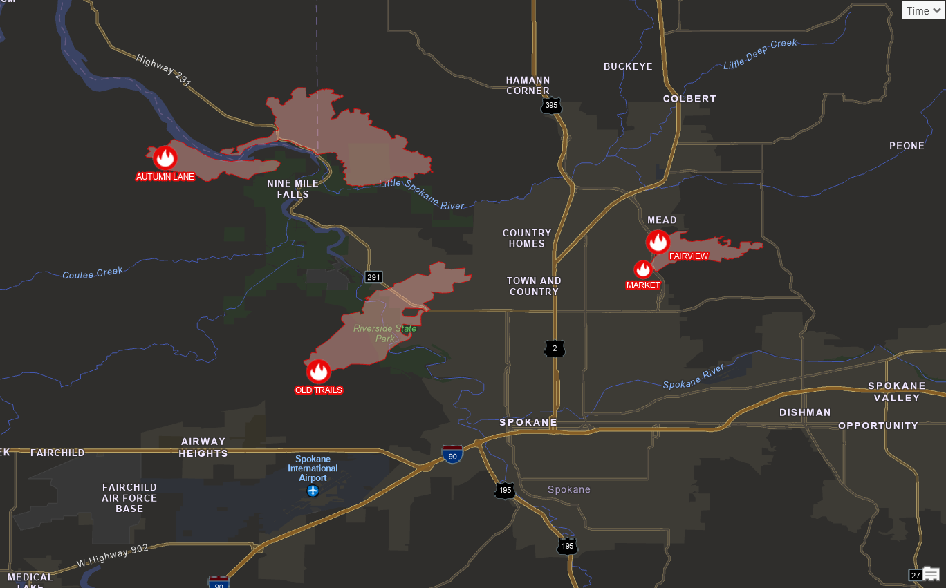
On the afternoon of August 1, three fires broke out around Spokane, Washington. By Sunday morning the Washington State Emergency Operations Center estimated about 700 structures had been destroyed and more than 65,000 people were under evacuation orders. Spokane’s mayor called it the worst natural disaster the region has faced. The fires were still at zero containment two days in.
Spokane is the headline, but it is not an outlier. Oregon had burned more than 1.7 million acres by the end of July and is on pace to pass 2024, its worst season on record. The Big Grass Fire crossed from Oregon into Idaho and grew past 300,000 acres in about a week. Nationally, more than 6 million acres had burned by July 31, roughly 165 percent of the ten-year average, and the National Interagency Fire Center moved the country to Preparedness Level 5 on July 18.
If you work in GIS for a city, county, utility, or agency anywhere in the West, someone has probably already asked you for a map. The good news is that you do not need to hunt down shapefiles or wait on a data request. Nearly everything you need to build a solid situational awareness map is already sitting in ArcGIS Living Atlas, and it updates itself.
This article walks through the layers I’d pull together in ArcGIS Pro, why each one matters, and how to make them work together instead of just piling them on top of each other.

Why ArcGIS Pro and not just a web map
You can make a decent fire map in Map Viewer in about two minutes. Sometimes that’s the right answer. But ArcGIS Pro gives you things a web map can’t:
- Layouts. Briefing packets, printed maps for an EOC wall, map series by district. This is still the most common ask during an incident.
- Analysis. Count the structures inside a perimeter. Summarize population within three miles. Clip fuel data to the fire footprint.
- Your own data. Water mains, hydrants, cell sites, critical facilities, customer accounts. The public feeds get much more useful once they sit next to the data only you have.
- Automation. A short Python script can refresh a layout and export a PDF on a schedule, which beats rebuilding the same map three times a day.
The layers below are the same ones you’d use in a web map. Pro just lets you do more with them.
Connecting to Living Atlas in ArcGIS Pro
You need to be signed in to an ArcGIS Online account. Once you are:
- Open the Catalog pane and click the Portal (#1 below) tab.
- Click the Living Atlas button (#2 below) (the globe icon).
- Search for the layer by name (#3 below)
- Right-click the result and choose Add To Current Map (#4 below)
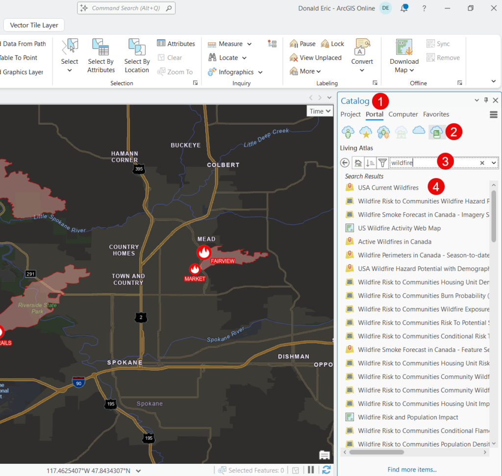
That’s it. You’re now streaming the live service, not a copy of it. When the source agency updates, your map updates. No refresh cycle to maintain, no stale perimeter from last Tuesday sitting in your file geodatabase.
One habit worth building: mouse over the layer name first and read the item details before you add it. Update frequency, source agency, and known limitations are all in there, and they matter a lot when someone asks you how current your map is.
The core fire layers
USA Current Wildfires
This is the anchor layer. It’s a group layer with two parts:
- Current Incidents — points, usually near the ignition location, coming from IRWIN (Integrated Reporting of Wildland-Fire Information). Symbols are sized by NWCG fire size class based on daily acres.
- Current Perimeters — polygons from the National Incident Feature Service, maintained by the GIS specialists assigned to each incident.
The service refreshes every 15 minutes and shows fires updated in the last seven days. Points and perimeters do not update on the same rhythm, though. The script runs every 15 minutes, but the perimeter itself only changes when the incident team posts a new one, which might be once a day after a night mapping flight. During a fast run like Spokane’s, the perimeter on your screen can be hours behind the fire.
A practical tip on filtering. This service takes heavy traffic during fire season. If you want to filter by time, don’t write a definition query against a date field with a relative expression. Esri’s own item description asks you to avoid those, because they can’t be cached.
Instead, use the precomputed age fields. Each one is an integer holding the number of days since something happened, recalculated every time the service updates. The two sublayers use different field names, which trips people up:
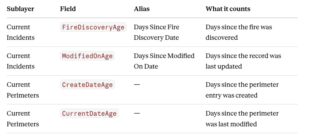
A value of 0 means within the last 24 hours. Esri’s own symbology uses FireDiscoveryAge = 0 to call out new starts, which is worth borrowing.
So instead of a relative date expression, write the following definition query for the Current_Incidents layer:
FireDiscoveryAge <= 2for fires discovered in the last three days, or on the perimeter layer:
CurrentDateAge = 0to show only perimeters updated since yesterday. Those queries cache, so they come back faster for you and put less load on a service everyone else is hitting at the same time.
A definition query to pull just the fires you care about:
POOState = 'US-WA' AND DailyAcres > 100Satellite (VIIRS) Thermal Hotspots and Fire Activity
This is a separate Living Atlas item, not part of the USA Current Wildfires group layer. Search Living Atlas for the full title, Satellite (VIIRS) Thermal Hotspots and Fire Activity, and add it the same way.
VIIRS flies on the Suomi NPP, NOAA-20, and NOAA-21 satellites and detects heat at 375 meter resolution. The layer holds global detections for the last 7 days and comes from NASA’s near real-time active fire product (VNP14IMG_NRT), refreshed hourly.
This is what fills the gap between perimeter updates. When the perimeter is a day old but the hotspots show a line of detections two miles northeast of it, you’re looking at where the fire actually went.
Two things to tell whoever reads your map:
- Hotspots are detections, not fire perimeters. A 375 meter pixel is bigger than a lot of neighborhoods.
- The satellite only sees the ground when it passes over, a few times a day. Gaps in the data are gaps in coverage, not gaps in the fire. Heavy smoke and cloud can also block detection.
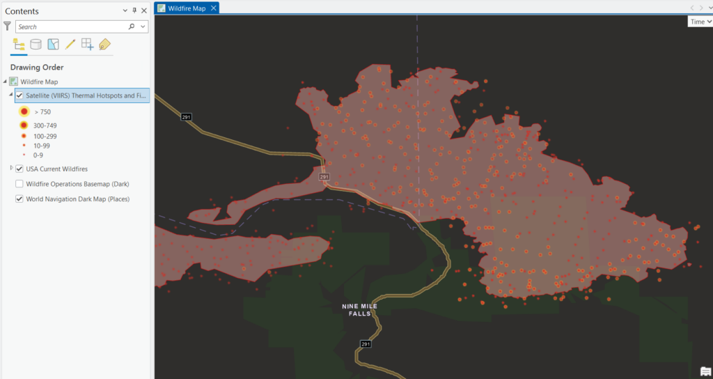
Notice in the screenshot above that VIIRS detected points are outside the current wildfire perimeter layer indicating wildfire spread that hasn’t been picked up and plotted to the polygon perimeter layer.
The same filtering advice applies here as on the wildfire layer, and for the same reason. Don’t build definition queries on the date fields. Use the age fields instead so your query can be cached — this service warns explicitly that uncacheable date filters will get rate limited by ArcGIS Online.
There’s a companion layer, Satellite (MODIS) Thermal Hotspots and Fire Activity, at 1 kilometer resolution. VIIRS is better for almost everything now, but MODIS goes back further if you’re looking at fire history.
Fire history: going outside Living Atlas
When someone asks whether an area has burned before, or you’re building a map comparing this season to the last ten, you’ll need to step outside Living Atlas. The authoritative history comes from WFIGS (Wildland Fire Interagency Geospatial Services), and those services are published by the National Interagency Fire Center’s own ArcGIS Online organization rather than curated into Living Atlas.
Two ways to get at them in ArcGIS Pro:
- In the Catalog pane, switch the Portal tab to ArcGIS Online instead of Living Atlas and search for WFIGS. The NIFC-published items come back in the results and add to your map the same way.
- Or browse the NIFC open data site at data-nifc.opendata.arcgis.com, copy the feature service URL from the item page, and add it in Pro through Add Data From Path.
The ones worth knowing:
- WFIGS Current Interagency Fire Perimeters — best available perimeters for recent and ongoing fires.
- WFIGS Interagency Fire Perimeters — the full history of known wildland fires. Still an ongoing project, so treat it as incomplete.
- InterAgencyFirePerimeterHistory All Years View — the national history layer built for wildfire decision support, combining perimeters from the Forest Service, BLM, BIA, Fish and Wildlife Service, Park Service, Alaska Interagency Fire Center, CAL FIRE, and WFIGS.
One caution on all of the history layers: agencies submit perimeter data on their own schedules, often only once a year, and each sets its own minimum acreage for inclusion. A fire missing from the layer wasn’t necessarily small — it may just not have been submitted yet.
Weather layers: what’s driving the fire
Fire behavior is often a weather story. These are the layers that explain why a fire did what it did, and hint at what it might do next.
Weather radar
Radar in Living Atlas has been renamed and reorganized more than once, so search radar in the Portal tab and see what your organization actually returns rather than hunting for a specific title.
If nothing useful comes back, go straight to the source. NOAA publishes its radar services publicly, and you can add them in ArcGIS Pro through Add Data From Path:
https://mapservices.weather.noaa.gov/eventdriven/rest/services/radar/radar_base_reflectivity_time/ImageServer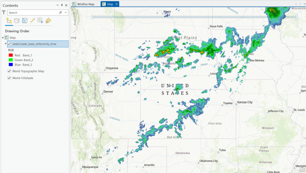
That’s the time-enabled version, built on the Multi-Radar/Multi-Sensor (MRMS) system. It carries a rolling four-hour window and updates about every ten minutes, covering the continental U.S., Alaska, Hawaii, Guam, and the Caribbean. There’s a non-time-enabled radar_base_reflectivity MapServer at the same location if you just want the current image with no slider.
Adding a service by URL is worth knowing regardless. Living Atlas titles change, but agency REST endpoints tend to stay put, and a URL in your project template keeps working after somebody renames an item.
Turn on time and step through it.
Radar is not just for rain during fire season. It shows you:
- Dry thunderstorms — the cells that produced the lightning that started the Oregon and Idaho fires this year. Rain evaporating before it hits the ground, lightning that doesn’t.
- Outflow boundaries — the wind shift that comes off a collapsing thunderstorm. This is what turns a flank into a head fire, and it’s how a lot of firefighters get hurt.
- Pyrocumulus and smoke plumes — big plumes show up on radar. If you see a return where there’s no precipitation, that’s often the column.
Right-click the layer and check Time properties so playback runs at a speed people can actually read.
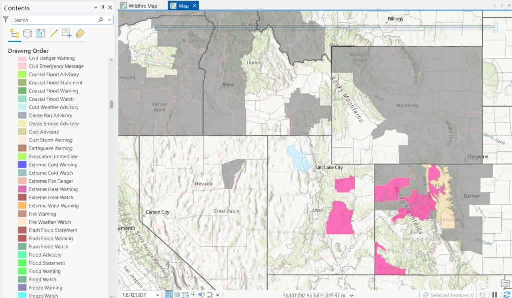
USA Weather Watches and Warnings
A live feed of every active NWS watch, warning, and advisory. Search Living Atlas for USA Weather Watches and Warnings.
One thing to know before you start filtering: this is a group layer, not a single layer. Expand it in the Contents pane and you’ll find several sublayers, including one called Events Ordered by Size and Severity — that’s the one most people want, and it’s where your definition query goes. Applying a filter to the group does nothing.
The field you want is Event, which carries the alias Subject Type. It holds the hazard name as the NWS writes it — “Red Flag Warning” and so on.
Build the filter in the visual builder rather than typing SQL. Choose Subject Type, use includes the values(s), and pick values from the dropdown. The dropdown gives you the names exactly as they appear in the data, which matters because these are string comparisons: a name that’s close but not exact returns zero features with no error to tell you why. The product list also changes over time — the NWS renamed its cold-hazard products in October 2024 — so a query built from the dropdown ages better than one you typed from memory.
For fire work, the values to look for include (note that these may not be exact matches):
- Red Flag Warning
- Fire Weather Watch
- High Wind Warning and Wind Advisory
- Dense Smoke Advisory
- Air Quality Alert
Without a filter this layer is a mess of flood advisories and marine warnings covering half the country. Filtered down, it’s one of the most useful layers on the map — a Red Flag Warning polygon over an active perimeter tells the story in one glance.
Current Weather and Wind Station Data
Search Living Atlas for Current Weather and Wind Station Data. It’s a global point layer of METAR observations from NOAA, carrying roughly eleven variables per station: wind speed and direction, gusts, temperature, dewpoint, relative humidity, visibility, and a few others.
What METAR is. It stands for Meteorological Aerodrome Report, the standard coded format weather stations use to report surface conditions. Reports go out hourly, with extra “special” reports when conditions change fast. It’s an aviation format — pilots have read raw METAR strings for decades — but the observations underneath are ordinary surface weather, and Esri has already parsed the codes into normal attribute fields, so you never have to decode anything.
The catch worth knowing. METAR stations are mostly at airports. In flat country with lots of airfields that’s fine. In fire country it often isn’t: the nearest reporting station may be 30 miles from the fire and 3,000 feet lower, sitting in a valley while the fire runs a ridge. Wind on a ridgetop can be double what the valley airport reports, and it can come from a different direction entirely. Use these observations for the regional picture, not as a proxy for conditions at the fire. Incident meteorologists set up portable weather stations for exactly this reason.
Symbolize wind direction with a rotated arrow or barb driven by the wind direction field — check the attribute table for the exact field name — and the regional steering flow reads at a glance.
Relative humidity is the number to watch. When RH drops into the teens and gusts hit 40 mph, which is what the Northwest saw on the days these fires ran, you’re in the conditions that make a fire uncontainable regardless of how many crews are on it.
Forecast layers
Observations tell you what happened. The question in the briefing is always what happens tomorrow.
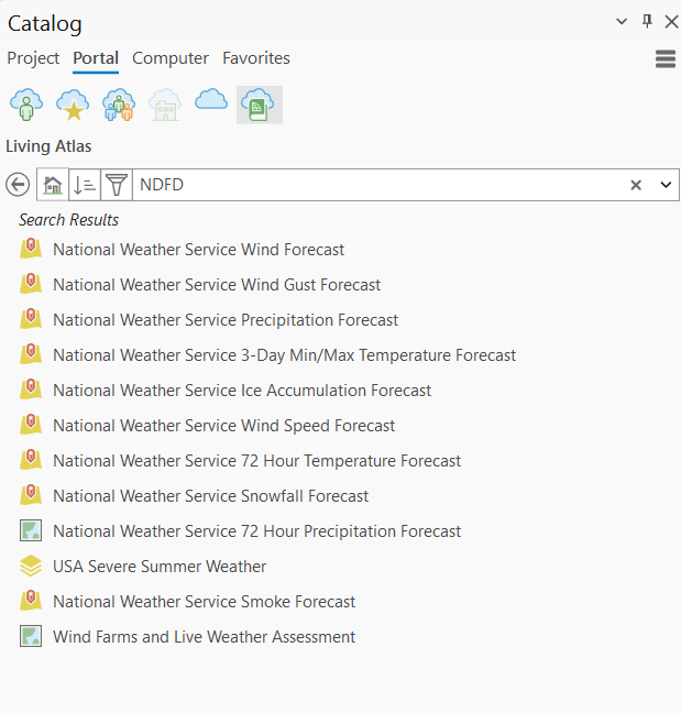
The National Weather Service publishes gridded forecasts through the National Digital Forecast Database (NDFD), covering wind speed, wind gust, temperature, and relative humidity among others — the four that matter most for fire behavior. Search Living Atlas for forecast or NDFD and see what your organization returns, since the titles and the set of available variables have shifted over the years. If nothing useful comes back, the NWS publishes NDFD services directly and you can add them by URL the same way as the radar service above.
Drought and fuel condition: why the fire is behaving this way
Drought Intensity
Search Living Atlas for drought. You’re looking for USA Drought Intensity – Current Conditions, the live feed carrying this week’s map. A companion layer, USA Drought Intensity 2000 – Present, holds the full weekly archive back to 2000 and is the one to reach for when someone asks how this year compares to the last drought.
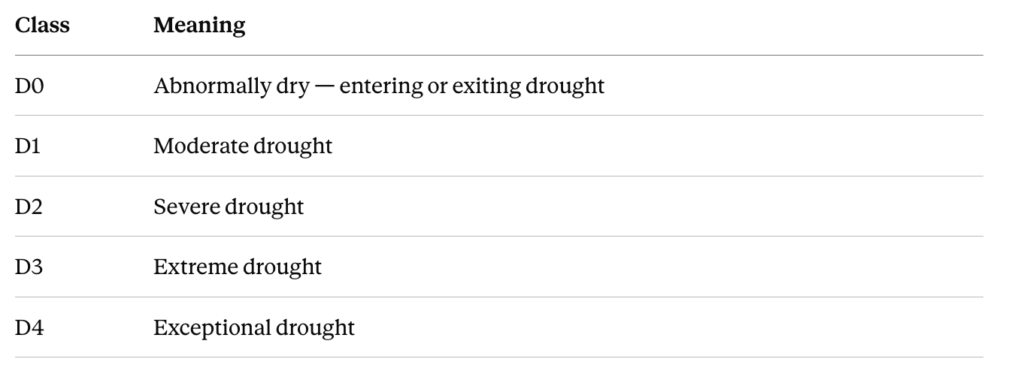
Both come from the U.S. Drought Monitor, produced since 1999 by the National Drought Mitigation Center at the University of Nebraska-Lincoln, in partnership with NOAA and the USDA. Five categories:
The weekly rhythm matters. Data cuts off Tuesday at 8:00 a.m. Eastern and the new map releases Thursday at 8:30 a.m. Eastern. So on a Wednesday you’re looking at conditions from over a week ago. That’s fine for context and wrong for anything operational — put the release date on the layout so nobody misreads it as current.
It’s an assessment, not a forecast. The Drought Monitor describes what has already happened, based on indicators plus local condition reports. It doesn’t project forward. It also carries real weight: USDA and other agencies use it to trigger disaster declarations and determine eligibility for loans and assistance, which is worth knowing if your county is deciding whether to apply for something.
This layer is context, not real time, and it’s the layer that explains the season. Researchers at the Western Regional Climate Center described the 2026 snowpack in Colorado and Utah as the worst seen in 50 to 75 years in some places. Early snowmelt gave the ground an extra month to dry out before fire season even started. Put the drought layer under your fire points and the pattern is obvious.
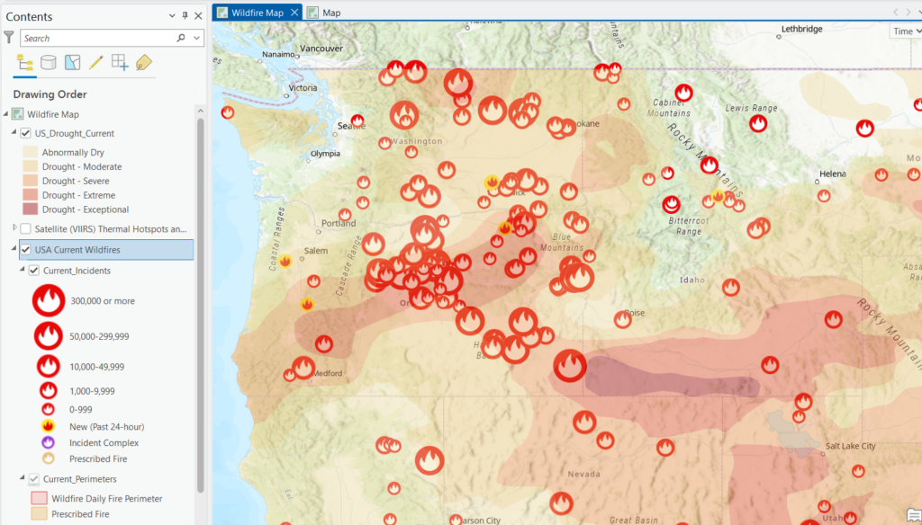
Planning layers: after the smoke clears
Everything above is about the incident. This one isn’t, and it’s worth keeping separate in your head and in your map.
Wildfire Hazard Potential
Wildfire Hazard Potential (WHP) is a raster from the USDA Forest Service’s Fire Modeling Institute showing the relative potential for high-intensity fire that would be difficult for crews to contain — where fire is likely to torch, crown, and outrun suppression. Search Living Atlas for wildfire hazard potential, or go to the Forest Service org at data-usfs.hub.arcgis.com for the authoritative raster. Older year-stamped services have been deprecated in favor of a single unified service.
Be clear-eyed about the vintage. The current release is version 2023, 4th Edition, from October 2023. But the inputs are older than the label: LANDFIRE 2020 fuels and vegetation, and fire occurrence through 2020. So the landscape it describes is roughly six years old, and everything that has burned across the West since — including this season — is still shown carrying the fuel it had before.
That’s a limitation and it’s why this layer doesn’t belong next to your live perimeters. It says nothing about current conditions, and the Forest Service says so directly: WHP contains no weather and no fuel moisture, it isn’t a forecast or a seasonal outlook, and on its own it isn’t a map of risk — only of fuel and terrain potential. It’s built for long-term strategic fuels planning at broad scales.
Where it earns its place is the conversation a few weeks later, when the council asks what else in the county looks like the place that just burned. Terrain doesn’t change and fuel structure changes slowly, so for that question a 2020-era landscape is mostly fine — as long as you mask out or annotate recent burn scars, where it’s now simply wrong.
Two footnotes if you go this route. The Wildfire Risk to Communities project publishes a spatially refined 30-meter version alongside related risk-to-homes datasets, which is better than 270 meters for community-scale maps. And don’t compare versions to argue hazard has increased — the Forest Service warns that differences between releases can reflect methodology changes as much as anything on the ground.
For the analysis itself, run Zonal Statistics as Table against WHP using your own geography — hexbins from Generate Tessellation, or existing districts and service areas — join the results back, and symbolize alongside population. Where high hazard meets high population density is the map that gets budget approved. Use the image service rather than downloading; the national rasters run to multiple gigabytes.
Vegetation and fuels
LANDFIRE
Don’t go looking for LANDFIRE in Living Atlas — searching there won’t turn up the vegetation and fuels products. LANDFIRE is a joint program of the USGS, Forest Service, and Department of the Interior, and it publishes its own data.
Two ways in:
- landfire.gov for downloads and documentation, including the LANDFIRE Product Services (LFPS) tool for pulling a custom area of interest rather than a whole region.
- The USGS image services at
lfps.usgs.gov/arcgis/rest/services, which you can browse and add in ArcGIS Pro through Add Data From Path. Services are organized by version and region — for exampleLandfire_LF2024/LF2024_FBFM40_AK— so open the services directory and find the current version for your area rather than trusting a URL from a blog post. Everything is 30-meter resolution.
The product family covers existing vegetation type, cover, and height; canopy cover, height, bulk density, and base height; topographic layers; and the fuel models.
The fuel models. Two sets, and you pick one:
- FBFM13 — Anderson’s original 13 models, values 1 to 13.
- FBFM40 — Scott and Burgan’s 40 models, values 91 to 204. More models in every fuel type, better handling of high dead-fuel-moisture situations, and herbaceous models that are dynamic, shifting load between live and dead to simulate curing. Non-burnable codes are 91, 92, 93, 98, and 99 for urban, snow and ice, agriculture, water, and bare ground.
FBFM40 is the better choice for most work now. Fuel model is also the layer to reach for first: grass burns fast and stops at a road, timber holds heat and throws embers, chaparral does things that surprise people. Overlay it on the direction of spread and you can see where a fire is likely to accelerate and where it might lay down.
On the vintage question — LANDFIRE has an answer that WHP doesn’t. The annual releases represent averages for a fire season, which is what you want for risk assessment but not for right now. Alongside those, LANDFIRE publishes Seasonal Fuels products (MoD-FIS), a refined FBFM40 built from current-growing-season Landsat imagery. LANDFIRE’s own guidance is to use Seasonal Fuels for fire behavior modeling in burn plans and during active wildfires, precisely because it reflects more current conditions, and to save the annual releases for risk assessment.
So if you’re mapping an active fire, check whether Seasonal Fuels covers your area before defaulting to the annual product. It won’t be everywhere — coverage is limited — but where it exists it’s the more honest layer.
Even so, be clear about what fuels data can’t know. No version reflects a fire that burned last month or a subdivision built last year.
Sentinel-2 Views
This one is in Living Atlas. Search for Sentinel-2 Views and add it the usual way.
It’s global Sentinel-2 multispectral imagery sourced from the Sentinel-2 on AWS collections and updated daily as new scenes land. Thirteen bands from visible blue through short-wave infrared, at 10 to 60 meters depending on the band. The two-satellite constellation revisits a given spot at least every five days, more often at higher latitudes. The service holds a rolling 14-month archive, which is what makes before-and-after comparison possible without hunting down old scenes.
The gotcha that stops most people. The layer ships with a default definition query that shows only the most recent, most cloud-free image available. It’s a sensible default and it silently blocks the thing you probably want. Whatever date expression you type, you’ll keep getting the same picture, and nothing tells you why.
To get at a specific date or the full archive: open Layer Properties → Definition Query, delete the existing query, and click OK. Now your own date filters work. This is worth knowing before you spend twenty minutes convinced the service is broken.
Switching renderers. These are processing templates, changed from the layer’s properties or the Processing Templates dropdown on the ribbon:
- Natural Color (bands 4, 3, 2) — what your eye would see. Useless when there’s smoke, which during a fire is most of the time.
- Short-wave Infrared (bands 12, 11, 4) — the one to reach for. SWIR penetrates smoke, so the active fire line shows as bright orange and red while everything around it stays legible. This is what people mean when they ask to “see the fire.”
- Color Infrared and Agriculture — healthy vegetation reads bright, which makes burn scars stand out sharply against unburned ground. Good for the post-fire extent map.
- NDVI Colorized and NDMI / Moisture Index — vegetation greenness and moisture content. Comparing NDVI against the same week in a previous year gives you a read on how cured the fuels are going into the season.
A caution on the fire line. SWIR shows heat at the moment of overpass, which may be many hours old by the time you’re looking at it. It’s a snapshot, not a live feed — VIIRS hotspots update far more often, and the incident perimeter is still the authoritative boundary. Use SWIR imagery to show people what happened, not to tell them where the fire is right now.
For burn severity, the standard approach is the Normalized Burn Ratio, computed from the near-infrared and short-wave infrared bands, differenced between a pre-fire and post-fire scene. The 14-month archive gives you the pre-fire image, and you can build the calculation with raster functions in Pro. That’s a longer workflow than this article covers, but it’s the right one when somebody asks how badly an area burned rather than simply whether it did.
When you need to see individual buildings
Sentinel-2 will not answer this. At 10 meters a house occupies roughly one pixel, so you can see that a neighborhood burned and you cannot see which houses did. No amount of zooming fixes that — you’re looking at the limit of the sensor, not a display setting. The same goes for VIIRS at 375 meters and the fire perimeter, which is a boundary and says nothing about what’s inside it.
Structure-level assessment needs a different class of imagery, and usually a different source entirely.
Maxar Open Data Program. Maxar releases pre- and post-event high-resolution imagery free in response to major disaster activations, published as cloud-optimized GeoTIFFs through the AWS Registry of Open Data. When an event is activated you get both a before and an after image at sub-meter resolution, which is exactly the comparison damage assessment needs. Check whether an activation exists for your event before assuming it doesn’t — coverage depends on whether they’ve tasked it.
NOAA Emergency Response Imagery. The National Geodetic Survey flies aerial survey missions after major disasters as soon as weather allows, producing directly georeferenced imagery that’s rapidly processed and published, along with a public online viewer. Their typical activations are hurricanes, tornadoes, and floods, so wildfire coverage is less certain — but it’s worth checking.
Esri’s Disaster Response Program. Esri provides imagery and support during active incidents. If you’re working for an agency responding to something at this scale, this is a phone call worth making rather than a dataset to hunt for.
A pre-fire baseline you already have. NAIP aerial imagery is available through Living Atlas at well under a meter. It’s flown on a multi-year state rotation so it won’t be current, but “current” isn’t what a before image needs to be. It gives you the reference to compare a post-fire flight against.
The honest caveat. Even with good imagery, remote assessment produces an estimate. The official structure counts come from damage inspection teams walking the ground, which is why the numbers move for days after a fire — they moved from roughly 600 to about 700 in the Spokane fires over a couple of days. If you’re publishing a map that implies a specific building’s status, you’re making a claim about somebody’s house from a photograph. Label it as preliminary, cite the assessment source, and point people to the county’s official damage assessment for anything that matters.
What’s at risk
The fire layers tell you where the fire is. These tell you what it’s about to reach, and this is usually what people actually want to know.
USA Structures
A national building footprint dataset from FEMA and Oak Ridge National Laboratory. This is how you turn “the fire is at Indian Trail Road” into “there are 1,200 structures inside the evacuation zone.”
The workflow is short:
- Add USA Structures and USA Current Wildfires.
- Select the perimeter you care about.
- Run Select Layer By Location, selecting structures that intersect the perimeter, or a buffer of it.
- Read the count off the bottom of the attribute table, or run Summarize Within for a cleaner output.
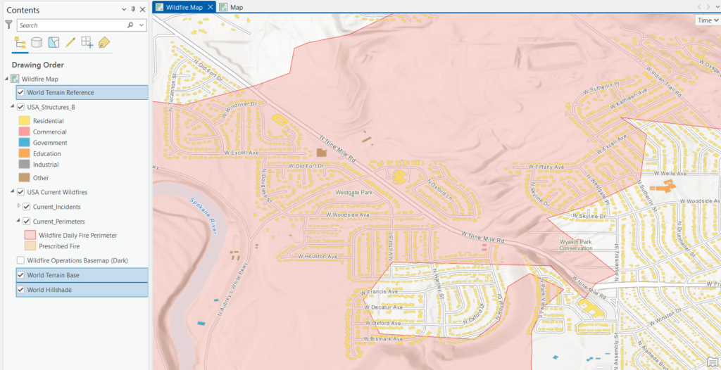
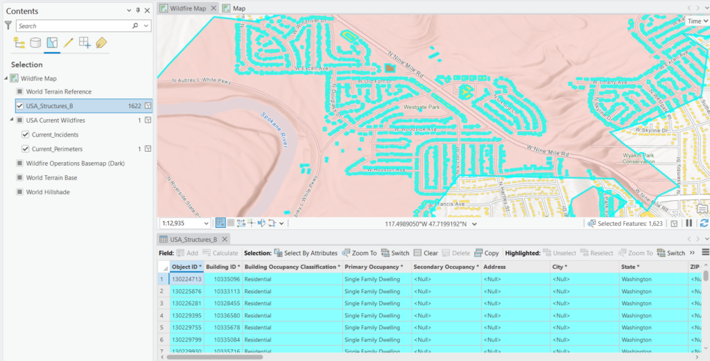
Add a buffer of one to three miles and you have a rough exposure figure for the next operational period.
Population and demographics
Living Atlas hosts current-year block group and tract layers with population, households, and age breakdowns. Summarize Within against a perimeter or buffer gives you population at risk. If you need vulnerable populations for evacuation planning, the age 65 and over and disability variables are the ones to pull.
Wildland Urban Interface
Search for wildland urban interface to find the WUI layer built from the SILVIS Lab data. It classifies areas where housing meets or intermingles with wildland vegetation. Almost every destructive fire in the last decade, Spokane included, burned in WUI.
Critical infrastructure
Living Atlas carries fire stations, hospitals, schools, and other HIFLD-sourced facility layers. During the Spokane fires a VA medical center had to be evacuated. Having those facilities already on the map, symbolized and labeled, saves you a scramble.
Putting the map together
Adding fifteen layers is easy. Making them readable is the actual work.
Group your layers. Build groups for Fire, Weather, Conditions, and Assets. Toggle whole groups on and off. This also keeps the Contents pane manageable when you’re driving the map live in front of people.
Set your draw order deliberately. Assets and incident points on top, perimeters below them, hotspots below that, then weather, then condition rasters, then basemap. If your perimeter is hiding your structures, the map isn’t answering the question.
Use transparency and layer blending, not just opacity. Drought and fuel rasters work well at 50 to 60 percent transparency. For a stronger effect, set the layer blend mode to Multiply so terrain shows through, which makes the topography that’s driving the fire visible.
Use a quiet basemap. Human Geography or Light Gray Canvas keeps the fire data readable. Save Imagery for the damage assessment map, where it earns its place.
Set up bookmarks. One per incident. When a fourth fire starts you’ll be glad you did.
Turn on time where it helps and off where it doesn’t. Time-enabling radar is useful. Time-enabling five layers at once means nothing draws when you want it to.
Automating the refresh
If you’re producing the same map several times a day, script it. A short ArcPy snippet that exports your layout to PDF with a timestamp:
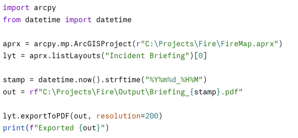
Because the Living Atlas layers are streamed, every export picks up the latest data on its own. Run it from Windows Task Scheduler every two hours and the EOC gets a fresh packet without anyone touching ArcGIS Pro.
If you’d rather not write code, the same thing can be built in ModelBuilder or with the Tasks framework, though scheduling is easier from a script.
Where this usually goes next
The script above is the small version. Once an agency starts leaning on a map like this, the asks tend to grow in a predictable order:
- Pull the fire perimeters against your own layers on a schedule and write the results to a table, so structure counts and population at risk are already calculated before anyone asks.
- Push those numbers into a dashboard or an Experience Builder app that the EOC and the public information officer can both use.
- Email or post an alert when a perimeter crosses a buffer around a facility you care about.
- Roll the whole thing into a Python Toolbox so the people who don’t code can run it from the Geoprocessing pane.
None of that is exotic work, but it takes time most GIS staff don’t have during an active season.
That’s the kind of thing we do at Location3x, our consulting arm. We write ArcPy and Python automation for government agencies, build Experience Builder and dashboard applications, package workflows as custom Python Toolboxes so non-coders can run them, and handle the data engineering that connects live feeds to your own systems. Recent work includes parcel synchronization scripts for a county GIS department, building footprint processing tools, and machine learning integrations for feature extraction from imagery.
If you have a workflow you’re running by hand every few hours during fire season, that’s usually a good candidate. Get in touch and we can scope it out.
Say what the data can and can’t do
Put a note on the layout. Something short and plain:
This map is for situational awareness only. It is not an official evacuation notice. Fire perimeters are updated periodically and may not reflect current conditions. Satellite hotspots are heat detections, not fire boundaries. For evacuation orders, contact your county emergency management office.
This matters. During an incident your map will get screenshotted and shared, and it will end up in front of people making decisions about their own homes. The Spokane fires produced evacuation levels that changed several times a day. A map that looks authoritative but lags reality by six hours can do real harm. Say what it is.
Wrapping up
The full stack takes maybe twenty minutes to build the first time, and you can save it as a project template and reuse it for every incident after that. The core of it:
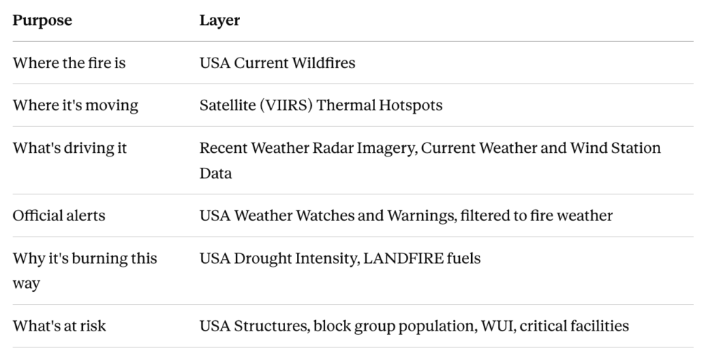
None of it costs credits. None of it needs maintaining. All of it comes from the agencies that produce the authoritative version.
Worth bookmarking: the Living Atlas Live Feeds Status page at livingatlas.arcgis.com/livefeeds-status. It shows the current update status of every live service and offers an RSS feed for outage notifications. When a feed goes quiet during an incident, you’ll want to know whether it’s the service or your connection before you tell a room full of people the fire stopped growing.
Geospatial Training Services offers instructor-led and self-paced ArcGIS Pro training, including cartography and Python automation courses that use Living Atlas wildfire data throughout. See our course catalog for upcoming dates. For custom development and automation work, visit Location3x.
