

Three very different wildfire mapping projects show how AI can help GIS professionals move from an idea to a working, shareable web experience—and where professional judgment still matters.
Over the past few weeks, I have been experimenting with a question that is becoming increasingly important for GIS professionals:
How much of a real GIS project can an AI assistant complete if it is given a clear objective, authoritative data sources, and informed feedback?
I did not test this with a generic map of sample data. I used three substantially different wildfire-focused projects:
- A U.S. wildfire “fingerprint” application that lets users hover over individual states and compare 2026 fire activity.

- A data-driven StoryMap tracking the 2026 wildfire season in the United States and Canada.

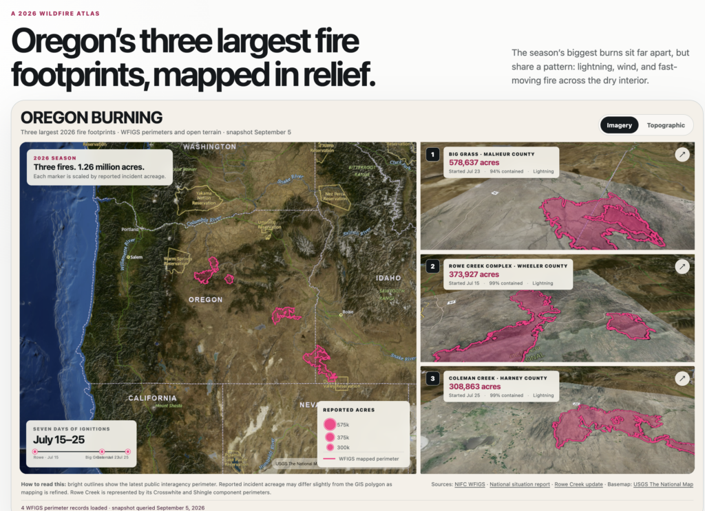
- A poster-style interactive atlas showing Oregon’s three largest wildfire footprints of 2026.
Together, these projects required live GIS services, temporal filtering, state-level aggregation, clustering, cartographic design, multimedia, 3D terrain, responsive web development, performance tuning, and public deployment.
The results suggest that AI is becoming much more than a code-completion tool. Used well, it can function as a capable GIS production partner—one that can research, prototype, revise, troubleshoot, and publish. But the quality of the result still depends heavily on the GIS professional directing the work.
I conducted these experiments as part of our ongoing work through Location3x, the GIS consulting arm of Geospatial Training Services. They were not only demonstrations of what current AI tools can do. They were also tests of a consulting model we can now bring to government agencies, private companies, and GIS teams that need to move from an idea to a working application more quickly.
Experiment 1: Building a State-Level Wildfire Fingerprint Map
The first project began with a visual reference: an interactive demographic map where users could mouse over countries and see a compact profile appear around the selected geography. I wanted to know whether AI could translate that same interaction pattern into a wildfire application.
The request was simple:
“Can you create something similar, but for wildfire? I’d like to be able to mouse over individual states and display wildfire information like they are doing in this app.”
I then narrowed the scope to the United States only.
View the U.S. Wildfire Fingerprints app
The resulting application uses 2026 U.S. wildfire incident data from the Wildland Fire Interagency Geospatial Services (WFIGS) year-to-date layer. Instead of displaying thousands of individual incident points, the AI queried and pre-aggregated the data by state. That made the application load quickly and allowed the interface to focus on comparison rather than raw feature rendering.
The app uses a tile-free U.S. SVG map, so there is no basemap API key requirement. Each state is shaded by reported wildfire acreage. Hovering over a state updates the side panel immediately; clicking pins the selection for closer review.
For each state, the application displays:
- Total wildfire incident records.
- Reported acres burned.
- Largest reported incident.
- National acreage rank.
- Monthly ignition counts.
- Monthly acreage progression.
- Reported cause mix.
- Size-class distribution.
The most distinctive part of the interface is the “fingerprint” graphic. It translates each state’s wildfire profile into three radial arms: one for ignitions, one for acreage, and one for reported cause. Oregon, for example, stands out because its 2026 acreage is heavily concentrated in midsummer, while other states show different seasonal and size-class signatures.
This demonstrated a different AI capability than a conventional StoryMap: AI can adapt an interaction concept from one domain and apply it to a new geospatial problem. The AI did not simply copy the visual style. It identified the underlying pattern—hover geography, update profile, compare regions—and rebuilt it for wildfire analysis using open-source mapping and visualization libraries.
The GIS professional still had to direct the important decisions: use only U.S. data, avoid slow point rendering, aggregate at the state level, and choose metrics that would make sense for wildfire interpretation. The AI accelerated the implementation, but the geographic question shaped the product.
Experiment 2: Mapping the 2026 Wildfire Season
The second project was much more data intensive. I asked for a StoryMap covering only the 2026 wildfire season in the United States, with Canadian data included if an appropriate GIS source could be found.
View the North America Wildfires StoryMap
The initial source list included Esri’s Living Atlas current-wildfire information, the National Interagency Fire Center’s Wildland Fire Interagency Geospatial Services data, and Canada’s Canadian Wildland Fire Information System. These sources do not all represent fire activity in exactly the same way.
- The ArcGIS Living Atlas Wildfire Aware resources provide current incident information for the United States.
- WFIGS provides authoritative interagency incident and perimeter services, including year-to-date layers.
- The Canadian Wildland Fire Information System distributes Canadian fire and satellite hotspot information.
The AI had to do more than add these services to a map. It had to interpret their roles, filter the information to 2026, reconcile different schemas, and design a coherent continental display.
Solving the Performance Problem
The first map loaded too many individual wildfire points. Even when a browser can technically display thousands of features, that does not mean it should.
I asked whether the points could be aggregated. The AI implemented clustering for the U.S. incidents, which dramatically improved load time and made the national pattern easier to interpret.
Canadian fires initially remained unaggregated, producing an inconsistent map. I pointed that out, and the AI converted the Canadian features into an aggregated display at continental scales while preserving the original geometry for closer inspection.
This is a good example of AI-assisted GIS troubleshooting. The problem was not a syntax error. It was a combination of performance, scale dependency, and cartographic consistency. The solution required changes to both data handling and visualization.
Reconsidering the Basemap
The initial basemap also created problems. One option requested an API key, and imagery was not appropriate for a continent-wide thematic wildfire map.
After several iterations, the application moved to keyless, open map sources with a dark gray presentation and an optional topographic view. The map became easier to read, and the fire symbols became the visual focus.
That exchange highlights something GIS professionals already understand: the technically available basemap is not necessarily the cartographically appropriate basemap. AI can propose and implement alternatives, but a human still needs to judge whether the background supports the map’s purpose.
Moving from National Overview to Local Story
The national map showed the scale of the season, but it needed a more focused narrative. Oregon had experienced extensive fire activity, so we added a chapter about the Rowe Creek Complex and zoomed the map tightly enough for readers to distinguish the fire footprint.
This created a useful multiscale sequence:
North America → United States and Canada → Oregon → Rowe Creek Complex
AI handled the map transitions, layer visibility, focus symbol, popup information, and supporting narrative. The GIS contribution was deciding that the national pattern alone was insufficient and that readers needed a specific incident to make the season tangible.
Experiment 3: Recreating a Cartographic Design from a Screenshot
The third project began with a screenshot of a cartographic poster showing three burned areas in Catalonia. I asked the AI to create something similar for Oregon’s largest fires of 2026.
View the Oregon Burning interactive atlas
This required a different kind of reasoning. Instead of starting from a written functional specification, the AI had to interpret a visual reference:
- One large regional map.
- Three stacked detailed maps.
- A strong editorial title.
- Proportional fire symbols.
- Bright perimeter outlines.
- Oblique terrain views.
- Compact statistics and annotations.
The AI queried the 2026 WFIGS records, ranked Oregon-origin wildfire perimeters by acreage, and built the layout around the Big Grass Fire, Rowe Creek Complex, and Coleman Creek Fire. At the September 5 snapshot, their reported incident totals were approximately 578,637 acres, 373,927 acres, and 308,863 acres—more than 1.26 million acres combined.
The finished application included an Oregon overview map, three interactive terrain panels, proportional acreage markers, perimeter hover information, an ignition timeline, and a switch between imagery and topographic backgrounds. It was then published as a public website.
This demonstrated another valuable capability: AI can translate visual inspiration into a functional geospatial interface. It did not merely reproduce the colors of the reference. It inferred the layout, hierarchy, map roles, and interaction pattern, then adapted them to new geography and new data.
View the Three Projects
Each of these applications is publicly available and can be opened without signing in:
- U.S. Wildfire Fingerprints · 2026 — a state-by-state hover application that summarizes wildfire incidents, acreage, monthly timing, cause, and size class.
- North America Wildfires: 2026 — a multiscale wildfire StoryMap combining U.S. and Canadian data with an Oregon and Rowe Creek focus.
- Oregon Burning · 2026 — an interactive cartographic atlas of Oregon’s three largest 2026 wildfire footprints.
These live examples allow readers to evaluate the maps, interactions, performance, and design choices directly rather than relying only on screenshots or descriptions.
What the AI Actually Did
Across the three projects, the AI performed work in several distinct GIS and development categories.
1. Data-Source Discovery
It located and evaluated public GIS services and open geospatial data from Esri, NIFC, Natural Resources Canada, open-map providers, and Census-derived state-boundary sources. It also identified which services represented current incidents, year-to-date records, hotspots, or mapped fire perimeters.
2. GIS Data Engineering
It constructed service queries, selected attributes, filtered records by year and state, transformed features for display, pre-aggregated state-level wildfire summaries, and combined sources with different schemas.
3. Cartographic Implementation
It created scale-dependent layers, clusters, graduated symbols, perimeter fills and outlines, labels, popups, legends, map transitions, 3D terrain views, and state-level thematic maps.
The final web maps used a mix of open-source mapping and visualization tools, including MapLibre GL JS for interactive map scenes and D3 for the state-level wildfire fingerprint application.
4. Narrative and Multimedia Production
For the StoryMap and atlas-style products, it organized geographic content into a readable sequence and integrated text, photography, artwork, video, charts, and source links.
5. Performance Optimization
It reduced the number of features displayed at small scales, clustered incident points, pre-aggregated state summaries, delayed nonessential requests, simplified map scenes, and created fallbacks when a live service was unavailable.
6. Web Application Development
It wrote the HTML, CSS, and JavaScript; made the layouts responsive; added accessible controls; and adapted the interface for desktop and mobile screens.
7. Hosting and Revision Management
It saved versions, deployed the applications, preserved their URLs through revisions, and changed sharing from private to public when requested.
What Still Required a GIS Professional
These experiments were impressive, but they did not eliminate the need for GIS expertise. In fact, domain knowledge became more important as the projects became more sophisticated.
Knowing What the Data Means
A current wildfire layer, a year-to-date incident layer, a satellite hotspot layer, and an authoritative perimeter layer are not interchangeable. Someone must understand the geographic meaning, update cycle, scale, and limitations of each source.
Recognizing Misleading Output
When the Canadian fires were not aggregated, the application was technically functioning but cartographically inconsistent. When the Rowe Creek map was too far out, the data was present but the story was ineffective. When individual incident points slowed the first national map, aggregation became a design requirement rather than an optional enhancement. Those are GIS-review problems, not programming problems.
Choosing the Right Visual Hierarchy
AI can generate colors and layouts quickly. It still benefits from clear guidance about which geographic pattern matters, which features should dominate, and what readers should notice first.
Verifying Facts and Services
Live GIS services change. Fields are renamed, layers are updated, and incident acreage is revised as mapping improves. AI-generated applications still require source verification, date labeling, attribution, and periodic review.
Setting the Editorial Direction
The strongest improvements came from human decisions: aggregate the wildfire points, replace the unsuitable basemap, focus the StoryMap on Oregon and Rowe Creek, zoom more tightly to the important fire footprint, and turn a hover-based visual example into a state-level wildfire comparison tool.
AI accelerated the implementation of those decisions. It did not originate all of them.
A New GIS Workflow Is Emerging
The traditional web GIS workflow often requires moving among documentation, service directories, desktop GIS, JavaScript code, design tools, hosting platforms, and testing environments.
AI can compress much of that workflow into an iterative conversation:
- Describe the audience and geographic question.
- Identify authoritative data sources.
- Specify the time period, geography, and required media.
- Review the first working version.
- Point out cartographic, factual, and performance problems.
- Refine and publish.
This does not mean “prompt once and accept whatever appears.” A better comparison is working with a very fast junior developer who can also research documentation, write interface code, and revise the application—but who still needs a knowledgeable GIS professional to define the problem and review the result.
For GIS teams, this creates several immediate opportunities:
- Rapid prototypes for proposed applications.
- Interactive demonstrations for clients and decision-makers.
- Story-driven public information products.
- Faster conversion of authoritative services into focused web tools.
- Alternative interfaces when an off-the-shelf application template is too restrictive.
- Training exercises that show students how data, cartography, narrative, and code fit together.
How to Get Better Results
Based on these projects, the quality of an AI-generated GIS application improves substantially when the request includes six things:
- Purpose: What should the audience understand or accomplish?
- Authoritative sources: Which agencies, layers, or services should be trusted?
- Geographic and temporal scope: Which places and dates belong in the application?
- Cartographic direction: What should be emphasized, aggregated, labeled, or de-emphasized?
- Performance expectations: How should the application behave with large or live datasets?
- Publishing requirements: Should the finished product be private, internal, or public?
Screenshots and visual examples are also extremely useful. The U.S. Wildfire Fingerprints app and the Oregon fire atlas both show that AI can extract a layout or interaction concept from a reference image and apply it to an entirely different dataset.
Bringing This Capability to Your Organization
The three projects described here are examples of a service Location3x (a Geospatial Training Services company) can provide for organizations that need custom mapping, automation, or spatial-data applications but do not want to begin with a long traditional development cycle.
We can help a client move from an operational question or visual concept to a working prototype, evaluate it with actual users and data, and then develop the successful idea into a production-ready application.
Depending on the project, that work can include:
- AI-assisted rapid prototyping of web GIS applications.
- Custom StoryMaps, interactive atlases, dashboards, and public-information maps.
- ArcGIS Online, ArcGIS Enterprise, Experience Builder, Field Maps, and ArcGIS Pro integration.
- Open-source applications using MapLibre, D3, and other modern geospatial libraries.
- Integration of ArcGIS feature services, Living Atlas content, government APIs, imagery, and open GIS data.
- Python, ArcPy, and geoprocessing-workflow automation.
- Performance improvements for large point layers, complex polygons, and live services.
- Responsive interface design for desktop, tablet, and mobile use.
- Hosting, deployment, documentation, and staff knowledge transfer.
An important part of the service is choosing the right technical path. Some projects are best served by ArcGIS StoryMaps or Experience Builder. Others need a custom open-source application. Many benefit from a hybrid approach that combines authoritative ArcGIS services with a purpose-built interface.
We are not simply generating a website and handing it over without review. Our process combines AI-assisted development with professional GIS oversight. We help define the geographic question, identify and evaluate the data, establish the cartographic requirements, test the spatial logic, improve performance, and document the finished workflow.
That approach is especially useful when an organization has:
- A mapping concept that has been difficult to communicate through a written specification.
- An existing web map that needs a more focused or engaging interface.
- A repetitive GIS process that should be automated.
- Several authoritative services that need to be combined into one application.
- A public-information story that needs maps, charts, photographs, video, and narrative in one experience.
- A prototype that needs to be demonstrated to leadership before a larger investment is approved.
Because AI shortens the distance between concept and working prototype, clients can react to something tangible much earlier. Instead of spending weeks debating a static requirements document, the team can inspect a real map, identify what is missing, and improve it through a series of focused revisions.
If your organization has a GIS application, data-integration problem, or automation idea that has been waiting for time or development resources, Location3x (a Geospatial Training Services company) can help evaluate the opportunity and build the first working version. We provide GIS application development, Python automation, spatial data science, AI integration, and workflow consulting for government agencies and private organizations.
Final Thoughts
AI is not replacing GIS. It is changing where GIS professionals spend their time.
Less time may be required for boilerplate code, service-query syntax, interface scaffolding, and repeated deployment steps. More time can be spent defining the geographic question, evaluating sources, reviewing spatial logic, improving cartography, and shaping the story.
The three projects moved from state-level wildfire comparison to live wildfire operations to 3D editorial cartography. None began with a formal software specification. Each began with a conversation, followed by review and increasingly precise feedback.
That may be the most important lesson: the future of AI-assisted GIS is not a single perfect prompt. It is a collaborative workflow in which geographic expertise directs increasingly capable tools.
For GIS professionals willing to experiment, the distance from an idea to a working public map has become dramatically shorter. For organizations that want help making that transition, Location3x can provide the GIS experience, development support, and AI-assisted workflow needed to turn the concept into a useful, maintainable product.
