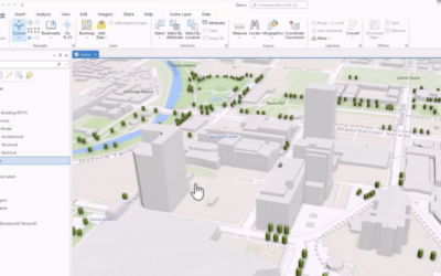
ArcGIS Pro 3.2 is out, and it's packed with some cool new features that are worth chatting about. Read below to find out more. 1. Easy Data Management Create Schema Reports: You can now generate a schema report of your geodatabase in different formats, such as CSV,...
Articles & Tutorials
Understanding SQL Syntax and Dialects in ArcGIS Pro
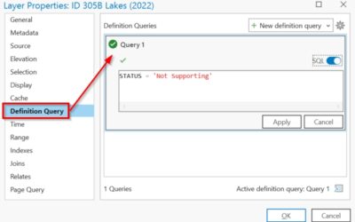
Structured Query Language (SQL) is a standard programming language used to access, manipulate, and extract information. You might have heard SQL pronounced as "Ess-cue-ell" or you may have heard it referred to as "Sequel". The latter originated from SQL being a...
Exporting Vector PDF Maps in ArcGIS Pro
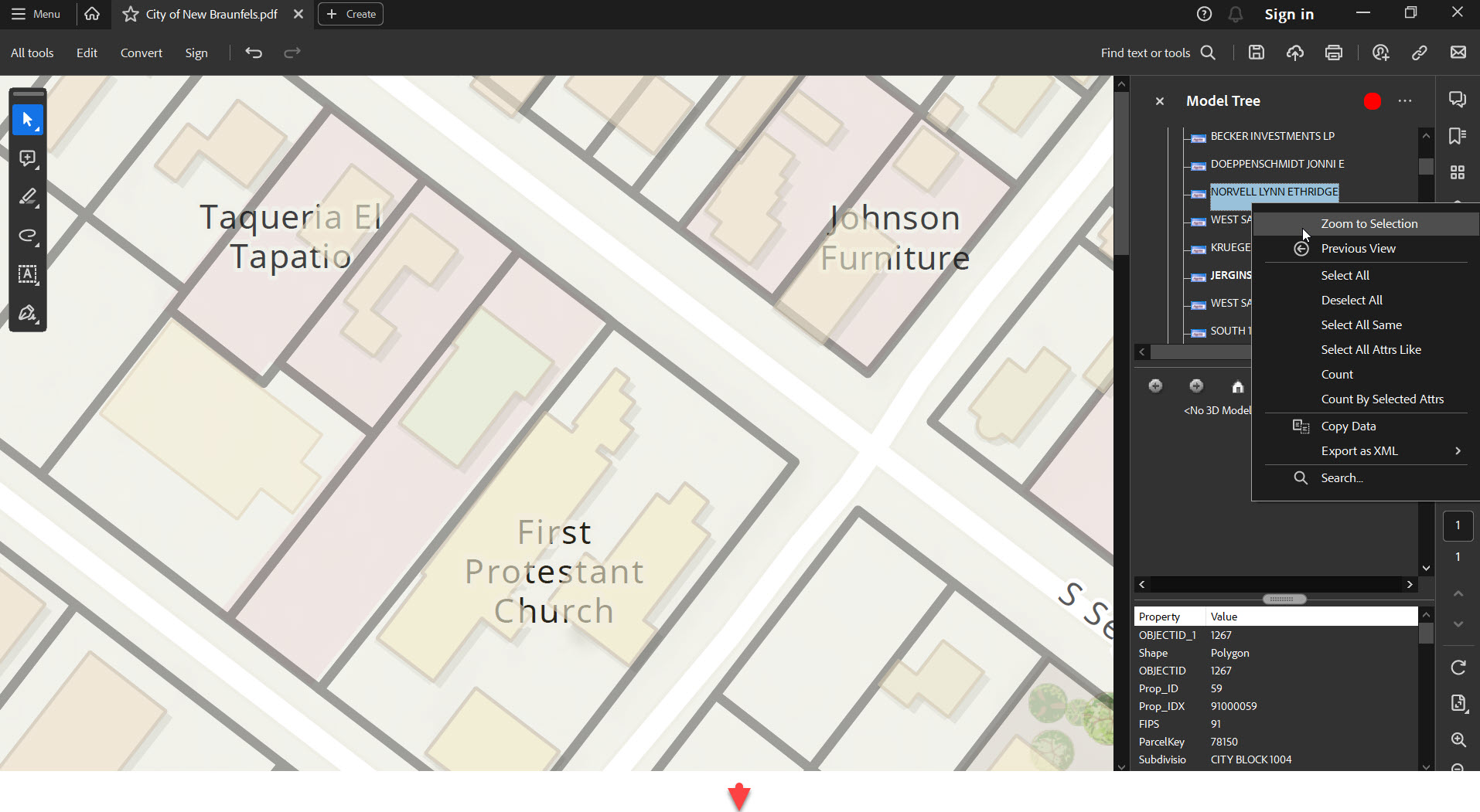
ArcGIS Pro is the next-generation GIS software that has taken mapping, analytics, and sharing of geospatial data to the next level. One of its capabilities is to export high-quality vector maps in the form of PDFs. This feature is especially beneficial for...
Configure Experience Builder Mobile Views: Tips and Tricks
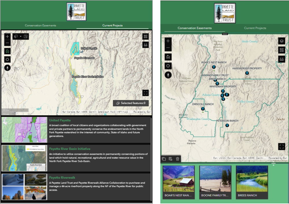
For the success and credibility of your map applications, it is important to provide users with a single URL. This universal URL should take a user to your application and provide them with an ideal layout regardless of their screen's size. Today's technology is...
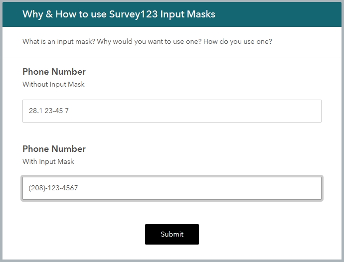
Why you should use Survey123 Input Masks
Survey123 is a magical application that allows you to create input forms that can be used on the web or from mobile devices. They can be used online, or offline. These survey forms can focus on community input, asset inventories, stakeholder feedback, and more. So,...
Our New Book – Fundamental ArcGIS Pro Skills: Workbook 2
Our new Fundamental ArcGIS Pro Skills: Workbook 2 has been published! The intermediate level book is the follow up to Fundamental ArcGIS Pro Skills: Workbook 1. If you're ready to learn intermediate ArcGIS Pro including creating spatial and bookmark map series,...
How to Calculate Distances Between Features in ArcGIS Pro
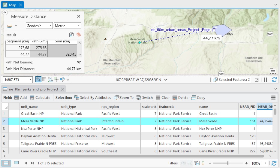
The Near geoprocessing tool in ArcGIS Pro calculates distances between features in different layers. We’ll demonstrate how this tool works using a point and polygon layer. To calculate the distance between two features you could use the measure tool that is available...
Convert a Raster or Vector Layer to KML in ArcGIS Pro
This tutorial covers a recently enhanced conversion tool in ArcGIS Pro to convert a raster or vector layer to KML in ArcGIS Pro. In ArcGIS Pro 3.x, the Layer to KML tool is enhanced to allow you to convert feature layers to basic KML files. We’ll describe how that...
Cluster Points into Polygons with ArcGIS Pro
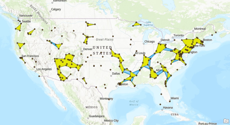
The latest version of ArcGIS Pro includes a new tool to cluster points into polygons. The resulting polygons can be aggregated into larger polygons using the Aggregate Polygons tool. Introduction This tutorial explains how point data can be aggregated into polygon...
Save 15% on this class – Mastering ArcGIS Pro 3: Maps, Layers, Projects, and Layouts
How does a monthly sale sound to you? Now through September 30th, take 15% off either the self-paced or live-online version of our newest ArcGIS Pro course! Mastering ArcGIS Pro 3.x: Maps, Layers, Projects, and Layouts is updated to include the newest...
