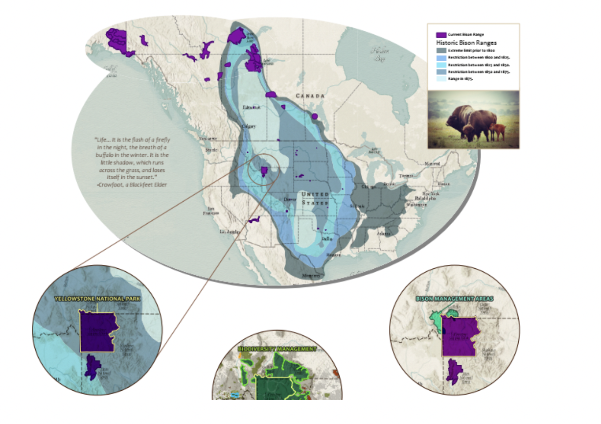
Color is an important symbol that helps convey the underlying meaning of your map. Color design and theory are as important in cartography as it is to make sure you include the key layers necessary to tell a meaningful story for your target audience. In fact, the colors you choose can make or break your audience’s ability to understand and interpret your map the way you intended them to.
“When not used properly, color in maps can obscure the data and mislead
the reader by concealing the actual state of the observed problem” – Morphocode
Evidence of color theory dates back to Aristotle (322 BCE), with each century introducing further investigation into the science of color. One outcome of these investigations has shown that color can produce instant reactions in a person. These reactions will be based on many variables, including that person’s background and culture. Take the color red for example. In the United States, red is often associated with passion and warmth, or it can be viewed as symbolizing something dangerous or in need of attention. In China, red symbolizes luck and celebration, while in in South Africa it denotes a time or mourning. In addition, the color red is also recognized as a stimulant and studies have shown that it can produce an increase in enthusiasm, heart rate, and even blood pressure.
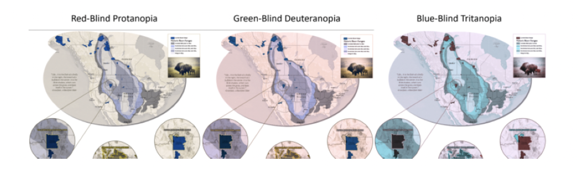
The cultural and psychological aspects of color aren’t the only things you should consider. Have you ever checked that your map colors are colorblind friendly? Or, have you considered whether your color contrast will remain intact when printed?
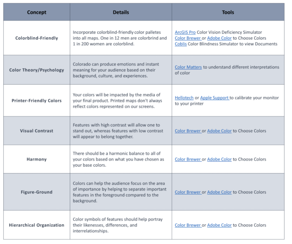
Below, we have listed key color principles that are well-studied and should be considered when creating a map. We have also provided a downloadable PDF with more details and links to some tools that can help you when deciding on the best color palette for your intended message and target audience.
What should I consider when choosing colors for my map?
- Color-Blindness Friendly
- Color Theory/Psychology
- Printer-Friendy Colors
- Visual Contrast
- Color Balance/Harmony
- Figure-Ground
- Hierarchical Organization
Click below to download your free Color Guide PDF.