
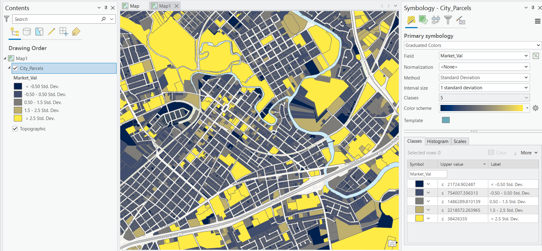
Few symbology tools get more use in day-to-day GIS work than the graduated colors renderer. Whether you’re mapping median household income by census tract, crime rates by precinct, or population change by county, graduated colors are the workhorse behind the classic thematic (choropleth) map. But the renderer is deceptively simple on the surface. The choices you make — which field to map, whether to normalize it, how many classes to create, and above all which classification method to use — can produce wildly different maps from the exact same data.
This article walks through the options available when defining a graduated colors renderer in ArcGIS Pro, with a special focus on the classification methods that determine where your class breaks fall.
When to Use Graduated Colors
The graduated colors renderer is designed for quantitative data — numeric values that fall along a continuum. It groups those values into classes and assigns each class a color drawn from a color ramp, typically progressing from light to dark or through a sequential hue range.
It’s the right choice when you want to show how much of something exists across your features: rates, densities, ratios, counts, indices, or any measured quantity. It is not appropriate for categorical data (land use type, zoning class, jurisdiction name) — that’s what the Unique Values renderer is for. And when you want to preserve the actual magnitude of every feature rather than lumping values into bins, consider graduated symbols, proportional symbols, or unclassed colors instead — depending on whether you want to vary symbol size or keep a continuous color ramp. If you want a broader tour of every rendering option ArcGIS Pro offers — unique value, graduated symbol, dot density, charts, and more — our Working with Symbology in ArcGIS Pro short course is a focused, half-day deep dive into exactly these techniques.
Setting Up the Renderer
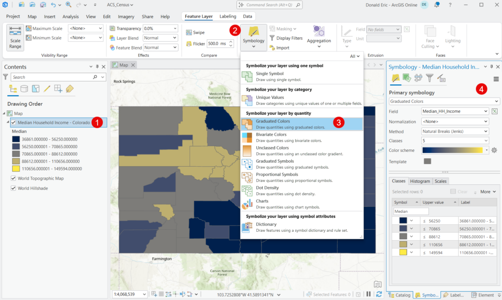
To apply the renderer, select your layer in the Contents pane, open the Symbology pane by selecting the Feature Layer tab and then the Symbology button, and choose Graduated Colors as the primary symbology. You’ll then work through a handful of core settings.
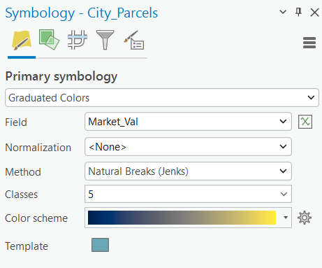
Field
Graduated colors are based on numeric values. You can choose a numeric attribute field, or use an Arcade expression that returns a numeric value — Arcade lets you derive a value on the fly (a ratio, a difference, a reclassification) without having to add a permanent field to your data. Choose the value that answers the question your map is asking. One caution: a syntactically valid expression won’t necessarily return a valid numeric result, so verify the output looks right before trusting the map.
Normalization
This is the single most important — and most frequently skipped — setting in the entire renderer, and it deserves careful attention.
Normalization divides your chosen field by a second field to convert raw counts into rates or ratios. The classic pitfall is mapping raw counts across areas of different size or population. If you map the raw number of households below the poverty line by county, you’ll essentially produce a population map — big counties with lots of people will always show high numbers. Normalize that count by total households, and you get a poverty rate, which is the meaningful measure.
Common normalization strategies include dividing a count by total population to get a per-capita rate, dividing by area to get a density, or dividing one attribute by another to get a percentage. ArcGIS Pro also offers a Percent of Total normalization, which expresses each feature’s value as its share of the sum of all values, and log normalization, which applies a logarithmic scale that can help tame datasets dominated by a few large outliers. One caveat: normalization is only available when you symbolize from a field. If your graduated colors are driven by an Arcade expression, the normalization option is disabled — you’d fold any ratio or rate calculation directly into the expression instead.
The rule of thumb: if you’re mapping a count and your features vary in size or population, you almost certainly need to normalize.
Method and Classes
These two settings work together and are the heart of this article. Classes sets how many groups (bins) your data is divided into — anywhere from 2 to 32, though 4 to 7 is the practical sweet spot for readability. Method determines where the breaks between those classes fall. We’ll cover each method in detail below.
Color Scheme
The color ramp assigns colors to your classes. For most graduated color maps you want a sequential scheme (single hue progressing light to dark, or a smooth two-hue blend) because it visually reinforces low-to-high order. Reserve diverging schemes (two hues meeting at a neutral midpoint) for data with a meaningful center point — percent change around zero, or standard deviation around the mean. Click the color scheme dropdown and check “Show all” or “Show names” to access the full set, including the perceptually-tested ColorBrewer ramps.
The Classification Methods
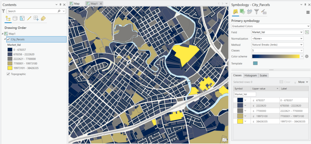
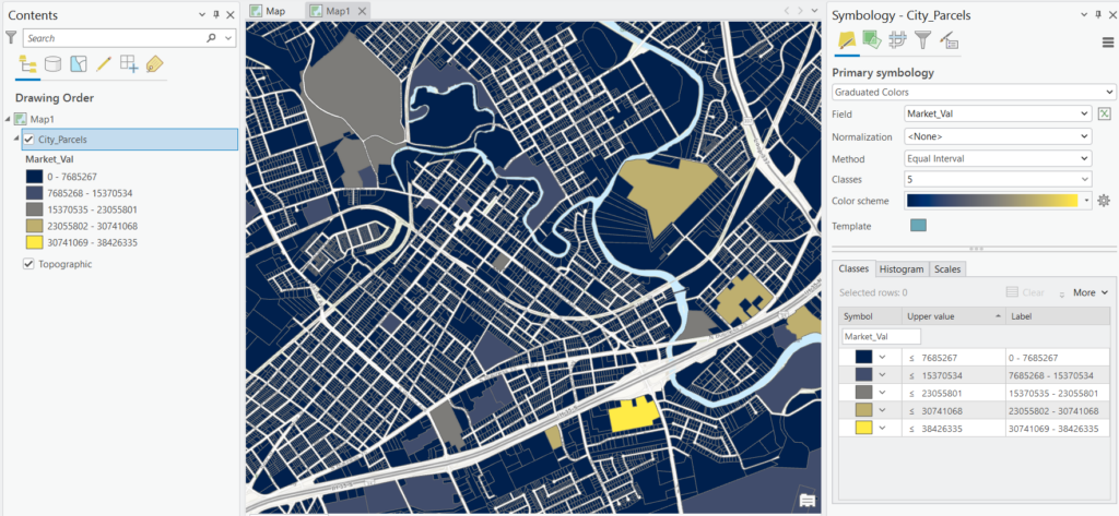
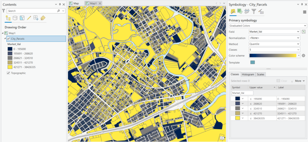
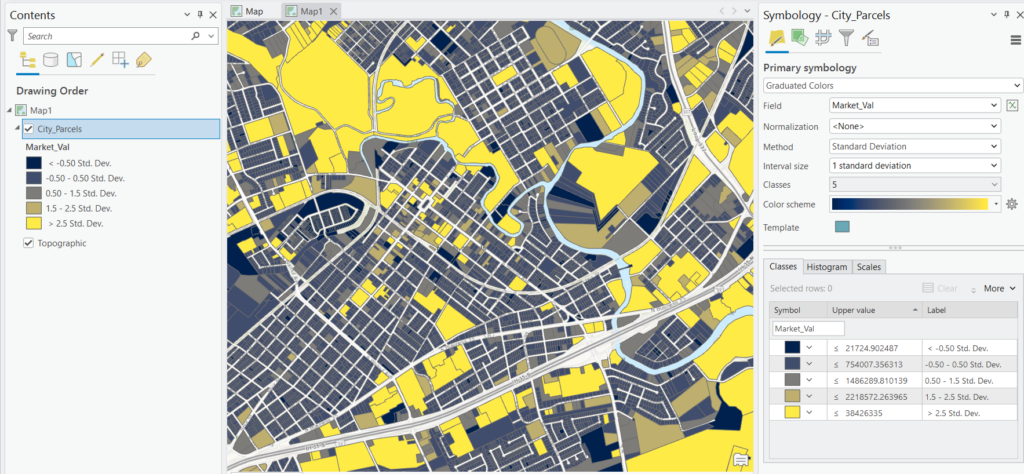
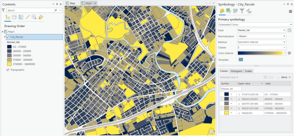
Here’s where the same dataset can become several very different maps. ArcGIS Pro offers seven classification methods. Understanding what each one does — and what it’s good and bad at — is what separates an honest map from a misleading one. Below many of the classification methods described below you’ll see an example applied to the market valuation of parcel data. You’ll see some dramatic differences in the symbology based on the classification method.
Natural Breaks (Jenks)
This is the ArcGIS Pro default, and for good reason. Natural Breaks uses the Jenks optimization algorithm to find the class breaks that best group similar values together. Technically, it minimizes the variance within each class while maximizing the variance between classes. In plain terms, it looks for the natural “valleys” in your data distribution and puts the breaks there.
Use it when: you want a general-purpose method that respects the inherent structure of your data, and your map is a standalone product rather than one in a series meant for comparison.
Watch out for: the breaks are entirely data-driven, which means they’ll produce awkward, non-round numbers (like 43,187) and — critically — they change every time the data changes. That makes Natural Breaks a poor choice when you need to compare multiple maps, multiple time periods, or multiple datasets, because the classes won’t be consistent from one map to the next.
Equal Interval
Equal Interval divides the full range of your data into classes of equal width. If your values run from 0 to 100 and you request 5 classes, you’ll get breaks at 20, 40, 60, and 80. The class boundaries are round and intuitive, and the method is easy for any audience to grasp.
Use it when: your data is spread fairly evenly across its range, or you’re mapping a familiar, continuous quantity like temperature or percentages where evenly-sized ranges make immediate sense.
Watch out for: skewed data. If most of your values cluster at the low end with a few extreme outliers, Equal Interval will cram the majority of features into one or two classes and leave the upper classes nearly empty — producing a map that looks almost uniform and hides real variation.
Quantile
Quantile (equal count) places an equal number of features in each class. With 100 counties and 5 classes, each class holds 20 counties. This guarantees a visually balanced map where every color is well represented, which is why it often looks so appealing.
Use it when: your data is linearly (evenly) distributed, or you specifically want each class to carry equal visual weight — useful for ranking features into tiers like quintiles.
Watch out for: its tendency to mislead. Because it forces equal counts, Quantile can split nearly-identical values into different classes (exaggerating trivial differences) while grouping very different values into the same class (hiding real gaps). Two features one unit apart can end up different colors; two features a thousand units apart can share a color. Always sanity-check the break values it produces.
Standard Deviation
This method is built around the mean. It shows how far each feature’s value deviates from the average of the dataset, creating classes at intervals of one standard deviation — or fractions of one (1, 1/2, 1/3, or 1/4 SD), which you can set. Standard Deviation is commonly paired with a diverging color scheme, so features above the mean read as one hue and those below as another, with intensity showing how many standard deviations out they fall.
Use it when: your question is explicitly about variation from the average — which areas are unusually high or low, and by how much — and your data is roughly normally distributed (a symmetric, bell-shaped spread).
Watch out for: two things. First, it shows relative position, not actual values, so your audience never sees the underlying magnitudes directly. Second, it assumes an approximately normal distribution; on heavily skewed data the standard-deviation classes become distorted and hard to interpret. It also asks more statistical literacy of your audience than most methods.
Geometric Interval
Geometric Interval creates class breaks based on a geometric series — the interval widths grow (or shrink) by a consistent multiplier rather than staying constant. It was designed as a compromise among Equal Interval, Natural Breaks, and Quantile, aiming to produce a visually and statistically balanced result on data that isn’t normally distributed. The algorithm works to balance the change between the middle and extreme values, so that no part of the range dominates the classification.
Use it when: you have continuous data that’s skewed or has a long tail, and none of the other methods are giving you a satisfying result. It’s especially well suited to data containing many zeros or duplicate values, where methods like Quantile tend to break down.
Watch out for: the break values are as unintuitive as Natural Breaks, and the method is less familiar to most map readers, so it can be harder to explain.
Defined Interval
With Defined Interval, you specify the size of the interval — say, every 10,000 people — and ArcGIS Pro calculates however many classes are needed to span the full range of your data. The number of classes is therefore a result of your interval choice and the data’s range, not something you set directly.
Use it when: a specific interval carries real-world meaning — mapping elevation in fixed 500-foot bands, or age in ten-year cohorts — and you want that interval held constant. Because the interval is fixed rather than derived from the data, it also works well for comparison across maps, as long as the datasets share a comparable range.
Watch out for: datasets with a very large range, which can generate an unwieldy number of classes and an unreadable legend.
Manual Interval
Manual Interval hands you full control: you set every break value yourself, either by typing them in or by dragging the break lines on the histogram. Nothing about the data forces the breaks — you decide.
Use it when: you have meaningful, externally-defined thresholds you need the map to honor — regulatory limits, policy tiers, established standards, or breakpoints your organization has agreed on. It’s also the method of choice when you want identical breaks across a series of maps so they can be compared honestly, since you can apply the same values to every layer.
Watch out for: the responsibility that comes with it. Manual breaks are only as good as your judgment, and poorly chosen breaks can distort the story as easily as a bad automatic method.
Choosing the Right Method
There’s no universally correct classification method — the right one depends on your data’s distribution and your map’s purpose. A few guiding principles:
Start by looking at the histogram in the Symbology pane. Its shape tells you most of what you need to know. A roughly symmetric, bell-shaped distribution is a good candidate for Equal Interval or Standard Deviation. A heavily skewed distribution with a long tail points toward Natural Breaks, Geometric Interval, or Quantile.
Match the method to the question. If you’re asking “which areas are above and below average,” use Standard Deviation. If you’re asking “how do these features rank into tiers,” use Quantile. If you’re honoring a policy threshold, use Manual Interval. If you just want the data’s natural groupings to speak for themselves on a one-off map, use Natural Breaks.
Above all, if you’re producing a series of maps meant to be compared — across regions, across years, or side by side — avoid the data-driven methods (Natural Breaks, Quantile, Geometric Interval) that recalculate breaks for each dataset. Use Manual Interval, Defined Interval, or Equal Interval with a fixed range so that a given color means the same thing on every map. This is one of the most common and consequential mistakes in thematic mapping: comparing two Natural Breaks maps whose classes were computed independently is comparing apples to oranges.
Refining the Classification
Once you’ve picked a method, several tools help you fine-tune the result.
The histogram and Classes tab let you drag break lines directly, type exact break values, and see how many features fall into each class. This interactive adjustment is often where a good map becomes a great one.
Label formatting controls how break values appear in the legend. Round unwieldy Natural Breaks values to sensible numbers, add thousands separators, set decimal places, and append units or symbols (%, $) so the legend reads cleanly. Formatting the labels doesn’t change the underlying breaks — only how they’re displayed.
Individual symbol editing lets you override the color, outline, or size of any single class if the ramp doesn’t quite work for a particular bin.
Data exclusion removes specific values or ranges from classification entirely — useful for suppressing outliers that would otherwise blow out your classes, or setting aside no-data placeholder values (like -99). Excluded features can be hidden altogether or given their own distinct symbol.
Additional ArcGIS Pro Options Worth Knowing
Beyond field, method, classes, and color scheme, the graduated colors renderer includes several features that matter in real-world — and especially enterprise — workflows.
Three tabs, not two. The Symbology pane organizes graduated color settings into three subtabs: Classes (field, method, and breaks), Histogram (the interactive distribution view), and Scales. The Scales tab lets you tie symbology to map scale, so your classification or symbol sizing can change as users zoom in and out — useful for multiscale maps and web layers.
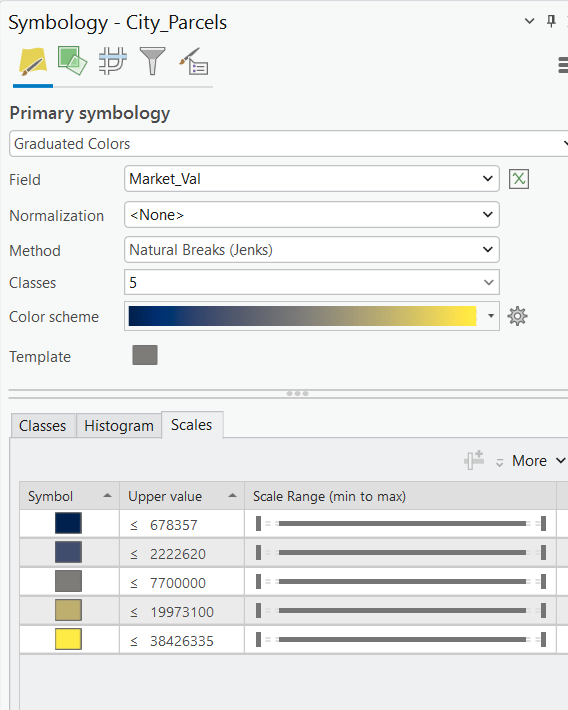
Critical breaks. For data with a meaningful anchor value — most often zero — you can set a critical break so that a class boundary lands exactly on it. This is especially valuable for percent-change and above/below-average maps paired with a diverging color scheme, ensuring the neutral midpoint of your ramp aligns with the meaningful zero point rather than an arbitrary break.
Sample size. ArcGIS Pro calculates class breaks and statistics from a sample of your data — 10,000 records by default. For most datasets that’s fine, but on large enterprise datasets a capped sample can miss extreme values and shift your breaks. If you’re symbolizing millions of features and outliers matter, raise the sample size so the classification reflects the full range of your data.
Out-of-range and null values. Classification is a snapshot of your data at the moment you set it. If the data updates afterward — records added, values edited — some features can fall outside your established class breaks, and null values behave the same way. The Show values out of range option lets you assign a distinct symbol to anything outside the current classification (nulls included), so those features stay visible instead of silently dropping off the map. It’s worth checking any time your symbology was configured before the data was finalized.
Secondary visual variables. Finally, graduated colors can be combined with variation by transparency, rotation, or size, driven by a second attribute — a way to encode an additional variable on the same layer. Use these sparingly; they can quickly overload a map that’s already communicating through color.
Final Thoughts
The graduated colors renderer rewards a little forethought. Before you accept the default map ArcGIS Pro hands you, ask three questions: Should this value be normalized? What is my map actually trying to say? and Does my classification method match the shape of my data and the purpose of the map? Get those three right, and you’ll produce thematic maps that are not only attractive but honest — which, in government and enterprise GIS work, is what ultimately matters.
The best habit you can build is to try several methods on the same dataset and compare the results side by side. Seeing how dramatically the map changes from Equal Interval to Quantile to Natural Breaks is the fastest way to develop an intuition for which method tells the truth about your particular data.
Continue Your ArcGIS Pro Training
Geospatial Training Services offers instructor-led and self-paced courses that build on the concepts in this article:
- Working with Symbology in ArcGIS Pro — a focused half-day deep dive into graduated colors, graduated symbols, unique values, dot density, charts, and other techniques for visualizing vector data.
- Mastering ArcGIS Pro 3: Maps, Layers, Projects, and Layouts — our foundational course covering the ArcGIS Pro interface, maps and layers, symbology and styling, selection sets, tables, projects, and presentation-quality layouts.
- Mastering ArcGIS Pro 3: Editing, Analysis, and Automation — our intermediate course covering map series, geoprocessing and analysis, data sharing, editing workflows, custom pop-ups, tasks, and Arcade.
- Our Annual GIS Training License includes these three classes along with all our other self-paced classes
