
Tutorial: Simplifying Point Layer Visualization with ArcGIS Pro’s Aggregation Tool
ArcGIS Pro offers two powerful methods for dynamically aggregating point feature layers: binning and clustering. While both are visualization techniques that aim to simplify and summarize data, they differ in their representation and behavior. For point feature...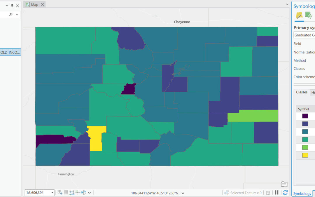
Mastering Class Definitions in ArcGIS Pro for Impactful Graduated Color Maps
If you want to learn more about using symbology functions like those described in this article, check out our foundational ArcGIS Pro courses and upcoming training events. Graduated color maps are a type of thematic map used to represent the spatial distribution of...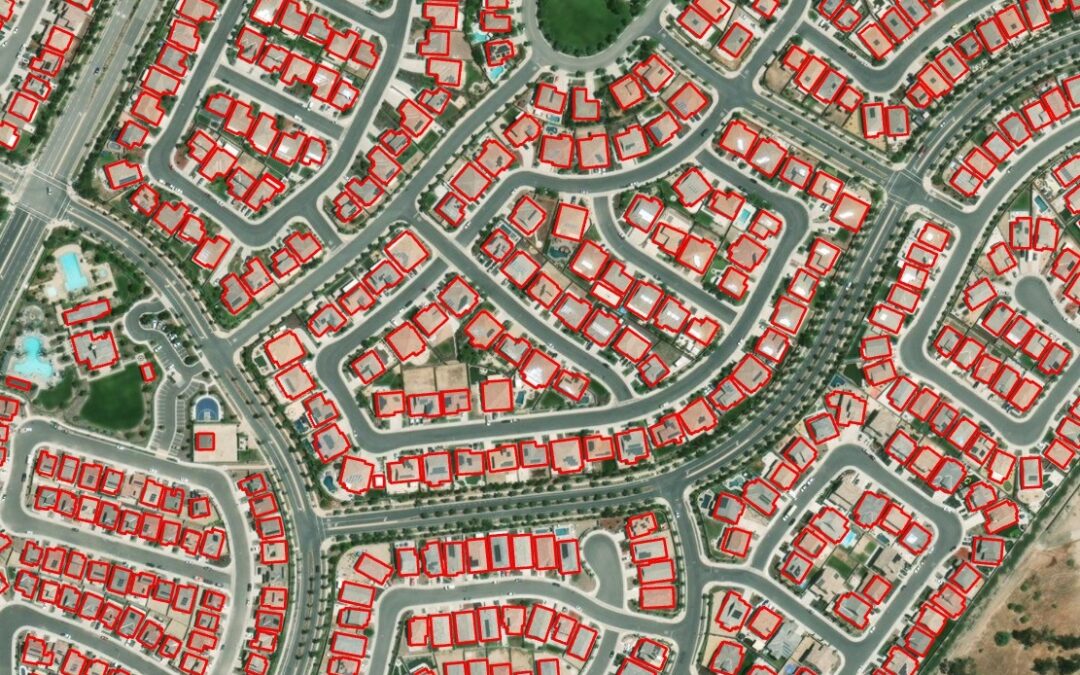
Meet Esri’s Gallery of Pre-Trained AI Models
ArcGIS Online offers 70+ pre-trained AI models that can be used for different ArcGIS platform configurations for tasks such as digitizing and extracting features from imagery and point cloud datasets. Esri’s Living Atlas of the World offers maps, apps, and data layers...