
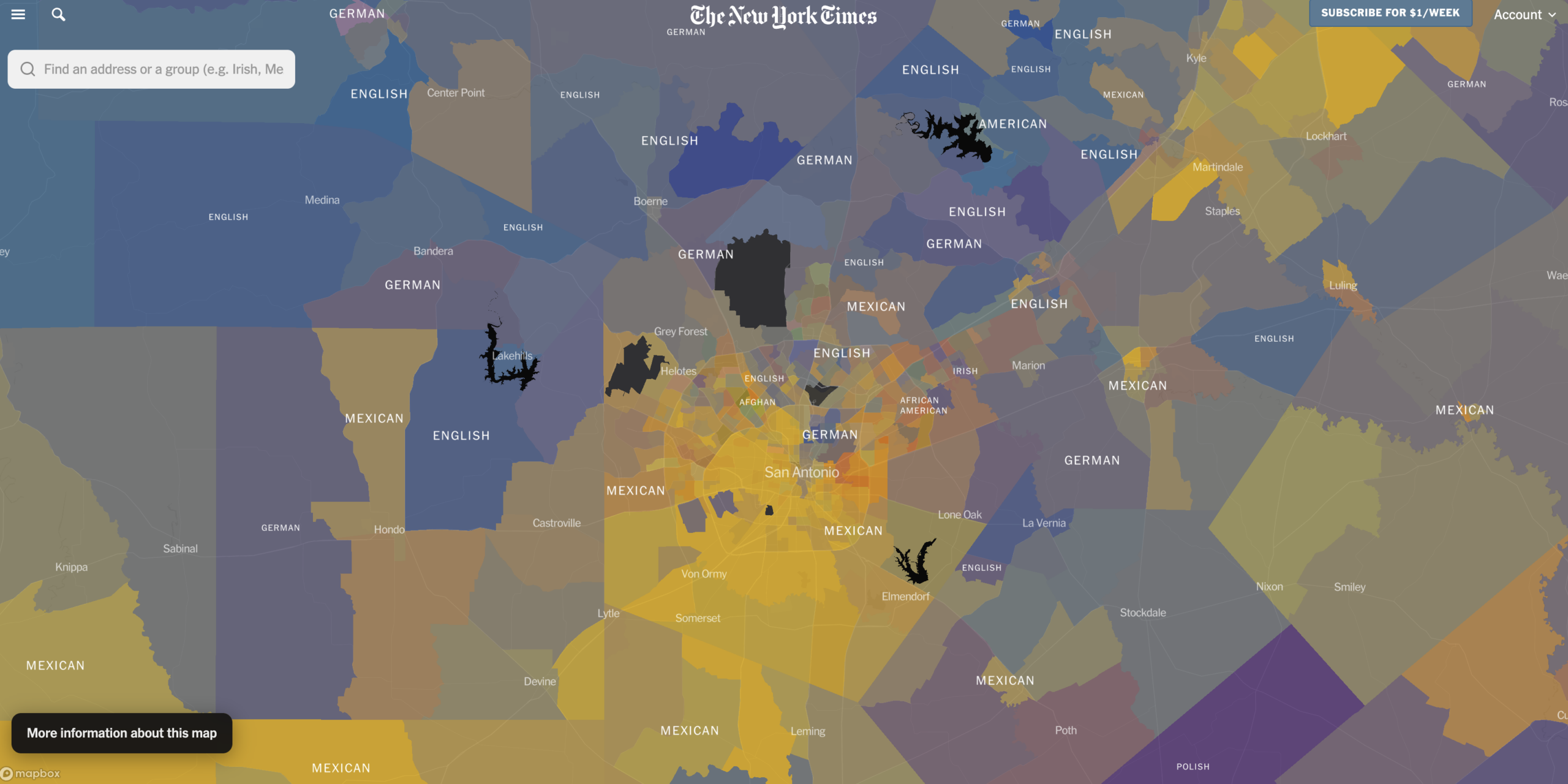
On July 1, 2026, the New York Times published an interactive map called “How a Nation of Immigrants Traces Its Roots.” It went viral almost immediately. People spent hours zooming into their own neighborhoods, finding Greek families in Tarpon Springs, Marshallese families in Springdale, Arkansas, and Portuguese families along the coast of New England.
If you make maps for a living, it is worth spending some time with this one. Not just because it looks good, but because it solves a set of problems that show up constantly in census work — and it solves them in ways you can borrow.
Take a look: How a Nation of Immigrants Traces Its Roots
What the map actually shows
Every census tract in the country gets a color. The color is not one flat value pulled from a single field. It is a blend, mixed from the ancestries reported by the people who live there. A tract that is mostly Mexican reads as one strong color. A tract with roughly equal numbers of Italian, Irish, and Puerto Rican residents reads as a muddier blend of three.
The underlying numbers come from the Census Bureau’s American Community Survey, covering 2019 through 2024. Nearly 200 distinct identities show up across all fifty states.
Zoom out and the rarer groups rise to the surface. Zoom in and the map favors whichever groups are actually dominant in that neighborhood. That zoom-dependent behavior is a design decision, not an accident, and it is the reason the map works at both the national and the block scale.
The hard part was the data, not the cartography
The team behind it — Jeff Adelson, Larry Buchanan, and Albert Sun — gave an interview about how it came together, and most of what they talk about is data wrangling. Anyone who has worked with ACS tables will recognize every problem on their list.
The categories overlap. Ancestry is not a single-choice field. You can report Irish and German. You can report Mexican and Spanish. That means the percentages in any given tract do not add up to 100, and there is no clean way to force them to. Buchanan pointed out that they eventually stopped treating this as a bug. The overlap is the finding. The country is mixed.
Some people don’t report an ancestry at all. A large number of Americans write down “American” and nothing more. That is a legitimate answer, and it leaves a hole in the map exactly where you would want detail.
Some people can’t report one. Adelson noted that many African Americans cannot trace their ancestry past the point at which their ancestors were enslaved. The census category exists, but it does not carry the same meaning as “Norwegian” or “Vietnamese.”
Some things aren’t asked at all. The map drew criticism for how little Jewish ancestry it shows. The answer is straightforward: the Census Bureau is legally barred from asking about religion. People of Jewish heritage appear on the map under whatever national origin they reported — German, Polish, Russian, Iranian, or simply American. Adelson noted that private surveys do ask about religion, but none of them offer tract-level detail.
None of these are exotic edge cases. They are the normal condition of census demographic data. What the Times did well was decide, up front, how each one would be handled and then be open about it.
How you would build something like this
You do not need a newsroom graphics team to make a blended-color demographic map. Most of the pieces are already sitting in ArcGIS Pro.
Getting the data. The ancestry numbers live in ACS table B04006, “People Reporting Ancestry,” with the collapsed version in C04006. But ancestry alone will not get you there. The Times map includes groups like Mexican and Puerto Rican, which come out of the Hispanic origin tables (B03001), and detailed Asian and Pacific Islander groups, which come out of B02015 and B02018. Building the full picture means pulling several tables and reconciling them, which is precisely the reconciliation work Adelson described.
You can pull all of it through the Census API. If you use ArcGIS Pro, the Living Atlas already carries a large set of ACS layers you can add directly to a map. If you work in R, tidycensus will fetch the tables and the tract geometry in one call.
Rendering the blend. ArcGIS has had a blend renderer for years. It takes several numeric fields, assigns each one a color, and mixes them per feature based on their relative values — exactly the effect the Times map uses. The classic Esri sample does this with four demographic fields across U.S. tracts. It works, but it gets muddy fast past four or five inputs, which is likely why the Times built custom logic to promote and demote groups by zoom level.
The alternative: dot density. If blending feels too abstract for your audience, dot density is the other standard approach and it is often easier for non-technical viewers to read. ArcGIS Pro has a dot density renderer built in. CNN used the same technique for the 2020 census release, generating random points inside each tract and rendering them as vector tiles.
A caution about scale. Whichever route you take, remember that tracts are drawn to hold roughly equal populations, not equal areas. A rural tract can be hundreds of square miles. A city tract can be six blocks. That distortion is the reason a national ancestry map can look like the whole country is empty except for a few bright spots. It is also why you should map rates, never raw counts.
The real lesson
The technique here is not new. Blend renderers, dot density maps, and tract-level ACS work have all been around for a long time. What made this map land was that the team picked a question worth asking, spent most of their time understanding the limits of their data, and then told readers about those limits instead of hiding them.
Buchanan said something in the interview that is worth keeping in mind on any demographic project: the messy parts of the data were problems for a reason, and the reason turned out to be the story.
That is a good standard for the rest of us too.
Sources: The New York Times, “How a Nation of Immigrants Traces Its Roots” (July 1, 2026) and the accompanying Times Insider interview with Jeff Adelson, Larry Buchanan, and Albert Sun (August 14, 2026).
