Experience Builder is unlike any of the ArcGIS Online (AGO) application builders we have experience thus far in the evolution of dynamic GIS software. It’s incredibly flexible and allows for complex layouts where widgets can be embedded in widgets that are embedded in other widgets. Because of this, some widgets are hiding underneath other widgets and selecting the widget you want to work with can sometimes be tricky. In these situations, it’s easiest to use the Page Outline panel to get to where you want to be.
ln this tutorial, we will show you how to navigate a complex Experience Builder application using the Page Outline.
Where is the page outline located?
The Page Outline is located on the Page panel. When you have the Page panel open and select a page from the list, the outline for that page will appear at the bottom of the panel.

How is the page outline structured?
Each Page Outline can be separated into three main parts, which are the Header, Footer, and Body. If you have not enabled a Header or Footer, they will not appear in the outline. However, you will always have the Body in the outline.
Each main part can be collapsed or expanded using the arrows found on the right. In the example below, we are viewing the outline for a page that has the Header enabled.

When you click on the arrows to the right, they will expand to show more detail. In the example below you can see that our Header only has a single text widget while the Body has at least a Section, List, and Views Navigation widget included.

We mentioned that the Body has “at least” a Section, List, and Views Navigation widget included. Why did we say it this way? Because you can see at first glance that the Section and List widgets also have arrows associated with them in the outline. These arrows mean they have other elements embedded within them.

As you can see in the below image, when we click the arrows to expand more details about the Section and List widgets, the complexity of the page layout and structure becomes clearer. We can now see the Section Widget has three Views and the List widget has two Text widgets embedded.

If we click the arrows next to the Home and WF Behavior views nested under our Section, we see the widgets that are embedded in them. In the example below, the Home view has a Map widget and the WF Behavior view has a Map and a List widget. As you continue to click the arrows next to the widgets, you continue to see how the structure and number of widgets included in the page layout.

How do we use the Page Outline to Navigate?
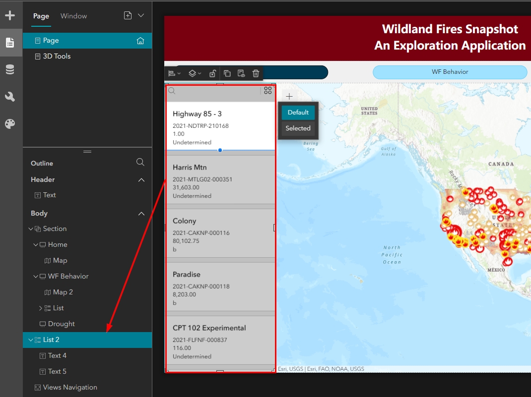
The Page Outline and widgets in the Canvas act together. When you click on a widget in the Canvas, the widget will become selected in the Page Outline. In the image below, I have selected the List widget in the Canvas and the List it is associated with became highlighted in the Page Outline.

The reverse is also true. If you highlight an item from the Page Outline, it will automatically select itself in the Canvas. If your layout structure includes Sections with many views, then you probably can’t see many of the widget frames because they are ordered on top of one another. When this is the case, using the Page Outline is one of the easiest ways to navigate to the view you would like to work with.
In the first image below, you can see that we are looking at our Home view. We would like to work on the WF Behavior view, which is positioned underneath the Home view. All we need to do is highlight the WF Behavior view in the Page Outline and the view will become selected and appear in the Canvas. This is demonstrated in the second image below.


We hope you’ve enjoyed this quick tutorial on how to use the Page Outline to navigate in Experience Builder. For a deeper dive into Experience Builder learning, view upcoming Experience Builder training events:

