
In this tutorial, we’ll cover multiple ways of managing large amounts of features and classifying them in ArcGIS Pro.
When you’re working with thousands of features within a single feature class within Pro, these can be difficult to manage. They affect performance, and zooming in and out can become tedious as a result of that. Having that many features can be necessary if they’re the basis for analysis, but, in this case, it’s a good idea to use Pro’s geoprocessing tools to reduce the amount. We’ll look at an example of this using the freely available EU population density dataset and Natural Earth data.
STEP 1: Download the data
We’ll use two datasets: the Natural Earth Quick Start kit and the EU population density dataset. Download both and unzip in a local folder. Open Pro with an empty map template and establish a folder connection to both downloaded datasets. Add the following shapefiles to the map window:
- JRC_POPULATION_2018.shp (found in the JRC_GRID_2018 folder from EUROSTAT)
- Ne_10m_admin_0_countries.shp (found in 10m_cultural subfolder in the Natural Earth quick start kit)
Make sure the population data is on top of the country data in the Contents pane.
STEP 2: Prepare the data
We’ll clip the population data with the boundary data of the Netherlands so we only have a subset of all the population density data. To select the polygon shape of the Netherlands, you can click “Map” on the ribbon interface and select “Select by Attributes”. Next, use the following parameters to make a selection of the data:
Input Rows: ne_10m_admin_0_countries
Selection Type: New selection
Add the following WHERE clause:
WHERE “ADMIN” is equal: “Netherlands”
Click “OK” and notice the boundary of the Netherlands is now highlighted. Now right-click the countries layer in the Contents pane and choose “Selection” and next “Make selection from selected features”. A new layer is added to the Contents pane called “ne_10m_admin_0_countries selection”. Rename as “the Netherlands” and remove the countries layer from the Contents pane. Next, open the Clip tool to clip the population data with the boundary layer. Use the following parameters:
Input Features or Dataset: JRC_POPULATION_2018
Clip Features: ne_10m_admin_0_countries selection
Click “Run”. A new layer is added to the Contents pane with only the population data for the Netherlands. Make sure it is the only selected layer in the Contents pane by de-selecting the boundary layer of the Netherlands created earlier. Rename it to “Population Density Counts for the Netherlands” or something similar.
STEP 3: Choosing the right tool to reduce the number of features
Our clipping operation resulted in a feature layer with 31,599 features covering the entire country of the Netherlands. We will now try to bring this amount down to a manageable number for better performance. The individual polygon features represent an area of 1×1 km and contain population counts for that particular area. In an earlier tutorial, we’ve selected only the features with a minimum threshold value to find the most populated areas. This is an example of selecting only the information we need, but suppose you want to keep all features to get an idea of population density values for the entire country.
Consider the following ArcGIS Pro tools to reduce the number of features:
- Group by proximity – A script tool that groups polygon features that overlap or share a border in case an attribute value is the same;
- Dissolve Boundaries – A geoprocessing tool that finds polygons that intersect or have the same field values and merges them to form a single polygon;
- Dissolve – A geoprocessing tool that aggregates features based on specified attributes.
Option 1 and 2 are good choices for reducing the number of features based on the population count attribute: if two neighboring polygons both have the same population count, they become a single polygon. However, both seem to have problems when dealing with thousands of features. The good news is that the third option does the same and in a more efficient way.
STEP 4: Running the tool
For quicker results than using the standard Dissolve tool, we’ll choose the Pairwise Dissolve tool to create a new feature class that contains aggregated population counts instead of individual counts. This will result in fewer data to manage by Pro, resulting in better performance. Locate the tool and use the following parameters:
Input features: Population Density Counts for the Netherlands
Output features: (accept preset)
Dissolve Fields: TOT_P_2018
Leave the “Create multipart features” box marked. Click “Run”. It should finish quickly and add a new feature class to the contents pane. Rename it to “Population Density Counts for the Netherlands” and make sure it’s the only selected layer in the Contents pane. Inspect the attribute table and notice you now have 3,842 features instead of 31,599. That’s because individual fields with equal population counts have now been grouped. We’ll now apply some symbology to see how this tool works out spatially.
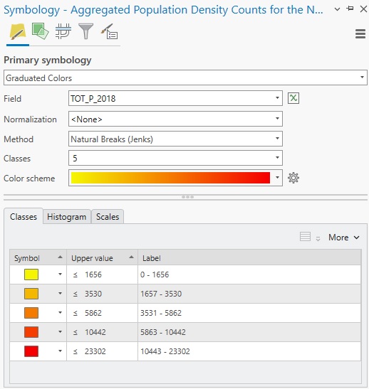
STEP 5: Applying map symbology Right-click the aggregated population density values layer and select “Symbology”. Select “Graduated Colors” under “Primary Symbology” and accept the presets:
Zoom in on the map to see the colors applied. The red parts correspond nicely to an earlier map (found at the end of this tutorial) using the same data showing the most populated parts of the country:
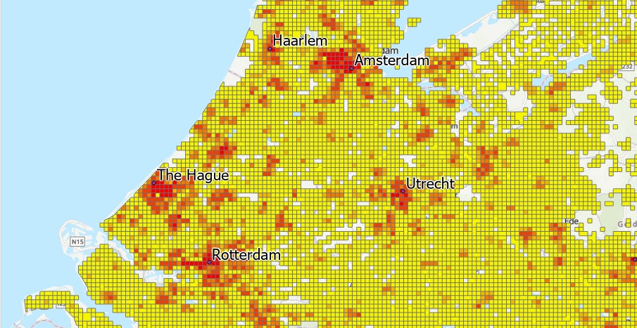
If you zoom in on the map, for example in south-western part of the country (with multiple peninsulares), you’ll see that the Dissolve tool eliminates borders when adjoining polygons have equal population values. However, because we selected the option to create multipart features before running the Dissolve tool, polygons with equal population values that are not geographically near each other still form part of the same (multipart) feature. This makes it a powerful tool to quickly group many features together based on attribute values, resulting in a better overall performance.
