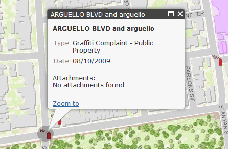
The new Popup widget, provided with the 2.3 release of the ArcGIS Server API for JavaScript can be used as a replacement for the default info window. This new widget provides an attractive alternative to the info window complete with navigation tools that allow you to move through the selected features, zoom to a selected feature, highlight the selected feature, and maximize/minimize,close the window.
You can also customize the look of the window as well as the content. In this post you will learn how easy it is to programmatically add this new widget to your application. You can also use the ArcGIS.com map viewer to create popup windows. This post is the first in a three part series. This first post will cover the basics of adding a Popup window to your application while the second and third posts will cover advanced customization topics.
Reference the Widget
You’ll first want to add the popup stylesheet to your application as seen below:
Next, reference the Popup widget using dojo.require.
Creating the Popup
The constructor for a Popup widget takes two parameters: options and an HTML source reference to where the popup will be placed. The ‘options’ parameter is optional and can be used to customize the look of the popup window.
In the code example below you’ll see that we simply provide a ‘null’ reference for the options object. This simply means that we’ll use the default options provided by the Popup. The srcNodeRef is going to be a <div> container that we create to hold the content.
The second line of code highlighted below indicates that when the map is initially created the new Popup widget, stored in a variable called ‘popup’, will serve as the info window for the application.
Finally, the dojo.place method is used to define where the popup will appear which in this case is the <div> container that we created. Place the popup under the map’s root element. This ensures that the coordinate space used by the popup for positioning aligns with the map’s coordinate space.
Adding just the lines we’ve already discussed is enough to create a basic Popup window. Many times that’s all you need for your application, but you can also customize not only the look of the window but also the content.
Formatting with the PopupTemplate Class
Popup content can be formatted using the PopupTemplate class. PopupTemplate inherits from the InfoTemplate class. A code example showing how to create an instance of PopupTemplate is provided below. This object can be used to create a title and description for the window along with a means for defining the fields that should be visible along with their labels and formatting. You can also define whether attachments should be visible (showAttachments:<boolean>) as well as images, charts, and other media that will be part of the window. We’ll examine some of these advanced customization techniques in our second post.
In this code example above we’ve simply defined a title for the window along with the fields that will be visible and stated that we want attachments to be loaded if they exist.
A PopupTemplate is then referenced from the ‘infoTemplate’ option when defining a new FeatureLayer as seen in the code example below.


