
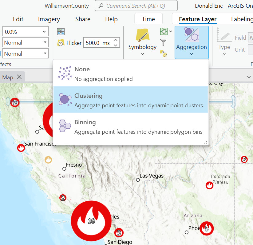
ArcGIS Pro offers two powerful methods for dynamically aggregating point feature layers: binning and clustering. While both are visualization techniques that aim to simplify and summarize data, they differ in their representation and behavior. For point feature layers only, clustering and binning are available through the Feature Layer | Aggregation tool starting with ArcGIS Pro 3.1. In this article you’ll learn how to use the Aggregation tool found on the Feature Layer tab in ArcGIS Pro.
Feature Clustering
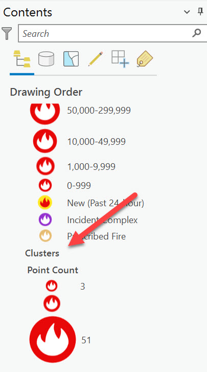
A cluster symbolizes two or more point features combined into a single entity. This aggregation process groups point features into clusters. Typically, the symbol for a cluster also displays a count of the point features it comprises. As the count of features within a cluster increases, the size or the shape of the cluster symbol changes proportionately, often becoming larger or more distinct. You can see an example of clustering in the screenshot above. Feature clustering helps to uncover and illustrate meaningful data patterns. Clustering also helps reduce visual clutter caused by overlapping data points.
When point features are aggregated into clusters, the layer reorganizes and consolidates features that are within a predetermined distance from each other into a single cluster on the map. This distance is known as the clustering radius, which defines how close point features need to be to each other to be considered for aggregation into a single cluster.
Clustering simplifies the representation of a complex layer with numerous overlapping points by streamlining its symbology. A distinctive aspect of feature clustering is that the symbols can include elements such as size, color, and text, allowing them to visually represent multiple data variables simultaneously. This method is particularly effective in revealing patterns that might be obscured in layers crowded with hundreds or thousands of points.
Examples of clustering include the following:
- Disease Outbreak Mapping: Clustering can be used to identify hotspots of disease outbreaks or clusters of health-related incidents. For example, visualizing points of reported cases can help health officials determine where resources need to be directed for containment and treatment.
- Pollution Monitoring: Environmental scientists can use clustering to map out pollution sources or areas with high levels of environmental contaminants, facilitating targeted clean-up operations and monitoring environmental health.
- Wildfire Analysis: Clustering can be used to group large numbers of wildfires within a particular geographic area during peak burn season.
- Crime Hotspot Identification: Law enforcement agencies can use clustering to pinpoint areas with high incidences of specific types of crime, aiding in resource allocation, patrol planning, and preventive strategies.
How to aggregate points into clusters:
- Open ArcGIS Pro (you’ll need 3.1 or above).
- Create a new project or open an existing project.
- Open an existing map or create a new map.
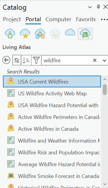
- From the Catalog pane, click the Living Atlas button found on the Portal tab and enter Wildfire as a search term.
- Add the USA Current Wildfire layer to the map. This will add a group layer that contains a point layer called USA Active Wildfire – Current Incidents along with a polygon wildfire perimeters layer. Zoom into an area that has a high concentration of active wildfire points.
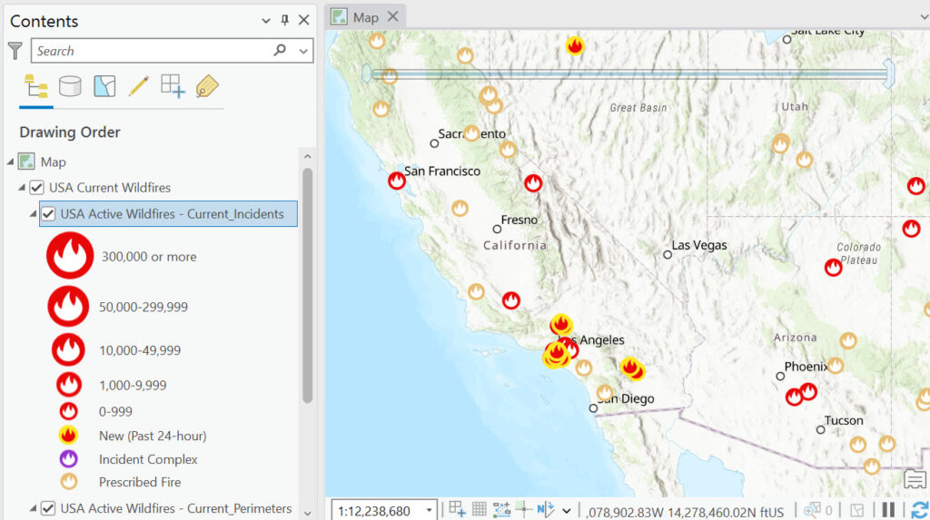
- With the USA Active Wildfires – Current Incidents layer selected in the Contents pane, select the Feature Layer tab and the Aggregation | Clustering. Your results will differ since this is a near real-time layer of information, but you should see a clustering of nearby points. The size of the symbol will increase based on the number of points within the cluster area and a numeric indicator will be present inside the symbol which indicates the number of points in the cluster.
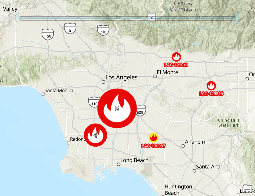
- The way clusters aggregate features is dynamic. As you navigate around the map, clusters change to represent features differently. Clusters draw in place of features until the geographic distance between them is large enough that individual points are drawn or the clustering scale threshold is passed. Changes in the number of clusters and the cluster’s sizes are determined in part by the clustering radius.
- A new section called Clusters will be added to the Contents pane as seen below.
- A new Clustering tab will be displayed on the ArcGIS Pro ribbon.
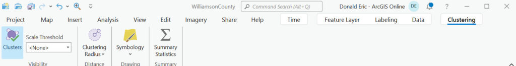
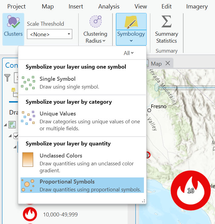
From left to right this toolbar provides functionality for turning clusters on/off, setting a visibility scale threshold, defining the cluster radius, setting the symbology style (proportional symbols is the default – see below), and generating summary statistics.
Feature Binning
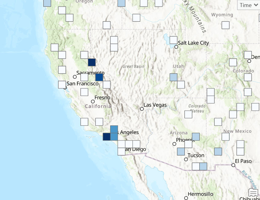
The other aggregation option is Binning. Feature binning is a technique that consolidates numerous point features into dynamic polygons known as bins. Each bin encapsulates all the features within its geographical limits and is visible wherever at least one feature exists within these boundaries. This approach significantly enhances the rendering performance of layers with large numbers of point features, making it an effective strategy for feature reduction. You can see an example of this below.
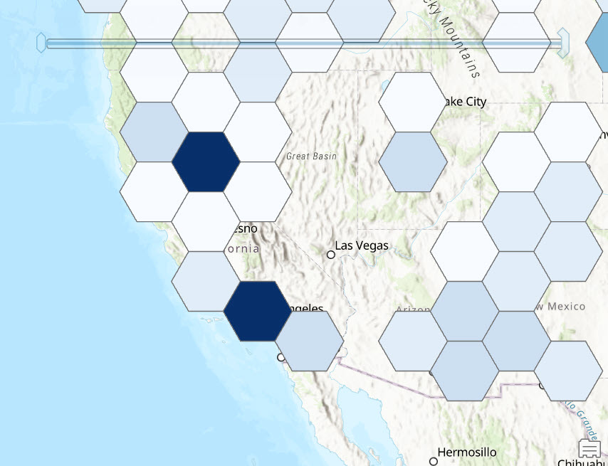
The nature of feature binning is dynamic; the size and attributes of the bins vary depending on the map scale. Bins are generated across different scales using a non-fixed framework, which does not rely on existing geographical or political boundaries. When implementing feature binning, it is crucial to choose an appropriate projected coordinate system. Systems that do not preserve area might introduce distortions or biases in the data representation. For additional details on handling binned feature layers, refer to guidelines on working with binned feature layers.
- With the USA Active Wildfires – Current Incidents layer selected click the Feature Layer tab and then Aggregation | Binning to create the map you see above. Remember that your map will differ due to the near real time nature of the dataset.
- A Binning tab will be displayed on the ribbon. From this tab you can turn binning on/off, change the scale or features, change the bin size and type, coordinate system, symbology, generate summary statistics, and computation settings. It’s beyond the scope of this article to detail all these settings, but I’ve provided some screenshots below that illustrate some of these concepts.

Summary
In conclusion, feature binning and clustering in GIS are powerful techniques that simplify the visualization and analysis of large datasets by dynamically aggregating point features into bins and clusters. These methods not only enhance the clarity and performance of maps but also provide scalable solutions for handling data across various levels of detail. While feature binning aggregates data into dynamic polygons without adhering to predefined geographical boundaries, clustering groups nearby points to reveal compelling patterns and densities within the data. Both approaches allow for flexible, context-specific analysis adapted to the needs of the user and the specifics of the dataset. By effectively utilizing both feature binning and clustering, GIS professionals can manage and interpret massive volumes of data more efficiently, making informed decisions based on the spatial patterns and trends revealed through these processes.
