

This article explores the significant disparities in housing affordability between the coastal regions of the United States and the Midwest. Here we present an R script that merges 2022 county-level median income data with the Zillow Home Value Index (ZHVI), a measure of home values, to calculate a housing affordability ratio for each county. The script also produces an output shapefile that can then be symbolized as a graduated color map in ArcGIS Pro.
The coastal areas, known for their high real estate prices, contrast sharply with the Midwest, often cited for its more accessible housing market. We also found pockets of seriously to severely unaffordable housing in the Intermountain West as well as extensive areas of Texas. This examination aims to provide insights into the varied landscape of homeownership costs across the country, highlighting the affordability divide that influences regional demographics and housing decisions.
What is the affordability ratio?
The affordability ratio calculates how affordable it is to live in an area by taking the home value (ZHVI) and dividing it by the median income. In other words, if a home buyer was to use their full annual salary to pay off their mortgage, the ratio calculates how many years it would take to do so.
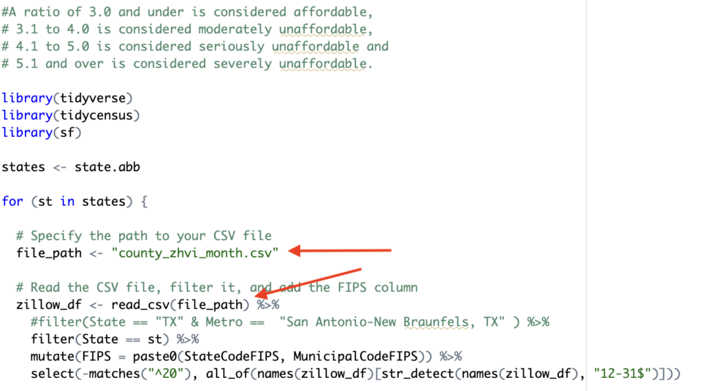
A ratio of 3.0 and under is considered affordable, 3.1 to 4.0 is considered moderately unaffordable, 4.1 to 5.0 is considered seriously unaffordable and 5.1 and over is considered severely unaffordable.
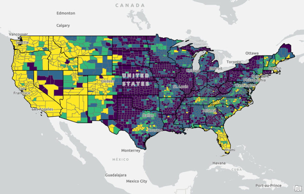
Home Affordability Map
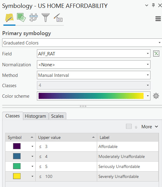
Before we take a look at the R code used to generate the output let’s examine the final map that was produced. The map tells the story with counties symbolized in yellow and light green representing counties where housing is severely or seriously unaffordable. As expected this includes the coastal regions of the United States which have traditionally been more unaffordable, but notice the large sections of the Intermountain West, Southwest, Texas, Tennessee, and western North Carolina that fall into these categories as well. As expected, the Midwest, Rust Belt, and portions of the Deep South are still “affordable”.
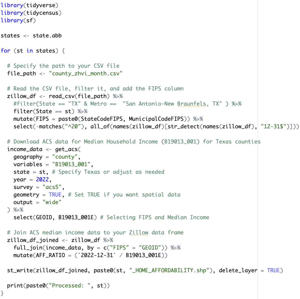
How this Map was Created
An R script was written to produce the output shapefile that was mapped in ArcGIS Pro. There were two data sources used in the analysis: ZHVI Single Family Home Time Series for the home values across counties, and median income pulled from US Census ACS data. Below I explain the individual code blocks used in the script. You can also download the entire script.
The first part of the script simply imports the R libraries that will be used in the script. The tidycensus package is used to extract census data from the US Census Bureau. This package is used in conjunction with the tidyverse package, which can be used for many data science tasks including data manipulation and visualization. Finally, the sf package provides simple feature access to geometric operations of spatial data.
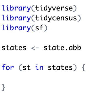
For this particular study I wanted to initially break out the datasets by state rather than running the entire country at once. This gives me the flexibility of visualizing the data state by state rather than producing one dataset for the entire U.S. So in the next code block I retrieve a list of state abbreviations and start a loop through each of the states.
I downloaded the ZHVI file from Zillow and stored it locally (it is possible set up the script to read directly from a URL) so in the next code block I read that data into a tidyverse data structure called a tibble. A tibble is basically an advanced version of what is known as a data frame which is a data structure that represents a tabular data and can be manipulated and used for visualization purposes.
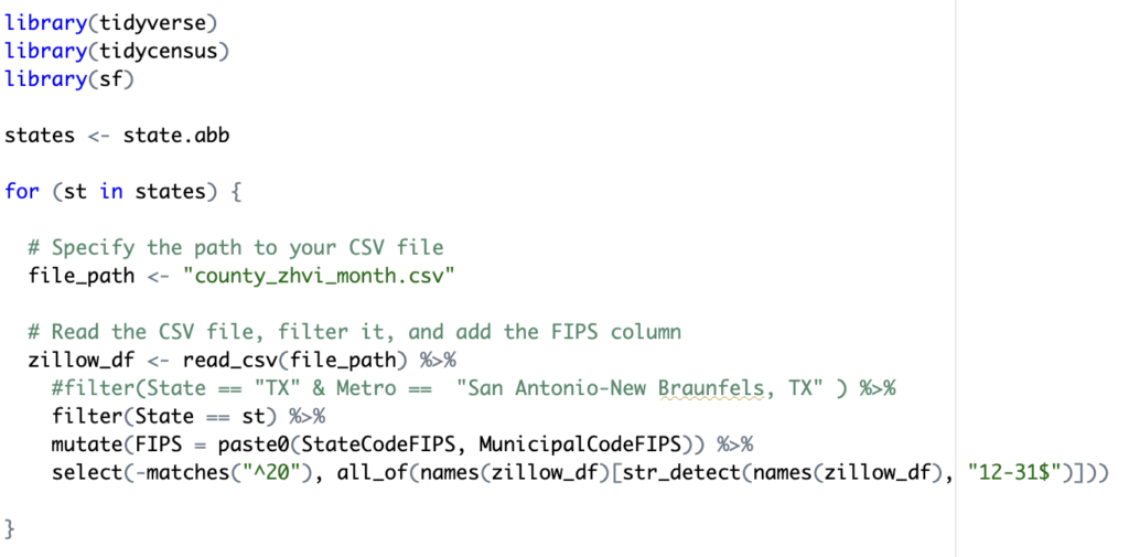
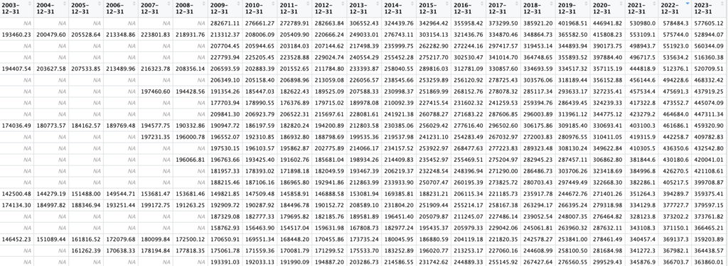
The read_csv() function reads the contents of the Zillow ZHVI data into a tibble (data frame). That data is then filtered by state, and because the Zillow data contains separate columns for state and county fips, I used the mutate() tidyverse function to create a new FIPS column that joins the state and county fips data. Finally, I removed all columns that start with the text ’20’ and don’t end with ’12-31′. The purpose of this is not at all obvious, but the Zillow csv file contains monthly data in separate columns going back to the year 2000. For my purposes I only wanted the December column at the end of each year. The select() function, and some supporting functions accomplishes this. Below is an example of the data frame that is produced. This screenshot does not contain all the columns. There are other columns for county name, state abbreviation, and others. The column 2022-12-31 was used in the affordability ratio calculation, but other types if visualization like a line chart or scatterplot could take advantage of these others columns so I left them in the tibble to support other potential operations. It can’t be seen in the screenshot below but there is also a FIPS column that contains the county fips code for each county. This will be used in a join operation in a later code block.
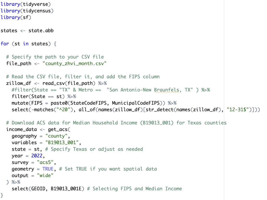
The next code block of code uses the tidycensus get_acs() function to retrieve median income data at a county level from the year 2022 using the ACS5 survey for each state. The select() function at the end trims the list of columns to only include the GEOID and B19013_001E (median income) columns. The result is a new tibble stored in a variable called income_data.
Here is an example of the tibble produced as a result of this code block. Notice the inclusion of a geometry column. This was produced through the call to the get_acs() function by setting the geometry parameter to TRUE. The B19013_001E column contains median income for each GEOID. The GEOID contains the county fips code.
![]()
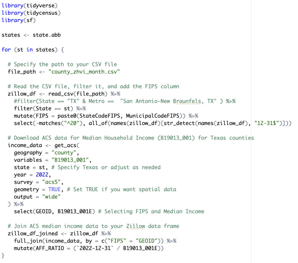
At this point there are two distinct tibbles: zillow_df and income_data. In the next code block, displayed below, I used the full_join() tidyverse function to join these two tibbles together using the FIPS (zillow_df data frame) and GEOID (income_data data frame) columns. This produced a new tibble stored in the zillow_df_joined variable. This produces a new data frame referenced by the zillow_df_joined variable.
The final step of the R script is to write the contents of the zillow_df_joined data frame to a shapefile and print out a progress indicator. This can be seen in the final two lines of code below. Here the st_write() function is used to export the data. This function is found in the sf packgage that was imported at the beginning of the script.
While I could certainly have used R to produce a graduated color map of the results using the ggplot2 or other packages, I prefer the flexibility and ease of using ArcGIS Pro to produce the final map. After loading the shapefile into an ArcGIS Pro map I selected the Feature Layer tab and the Symbology button to initiate the symbology pane. The Method was changed to Manual Interval with 4 classes and a blue to yellow color scheme. Manual interval classification requires manual input of the classes. To define the classes you simply type in an a Upper value for each category. In this case we have predefined values for Affordable as being anything equal to or below 3. Moderately affordable is defined as anything from 3.01 to 4. Seriously unaffordable ranges from 4.01 to 5, and severely unaffordable is any ratio above 5. I set the upper value for Severely Unaffordable to 100, but this is somewhat arbitrary. As long as the upper value is not less than the largest value in the column it will capture all features within this class.
Using AI to Produce R Script
As we close this article I wanted to mention that access to an AI interface like ChatGPT4 can make the process of creating the R script so much more efficient. Tools like ChatGPT4 for code generation are becoming very popular and will no doubt increase programmer efficiency. However, it does require something more than just a basic level of understanding of the underlying programmatic structures of R and the required packages for this type of task to fully utilize the tool.
Below is an example of how ChatGPT4 can be used to become a more efficient coder. The first task in this script is to load the existing Zillow csv file containing home valuation information. I prompted ChatGPT4 with the following:

ChatGPT4 responded with:
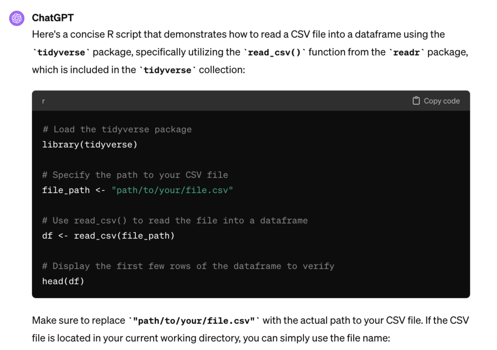
If you refer back to the script that was created for this tasks you’ll notice how this code was utilized to read the county_zhvi_month.csv file.
From there you can iteratively built the script by continuing to prompt ChatGPT4 as seen below.

This produced the following.
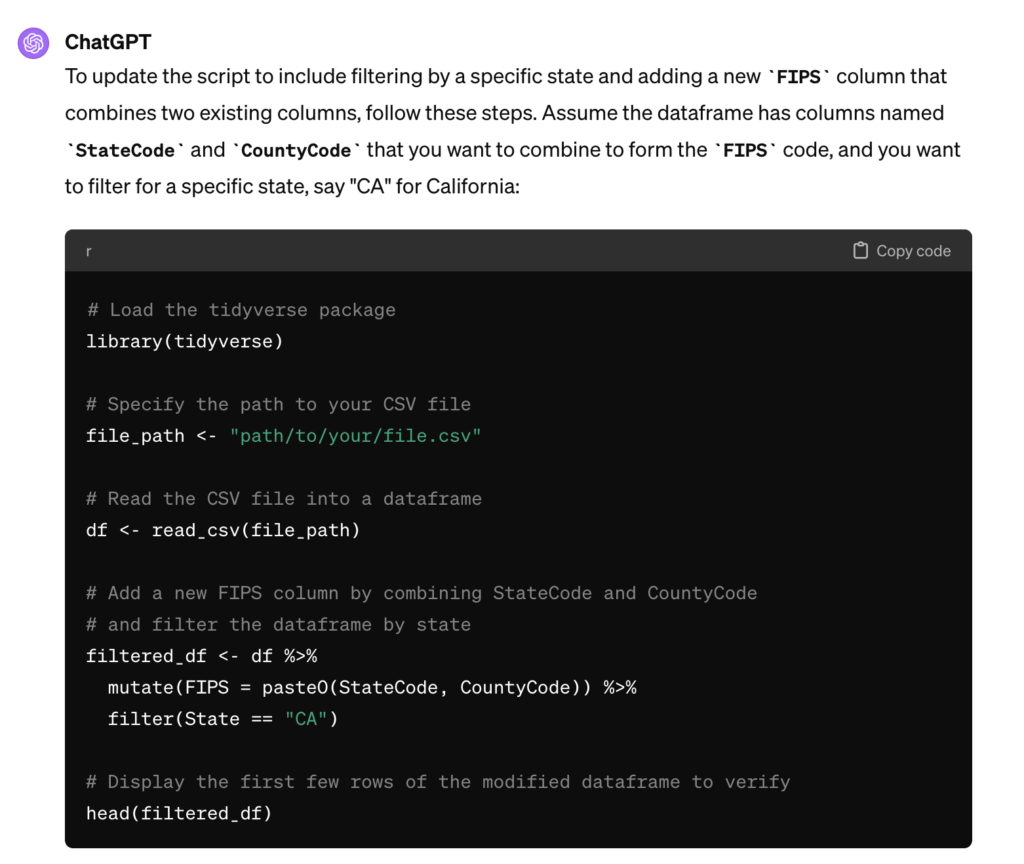
Obviously this isn’t exactly what I want but it’s pretty close and I know enough about R and the tidyverse package to be able to alter the code to produce the result I ultimately need.
I also wanted to produce one shapefile per state so I need to be able to iterate this code once for each state so I then prompted ChatGPT4 with:

ChatGPT4 returned the following:
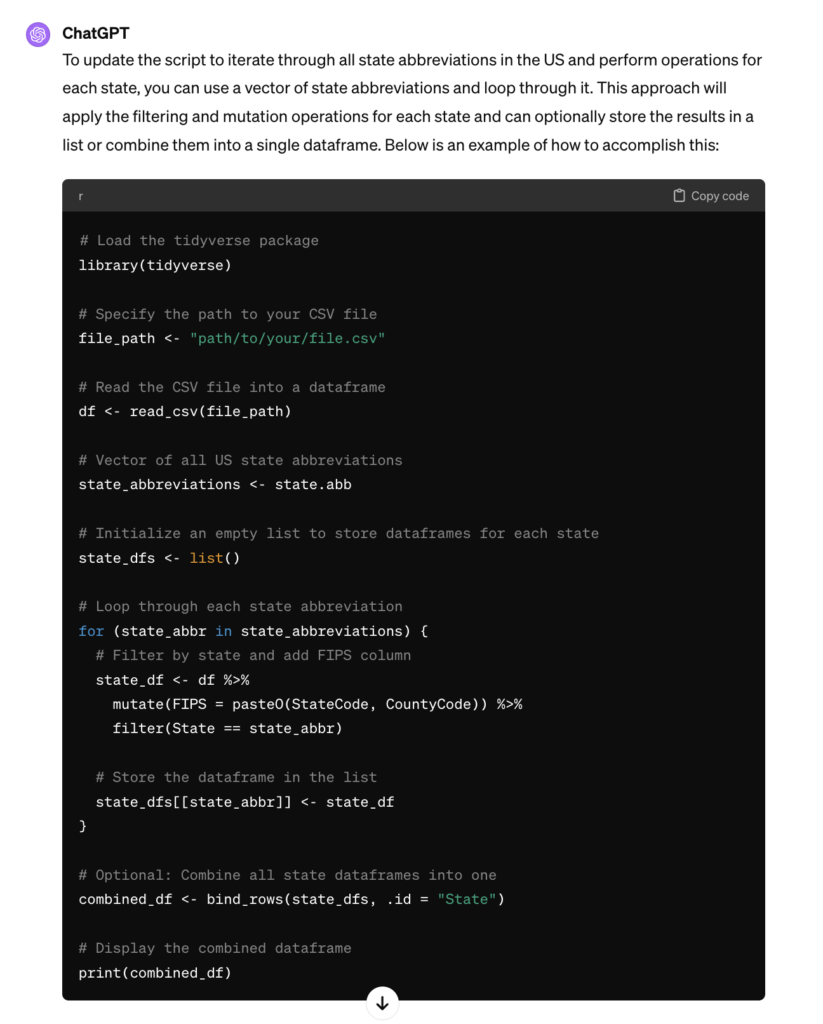
Again, not exactly what I want, but pretty close. My existing knowledge of R and tidyverse combined with ChatGPT4 makes the process MUCH more efficient. I can continue to build the script in this manner until I complete the script. Don’t expect AI tools to be able to produce the exact result you want, but with a little knowledge of the fundamentals of a programming language and it’s applicable libraries you can dramatically increase your programming efficiency. I’ll have much more information on using AI tools to increase your programming productivity in future articles.
