

If you want to learn more about using symbology functions like those described in this article, check out our foundational ArcGIS Pro courses and upcoming training events.
Graduated color maps are a type of thematic map used to represent the spatial distribution of numerical data across a geographic area. These maps apply varying shades or colors to areas (such as regions, countries, states, or counties) to indicate different values or intensities of a particular variable. The variable in question can be anything measurable across the map area, such as population density, income levels, temperature, or precipitation.
The “graduated” part of the term refers to the method of classifying the numerical data into ranges or classes, with each class assigned a specific color or shade. The colors usually follow a gradient, moving from light to dark or through a color spectrum to represent increasing or decreasing values. This gradient helps to visually convey how the variable changes across the map, allowing for easy comparison between different areas.
In this article, we’ll explore the different techniques available in ArcGIS Pro for establishing the classes used in graduated color mapping. The following examples focus on visualizing the ratio of housing expenses to household income at the county level. More precisely, we’re illustrating the proportion of homeowners with mortgages spending more than 50% of their income on housing costs in Colorado counties for the year 2022. However, before discussing the available classification methods you first need to understand the concept of normalization and how it applies to graduated color mapping.
The Role of Normalization in Graduated Color Mapping
Normalization plays a crucial role in graduated color mapping, especially when comparing data across different geographical areas or units with varying sizes or populations. Normalization involves adjusting the data to account for another variable, making comparisons fair and meaningful. This process is vital for graduated color mapping, where data is visually represented by varying colors to indicate different value ranges across a map. Let’s explore the significance of normalization in this process:
Enhancing Comparability
Normalization allows for the comparison of data across areas that might not be directly comparable due to differences in size, population, or other underlying factors. For example, comparing total income across counties without considering population size could lead to misleading interpretations, as areas with larger populations are likely to have higher total incomes. Normalizing income by population size (e.g., per capita income) enables a more accurate comparison of economic well-being across regions.
Preventing Misinterpretation
Without normalization, maps can unintentionally emphasize areas with inherently larger values due to their size or population density, overshadowing important patterns in the data. Normalization helps prevent such misinterpretation by ensuring that the visual representation reflects the relative magnitude or density of the variable of interest, rather than absolute values that could be skewed by area or population size.
Supporting Informed Decision-Making
In graduated color mapping, normalization supports informed decision-making by providing a clear and accurate visual representation of the data. For policymakers, urban planners, and researchers, normalized maps offer valuable insights into patterns and trends, such as the distribution of a specific demographic group, the prevalence of a health condition relative to population size, or economic indicators adjusted for inflation.
Methods of Normalization
Common methods of normalization include:
- Per Capita: Dividing a total quantity by the total population to get a per-person value.
- Percentage: Converting raw numbers into percentages of a whole to understand proportions.
- Density: Calculating the number of occurrences per unit area (e.g., population density per square kilometer).
Normalization is tailored to the data and the objectives of the mapping project. The choice of normalization method can significantly impact the interpretation of the map, highlighting the importance of selecting an appropriate method that accurately conveys the message or insights intended by the map creator.
In summary, normalization is a critical step in graduated color mapping that ensures data comparability, prevents misinterpretation, and supports informed decision-making by providing a fair and meaningful visual representation of data across different geographical units.
Classification Methods
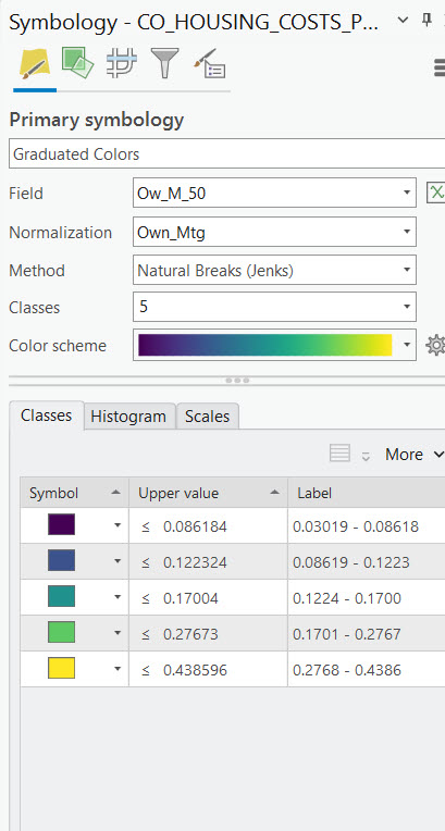
Now that you have a better understanding of the role normalization plays in graduated color mapping let’s turn our attention the various methods that can be used to produce graduated color maps. For the examples below we are using a feature class that contains census data from the year 2022 for counties in the State of Colorado. We’ll use the attribute column Ow_M_50 which contains the number of households that own their home, have a mortgage on the home, and are spending more than 50% of their income on housing costs. In each example we’ll also normalize the data using the Own_Mtg column, which is simply the number of households in each county that own their home and have a mortgage.
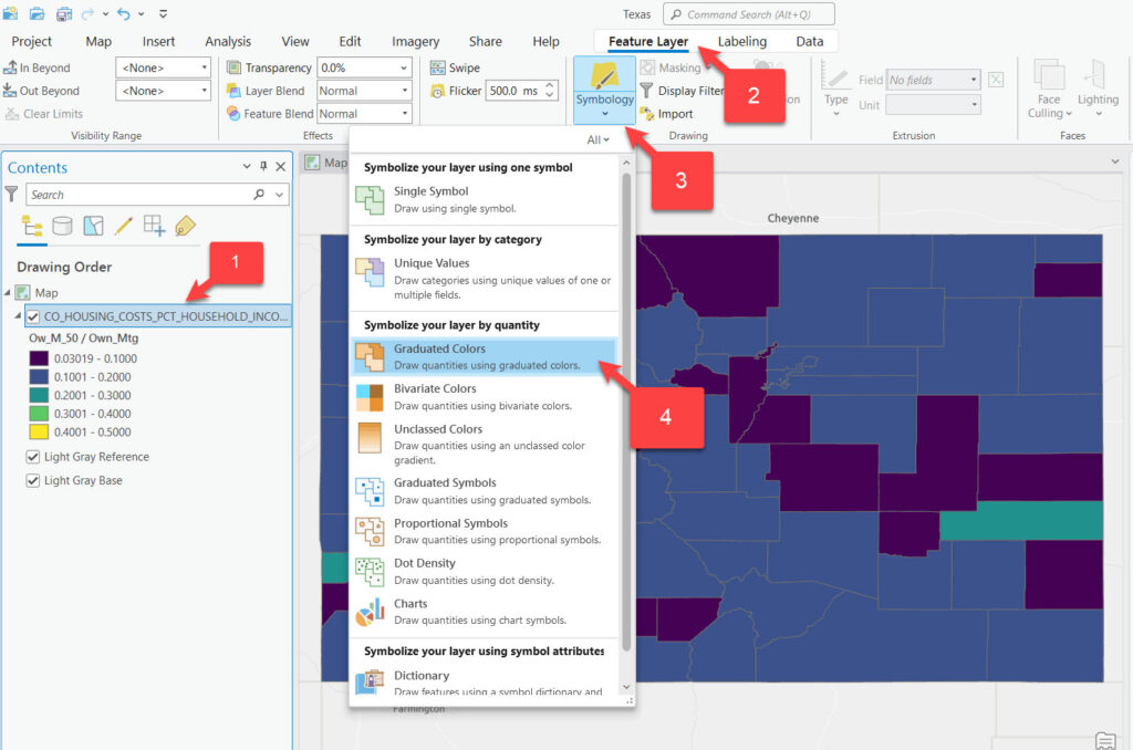
To access the Symbology pane for the creating the graduated color rendering simply follow the process illustrated in the screenshot below.
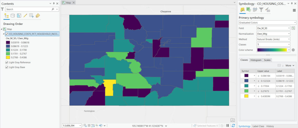
The symbology pane will display as seen below. Graduated color renderings must use a numeric field for both the Field and the Normalization parameters. The method will default to Natural Breaks (Jenks) with 5 classes and a default color scheme. All of these parameters can be changed as needed.
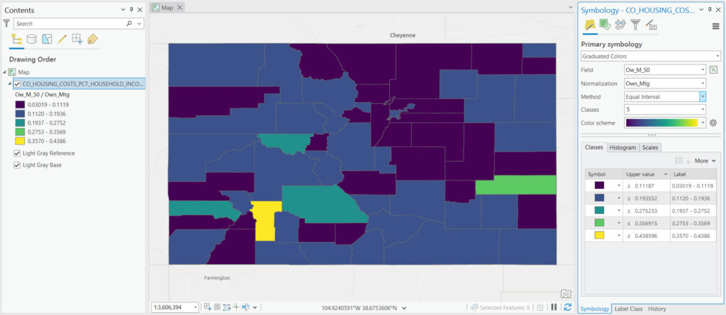
Equal Interval Classification
Equal interval classification divides the range of data values into segments of equal size. This method is particularly straightforward, assigning the same width to all classes. It shines when you need to emphasize the absolute magnitude of values, making it easier for map readers to understand the distribution scale. However, its simplicity may also be a drawback. In datasets with outlier values or uneven distribution, equal interval classification can result in many features falling into a few classes, while others remain sparsely populated. The example below illustrates an Equal Interval classification on the Ow_M_50 column that we discussed earlier and with the Own_Mtg column used for normalization. Note that in this case most of the values fall into the lower classes using this method. It’s important to note that there isn’t necessarily a “best method” to use but it’s often the case that one or two methods will work better than others for a given dataset.
How it Works
When applying the Equal Interval method, you first decide on the number of classes you want to use. ArcGIS Pro then calculates the class intervals by dividing the total range of your data (the difference between the maximum and minimum values) by the number of classes. Each class is assigned a color, creating a graduated color map where the color intensity or hue changes progressively with the value range.
Applications
This method is particularly useful when:
- You want to emphasize the distribution of data values across a fixed range.
- You aim for a simple and straightforward classification that is easy to interpret.
- The data distribution is relatively uniform, and you wish to highlight variations across the entire data range.
Considerations
While the Equal Interval method is easy to implement and interpret, it may not always be the best choice for all data types or distributions. For instance:
- If the data is highly skewed or contains outliers, this method might result in many data points falling into a single class, reducing the effectiveness of the visualization.
- It may not adequately highlight clusters or natural groupings in the data.
Example
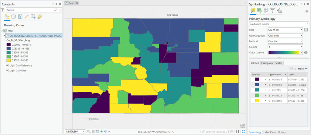
Quantile Classification
Quantile classification ensures an equal number of observations within each class, distributing the data evenly across the color spectrum. This method excels in portraying the relative ranking of data points, making it ideal for datasets where the position within a distribution is more important than the absolute value. However, one caveat of quantile classification is that it can mask the significance of large gaps or clusters in the data, as it focuses solely on the distribution’s order rather than its structure.
How it Works
When applying the Quantile classification method, ArcGIS Pro sorts the data values from smallest to largest and then divides them into nearly equal-sized groups or classes according to the number of classes you specify. This method is especially beneficial when the data distribution is skewed or when you’re interested in emphasizing the distribution of data values across specified percentiles.
Applications
The Quantile method is particularly useful in scenarios where:
- The relative ranking of data values is more important than the actual data values.
- The data is not normally distributed, and there are outliers that might skew the results in other classification methods.
- You want to ensure that the map visualization includes a balanced representation of data points across all classes.
Considerations
While the Quantile method helps in evenly distributing data points across classes, it has some considerations:
- It may mask significant differences between data values if those differences are within the same quantile.
- Adjacent geographical areas with similar but not identical values might be placed in different classes, potentially exaggerating differences.
- It is particularly sensitive to changes in the dataset; adding or removing data points can shift the class boundaries significantly because the method focuses on the number of observations rather than their value.
Example
Natural Breaks (Jenks) Classification
Natural breaks, or Jenks optimization, seeks to identify class boundaries that minimize the variance within classes while maximizing the variance between them. This approach is adept at revealing inherent patterns in the data, grouping data points that are similar and separating those that are different. It is particularly effective for datasets with distinct clusters of values. The computational complexity of finding these natural groupings is a trade-off, but the method’s ability to uncover the underlying structure of the data often justifies the effort. ArcGIS Pro uses natural breaks as the default parameter for graduated color mapping.
How it Works
Natural Breaks classification analyzes the data to find breakpoints where there are relatively large jumps in the data values. These breakpoints indicate where the data naturally forms clusters or groups. By grouping similar values together and separating dissimilar values, the Natural Breaks method effectively highlights the significant differences in the dataset.
Applications
The Natural Breaks method is particularly beneficial when:
- The data contains distinct clusters of values or when you’re interested in emphasizing the natural groupings within the data.
- You aim to visualize data where the distribution is not uniform, and there are clear gaps or jumps between values.
- The focus is on representing the data in a way that reveals patterns and anomalies that may not be apparent with more uniform classification methods.
Considerations
While the Natural Breaks method is powerful for highlighting natural patterns in the data, there are some considerations:
- It can be computationally intensive, especially with large datasets, because it requires examining the data distribution to find the optimal breakpoints.
- The classification results are highly dependent on the specific dataset, meaning that slight changes to the data can lead to different class boundaries.
- It may not be the best choice for datasets that do not exhibit natural groupings or for users who require classes based on predefined intervals or specific criteria unrelated to the data’s inherent structure.
Example
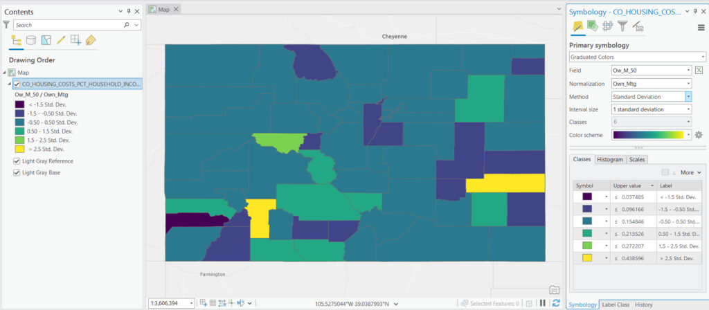
Standard Deviation Classification
Standard deviation classification organizes data based on its deviation from the mean, creating classes that represent intervals of standard deviation units. This method is well-suited for data that approximates a normal distribution, highlighting how far values deviate from the average. It offers a statistical perspective on data variance, effectively distinguishing between typical and atypical values. However, its utility may be limited for skewed distributions or datasets with extreme outliers.
How it Works
The Standard Deviation method calculates the mean (average) of the data values and the standard deviation (a measure of data variability). Data values are then classified based on their distance from the mean, in units of standard deviations. This results in classes that represent values significantly below the mean, close to the mean, and significantly above the mean.
Applications
The Standard Deviation method is beneficial in scenarios where:
- The goal is to highlight variations from the average within the data, making it easy to spot areas that deviate significantly from the norm.
- The data distribution is close to normal (bell-shaped curve), and the analysis focuses on the degree of deviation from the mean.
- Analysts are interested in standardizing the data representation to allow for comparisons across different datasets or study areas.
Considerations
While useful, the Standard Deviation method has considerations:
- It assumes the data is normally distributed. For datasets that do not fit this distribution, the method might not accurately reflect the data’s structure.
- This method can mask the presence of spatial patterns or clusters if the focus on deviation from the mean overlooks localized trends.
Example
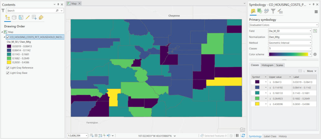
Geometrical Interval Classification
Geometrical interval classification is designed for skewed data distributions, creating classes with boundaries that increase geometrically. This method helps in dealing with data that is not evenly spread, ensuring that each class is visually distinct, even when values are clustered at one end of the scale. The geometric progression helps to balance the class sizes, making this method a good choice for data with exponential growth or decline patterns.
How it Works
The Geometric Interval method calculates class breaks by starting with the smallest data value and then multiplying it by a constant factor to determine the next class break. This process repeats until all data values are classified. The result is a series of intervals where the difference between the minimum and maximum values of each class increases as the values get larger, accommodating the skewed nature of the data.
Applications
The Geometric Interval method is advantageous when:
- Visualizing data with exponential growth patterns, such as population growth in certain areas, income distribution, or certain types of sales data.
- Dealing with datasets that include a few extreme high values while the majority of the data clusters at the lower end of the scale.
- The aim is to avoid the domination of a few high values so that the map can effectively display variations across the broader range of lower values.
Considerations
While the Geometric Interval method offers a tailored approach for certain data types, there are considerations:
- It may not be suitable for datasets with a normal or uniform distribution, as the geometric progression could misrepresent the true nature of the data.
- Choosing the right constant multiplier is crucial, as it affects the classification and, consequently, the map’s interpretability.
Example
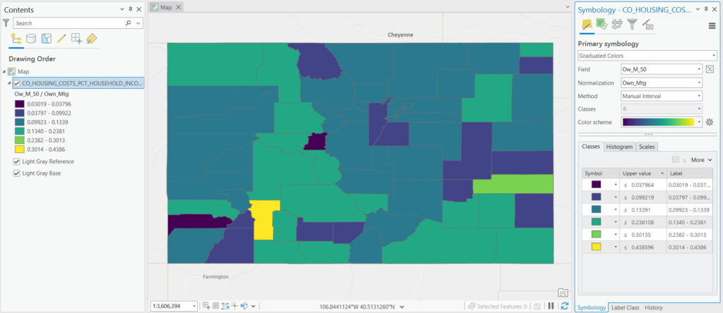
Manual Classification
Manual classification empowers users with complete control over the class boundaries, allowing for custom-defined intervals based on knowledge of the dataset or specific analytical needs. This method is invaluable when there are predetermined thresholds of interest or when the data requires a nuanced approach that automated methods cannot provide. While manual classification offers precision, it also demands a deep understanding of the data and the objectives of the analysis.
How it Works
With the User-Defined Interval method, the user directly inputs the break points that separate data into different classes. This approach does not rely on statistical algorithms to determine class boundaries but instead allows the analyst to apply expert judgment or specific criteria. For example, if analyzing pollution levels, an environmental scientist might set intervals based on regulatory thresholds.
Applications
The User-Defined Interval method is particularly useful when:
- There are established standards or thresholds that data points can be categorized by, such as pollution levels, income brackets, or land use codes.
- The user wishes to focus on specific ranges of data that are of particular interest or importance to the research question or policy discussion.
- Data distribution is irregular, and automated classification methods do not adequately highlight the desired patterns or trends.
Considerations
While offering maximum flexibility, the User-Defined Interval method requires a solid understanding of the data and the objectives of the analysis. Key considerations include:
- Potential subjectivity in choosing class boundaries, which might affect the comparability of results across different studies or time periods.
- The need for a detailed preliminary analysis to ensure that the chosen intervals meaningfully represent the data’s structure and distribution.
Example
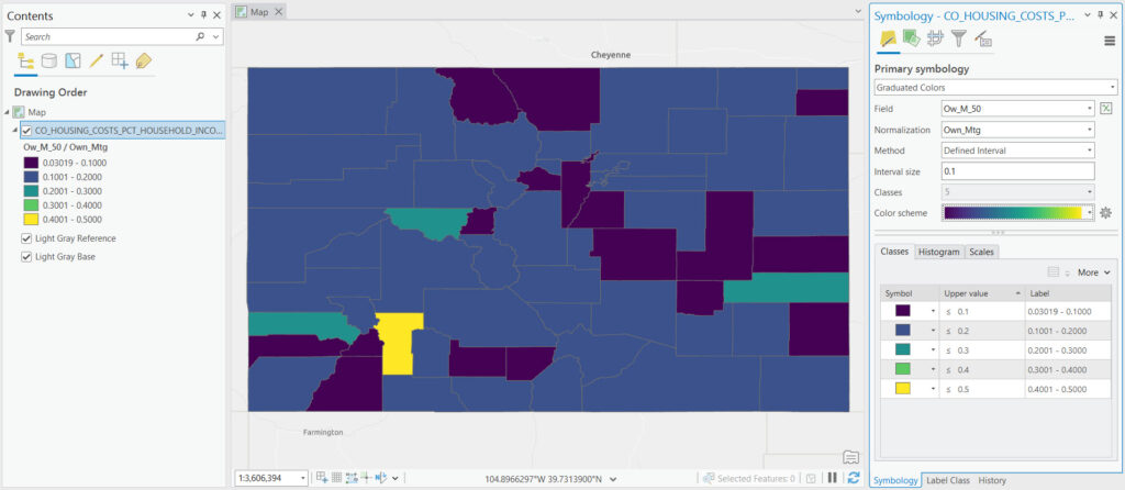
Defined Interval
The Defined Interval method, when using graduated color rendering in ArcGIS Pro, is a classification scheme that allows users to specify a fixed interval to categorize the data values for mapping. This approach is particularly useful when you have a clear understanding of the data distribution and want to highlight specific value ranges using a consistent interval size across the entire dataset.
How it Works
In the Defined Interval method, the user determines the size of each class interval directly. For example, if analyzing population density and you set the interval to 100 people per square kilometer, the classification breaks would be at 100, 200, 300, and so on. Each of these ranges would then be assigned a different color, creating a map where the color intensity increases with population density.
Applications
This method is advantageous in several scenarios:
- Uniformity: It provides uniformity in the class intervals, making it easier for map readers to understand the differences between adjacent classes.
- Customization: It offers flexibility for users who wish to define their own intervals based on expert knowledge or specific research requirements.
- Comparability: It facilitates the comparison of different maps or datasets using the same interval scale, providing a consistent basis for analysis.
Considerations
While the Defined Interval method offers significant control over the classification process, it requires a good understanding of the data distribution to avoid misleading representations. If intervals are too large or too small, they might obscure important patterns or exaggerate minor variations. Therefore, it’s crucial to choose interval sizes that best represent the underlying data distribution and the story you intend to tell with your map.
Example
Navigating the Choices
Each classification method offers unique advantages and is suited to particular types of data and analytical goals. When selecting a method for graduated color rendering in ArcGIS Pro, consider the distribution of your data, the presence of outliers, the importance of relative vs. absolute values, and the story you aim to tell with your map. Experimenting with different classification methods can provide insights into the most effective way to communicate the complexities of your spatial data.
Incorporating these graduated color techniques into your GIS projects will not only enhance the visual appeal of your maps but also deepen the level of analysis, facilitating a more informed and insightful exploration of spatial phenomena.
