
This tutorial demonstrates how to use R and ArcGIS Pro to generate hot spot maps of population growth by census tract.
In a previous article I showed you how to use the tidycensus R package to quickly access and map US census data. You can also download a free copy of my digital book – Exploring and Visualizing US Census Data with R. tidycensus can be used to interface with the US Census Bureau’s decennial Census and five-year American Community APIs and return tidyverse-ready data frames, optionally with simple feature geometry included. The sf R package can then be used to create a shapefile containing the census data of interest.
The Spatial Statistics toolbox in ArcGIS Pro includes a Hot Spot Analysis tool that can identify statistically significant hot spots and cold spots using the Getis-Ord Gi* statistic. In this tutorial we’ll use R with the tidycensus, tidyverse, and sf packages to quickly fetch population estimates for 5 year ACS census data from 2010-2014 and 2015-2019. These two datasets will be joined together and a new column containing the percent change in population will be generated. Finally, the resulting data frame will be exported to a shapefile. All of this can be accomplished in R with just a few lines of code. ArcGIS Pro and the Hot Spot Analysis tool will then be used to generate a new layer containing population growth hot and cold spots.
R Code
You’ll need to install R along with an R development environment like R Studio to complete this tutorial. You’ll also need to install the tidycensus, tidyverse, and sf packages.
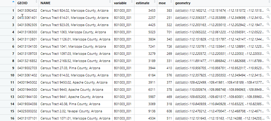
The R script for downloading the census data, joining the two data frames together, adding a column, calculating the percentage change, and exporting the data frame to a shapefile are below. The first three lines just import the packages that will be used. Then, we use the tidycensus get_acs() function twice to pull population estimates from the B01003 5 year ACS tables for the periods 2015-2019 and 2010-2014. This function creates a data frame object in R, which is tabular type structure. You can see an example of a data frame in R below the code. In this tutorial we are pulling census tract information (geography = tract) for the state of Arizona, using the population estimate table (B01003), returning geometry information for one of the data fames, defining the time periods, and caching the table for more efficient access if we want to pull this data again.
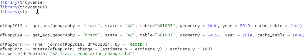
Next, we join the two data frames together using the inner_join() function. The mutate() function is used to add a new column called ‘change’ and populates it with the percentage change in population from the two time periods. Finally, we use the st_write() function to write the new data frame to a shapefile.
Note: We still have seats available for our Discounted Fall ArcGIS Pro Workshops in September.
ArcGIS Pro
Next, we’ll use the Hot Spot Analysis tool in ArcGIS Pro to determine the census tracts hot spots (and cold spots) of population growth. Open ArcGIS Pro and create a new project from the Map template. You can save the project wherever you’d like with a name of your choice.
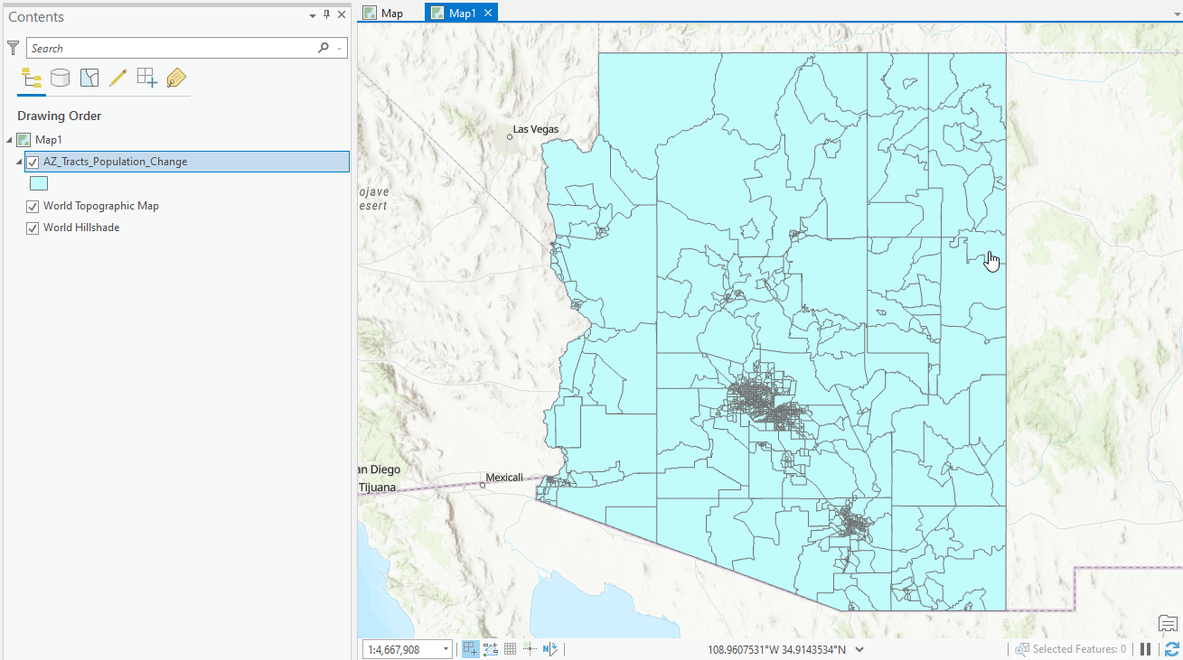
Add the AZ_Tracts_Population_Change shapefile to the map in your project. It should appear similar to what you see below.
In ArcGIS Pro click the Analysis tab and then Tools to display the Geoprocessing pane. Find the Spatial Statistics Tools toolbox, and drill-down to Mapping Clusters –> Hot Spot Analysis. Click the Hot Spot Analysis tool.
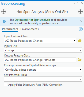
Add the parameters from the screenshot below and click the Run button. Here we’re using the change field as the input field. Remember from the R script that this field contains the percentage change in population from the 2010-2014 to 2015-2019 5 year ACS surveys. For Conceptualization of Spatial Relationships parameter we are using Continguity edges and corners. There are a number of options you can use for this parameter and it is very important in determining the neighborhood that will be used in the analysis of whether each tract will be marked as a hot spot, cold spot, or statistically insignificant tract. For more information on using the Hot Spot Analysis tool please refer to our Introduction to Spatial Analysis using ArcGIS Pro and R class.
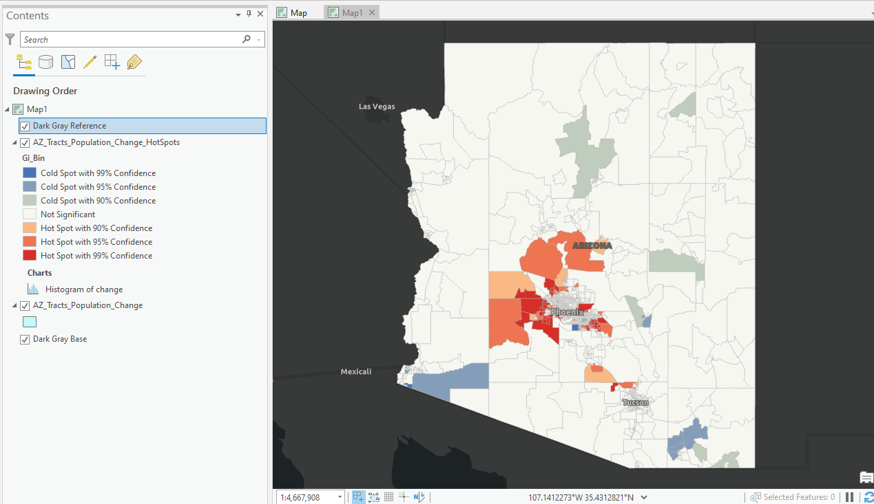
The output should appear as seen below. Note that I have changed my basemap to Dark Gray Base for better visualization of the data. Most of the census tracts in the state of Arizona fall into the Not Significant category, but there are clearly some areas around the Phoenix metropolitan area that have been identified as hot spots.
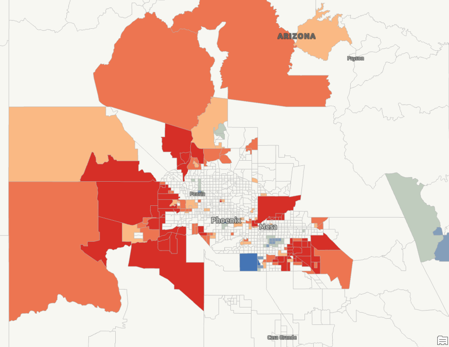
Zoom in closer to the Phoenix metropolitan area as seen below. The outlying suburban areas of Phoenix, particularly to the west, north, and south east are identified as hot spots for population growth. There are a few scattered tracts marked as cold spots as well. The only real pattern of cold spots appears to be just south of Mesa, AZ.
If you liked this tutorial you may find the following classes helpful for building your GIS analytical skills using R and ArcGIS Pro.
