
ArcGIS Pro 2.8 comes with a new Data Engineering toolset. This tutorial demonstrates how to get started using data engineering in ArcGIS Pro.
To follow along with the steps in this tutorial, download the Natural Earth quick start kit and create a new folder connection to this dataset on your local system in an empty, new project in ArcGIS Pro. Open the 110m_cultural subfolder and drag the ne_110m_admin_0_countries.shp file to the map window, which shows all countries on earth as polygon features.
Why does ArcGIS Pro 2.8 have a data engineering toolset?
The new Data Engineering tools helps users explore, visualize, clean, and prepare data. Because much GIS and data science workflows involve a lot of repetitive data preparation task, Esri decided to combine a set of existing tools under a new name and place inside ArcGIS Pro, which will save users a lot of time and mouse clicks.
Accessing the Data Engineering toolset
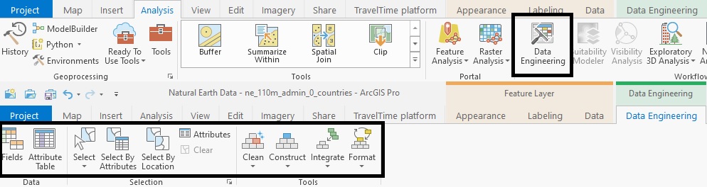
The Data Engineering toolset is available through the ribbon interface under Analysis and by right clicking a layer in the table of contents. When using the ribbon interface, a new window is opened on the lower half of the map window. This so-called Data Engineering view shows a vertical list of all field names. The left part of the window is empty but serves to add fields from the fields panel on the left. We’ll do that in a minute. First, have a look at the different buttons in the Data Engineering menu on the ribbon interface (fig 1). Some of them are familiar, such as the different selection tools, while others are new, such as the Clean, Construct, Integrate and Format tools. We’ll have a look at the Data Engineering view first before diving into the different new tools.
Using the Data Engineering view to calculate statistics and update map symbology To populate the right part of the Data Engineering view panel (which is called the Statistics panel), you can select a single field in the Field panel and use the keyboard shortcut CTRL + A to select all fields at once. Drag these from the left to right field with the mouse and press the Calculate button on the upper right part of the right panel. Pro will then create statistical and data quality metrics for each field from the attribute table (Figure 2). The description for each field can be found here.
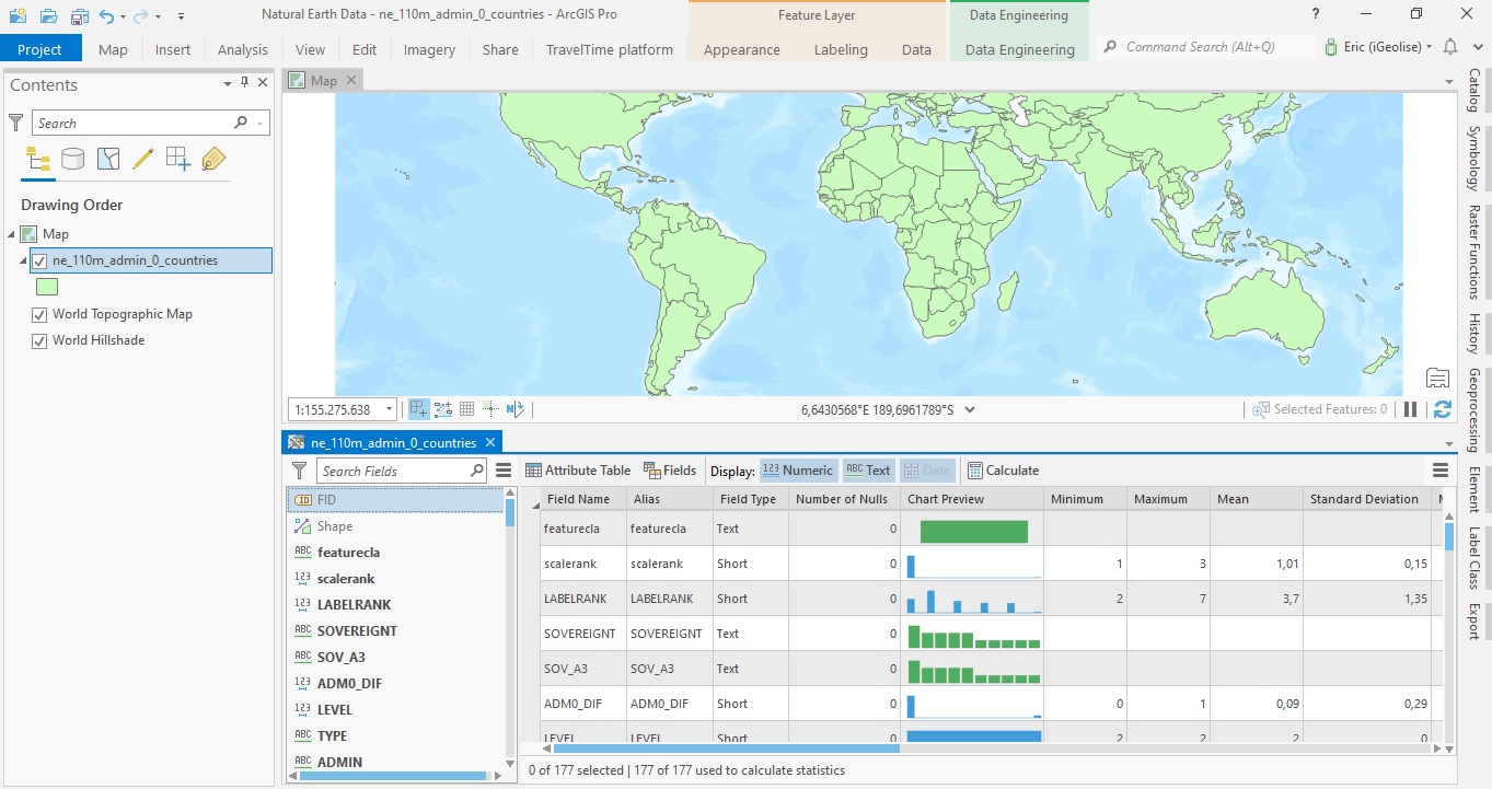
Notice that the list of field names on the left part of the screen corresponds with those in the Field Name column on the right part of the screen. This overview provides some handy selection tools, apart from showing different metrics and statistics in a single overview: as you can see in the image above, the display has Numeric, Text and Data fields toggled on. With one mouse click, you can display text, numeric or date fields only. This is handy for selecting different fields in the Statistics panel, whereas the Field list on the left has its own search tool to select a single field rapidly).
The Number of Nulls field inside the Statistics panel shows you how many null values (empty values) there are for a given column. In the case of missing values, you can right-click and select Fill Missing Values automatically. You can do something similar with the Chart Preview field for numerical values and choose the Transform Field tool to change the distribution to a normal one. However, this modifies your underlying data, so be careful.
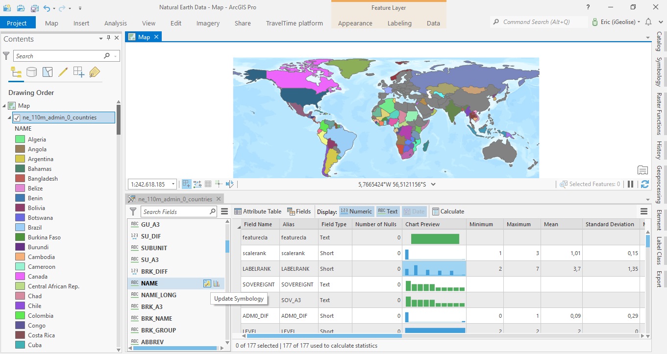
We’ll now use the Update Symbology option in the Field panel on the left: this option will become visible when you hover over a field name of your choice with the mouse, along with a Create Chart tool (see image below). Choosing the update symbology tool for the Name field will update the map symbology and give each country a distinct color, with the corresponding country name being listed automatically in the table of contents:
Using the Encode tool to prepare data for further analysis
We’ll now have a look at the Encode field tool that is found under the Format tools. This serves as a demonstration of how you can use the new Data Engineering tools to format data for further analysis. Before opening the tool, we’ll update the symbology for the Type field just like we did with the Name field, which shows us the different country types. The table of contents shows that there are six different country types and that most countries are either belong to the category “Country” or “Sovereign Country”:
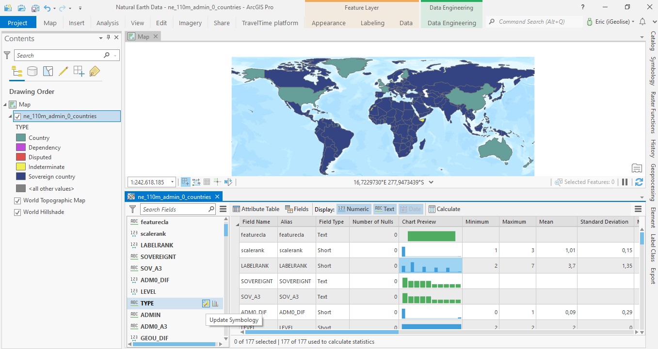
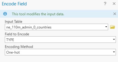
We can conclude from the Field Type column that our field named “Type” is a text field and contains six different possible categorical values (five named categories and one that is called “<all other values>”). Using the Encode Field tool, we can reformat these values so that they become numerical instead of text values. Although this data transformation is not necessary for the purposes of this tutorial, there are instances where such a transformation is required or handy. To change the field values, open the Encode Field tool from the Data Engineering ribbon interface. Choose the TYPE field under Field to Encode and click OK:
Next, click “Attribute Table” in the Statistics panel to open the Attribute Table. Inspecting the values of the TYPE column, you will see that nothing has changed, but that five columns have been added to the far right of the attribute field list (see image below). These correspond to the five country types from TYPE column but contain now either a one or a zero (numerical) value, corresponding to True or False Boolean values. To check if the information from our newly created fields correspond to the information in the TYPE field, we’ll single out the United States polygon feature, which is listed as “Country” under TYPE, which corresponds to a “1” (= True) value in the newly created “OH-Country” field, while the other four fields contain a “0” ( = False) value. This means that the Encode Field tool correctly reformatted the text-based values from one attribute field into multiple new numerical field values.

