

There are two previous articles in this series. Complete the activities in these articles before attempting to work through this tutorial.
- Introduction to GIS Analysis using Sasquatch Sightings
- Spatial Squatch – Using the ArcGIS Pro Spatial Statistics Toolbox to Identify Sighting Patterns
In the first article in this series we identified and downloaded a dataset of Sasquatch sightings, prepared the dataset for analysis, created some basic graduated color maps and summary statistics.
In the second article we took the spatial analysis one step further by using several tools from the Spatial Statistics Tools toolbox. Specifically, we used several tools from the Measuring Geographic Distributions toolset that measured the center point of our dataset as well as the dispersion and direction of the phenomenon. We also learned how to use Average Nearest Neighbor (ANN) tool to measure the presence or absence of clustering in a dataset. Detecting the presence of either clustering or dispersion of the dataset is a pre-requisite to the cluster analysis tools we’ll examine today. Had the ANN tool identified a random spatial pattern in the data it would have been pointless to continue with the cluster analysis tools. However, the ANN tool identified a clustered pattern in Sasquatch sightings for Oregon and Washington.
This article will examine a handful of tools from the Mapping Clusters toolset found in the Spatial Statistics Toolbox including Hot Spot Analysis, Optimized Hot Spot Analysis, and Cluster and Outlier Analysis.
Introduction to the Mapping Clusters Toolset
The Mapping Clusters tools are good for specific situations including pinpointing the location of the clustering, and for when action is needed based on the location of clusters. These tools can be used to visualize the locations of clusters and the geographic extent of the clusters. They help us answer certain types of questions including: Where are the clusters? Where are incidents most dense? Where are the spatial outliers? Which features are most similar or dissimilar?
Hot Spot Analysis (Getis-Ord Gi*) Tool
We’ll start today’s analysis with the Hot Spot Analysis (Getis-Ord Gi*) tool. This tool is fairly complex and requires some explanation but I want you to understand the details of how the hot spot map is created so stick with me for a few paragraphs while I explain it. The Hot Spot Analysis tool examines features and their attributes to identify statistically significant hot spots and cold spots using the Getis-Ord Gi* stats. It provides a visual clustering of high, low and not significant values.
Learn more about Spatial Analysis with ArcGIS Pro in our class Introduction to Spatial Analysis using ArcGIS Pro and R.
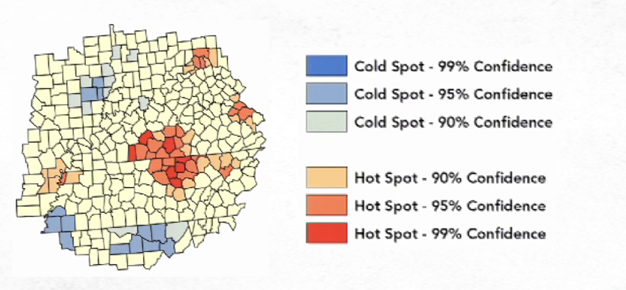
This tool identifies statistically significant spatial clusters of high values (hot spots) and low values (cold spots). It creates an Output Feature Class with a z-score, p-value, and confidence level bin field (Gi_Bin) for each feature in the Input Feature Class.
The z-scores and p-values are measures of statistical significance that tell you whether or not to reject the null hypothesis, feature by feature. In effect, they indicate whether the observed spatial clustering of high or low values is more pronounced than one would expect in a random distribution of those same values. The z-score and p-value fields do not reflect any type of FDR (False Discovery Rate) correction.
The Gi_Bin field identifies statistically significant hot and cold spots. Features in the +/-3 bins reflect statistical significance with a 99 percent confidence level; features in the +/-2 bins reflect a 95 percent confidence level; features in the +/-1 bins reflect a 90 percent confidence level; and the clustering for features in bin 0 is not statistically significant. Without FDR correction, statistical significance is based on the p-value and z-score fields.
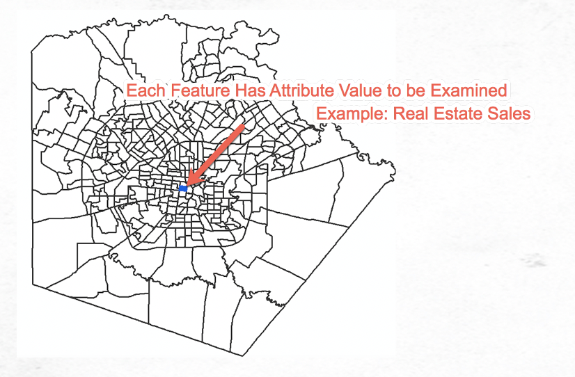
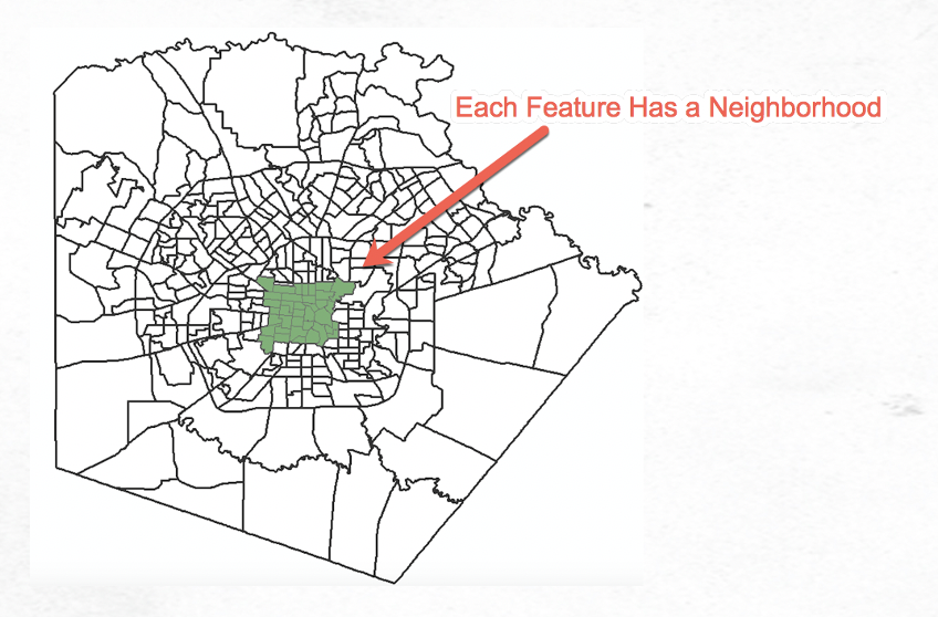
To perform the analysis, a neighborhood is defined for each feature. How a neighborhood is defined is critical to the output of the tool as it is the neighborhood that is examined in relation to the study area for assignment of each feature.
Each feature in the dataset is an attribute value that is being measured in the analysis. A neighborhood is assigned to each feature. This neighborhood is critical to the analysis. You must decide how the neighborhood is to be defined as part of the input parameters of the tool. The neighborhood is defined in the Hot Spot Analysis tool through the Conceptualization of Spatial Relationships parameter. Fixed distance band is the default, but there are currently eight different possibilities. It’s beyond the scope of this article to fully describe all the parameter possibilities for Conceptualization of Spatial Relationships but you can read the details here.
If you don’t have a good idea of what the neighborhood should be then you should consider using the Optimized Hot Spot Analysis tool instead (examined later in this article). We’ll talk about the neighborhood in greater detail in the next few paragraphs.
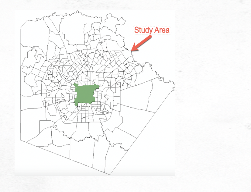
After the neighborhood has been defined it is the neighborhood that is compared to the entire study area. If the neighborhood values are significantly higher than the study area, the feature will be marked as a hot spot. Conversely, if the neighborhood value is significantly lower than the study area, the feature is marked as a cold spot. If neither is the case then the feature is is marked as Not Significant. This process is illustrated in the graphics below, and is repeated for every single feature in the study area to create the hot/cold spot map.
As described earlier, the output defines various confidence levels for each feature including 90, 95, and 99%. This information is stored in the Gi_Bin field for the output feature class. Features can also be marked as not significant meaning that the feature exhibits a random pattern.
With that somewhat lengthy description of the tool out of the way let’s run the Hot Spot Analysis tool against the Sasquatch sightings dataset that we previously joined to counties for Washington and Oregon.
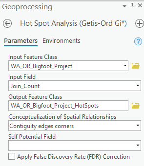
Remember from a previous article that most of the tools in the Spatial Statistics toolbox require the input feature class be projected into a coordinate system that provides accurate distance measurements. Use your ArcGIS Pro skills to project the WA_OR_Bigfoot feature class to a new feature class called WA_OR_Bigfoot_Project defined with the Azimuthal Equidistant projection.
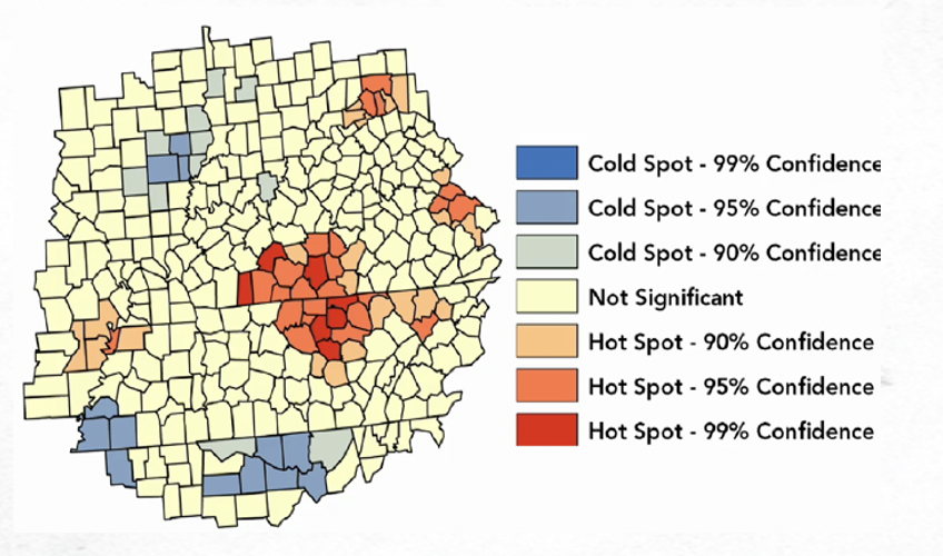
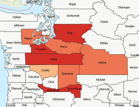
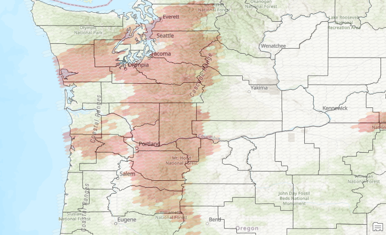
Find the Hot Spot Analysis (Getis-Ord Gi*) tool found in the Mapping Clusters toolset and open it. Enter the input parameters for the Hot Spot Analysis tool as defined below. The Join_Count field contains the number of sightings per county as defined with the Spatial Join tool in the last article, and we’re going to use “Contiguity edges corners” for the Conceptualization of Spatial Relationships. This will define the neighborhood for each county as all other counties that touch an edge or corner of the feature being analyzed. Run the tool.
The output should appear as seen in the screenshot below. Hot spots were identified in the central and southern counties of Washington and some northern counties of Oregon. Cold spots were identified primarily in eastern Washington.
You may want to turn on some county labels for identification purposes.
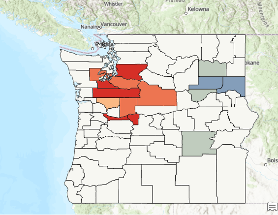
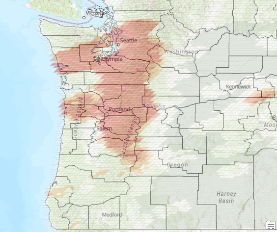
The Conceptualization of Spatial Relationship parameter can have a dramatic impact on the output hot spot map. For example, the hot spot map below was generated using Inverse distance squared for this parameter.
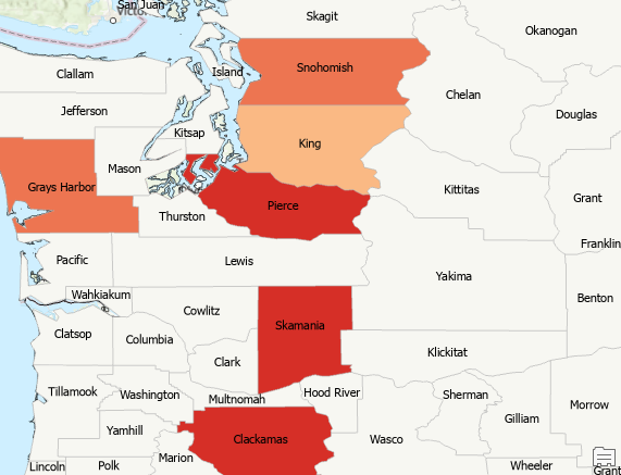
There isn’t necessarily a right or wrong value for this parameter, but quite often some values are better than others for a particular dataset. Ultimately you should answer the question “What is the best way to create a neighborhood for the dataset in question?” Some datasets that you study will be fairly straightforward. For crime data you might want to select a parameter that would result in a fairly limited spatial extent for the neighborhood. The same would apply to a topic like real estate sales. However, if you are studying something like Sasquatch sightings you may not really have a good answer to this question so you might just try different Conceptualization of Spatial Relationship parameters to see the differences.
You can also use the Optimized Hot Spot Analysis tool if you don’t know which parameter to select for Conceptualization of Spatial Relationship.
Optimized Hot Spot Analysis Tool
The Optimized Hot Spot Analysis tool interrogates the input feature data and using characteristics of that data will then automatically define various hot spot parameters. The Hot Spot Analysis tool is then executed using the characteristics derived from the data.
It essentially removes the need to define certain hot spot parameters including the conceptualization of spatial relationship, and others. While this tool requires less input from the analyst, you do give up the ability to define the conceptualization of spatial relationship parameter (neighborhood definition). Instead, this tool automatically uses Fixed Distance Band for the conceptualization of spatial relationship which may or may not be the right choice for your data.
While I don’t particularly like to use the Optimized Hot Spot Analysis tool in most situations due the inability to select a parameter for conceptualization of spatial relationship, this tool does provide the ability to generate hot spot maps from incident data (points). Crime locations are a good example of incident data. With crime data, the location of the crime is very important, but you don’t necessarily have a measurable attribute associated with each crime. This applies well to Sasquatch sightings as well. Let’s see how that works.
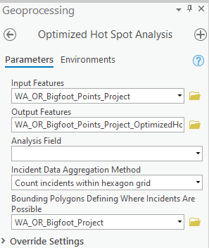
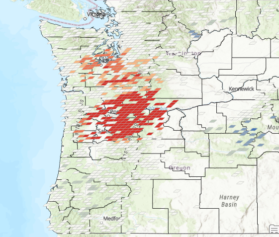
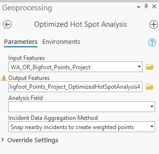
Find and open the Optimized Hot Spot Analysis tool found in the Mapping Clusters toolset. Define the parameters as seen in the screenshot below. We’re using the projected point feature class of sightings from Washington and Oregon that we created in a previous tutorial as the input feature layer. You can leave Analysis Field empty since we are only interested in the individual sightings rather than any value associated with those incidents. Select “Count incidents within hexagon grid” as the Incident Data Aggregation Method. This will create hexagons for the individual features in the output feature class. Define WA_OR_Bigfoot_Project as the bounding polygon layer. We’ll talk more about this parameter later.
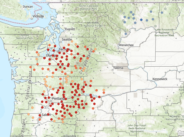
Run the tool and the output feature class should appear as seen in the screenshot below.
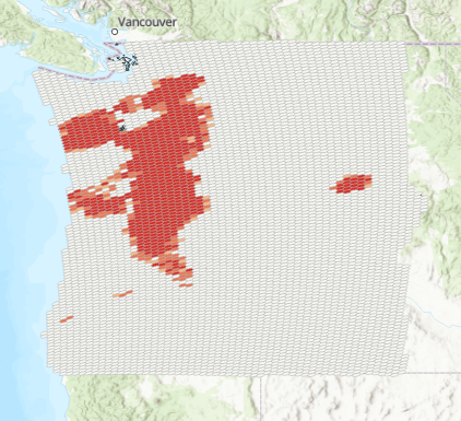
You may want to zoom in and apply a transparency to the layer using the transparency slider on the Feature Layer | Appearance tab. You can see from this view that Sasquatch sighting hotspots roughly follow the Cascade Mountain range with some additional hot spots to the west and a smaller hot spot near Kennewick in central Washington.
You might also use an output feature class with a fishnet grid structure instead of a hexagon as seen below.
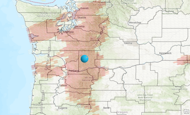
You can also display some of the other datasets we generated in a previous article such as the central feature.
The Bounding Polygons Defining Where Incidents Are Possible parameter needs some explanation. The use of a bounding polygon is helpful for situations where “dead space” might be introduced. Dead space would be an area where no events occurred but where there is the potential for an event to occur. Without the bounding polygon, an area might simply be marked as null as seen below.
One other unique way of rendering points locations with the Optimized Hot Spot Analysis Tool is to use the “Snap nearby incidents to create weighted polygons” option for the Incident Data Aggregation Method. This is illustrated below.
Learn more about Spatial Analysis with ArcGIS Pro in our class Introduction to Spatial Analysis using ArcGIS Pro and R.
Outlier and Cluster Analysis Tool
The final tool we’ll examine is the Cluster and Outlier Analysis tool. This tool, in addition to performing hot spot analysis, identifies outliers in your data. Outliers are extremely relevant to many types of analysis. The tool starts by separating features and neighborhoods from the study area. Each feature is examined against every other feature to see if it is significantly different from the other features. Likewise, each neighborhood is examined in relationship to all other neighborhoods to see if it is statistically different than other neighborhoods.
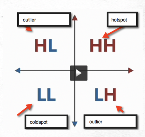
The result of the Cluster and Outlier Analysis tool is data that is divided into quadrants. In the upper right hand corner of the quadrant are High-High values. In this case, the feature and the neighborhood are both high in relation to their counterparts. These features are marked as hot spots.
In the lower left quadrant are Low-Low values. In this case, features and neighborhoods are both low in relation to their counterparts. These are the cold spots.
In the upper left hand corner is the High-Low quadrant. These are outlier features where the features are high in relation to other features and the neighborhoods are low in relation to other neighborhoods. If we use the example of Sasquatch sighting activity, features in this quadrant would indicate a high level of sighting activity surrounded by neighborhoods of low sighting activity.
Finally, in the lower right hand corner of the quadrant is the Low-High group. Back to our Sasquatch sighting example this would indicate areas of low sighting activity surrounded by neighborhoods of high sighting activity.
The Cluster and Outlier Analysis tool should be run anytime you run Hot Spot Analysis. Outliers can be extremely important when examining many types of problems. If you were examining crime activity this tool would enable us to find areas with high crime activity that are surrounded by areas of low crime activity and vice versa. It attempts to find values that are different from their neighbors and is an underutilized tool.
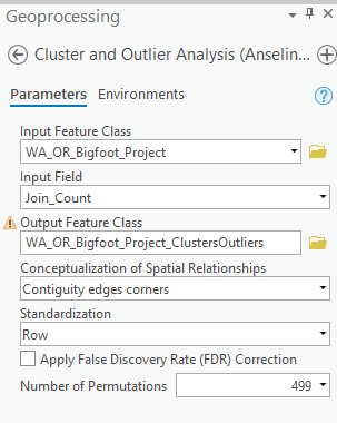
Find the Cluster and Outlier Analysis tool in the Mapping Cluster toolset and open it. Fill in the parameter as seen below. Run the tool.
The output should appear as seen below.
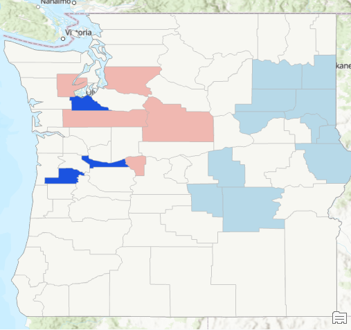
How do you interpret this? The counties in dark blue are in the LH quadrant (outliers), which means that the county has a low level of sightings but the surrounding neighborhood has a high level of sightings. The counties symbolized in a light blue color are the cold spots (LL). Counties symbolized in light pink are part of the HH quadrant indicating hot spots for both the county and the neighborhood. No features fell into the HL quadrant (outliers), but if they had it would define those counties as high sighting activity with neighborhood sighting activity that is low.
Next week we’ll start taking a look at some R programming tools that can be used to analyze Sasquatch sightings.
