In this tutorial, you will learn how to create a heat map in ArcGIS Pro. This heat map will display the distribution of individual points that represent populated areas in the US. Using population values as a weight field, we can visualize the highest populated areas in the US as well.
You can use Pro to produce heat maps, that show the density of many points that are close together. Using heat map symbology, point features are drawn as a dynamic, representative surface of relative density. In this tutorial, we will use heat map symbology to displays the relative density of a large set of points as a dynamic raster visualization using a color scheme to indicate density values. More specifically, we’ll use a dataset of points that show populated areas in the US. Next, we will use individual population values from the point attribute table to display the highest populated areas in the US.
STEP 1: Load the data
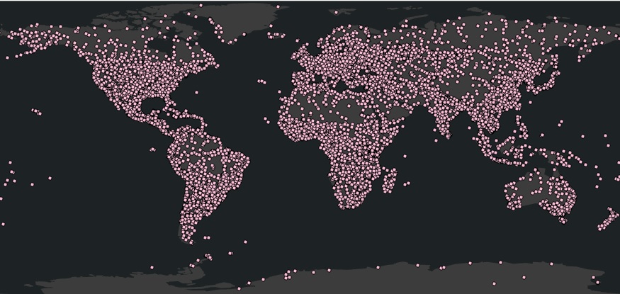
Download the Natural Earth quick start kit (227 mb), unzip the files on your hard drive and create a new, empty project in ArcGIS Pro. For this tutorial, I use a different base map than is the default in Pro. For better visual results using a dark background map, set the Dark Gray Canvas from the ribbon by selecting Map and then Base Map. Next, use the Catalog window to establish a new folder collection and drag the ne_10m_populated_places.shp file from the 10M_cultural folder to the map window. You should see a point layer with many points over the entire globe:
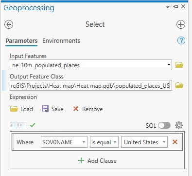
STEP 2: Select all populated places in the US We only need the populated places in the US, not those for the entire planet. We can select these point features by using the country information from the point layer’s attribute file. The country name is found in the shapefile’s attribute table in the SOV0NAME field, so we can create a query selecting only the features that meet this condition. This is done as follows: click “Analysis” on the ribbon interface, and then “Tools”. Next, click “Analysis Tools” to unfold the tools inside it and click “Extract” so see all Extract tools. Next, select the “Select” tool inside it. Use the image below to add a new SQL Clause with the correct parameters. Next, click “Run” in the bottom right of the tool window.
A new feature class is added to the map window after running the tool. De-select the input layer with all populated places in the world to see the output of the Select showing only the populated places in the US.
STEP 3: Creating the heat map
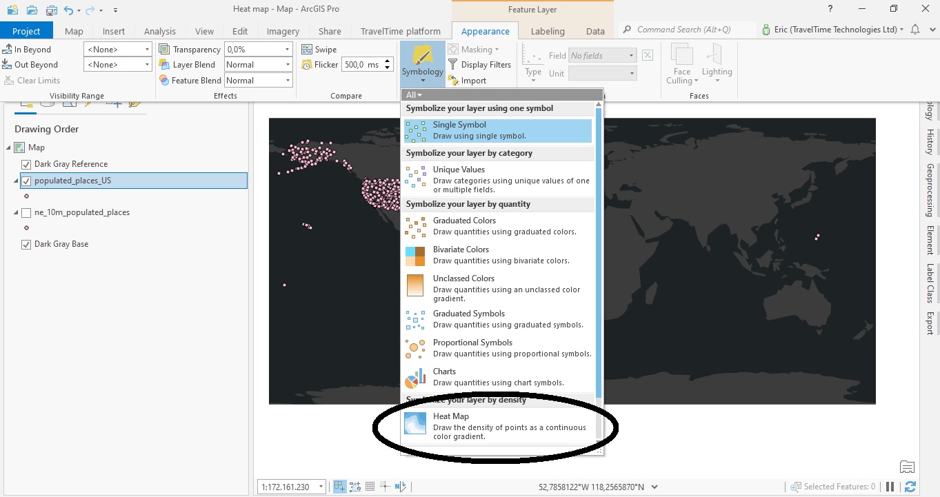
We will now create the heat map using the output feature class created in Step 2. This is done through the ribbon interface, by selecting “Appearance” under “Feature Layer” and clicking “Symbology”. The Heat Map option is encircled in the image below:
If you click on the “Heat Map” button, Pro will create a heat map and open the symbology tab, which you can modify (see image below). We’ll now look at the results and map symbology options to change the heat map.
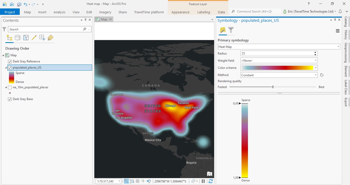
The map above shows densely populated areas for Chicago and New York and the West Coast, but shows the entire country as one single area, which makes it impossible to distinguish individual urban areas. So this map needs some improvement, which we will do next.
If you zoom in and out of this map with your mouse wheel, you’ll notice that the map symbology will change: zooming in, you’ll see more blue (sparse), zooming out shows more yellow (density). This is to be expected: the rendering method used here is “Constant”, which means that the density definition remains constant to compare different areas at the same scale. Using “Dynamic” as rendering mode of choice, the density definition is recalculated dynamically as you change scale and extent. Using this method, you will keep seeing denser red urban areas, whereas these turn blue when using “Constant”. If you read the ArcGIS Pro documentation, you will learn that the Dynamic method is useful to view the distribution of data in a particular area, but is not valid for comparing different areas across a map.
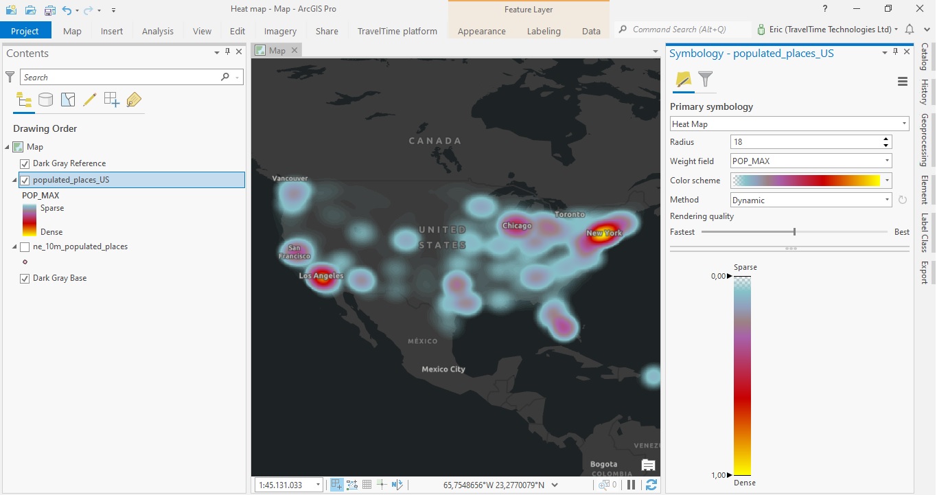
Using a Weight Field
The map below uses the POPMAX field as a Weight Field, in order to show the urban areas with the highest population values in the US more clearly. This field from the attribute table contains population values for the individual populated places. The radius is set to 18 instead of 25 to visualize the individual urban areas better. I used the “Dynamic” rendering mode instead of “Constant”, which makes no visual difference when using the same scale (so without zooming in or out).
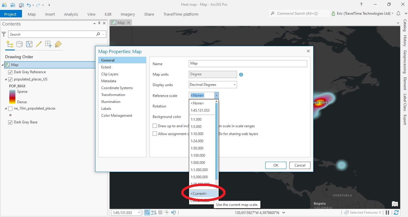
STEP 4 (Optional): Creating a static heat map
You can also create a static heat map that does not recalculate at all, regardless of scale or extent. To do this, click the Map icon in the Table of Contents (under Drawing Order) and select Properties and next General, then under Reference Scale select “Current” and click “OK”. See the image below: