
The following tutorial uses multiple spatial analysis tools to be able to compare population counts for the four different regions in the US.
When doing spatial analysis, you often must combine multiple tools to be able to find a solution to a specific problem. This tutorial shows how you can combine familiar and new tools in ArcGIS Pro to be able to compare population counts for the four different regions in the US. To follow along, please download the Natural Earth quick start kit, open a new and empty project in ArcGIS Pro and create a folder connection to the folder containing the data through the Catalog pane.
Specifically, we’ll be using the following tools:
- Intersect tool (found under Analysis Tools)
- Spatial join tool (found under Analysis Tools)
- Update Symbology tool (found under Data Engineering)
- Bar Chart tool
STEP 1: load the data
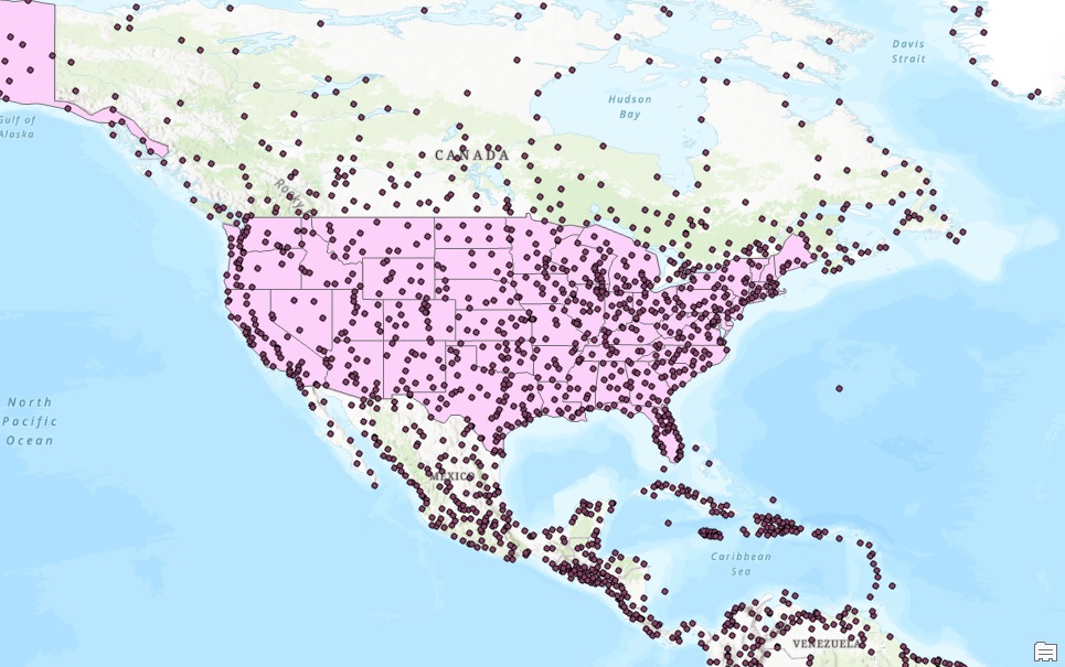
We’ll start off with loading a point features layer that shows all populated places on Earth as point features. The name of this file is ne_10m_populated_places.shp and is found in the 10m_cultural folder. Add this layer to map, along with the ne_110m_admin_1_states_provinces.shp file found in the 110m_cultural subfolder. If you zoom into the US, you will see the point and polygon data on the map:
STEP 2: select only the populated places in the US
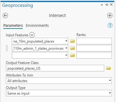
The second file that was added to the map shows all US states as polygon features. This last file is needed to select only the populated places found within the US. To do this, search for the Intersect tool (under Data Management tools), use the settings displayed below and click “Run”. The output shows only a new output feature class with only the point features of all US cities instead of the entire planet.
STEP 3: Performing a spatial join to list cities by US region
We now have two different feature layers that need to be combined to answer our main question: what are the population counts per US region? The first piece of information is stored in the new point features layer created in Step 2: the attribute table has a field names POP_MAX that shows population estimates for all point features (populated places). The second piece of information is stored in the ne_110m_admin_1_states_provinces feature layer: the “region” field in the attribute table displays which state belongs to which of the four US regions.
To be able to combine these two pieces of information, we can use a Spatial Join, as both our point and polygon features have a spatial relation: all points are located into a specific US state. The Spatial Join will join the information from the polygons to the individual points, so that we can see in which region each city (populated place) is located. Once we have that information available, we can list and compare the population counts for each region.
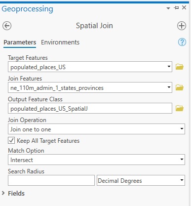
To perform the spatial join, search for the geoprocessing tool under Analysis on the ribbon interface and click “Tools”. Use the following parameters and click “Run”:
A new feature class is added to the map. The main interest is its attribute table. Select the new output feature class named populated_places_US_SpatialJ in the table of contents, right-click and select “Data Engineering”. We are interested in the Region field, which has been specified for each of the 743 cities in the US by using the Spatial Join tool. In the “Search Fields” field found on the left of the Data Engineering window, type in “region” and hit enter. Next, click the Update Symbology option (the number “1” in the image below) to update the map symbology and the table of contents, using different colors for each city based on their region. Next, drag the “region” field from the field list to the empty statistics field to the right (the number “2” in the image below). Next, click “Calculate” (see the number “3” in the image below). You should see the following results:
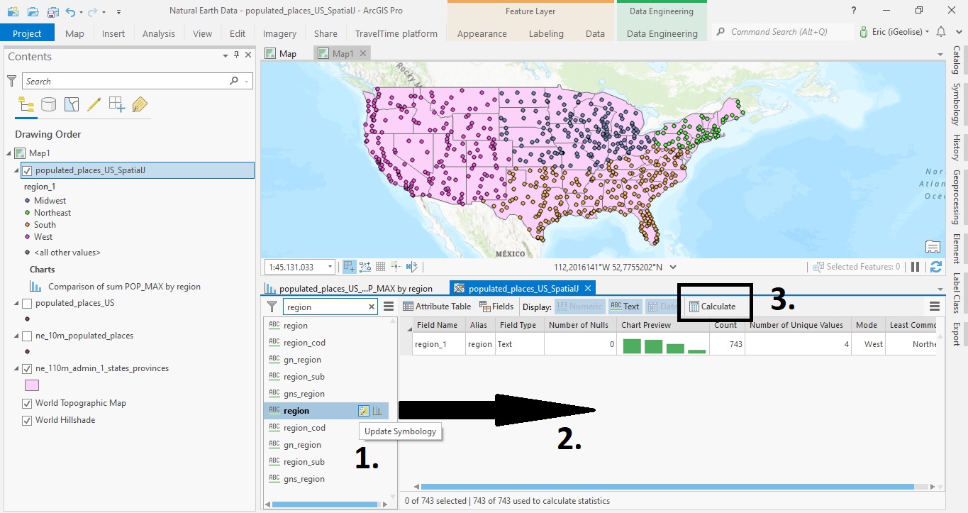
The Chart Preview field with the four green bars shows the distribution of the different region values. There are four different unique values. We’ll now create a similar bar chart, but now for the population counts per region.
STEP 4: Create a bar chart with population counts per region
Next, right-click the populated_places_US_SpatialJ in the table of contents and select “Create Chart” and choose “Bar Chart”. Use the following parameters:
*Category or Date: region
Aggregation: SUM
*Numeric Field(s): Click the +select button, mark the POP_MAX field and click “Apply”.
Under Sort, click “Y-axis Descending” to see the region with the highest population counts as the first bar on the left. You should see the following bar chart:
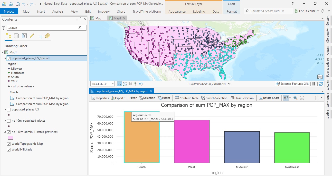
As you can see, the southern region has the highest population counts, followed by the western region. The largest US cities, New York and LA, are found in these two regions so the outcome is as expected. As displayed above, when you hover over on of the four bars, it will display a pop-up with the exact population count. The map and bar chart are interactive: if you click on one of the four bars, the corresponding region will be selected on the map (in this case, I’ve selected the southern region by clicking the South bar on the far left).
