
Many of our readers regularly work with U.S. Census data for mapping and analysis purposes. Whether you work with these datasets every day or just every now and then to create a map or graph you’ve no doubt discovered how difficult it can be to decipher census table names, find the data you need, download the data, and then create maps or perform analysis. The tidycensus R package makes this workflow much easier.
There is a bit of learning curve when it comes to getting up to speed with the R programming language, but it’s well worth the investment. If you’re already a Python programmer the learning curve is greatly simplified since there are a lot of similarities between the two languages. In this post we’ll examine how easy it is to create a variety of visualizations related to Denver area home values using R with the tidycensus package.
Visualizing Home Values Over Time
For this example we’re going to visualize median home values in a variety of counties in the Denver area including: Adams, Arapahoe, Denver, Douglas, and Jefferson from 2005 through 2019. Broomfield County was excluded since it is not included in the ACS1 dataset for the entire data range. ACS1 requires a minimum population of 65,000 for a geography to be included. Broomfield has surpassed that population in recent years, but not for the entire date range.
The code you see below pulls median home values from 2005 through 2019 (2020 data is not currently available for the 1-year ACS data). I’m not going to go into a lot of detail on the specifics of the code in this post but will instead focus on the capabilities of R, tidycensus, and tidyverse. If you want to learn more about the basics of R for data exploration, visualization, and mapping please see our Introduction to R for Data Visualization and Exploration class.
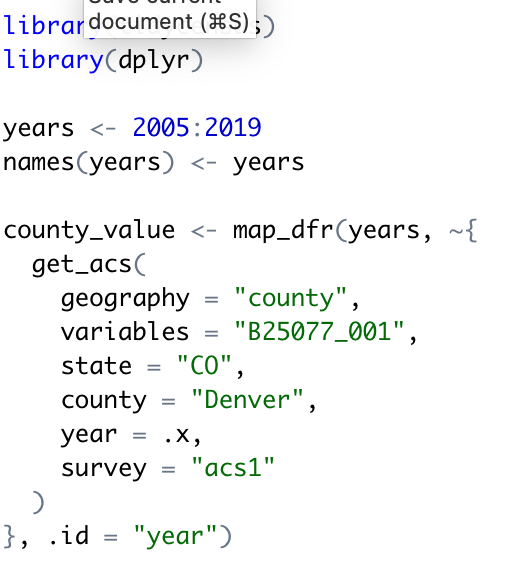
This code block uses the get_acs() tidycensus function in conjunction with the map_dfr() tidyverse (purrr) function to loop through a vector of years (2005-2019). This will create a time-series dataset of median home values in Denver County since 2005. The same process is run for the other counties included.
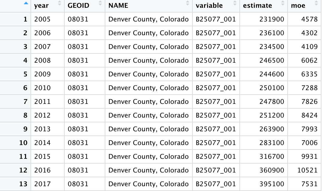
The resulting data frame can be seen below. Notice that you have one row per year and that each year include an estimate, which is the estimated median home value for that year, along with an moe column. This is the measure of error. ACS data is statistically calculated unlike ten year decennial census so there is some error associated with the estimates.
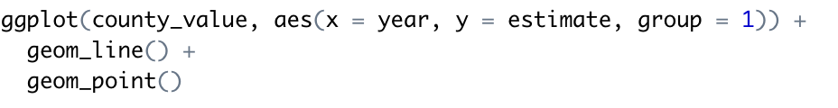
Next, we’ll visualize the data with a line chart using the ggplot2 tidyverse library using the code you see below. county_value is specified as the input data, with year mapped to the x-axis and estimate mapped to the y-axis. The argument group = 1 is used to help ggplot2 understand how to connect the yearly data points with lines given that only one county is being visualized. geom_line() then draws the lines, and we layer points on top of the lines as well to highlight the actual ACS estimates.
This produces the following chart.
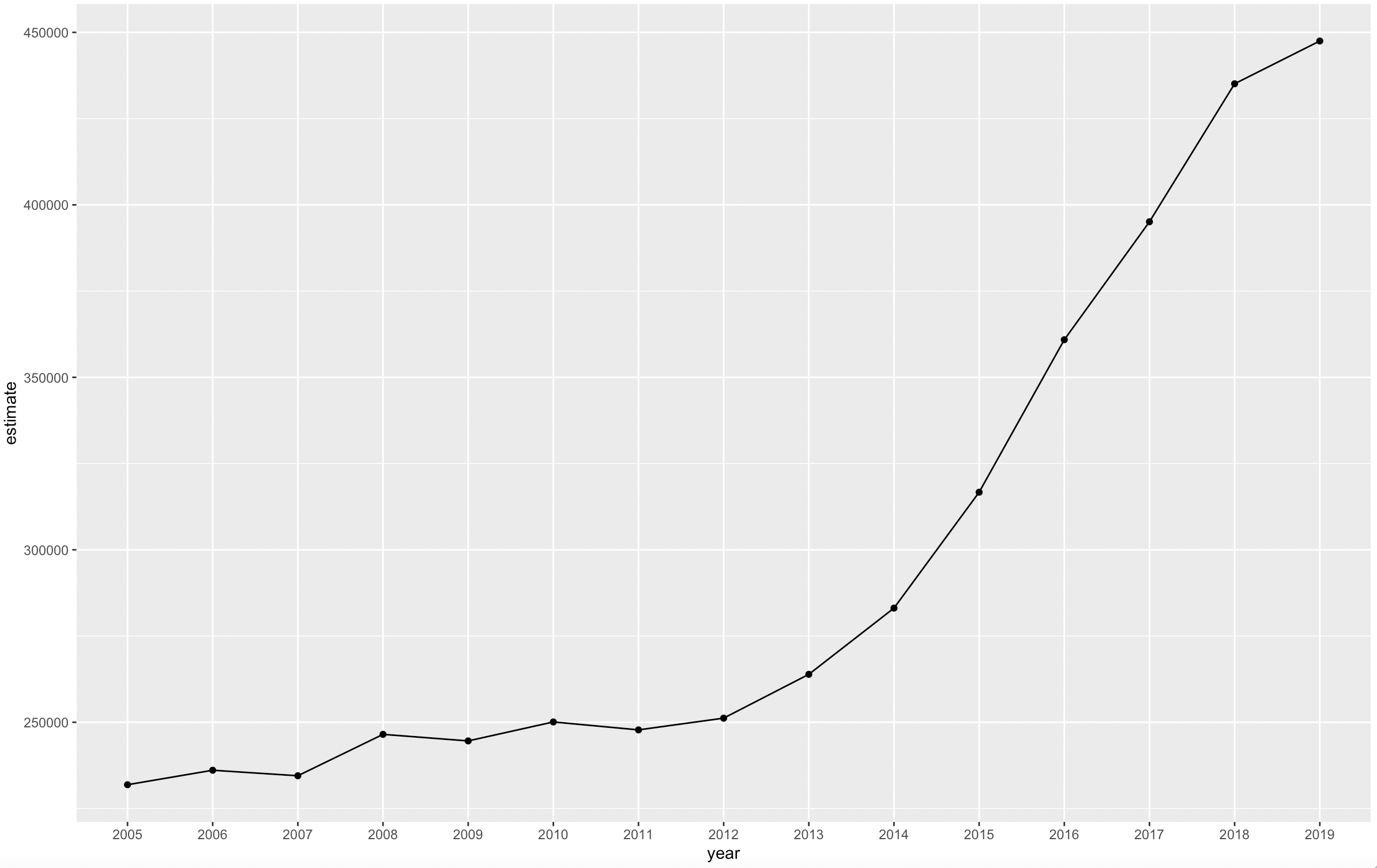
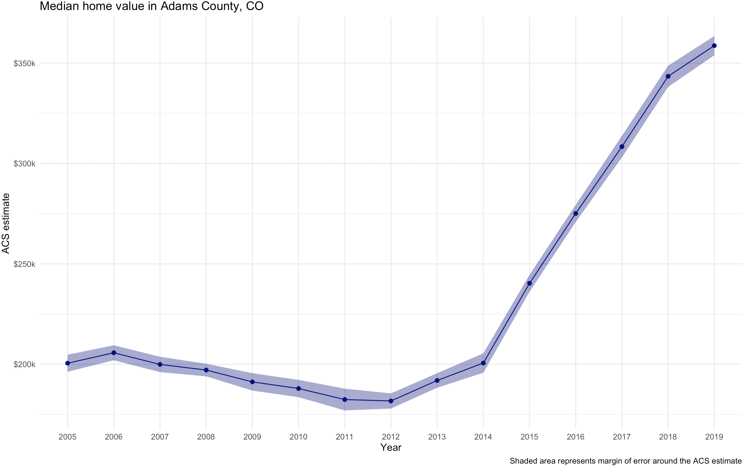
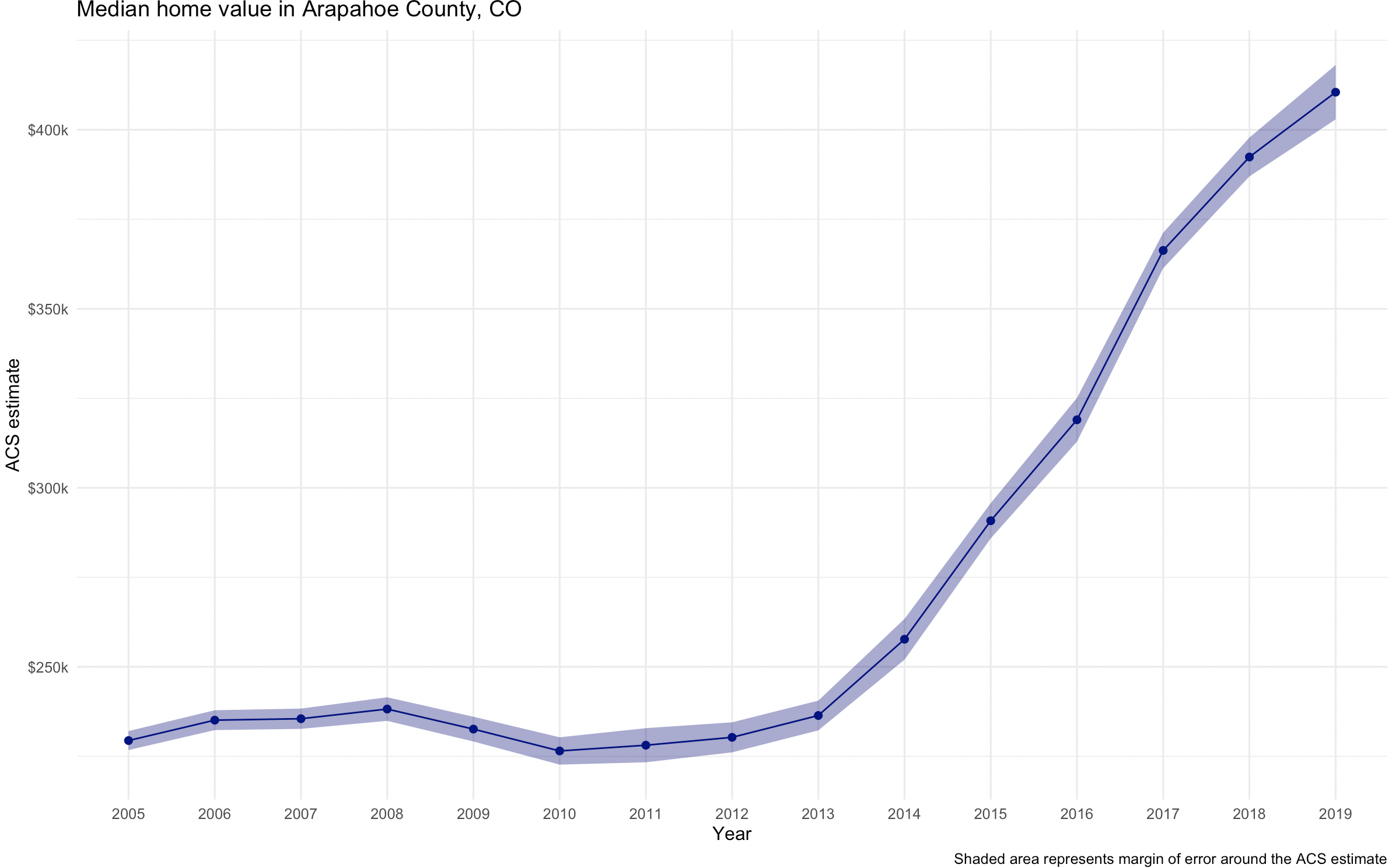
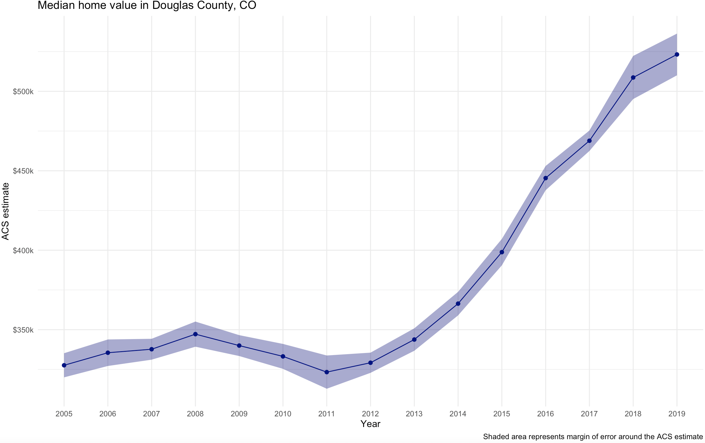
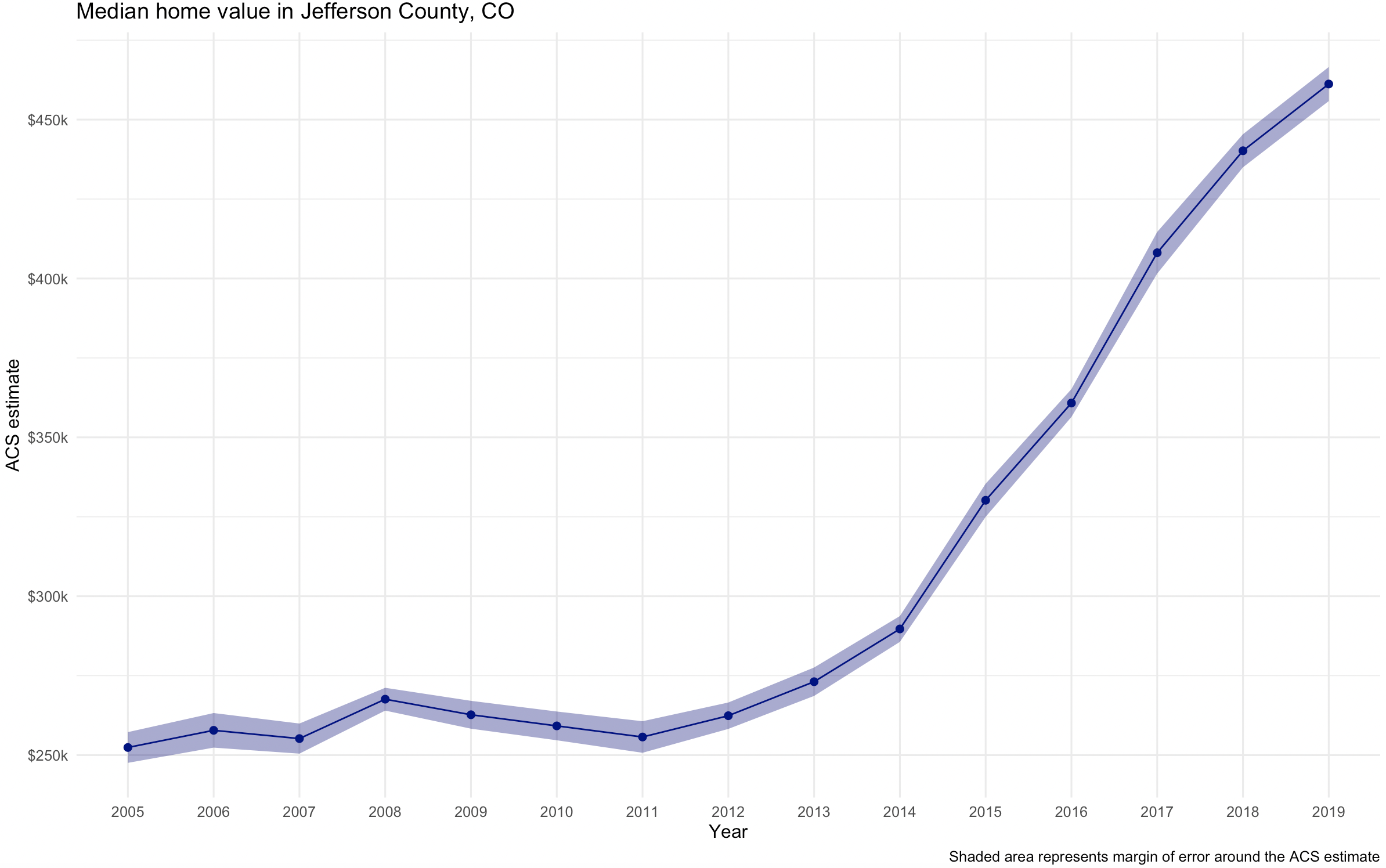
The chart shows gradually rising home values prior to the 2008 recession; a notable leveling after the housing market crash; and rising values since 2011.
We can also build the margin of error information into the line chart. We’ll use the ggplot2 function geom_ribbon() to draw the margin of error interval around the line, helping represent uncertainty in the ACS estimates. I’ve also cleaned up the chart and added a title and caption.
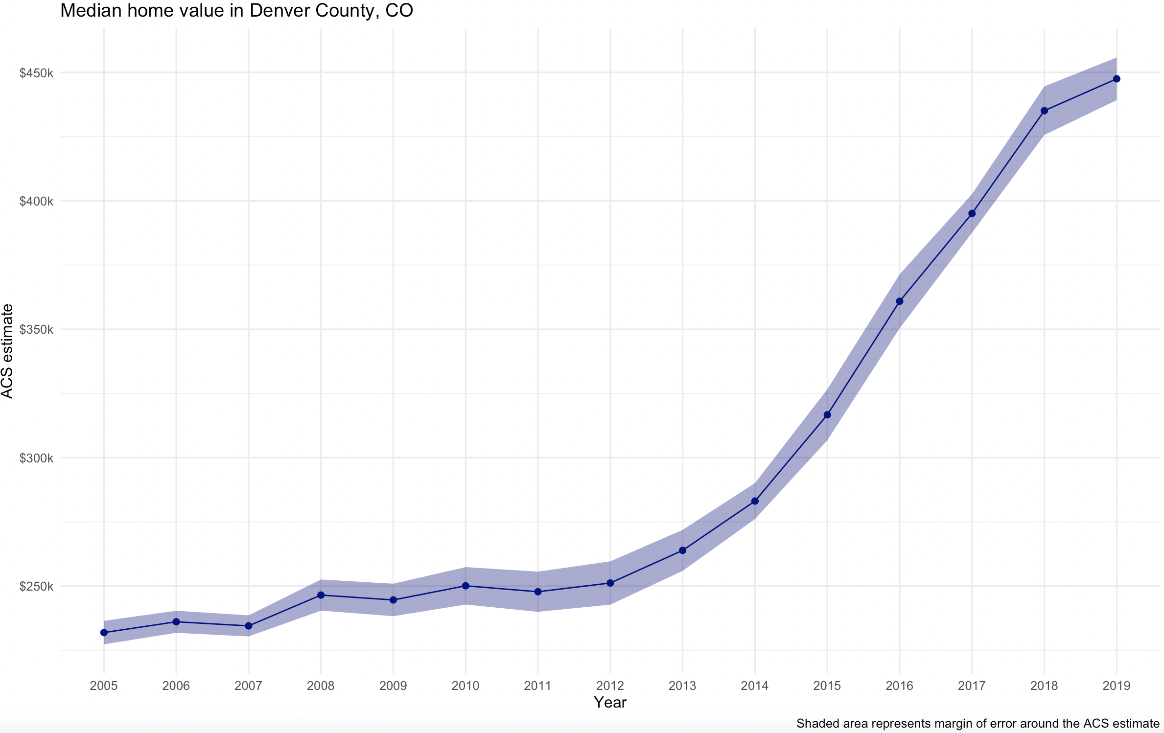
Here are the final charts for the other counties.
Visualizing Group-Wise Comparisons
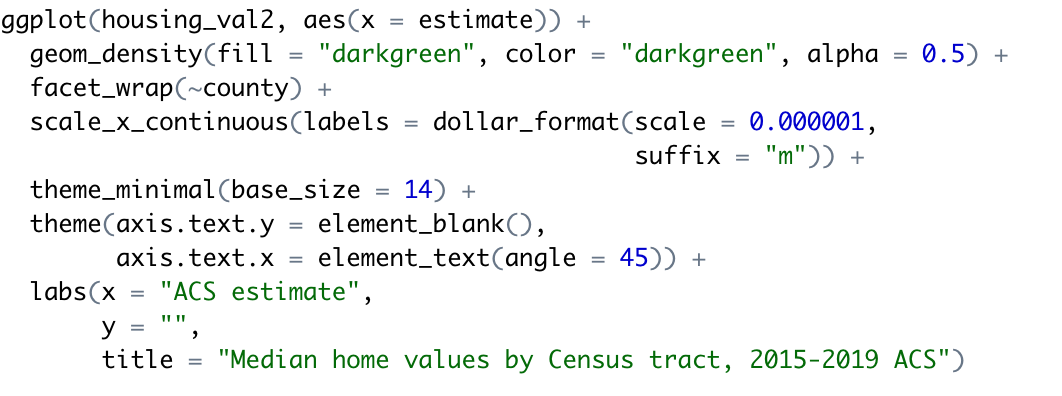
One of the most powerful features of ggplot2 is its ability to generate faceted plots, which are also commonly referred to as small multiples. Faceted plots allow for the sub-division of a dataset into groups, which are then plotted side-by-side to facilitate comparisons between those groups. This is particularly useful when examining how distributions of values vary across different geographies. Our next example, shown below, compares median home values by Census tract for the counties in the Denver, CO area. For this graph we’re using ACS5 data so we are able to include Broomfield as well.
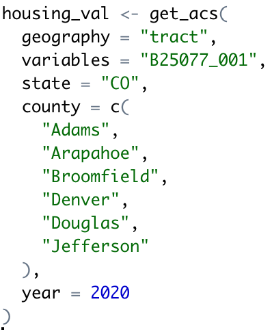
The first block of code below pulls the ACS-5 median home value data for 2020.
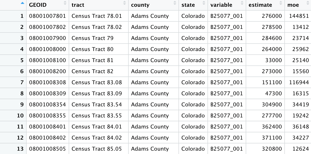
This produces a data frame containing all census tracts for these counties in the year 2020.
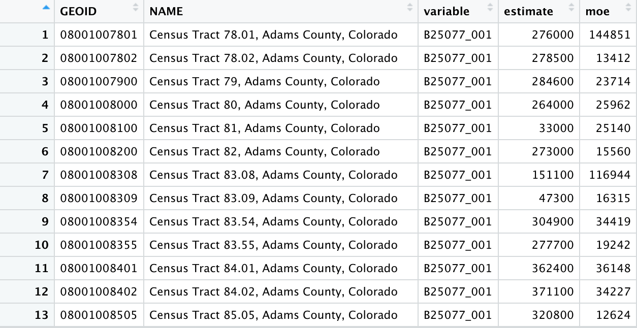
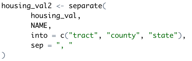
As with other datasets obtained with tidycensus, the NAME column contains descriptive information that can be parsed to make comparisons. In this case, Census tract ID, county, and state are separated with commas; in turn the tidyverse separate() function can split this column into three columns accordingly. This code and the result are displayed below.
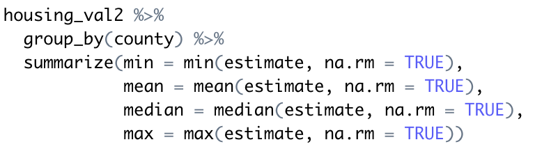
A major strength of the tidyverse is its ability to perform group-wise data analysis. The dimensions of median home values by Census tract in each of the eight counties can be explored in this way. For example, a call to group_by() followed by summarize() facilitates the calculation of county minimums, means, medians, and maximums. You can see this below.
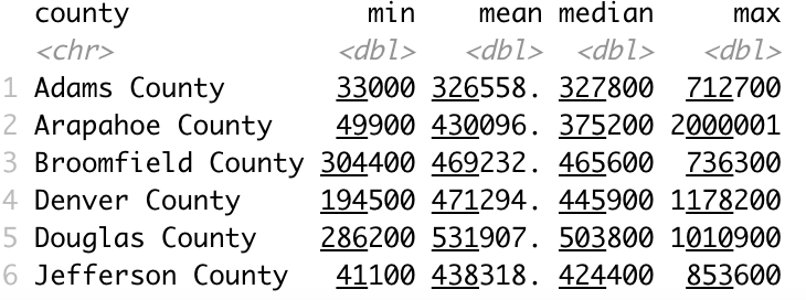
While these basic summary statistics offer some insights into comparisons between the three counties, they are limited in their ability to help us understand the dynamics of the overall distribution of values. This task can in turn be augmented through visualization, which allows for quick visual comparison of these distributions.
The facet_wrap() function, specifying county as the column used to group the data, splits this visualization into side-by-side graphics based on the counties to which each Census tract belongs. The resulting side-by-side comparative graphics show how the value distributions vary between the counties.
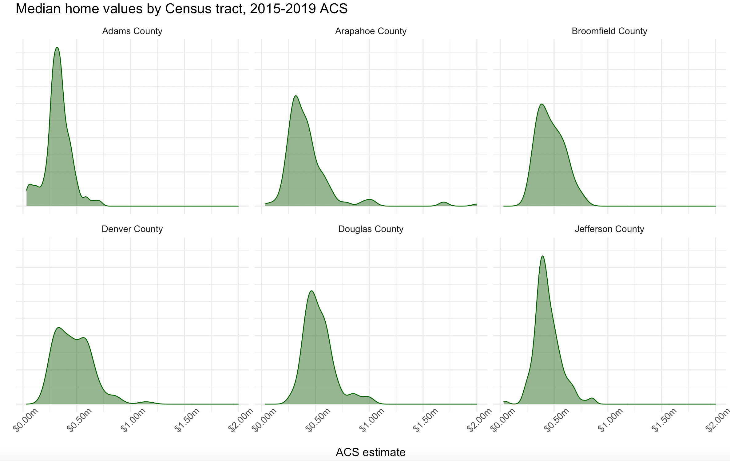
The ggridges package is a ggplot2 extension, and adapts the concept of the faceted density plot to generate ridgeline plots, in which the densities overlap one another. The example below creates a ridgeline plot using the San Antonio-area home value data; geom_density_ridges() generates the ridgelines, and theme_ridges() styles the plot in an appropriate manner.

The overlapping density “ridges” offer both a pleasing aesthetic but also a practical way to compare the different data distributions. As ggridges extends ggplot2, analysts can style the different chart components to their liking using the methods introduced earlier in this chapter.
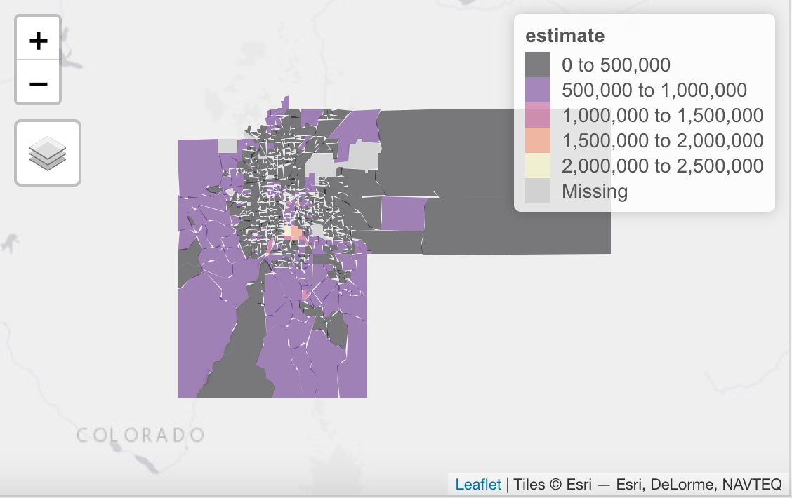
Mapping the Census Data
Finally, let’s map the median home values by census tract using the tmap package.
This produces the interactive map you see below.
As you’ve seen in this article, R with the tidycensus, tidyverse, and several other supporting packages make it easy to visualize US Census data.
If you’d like to learn more about R and how it can be used for data visualization and exploration please consider our Introduction to R for Data Visualization and Exploration class. We offer this class live-online several times each year or you can take it online as a self-paced class. We can also teach the class in-person as well.
