One of the most difficult tasks for many web developers building GIS applications is designing and creating the user interface. The ArcGIS Server API for JavaScript and Dojo greatly simplifies this task. Dojo’s layout dijits provide a simple, efficient way to create application layouts and ESRI has provided a number of sample application layouts that you can use to get up and running quickly. The AGIS JavaScript API also provides Draw, Edit, and Navigation toolbars that you can use to quickly embed commonly used tools in your application. In this post we’ll examine how you can quickly build your application layout using these tools.
BorderContainer Dijit
Since the AGIS API for JavaScript is built directly on top of Dojo you automatically have access to the user interface libraries including layout dijits such as BorderContainer. BorderContainer serves primarily as a container for other child containers and can be one of two design types: headline or sidebar. You define the design type using the ‘design’ attribute as seen in the code examples below. In either case, whether you define a design type of headline or sidebar is split into as many as 5 different regions: top, bottom, right, left, and center. Each region is normally filled by a Dojo layout element.
Note: Not every region has to be filled by a layout element.
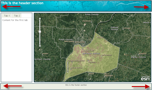
In the first code example, we are defining the design to be of type ‘headline’ which results in the general configuration that you see below with the ‘top’ and ‘bottom’ regions stretching across the entire width of the screen space. In this case you only need to set the ‘height’ property for the top and bottom regions.
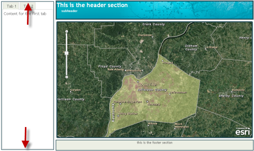
In the second code example we define the design as ‘sidebar’. With the sidebar design the left and right regions expand to take up 100% of the height of the window, sacrificing the area available to the top and bottom regions. In this case you only need to define the width style property since the height will always be 100%.
In either case the center region will conform to fit the amount of space available based on the sizing of the other regions.
Child Elements of BorderContainer
Each region of a BorderContainer (top, bottom, left, right, center) can be filled by a Dojo layout element. These elements are AccordionContainer, ContentPane, SplitContainer, StackContainer, and TabContainer. You can also created nested BorderContainers to further divide the available layout space.
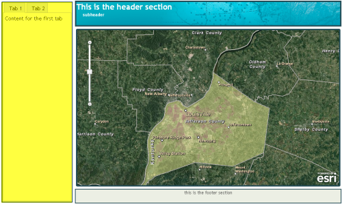
Child elements are placed inside a region through the use of the ‘region’ attribute as seen below. Notice in the yellow highlighted section that the ‘region’ attribute is set to ‘left’. This will create a ContentPane in the left region. A ContentPane is a very basic layout element and is used as a container for other widgets. In this case it is going to hold a TabContainer (green highlighted code).
The other child layout elements that can be placed inside a BorderContainer include AccordionContainer, SplitContainer, and StackContainer.
AccordionContainers hold a set of panes whose titles are visible, but only one pane’s content is visible at a time. As the user clicks a title, the pane contents become visible. These are excellent user interface containers that can hold a lot of information in a small area.
StackContainers resemble books where only a single pane of information is available at a time. Users can page through various panes of information.
Finally, a SplitContainer is a container that contains multiple children. All the children are displayed side by side either horizontally or vertically with a bar in between. The bars can be dragged to change the relative size of the child areas.
There are a number of other design considerations which you should take into account. ESRI has done a great job of defining those here near the bottom of the page.
Sample Layouts from ESRI
ESRI has provided a number of sample layouts that you can use to get started in the layout of your application. Go to the ArcGIS API for JavaScript Samples and click Layouts on the left hand side to see the available layouts. If you see one you like you can easily copy and paste the code into your application files to get started. Spend some time getting to know the various options provided by BorderContainer and its child layout elements.
Toolbars
ESRI also provides toolbar helper classes that enable you to easily add in navigation, drawing, or editing functionality. These toolbars aren’t user interface components that you simply drop into your application, but are instead helper classes that make creating the toolbars a snap to create and add to your interface. For now we’ll just take a look at adding a navigation toolbar to your application. There are several steps to adding the toolbar, but all are quite simple.
First you’ll want to add in the references that you’ll need to implement this functionality.
You need a reference to the navigation toolbar along with a reference to dijit.Toolbar and dijit.form.Button. Each of the tools in the toolbar is actually a Dojo Dijit Button that is contained within a Dojo Dijit Toolbar.
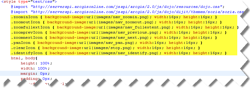
Next we’ll define the icons that will be used for each of our buttons. This can be done through CSS styling as seen below. Here we are defining the images to be used along with their width and height.
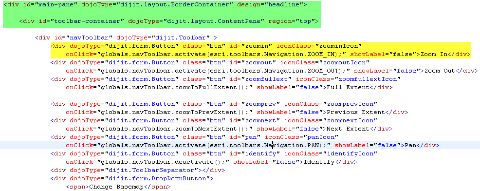
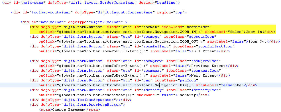
Finally, we create the toolbar through the use of dijit.Toolbar which is defined inside a ContentPane in the ‘top’ region of our BorderContainer. You can see this in the code below. In the yellow highlighted code we are creating an instance of dijit.Toolbar called ‘navToolbar’. This new toolbar is located inside a ContentPane called ‘toolbar-container’ which is a child layout element of BorderContainer. This code is highlighted in green.
Inside our toolbar (‘navToolbar’) we create a series of dijit.form.Button objects that correspond to the type of function that should be performed by that tool. I’ve highlighted one example of this in the code below. This is the Zoom In tool that a user can click and then drag a rectangle on the map to zoom to a new extent. This tool is defined as type dijit.form.Button. The ‘onClick’ event is particularly important here because it references back to the esri.toolbars.navigation reference that we defined earlier. This actually defines what type of functionality should be provided by this button. In this case, esri.toolbars.Navigation.ZOOM_IN. The ‘iconClass’ attribute is used to reference back to the style we created earlier which contains the icon that will be used for the button.
So, all of that results in a toolbar.
It’s really quite simple. You no longer have to worry about writing basic navigation code such as creating the rectangular zoom box, zooming to the extent defined by the user, and other basic navigation functionality that most web mapping applications need. The AGIS JavaScript API handles all that. You just need to worry about hooking everything up.
