

For the success and credibility of your map applications, it is important to provide users with a single URL. This universal URL should take a user to your application and provide them with an ideal layout regardless of their screen’s size. Today’s technology is awesomely aware of the prevalence of small screen sizes. Which also means new technology incorporates mobile responsive design. This is one of the reasons ESRI is moving away from old tech and into new tech, like Experience Builder. A great benefit of this transition is that you can configure Experience Builder mobile views based on many screen sizes. Now you can give your users one beautiful URL that does it all!
What exactly is a Mobile View?
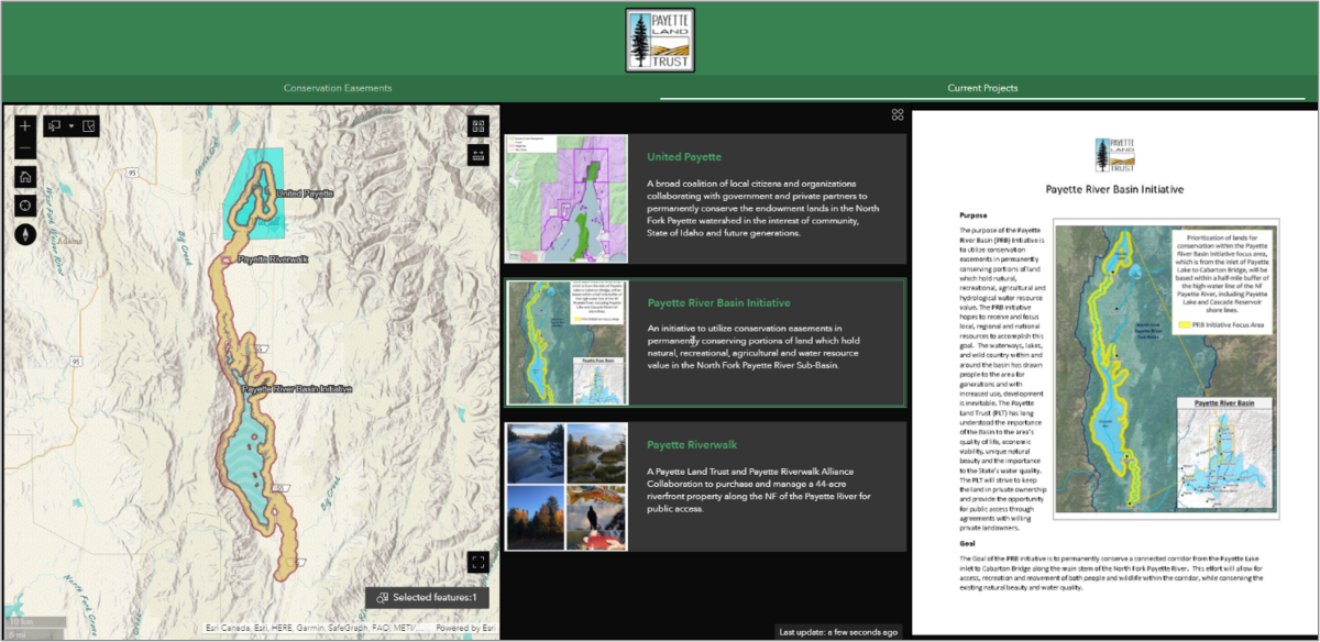
Simply put, a mobile view in Experience Builder is a separate configuration based on a different screen size. Most applications are originally created for a desktop computer screen. The image below displays a desktop view configuration. With over a third of United States internet users preferring to use mobile phones, we need to ensure that our applications will make sense on small screens. This is why mobile responsive design is important.
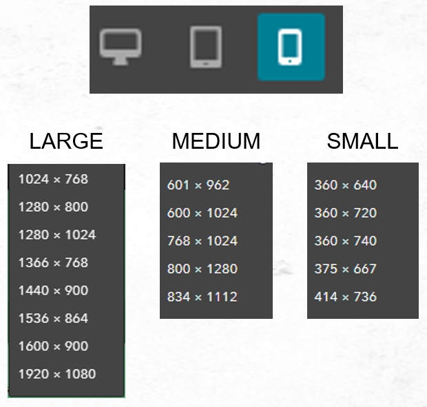
Experience Builder provides mobile views for five common screen sizes of tablets and five common screen sizes of mobile phones. You can choose which mobile views to focus on for your mobile responsive designs. The below image displays the list of mobile view screen sizes you can design for a single Experience Builder application.
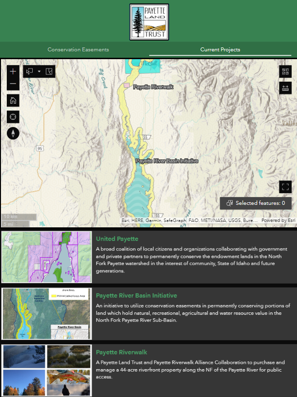
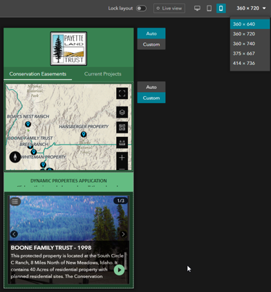
The following image displays a tablet mobile view design. When you compare this to the desktop view above, you can see how important mobile responsive design is for a smaller screen size.
Tips to help you configure Mobile Responsive Design
You already have a head start when you configure Experience Builder mobile views. This is because some tools, such as the map pop-ups, apply existing transformation rules that help in mobile design. However, there are still things you need to think about and incorporate. Below are some tips to consider when designing your applications.
Make use of Experience Builder Templates
When possible, use Experience Builder templates that are not ‘blank’. Non-blank templates already incorporate transformation rules that consider mobile optimization. But if you are like me, then you will want to customize your application from the ground up so the following tips and tricks will be your bread and butter.
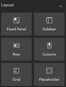
Make use of Layout Widgets
When creating your original application layout, using layout widgets such as Rows, Columns, and Sidebars will help streamline your responsive design. This is because ESRI has pre-configured these widgets to include some transformation rules. For example, elements spread horizontally will become vertical.
Change Widget Content
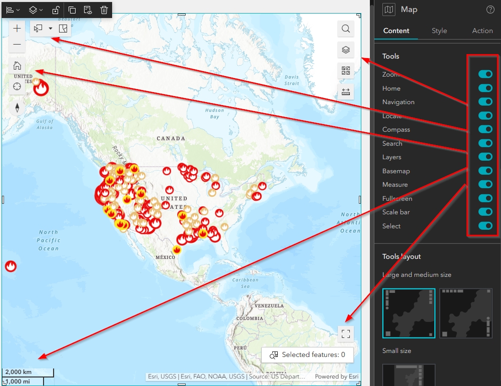
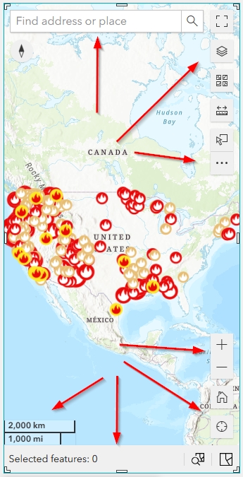
The size of your text, type of font, and other widget tools will likely need to change for smaller screen sizes. For example, a list widget that needs large text in desktop view will require smaller text in mobile view. Or a map widget that has many tools enabled, such as search, measure, and select, may need to have less tools enabled. In the first image below, you can see a map that has all the tools enabled, which means all the icons for those tools appear in the map view. In the second image, a mobile view of the same map shows a cluttered view due to all the tool icons.
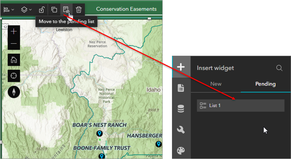
Always use the Pending List
Before you change content and configurations in your widgets, you need to understand the Pending List. The Pending List is the most important concept to learn when you begin to configure Experience Builder Mobile Views. You should never modify the content or configuration of your current widgets. If you alter them in a mobile view, they will also change in your original desktop view.
If you want to use a list widget with smaller text, you need to first move the current list element to the pending list and then pull in a brand-new list widget to reconfigure in your mobile view. This process applies to any changes you want to make to any of your original widgets.
Use a Duplicate Widget with a Different Template
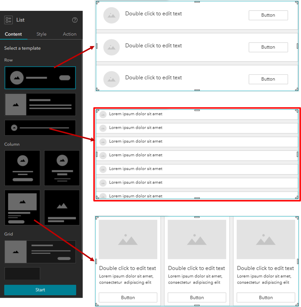
Some widgets, such as List and Bookmark, require you to choose a layout template before you can start to configure them. Some of these templates are better for larger screens while others are perfect for smaller screens. Because of this, you might want to consider using a different template entirely, in addition to any font and text-size alterations. The below image displays three different template styles for the list widget. Depending on your application layout, the template outlined in red may be a better choice for smaller screen sizes.
Remove Unnecessary Widgets
Sometimes, the best course of action is to remove a widget entirely. For instance, a subtitle might be a great addition on a large screen but can sometimes clutter a small screen. In addition, there are some widgets, such as basemap selector or search, that are not necessary outside of a map widget, which already includes these options.
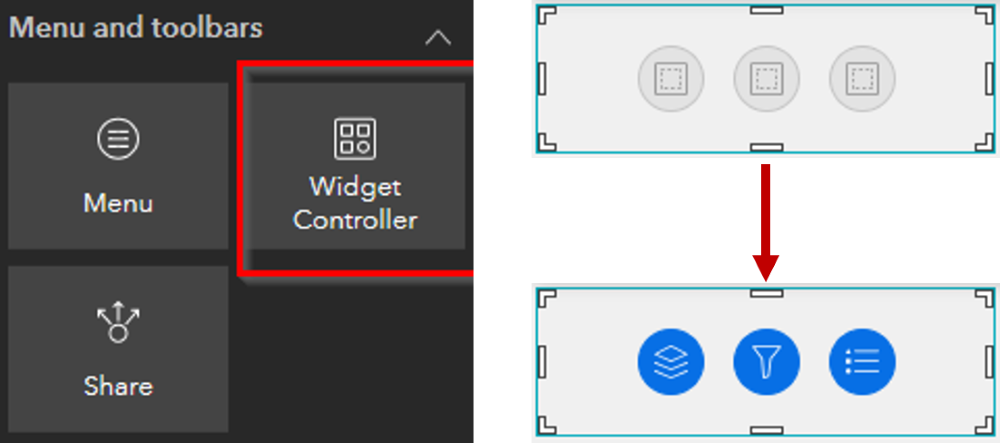
Use the Widget Controller
The widget controller allows you to condense multiple other widgets into a confined space. When you add widgets to the controller, they become icons that a user can choose to turn on or off. The example below shows the layer list, filter, and legend within a single controller widget. This is one of the most efficient ways to condense your layouts.
Preview all available Screen Sizes
Lastly, it will be important that you preview all available screen sizes for both desktop and mobile views. Though daunting, this will help to ensure your application will be useful to any user that opens it, regardless of their screen size.
We hope you find these mobile responsive design tips useful as you build your Experience Builder applications. And if you would like to develop your Experience-Builder skills, click the following links to view more details on our Introduction and Intermediate Experience Builder courses and register for upcoming training events.
To view free tutorial videos on Experience Builder, visit our YouTube channel.
