

The Business Analyst widget helps us visualize key indicators and data about locations using interactive infographics. These ready-to-use infographics can be used in ArcGIS Business Analyst Web App or ArcGIS Community Analyst with additional licensing, or you can utilize some of its power in Experience Builder without additional licensing. However, there are some things you will want to keep in mind. In this article, I will detail important factors to consider prior to choosing to use the Business Analyst widget and what kinds of information and functionality you will provide to your users when you do use the widget.
Factors to Consider
- Your users must be signed in with an ArcGIS account to access the widget functionality.
- Your user’s ArcGIS privileges must include premium content permissions.
- Using this widget will consume credits.
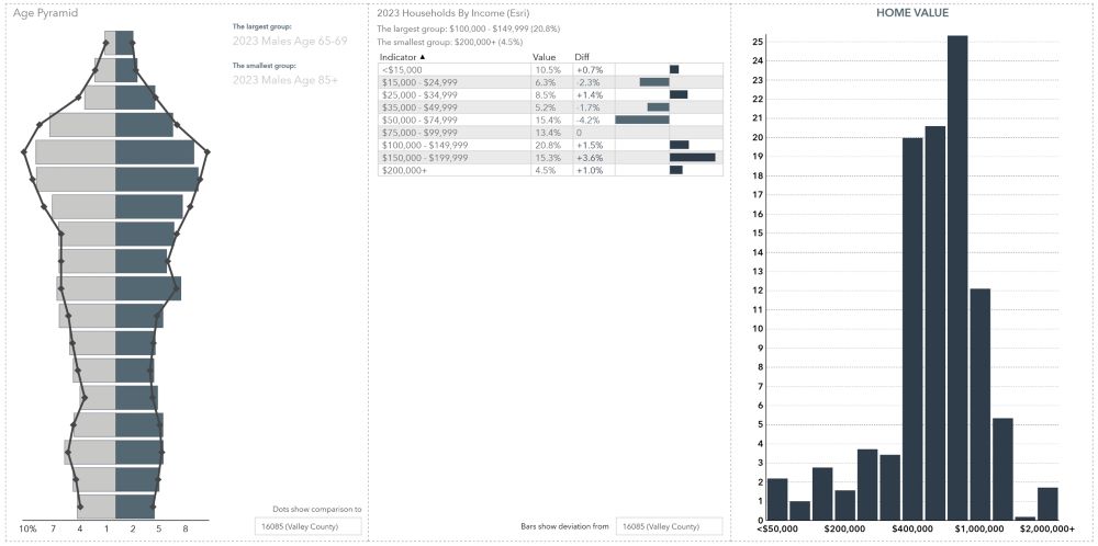
- Data utilized for infographics come from authoritative data sources such as American Community Survey, MRI-Simmons (Market Potential), Consumer Expenditure Surveys, AGC Crime Index (relative risk), and more. To view the list of data sources used to create infographic reports and summaries, visit the ESRI Location Data page.
Because Network Analysis and GeoEnrichment are part of ArcGIS Online’s premium content, your users will not be able to view and export infographics without premium content permissions. If your users do not have these priveleges within their own organization, you do have the option of authorizing the use of your own organization’s credits. This will allow any user to utilize the widget’s functionality. You trigger this authorization through the addition of the GeoEnrichment Utility Service when you configure the widget’s settings.

Infographics and Functionality
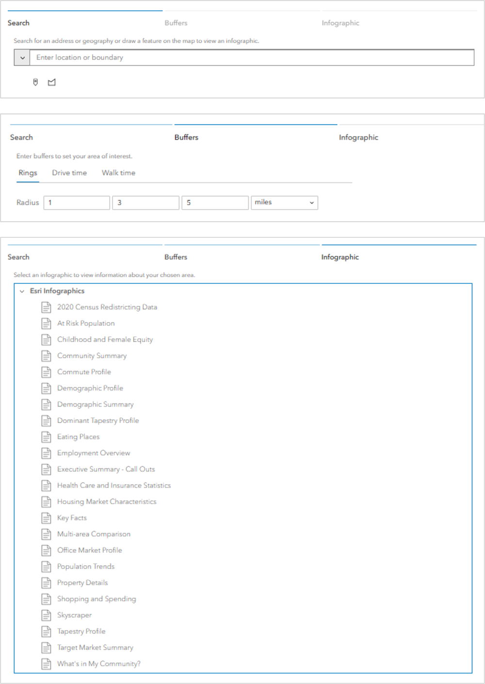
- Workflow mode allows users to decide on the infographics they want to see.
- Preset mode allows you to choose one infographic type and pre-determine the buffered distances used in the analysis.
- View mode is how you will determine what the initial layout will look like for users.
- Once the infographic is created, users have many options for viewing the data, such as viewing in full screen, comparing individual variables, and choosing side by side comparison.
- The user can interact with the infographic panels dynamically by filtering the displays or accessing additional information, statistical summaries, and graphics.
- Users can export as an image, PDF, Dynamic HTML or excel sheet.
Infographic Mode
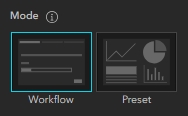
One of the first things you will configure is the Infographic Mode, which will be either Workflow or Preset. When choosing Preset mode, the only option your users have is to choose a location and the infographic will be generated based on the settings you configured.
Workflow mode is much more flexible for the user. Once your users pinpoint, search for, or draw a polygon around a location, they will then choose the buffered distances and units desired, and choose the infographic type they want to run.
View Mode
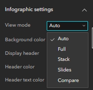
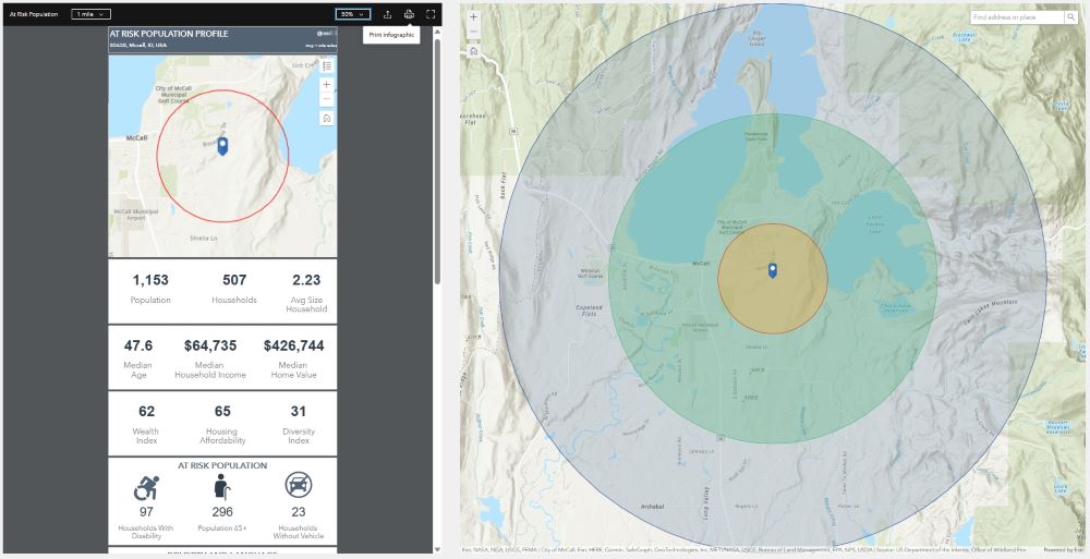
View mode, as mentioned above, defines the layout for the initial summary layout. There are currently five View modes under Infographic settings.
Auto view mode is designed to be mobile responsive which may be the only difference between Auto and Full. Auto and Full view modes will both provide you with the below initial layout.
Stack view mode organizes the infographic and data summaries into a scrolling vertical panel, as opposed to a full-page layout.
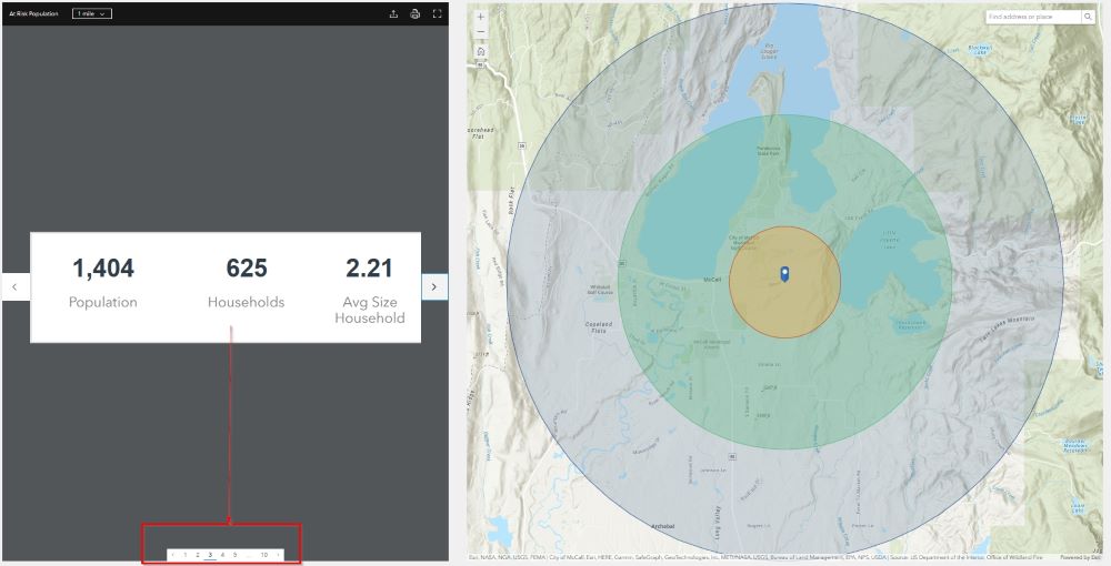
Slides mode is perhaps the mode that we find to be the least user-friendly and meant more for someone who is not looking for specific data and maybe just exploring for fun. It provides the infographics and data summaries in small pieces, forcing the user to navigate through multiple pages of information manually and without any sort of index for each page contains. The only way you know what is detailed on a page is to go to that page and view the slide, which makes finding specific information tedious.
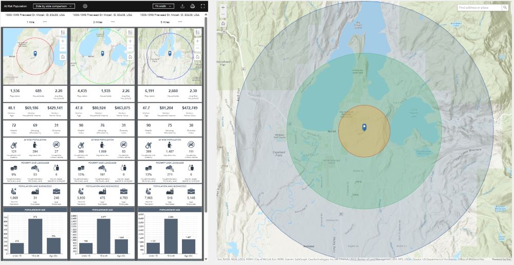
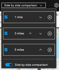
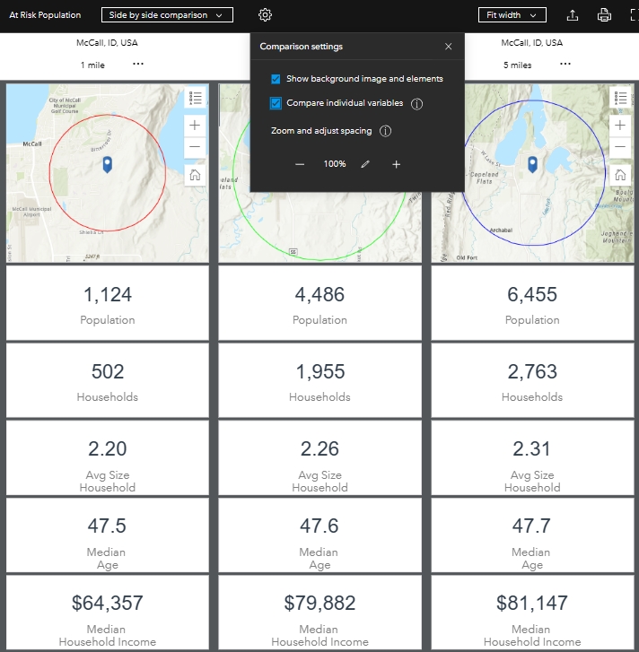
Compare view mode has a default layout that puts the infographics into side-by-side stacks for each buffered distance. This comparison layout is also a setting that users can choose from any of the view modes above, except for Slides, by clicking on the buffered-distance drop-down and enabled the “Side by side comparison” option.
Dynamic Viewing Options
Once the initial report is generated, your users can dynamically alter the layout. One such example of this was mentioned above relative to the Side-by-Side Comparison option. Users can also choose to compare individual variables, increase or decrease spacing between infographics, change the width of the report in the application, or view the report in full screen.
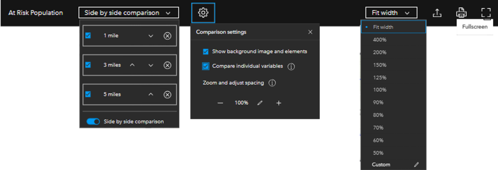
When a user chooses to “Compare individual variables”, the stacks in comparison view will show each infographic as an individual value instead of grouped.
Dynamic Infographic Interaction
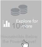
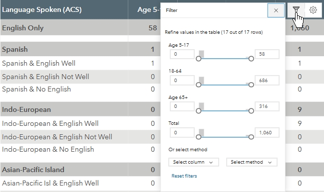
When the user hovers their mouse over any of the infographic elements in the report, including the map, they will be allowed to interact with that element to discover additional information and statistics related to the data.
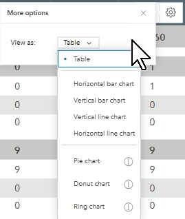
for example, tables allow the user to filter the information based on key data included in the table. They also allow users to view the data found in the table as another type of graphic, such as a chart or graph. The other graphic options shown will depend on the type of data being presented.
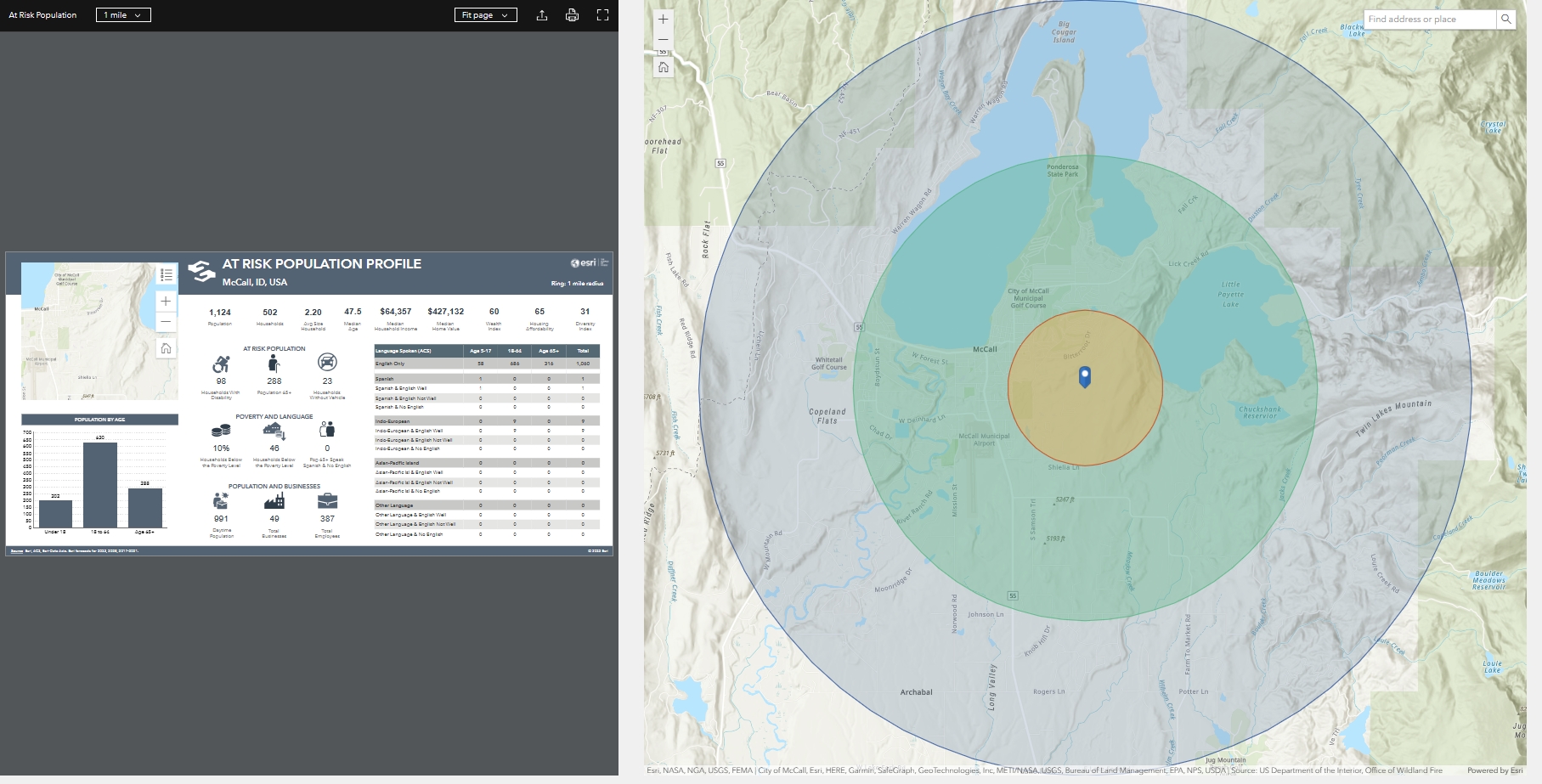
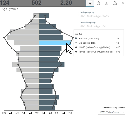
Most infographic interactions will provide a much more in-depth look at the data represented in the primary infographic, and also allow the user to export or print the data. In the example below, I have clicked on the Median Age infographic and have been provided a graph that shows me how many males and females in each group are present within the one-mile buffer radius around my chosen location. When I hover my mouse over a bar in the graph, it will break the information down even further by comparing the local-area data to the full-County data.
Clicking each infographic for the first time is like going through a box of chocolates because you truly don’t know what you are going to get!
Export Infographic
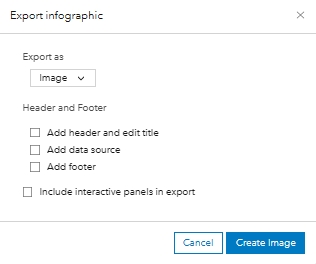
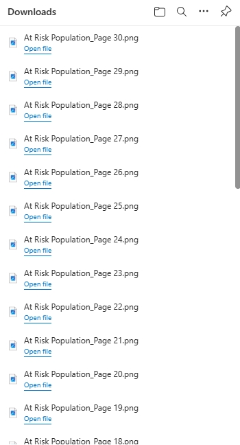
Infographic reports can be exported in a few different formats, including jpg, PDF, Excel, and Dynamic HTML. You are given the option to add a header, footer, and data sources. You also have the option to include interactive panels in the export. However, a word of caution. Choosing to include interactive panels will export many individual files. Some of these will be a single graphic display, while others will group the additional graphics, such as what is shown in the image below.
In summary, we think the Business Analyst widget is one of the greatest Experience Builder tools for decision makers in a broad range of industries. If you have enough credits and the appropriate permissions, we highly recommend you start to play around with the possibilities and then share what you learn with others.
Subscribe to our newsletter to get articles like this delivered straight to your inbox. subscribe in the pop-up that appears on this website, or click the following link: http://eepurl.com/bPXsm1
