

Learn more about this ArcGIS Pro topic and others in our Mastering ArcGIS Pro 3: Maps, Layers, Projects, and Layouts class and our Mastering ArcGIS Pro 3: Editing, Analysis, and Automation class.
If you’ve spent any time making thematic maps in ArcGIS Pro, you’ve almost certainly used the Graduated Color renderer — the tool that color-codes a layer based on numeric attribute values. It’s one of the most powerful and widely used cartographic tools in the software. But here’s where many users stop short: they accept the default classification method without considering whether it’s actually the right choice for their data.
The classification method you choose has an enormous impact on what your map communicates. The same dataset can tell very different stories depending on how the class breaks are defined. This article walks you through how to apply a Graduated Color renderer and then takes a deep dive into the six classification methods available in ArcGIS Pro — what they do, when to use them, and when to avoid them.
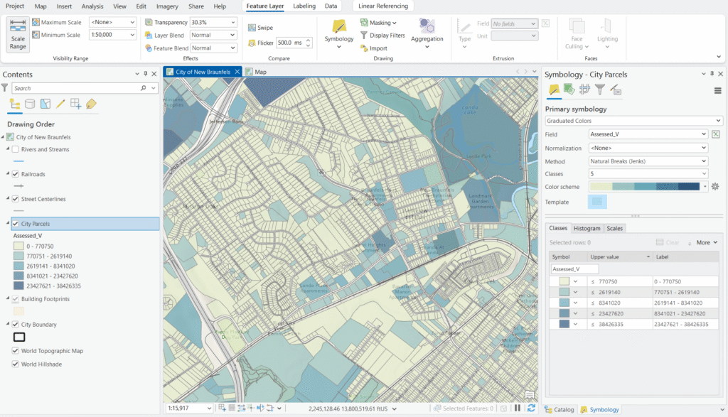
Throughout this article, we’ll use a common real-world example: a City Parcels layer with an Assessed Value field containing the assessed property value for each parcel in the city.
Applying a Graduated Color Renderer: A Quick Walkthrough
If you’re already comfortable applying the renderer, feel free to skip ahead to the classification methods section. For everyone else, here’s a quick overview using our City Parcels layer:
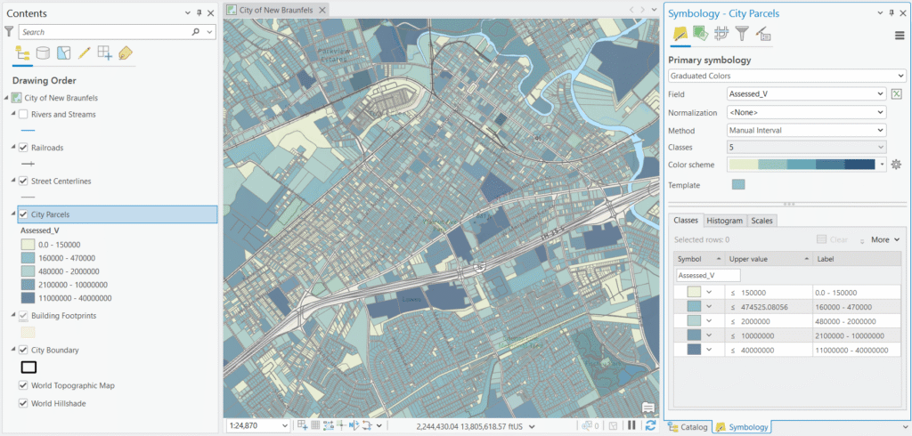
- In the Contents pane, click the City Parcels layer and then the Feature Layer context tab.
- Click the Symbology button and then Graduated Color.
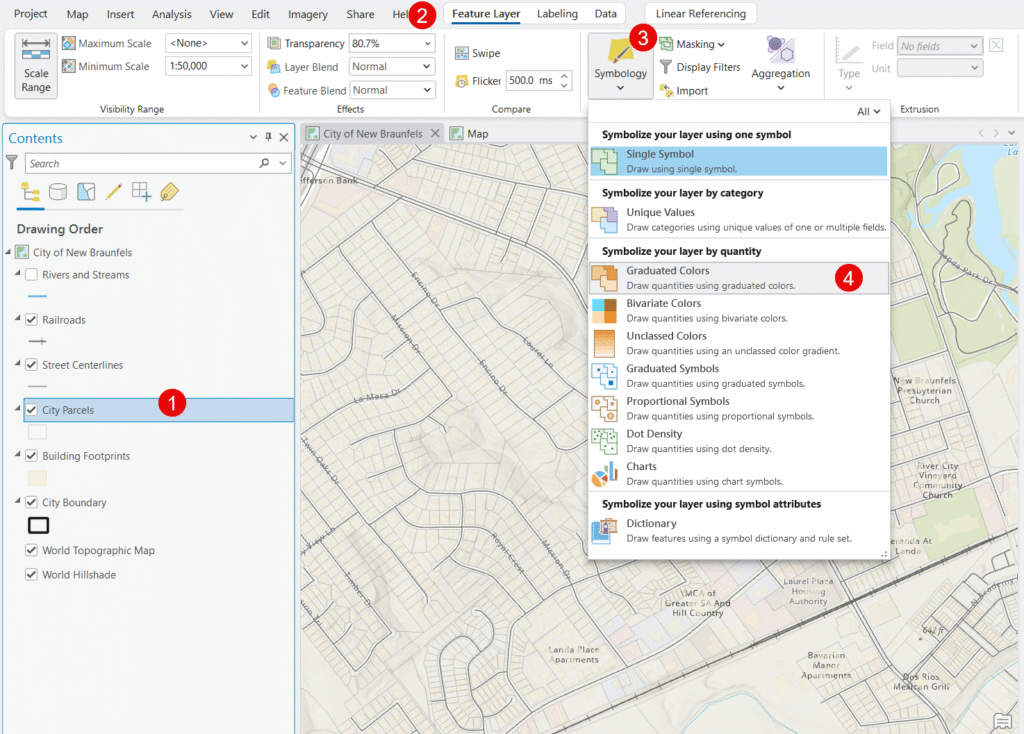
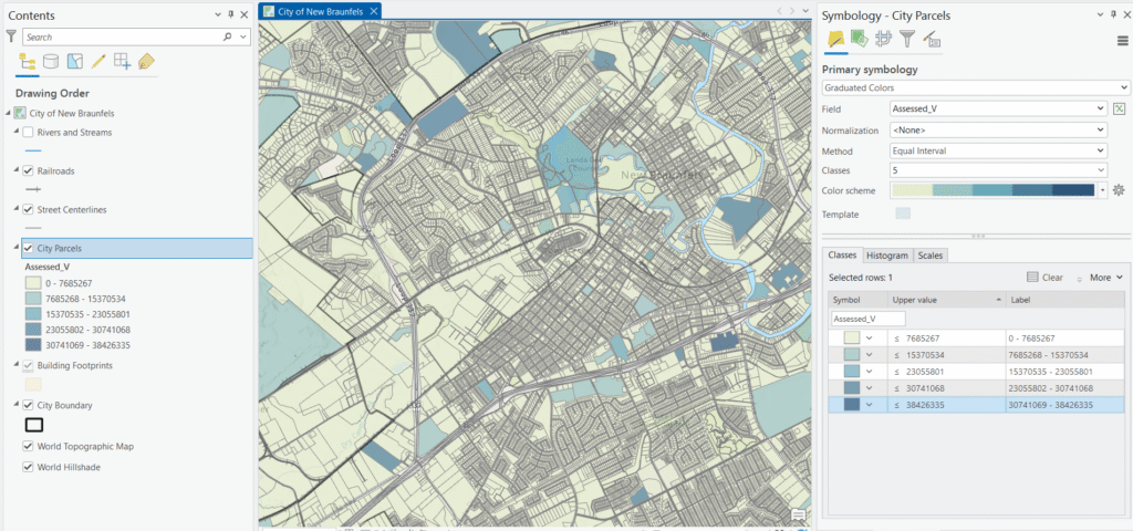
- Set the Field to Assessed Value (Assesed_V in this case).
- Select a Color Scheme — a light-to-dark single-hue ramp works well for value data, with darker colors representing higher assessed values.
- Choose a Classification Method from the Method dropdown — this is the focus of the rest of this article.
- Set the number of Classes (5 is a reasonable starting point for parcel data).
- Each time you make a change the map will automatically update.
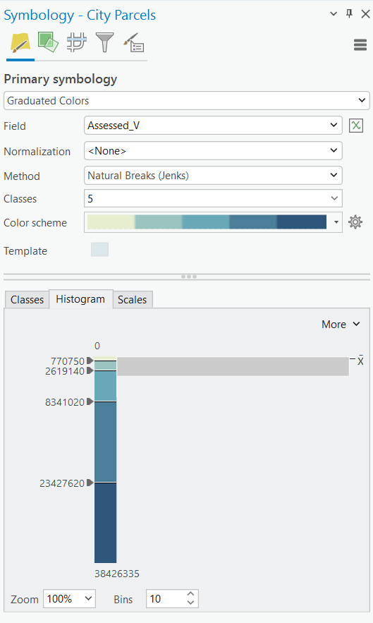
You can also access the Histogram tab at the bottom of the Symbology pane to visualize how your assessed values are distributed across parcels — this is an invaluable tool for understanding your data before choosing a classification method.
Understanding Classification: Why It Matters
A Graduated Color renderer works by dividing your data into a set number of classes and assigning a color to each class. The critical question is: where do the class boundaries (breaks) fall?
Consider a City Parcels layer where assessed values range from $0 for tax-exempt parcels to $38,000,000 for a single large commercial property. With five classes, you need to decide where to draw the four lines that divide those values into groups. Place the breaks in the wrong places and you might make a middle-class neighborhood look like a high-value district, or bury important variation in property values under a single color. The classification method determines that logic automatically — but each method uses a different approach, with different assumptions about your data.
The Six Classification Methods
1. Natural Breaks (Jenks)
How it works: Natural Breaks is the default method in ArcGIS Pro, and for good reason — it’s often the best starting point. The algorithm identifies natural groupings in your data by minimizing the variance within classes while maximizing the variance between classes. In plain terms, it looks for gaps in the data distribution and places breaks at those gaps.
Parcel example: Applied to Assessed Value, Natural Breaks might identify distinct clusters of smaller residential parcels ($0–$120K), mid-range homes ($120K–$280K), higher-end residential ($280K–$600K), smaller commercial properties ($600K–$5M), and a top class capturing the large commercial and industrial outliers up to $38M. The breaks land where the data actually clusters, so the map reflects real groupings in the property market.
Pros:
- Produces classes that reflect the actual structure of your data
- Great for data with distinct clusters or groupings
- Minimizes the chance of misclassifying values that are close to a break
Cons:
- Class breaks are irregular, making the legend harder to read at a glance
- Class ranges are different sizes, so comparing maps of different datasets is difficult
- Not ideal for comparing this year’s assessed values to last year’s — the breaks will shift as the data changes
Best used when: Your assessed value data has natural clusters — common in cities with distinct residential, commercial, and industrial zones.
Avoid when: You need to compare parcel maps year-over-year or across multiple cities, since the break values will differ between datasets.
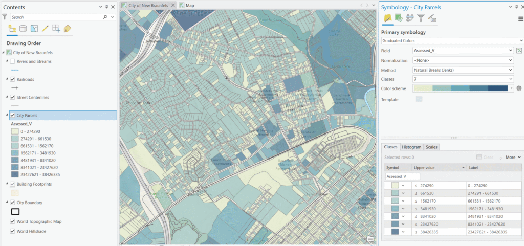
Below you can see an example where we’ve split the data into 7 classes using the Natural Breaks method.
2. Equal Interval
How it works: Equal Interval divides the full range of your data into classes of identical width. If assessed values range from $40,000 to $4,200,000 and you have five classes, each class covers a range of approximately $832,000.
Parcel example: With a range of $0 to $38,000,000 and five classes, each class would cover a range of roughly $7,600,000. That means the first class runs from $0 to $7.6M — capturing the overwhelming majority of residential parcels in a single color. The remaining four classes exist almost entirely to accommodate the handful of high-value commercial properties, leaving the map a nearly uniform single hue with almost no visible variation across residential neighborhoods. This is the classic pitfall of Equal Interval with skewed data.
Pros:
- Produces clean, easy-to-understand legend values
- Excellent for comparing parcel maps across multiple years when the value range is stable
- Intuitive for audiences unfamiliar with GIS
Cons:
- Highly sensitive to outliers — a single high-value commercial parcel can compress most residential values into one class
- Can produce empty or near-empty classes when data is skewed
- Often a poor choice for assessed value data, which tends to be right-skewed
Best used when: Your assessed values are relatively evenly distributed with few extreme outliers — perhaps a dataset limited to a single zoning class like single-family residential.
Avoid when: Your parcel layer includes a mix of residential and commercial properties, as the extreme commercial values will dominate the range and obscure residential variation.
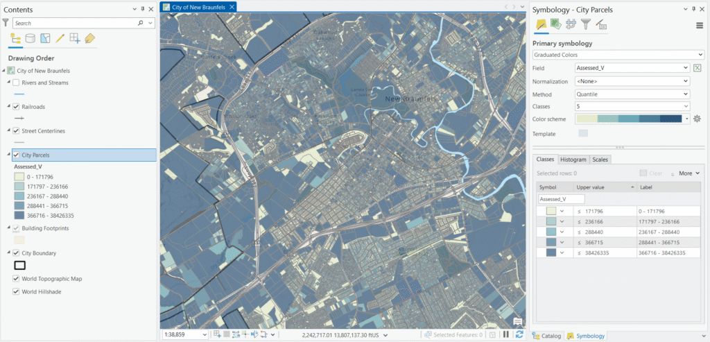
3. Quantile
How it works: Quantile classification puts an equal number of features into each class. With 5,000 parcels and five classes, each class will contain exactly 1,000 parcels, regardless of the value ranges required to achieve that.
Parcel example: This means the bottom 1,000 parcels by assessed value land in the first class, the next 1,000 in the second, and so on. Your map will show a visually balanced distribution of colors across the city — but the break between the fourth and fifth class might be $380,000 while the break between the first and second class is $95,000. Two parcels assessed at $379,000
Pros:
- Creates visually balanced maps — every color appears with roughly equal frequency across the city
- Useful when you want to highlight how parcels rank relative to each other
- Works well for showing property value tiers in a city context
Cons:
- Can be misleading — parcels with very similar assessed values may fall in different classes
- The legend values can appear arbitrary ($94,750–$187,320, etc.)
- Doesn’t communicate the actual spread of values well
Best used when: You want to show the relative ranking of parcels — for example, identifying the top 20% of assessed properties for a tax analysis — and your audience understands that classes represent equal counts, not equal value ranges.
Avoid when: Absolute dollar values matter or when you need to communicate meaningful value thresholds to a non-technical audience.
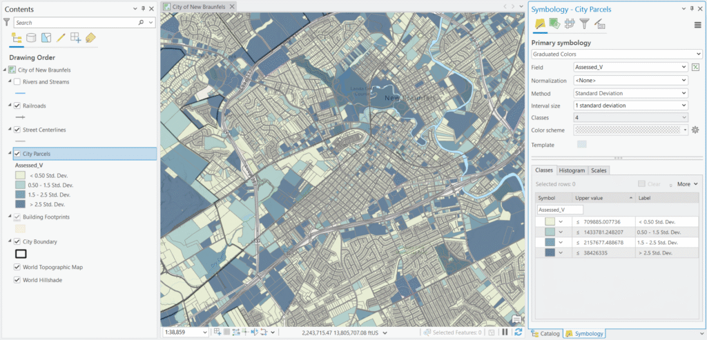
4. Standard Deviation
How it works: This method calculates the mean and standard deviation of your assessed values, then places class breaks at regular intervals above and below the mean — typically at one standard deviation, one-half standard deviation, or one-quarter standard deviation intervals.
Parcel example: If the mean assessed value is $215,000 with a standard deviation of $180,000, the class breaks would fall at $35K, $125K, $215K (mean), $305K, $395K, and so on. Parcels are then colored based on how far their value falls from the city average — making it immediately clear which neighborhoods are above or below the mean and by how much.
Pros:
- Immediately communicates statistical context — which parcels are above or below average assessed value, and by how much
- Excellent for identifying outliers like unusually high-value commercial parcels
- Good for policy or planning audiences who think in terms of averages and deviations
Cons:
- Assumes a roughly normal distribution — assessed value data is often right-skewed, which can make this method misleading
- Requires your audience to understand standard deviation
- Offers less control over the number of classes
Best used when: You want to highlight which parcels deviate significantly from the city average — useful for equity analyses or identifying assessment anomalies.
Avoid when: Your assessed value data is heavily skewed (common when commercial and residential parcels are mixed), or when presenting to a general public audience.
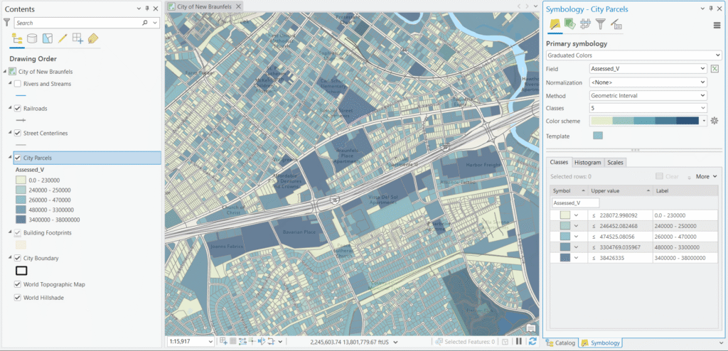
5. Geometrical Interval
How it works: Geometrical Interval creates class breaks based on a geometric series — each class range is multiplied by a constant factor rather than added to, producing classes that increase exponentially in size. It also attempts to minimize squared deviations within classes.
Parcel example: For assessed values ranging from $0 to $38,000,000, Geometrical Interval might produce breaks around $0, $65K, $240K, $900K, $5M, $38M. The lower classes cover narrow ranges to capture meaningful variation among the thousands of residential parcels, while the upper classes span much wider ranges to accommodate the handful of high-value commercial and industrial properties — including that $38M outlier — without letting them overwhelm the map.
Pros:
- Handles the right-skewed distribution of assessed value data very well
- Produces visually balanced maps even when a few high-value commercial parcels dominate the range
- Good compromise between Natural Breaks and Equal Interval for property value data
Cons:
- Difficult to explain to a planning board or city council — the logic behind the breaks is not intuitive
- Legend values are irregular and hard to interpret at a glance
- Less well-known, so audiences may question the methodology
Best used when: Your parcel layer includes a wide mix of property types and values — the exponential scaling handles the long tail of high-value commercial parcels while still showing meaningful variation among residential properties.
Avoid when: Your audience needs to interpret the legend values quickly and intuitively, or when your data is normally distributed.
6. Manual / Defined Interval
How it works: With Manual classification, you define the class breaks yourself by typing specific values directly into the Symbology pane. With Defined Interval, you specify a consistent interval size and ArcGIS Pro calculates the breaks automatically based on that value.
Parcel example: A city assessor might use Manual breaks aligned to local property tax brackets or assessment tiers — say $0–$150K, $150K–$500K, $500K–$2M, $2M–$10M, and $10M+ — because those thresholds have real-world policy meaning and cleanly separate residential, small commercial, large commercial, and the handful of major industrial or institutional properties like that $38M outlier. Trying to use Defined Interval here would be impractical — a $7M interval, for example, would dump virtually every parcel in the city into the first class, making it no better than Equal Interval. Manual classification is really the only automated-break option that fails gracefully at this scale, and it’s the right tool when your thresholds are driven by policy rather than statistics.
Pros:
- Full control over break placement using thresholds that are meaningful in context
- Essential when your map needs to align with tax brackets, zoning thresholds, or assessment tiers
- Allows consistent breaks across annual parcel maps for year-over-year comparison
Cons:
- Requires domain knowledge of local property values and policy thresholds
- Easy to introduce bias by choosing breaks that overemphasize or hide certain value ranges
- Results may not reflect the actual distribution of the data
Best used when: You have a specific policy or domain reason for the break values — tax analysis, assessment equity studies, or any scenario where you need consistent breaks across a map series.
Avoid when: You don’t have a strong data-driven or policy-driven reason for specific breaks. In that case, one of the automated methods will serve you better.
Choosing the Right Method: A Quick Reference
| Method | Best For | Watch Out For |
|---|---|---|
| Natural Breaks | Mixed parcel data with distinct value clusters | Inconsistent breaks across annual maps |
| Equal Interval | Single-use-type parcel datasets with few outliers | High-value commercial parcels distorting classes |
| Quantile | Showing relative property value ranking | Splitting similarly valued parcels across classes |
| Standard Deviation | Highlighting deviation from mean assessed value | Skewed data, non-technical audiences |
| Geometrical Interval | Mixed residential/commercial with wide value range | Non-intuitive legend values |
| Manual / Defined Interval | Tax brackets, policy thresholds, map series | Potential for unintentional bias |
A Practical Workflow: Use the Histogram
Before choosing a classification method, always check the Histogram in the Symbology pane. For a City Parcels layer, you’ll almost certainly see a right-skewed distribution — a large cluster of residential parcels on the low end and a long tail of higher-value commercial and industrial properties stretching to the right. That pattern is your signal that Natural Breaks or Geometrical Interval will likely serve you better than Equal Interval.
You can also drag the break lines manually in the histogram view, which is particularly useful when fine-tuning a Manual classification to align with specific value thresholds.
As a general starting rule for assessed value data: begin with Natural Breaks to get a sense of how the data clusters, then consider Geometrical Interval if you have a wide mix of property types, or Manual if you need to align breaks with policy thresholds.
Our recommendation for this use case: For a City Parcels layer with assessed values ranging from $0 to $38,000,000, Geometrical Interval is the strongest choice for most mapping purposes. The data is heavily right-skewed — the vast majority of parcels are residential properties clustered at the low end of the range, with a long tail of commercial and industrial properties stretching to that $38M outlier. Geometrical Interval is purpose-built for exactly this kind of distribution, and it will produce a map that shows meaningful variation across residential neighborhoods while still accommodating the high-value commercial properties without letting them distort the entire classification scheme. Natural Breaks is a close second and worth comparing side by side, but Geometrical Interval handles the extreme range more gracefully. The one exception: if your map is intended for a policy or public-facing audience where the breaks need to align with tax brackets or assessment tiers, Manual classification is the better call — the added interpretability is worth the trade-off in statistical precision.
There Is No Single Right Answer
One of the most important things to understand about classification methods is that there is no universally correct choice — and no universally wrong one either. The right method is always the one that best serves your data and your audience. A Quantile classification that would be completely inappropriate for an assessed value map might be perfect for a map showing relative school performance rankings. An Equal Interval approach that fails spectacularly on a mixed-use parcel dataset might work beautifully on a temperature anomaly map with a tight, normally distributed range.
This means experimentation is not just acceptable — it’s expected. Don’t settle for the first method you try. Apply two or three different methods, compare the results side by side, and ask yourself which map most honestly and clearly represents the patterns in your data. ArcGIS Pro makes this easy since you can switch methods instantly in the Symbology pane and see the result update in real time. Take advantage of that. A few minutes of comparison can make the difference between a map that misleads and one that genuinely informs.
It also helps to keep the bigger picture in mind: the Graduated Color renderer is fundamentally a visualization tool. Its entire purpose is to communicate information to the person reading your map. Every decision you make — the classification method, the number of classes, the color scheme, the break values — should be evaluated through that lens. Ask yourself: Does this map make it easy for my audience to understand the patterns in the data? If a technically superior classification method produces a map that confuses your audience, it isn’t actually serving its purpose. Clarity and accuracy together are the goal.
Final Thoughts
The Graduated Color renderer is deceptively simple to apply but surprisingly deep when you dig into it. For something like assessed property values — data that is inherently skewed, politically sensitive, and often presented to non-technical audiences — the classification method you choose is one of the most consequential cartographic decisions you’ll make. It shapes what patterns your audience sees and what conclusions they draw.
Experiment with different methods on your City Parcels layer, keep the histogram open, and don’t be afraid to try a few options before settling on one. The few extra minutes it takes to make an informed choice will result in a map that communicates clearly, accurately, and honestly.
