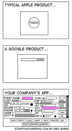
As GIS application designers and developers we should all heed the advice in the simple figure below. Resist the temptation to add in that extra widget that is just too cool to leave out! And I’ll resist the temptation to sharp stick ESRI on this issue! Tip of the hat to I’d Rather Be Writing.
…..every time you add something to an interface, you should take something away. Keeping the interface simple ensures you aren’t crowding out screen real estate.

