
There are now 19 Instant Apps to choose from in ArcGIS Online, two of which are still in Beta testing. What is an Instant App? Instant Apps are the newest no-code, configurable web applications offered in ArcGIS Online. They have been created to meet the requirements of the newest web structure and technology and work only with the new Map Viewer.
You would choose to use these web application builders when your map will serve a simple purpose and you don’t need a lot of complex functionality. Some examples of when you might want to use instant apps are when you simply want to view attachments, count features nearby to an address location, or highlight areas of interest in the map. To read through the list of Instant Apps and understand how they might meet your needs, you can visit the Choose an app template page.
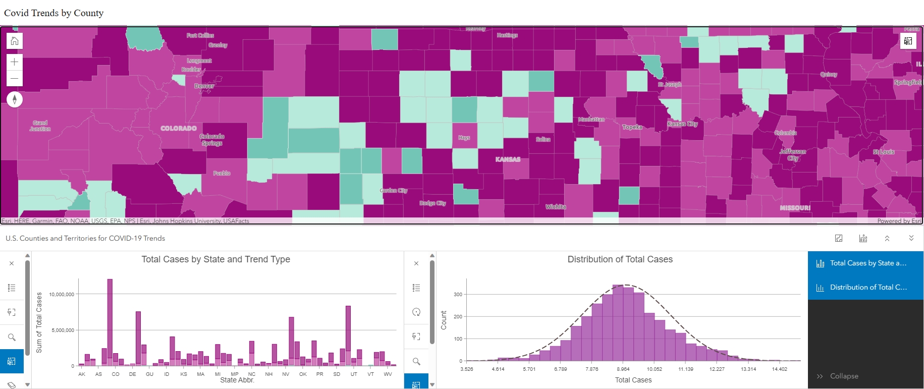
When would I want to use the Chart Viewer Instant App?
The reason is simple. You would want to use the Chart Viewer instant app when the main purpose of your application is to allow users to visualize summary statistics, trends, and other values in the map by using charts and graphs. Currently, you can choose to include the following:
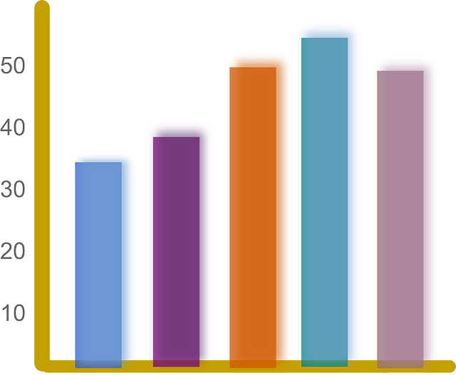
- Bar Charts
- Line Charts
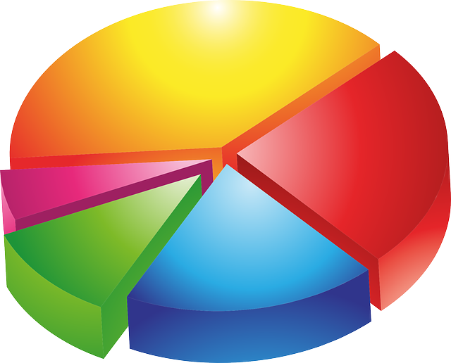
- Pie Charts
- Histograms
- Scatter Plots
How do I configure Charts in Map Viewer?
Start with a Map
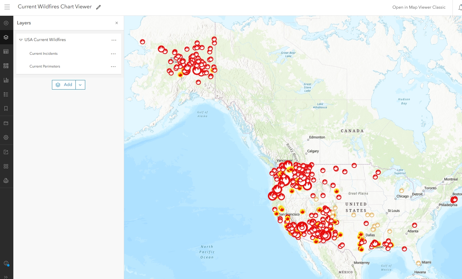
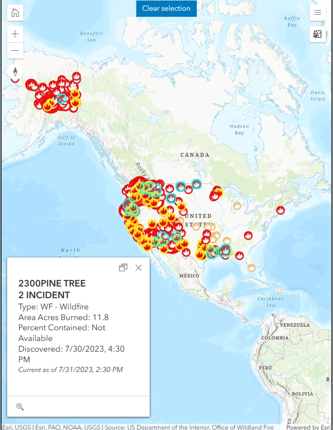
As with many ArcGIS Online map application builders, you need to start with a map created in Map Viewer and this map must have at least one chart configured. For the purposes of this tutorial, I have created a simple map that includes Wildland Fire points and perimeters sourced from Integrated Reporting of Wildland-Fire Information (IRWIN) and National Interagency Fire Center (NIFC), respectively.
Determine how to best Show the Data
It is incredibly important to choose the correct chart or graph based on your data type and what you want to show. Below are some helpful hints to help you decide which charts and graphs to include.
Bar Graphs show nominal data when data are independent of one another.
Line Charts show trends in how numbers have changed over time or some other linear scale of reference.

Pie Charts divide parts of a whole into slices that represent the proportion or percentage of the whole.
Histograms show quantitative or numerical data distribution that usually represent the data in frequency.
Scatter Plots help show the correlation, or lack of correlation, between two different things. For example, if the x-variable and y-variable increase at the same time, they likely have a positive relationship.

Create Charts in Map Viewer
The charts you will see in the Chart Viewer Instant App are not created in the Chart Viewer web application builder; they are created in Map Viewer. For this tutorial we are going to create the following charts:
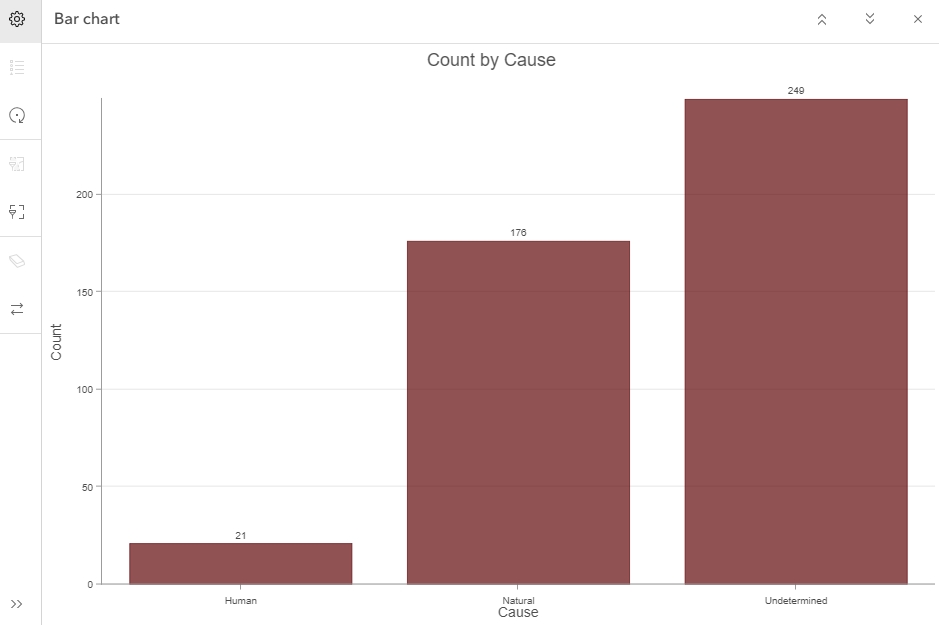
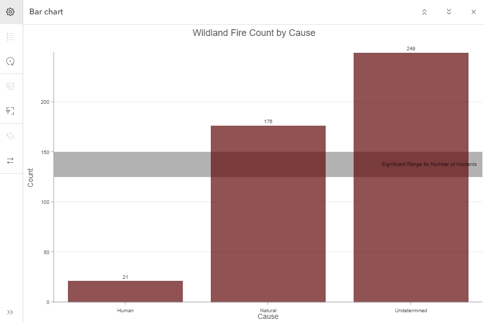
- Bar Chart of Wildland Fire Causes to show the count of each type of wildland fire cause relative to currently active fires.
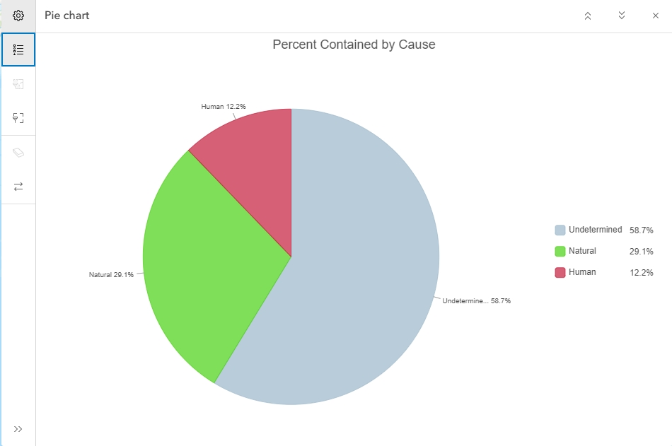
- Pie Chart showing Percent Contained for each type of Cause relative to currently active fires.
It is important to note that because I am using a Living Atlas layer that is updated frequently by the authoritative data source agencies, my resulting map application features and charts will also be updated in real-time without requiring any extra work on my behalf.
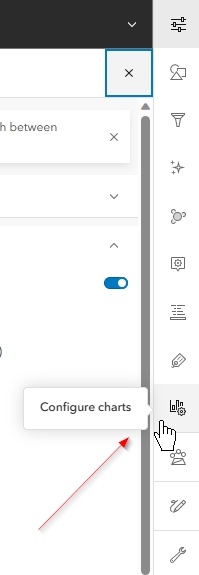
I first need to make sure the appropriate layer is highlighted in the layer menu on the left and then click on the configure charts button found on the light menu to the right of the map. For the Bar Chart, I will be selecting the Current Incidents point layer.
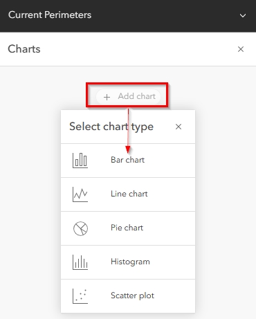
After the Charts pane opens, I will next click on “Add Chart”. This will show the selection of charts I have the option of creating. For this first example, I will choose Bar Chart.
Each chart will have options specific to the chart type. For bar chart, you will see the below options.
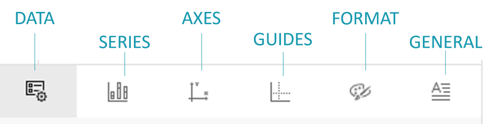
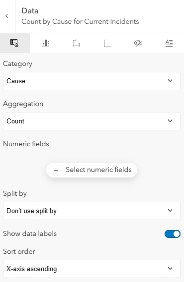
Configure Data Tab
Under the Data tab, I will define the category I am visualizing. In this case, I will choose the “Cause” field. Under Aggregation, I can choose from various summary values, such as count, sum, mean, etc. For this situation, I will leave the default of “Count”. Because I am visualizing a straight count of records, I do not need to select a Number field. I will also not split the graph to show multiple types of categories, such as Cause next to Fire Type, so I will leave the “Split by” option as, “Don’t use split by”. I want to make reading the graph easy for my users, so I will always enable “Show data labels”. Sort order will be the default of “X-axis ascending” because I think the larger values on the right of a graph looks nice.
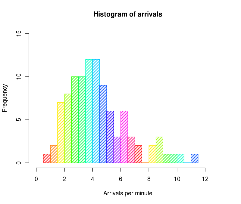
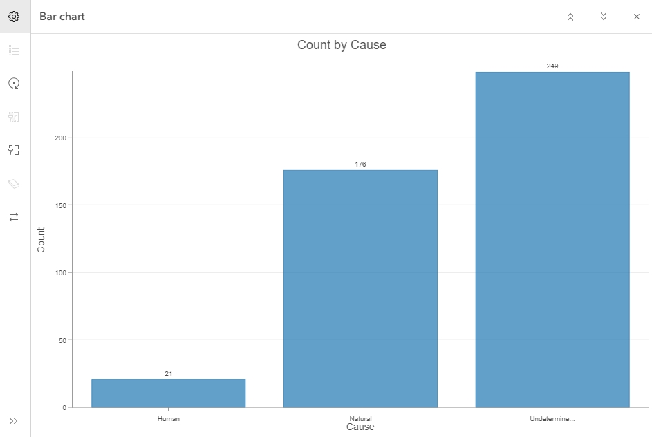
At this point, my bar chart looks like the below image. You will notice the high value of “undetermined” cause. This could be for many reasons. For example, investigation into the cause of a Wildland Fire takes time, and these are currently active wildland fires. Many fires are new, and the timeline of investigation may be challenged by current activities or lack of access to the initial start point.
Configure Series Tab
The Series tab for bar charts is pretty simple. I can choose from multiple layouts, such as side-by-side or stacked and then choose the series color. Because my Current Incidents point layer does not have unique symbology based on Cause in the map, all of the bars will be a single color. For this tutorial, I have chosen side-by-side and will change the series color to a deep red.
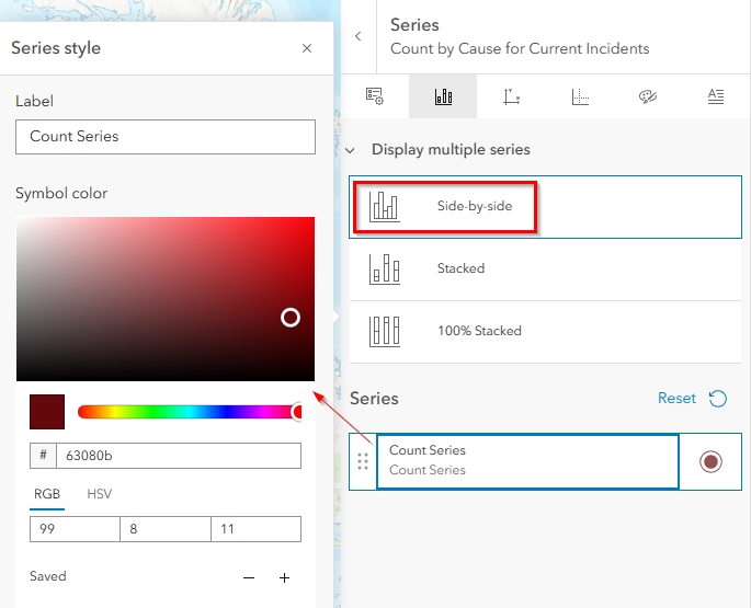
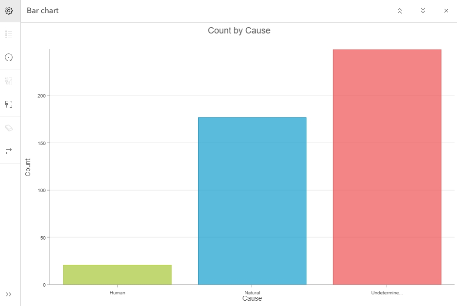
If I had chosen to symbolize the Current Incident points in the map as unique colors based on Cause, then the Bar Chart would automatically show the bars as the same colors chosen in the symbology tab (see example below) and I would be unable to change them from the Bar Chart series tab.
Configure Axes Tab
From the Axes Tab, I can alter the length of characters shown in the labels, the highest value shown on the graph, and format my number labels relative to significant digits and a thousands separator. For this tutorial, I have increased the character limit but left all the other settings as default.
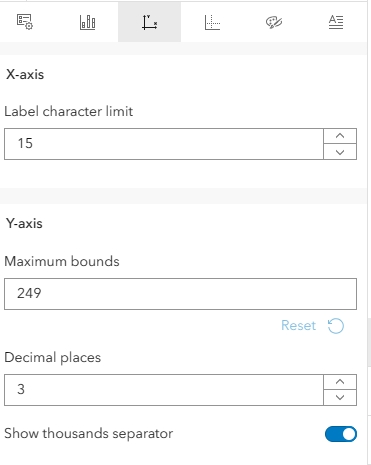
My bar chart now looks like the below image. You can see the full category name for “Undetermined” is now showing, whereas above it was not showing the complete name. This is due to my increasing the label character limit to 15.
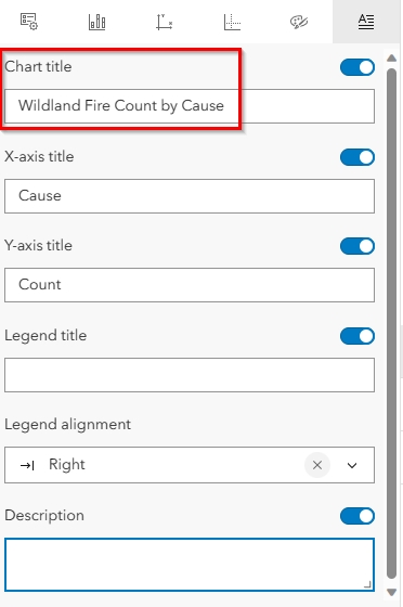
Configure Guides Tab
As you can see above, there are already some light grey guides present in the graph by default. However, these do not stand out or show a meaningful threshold value, so I am going to add a guide at a range between 125 and 150. These numbers are not significant to wildland fire, but are values I chose at random to show what a guides look like when added to the bar graph.
From the guides tab, I have entered my start range for my y-axis guide at 125 and ended it at 150 to show a range of values. I have left the style and guide name as default but have changed the guide label to something meaningful. I have also chosen to leave the display of the guide in the back because I believe this makes for a nicer looking graphic.
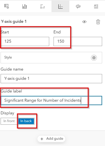
My bar chart now looks like the below image. As you can see, my guide range is labeled to help users understand it’s meaning.

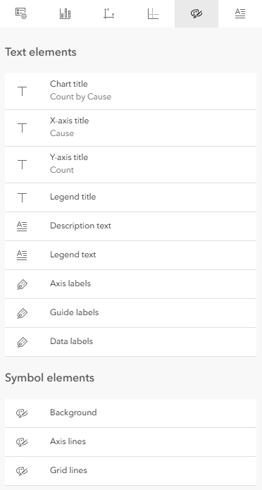
Configure Format Tab
From the format tab, there are a number of text and contextual chart elements I can configure text style and color for. These are shown in the image below. I am going to leave all of these set to their defaults.
Configure General Tab
The only thing I will change on the General Tab is the graph name to something more meaningful. Otherwise, I will leave all other settings as default.
The below image shows my final bar chart. For the purposes of this tutorial, I have already pre-configured the Pie Chart also shown below. The next section will cover how to configure the Chart Viewer Instant App.
How do I configure Chart Viewer Instant App?
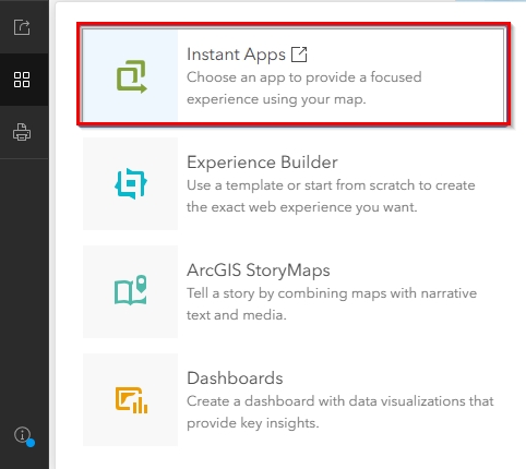
Like with most things in ArcGIS Online, there are multiple ways to get to where you want to be. For the purpose of this tutorial, we are going to start from the map. On the dark panel to the left of the map, there is a “Create App” button.
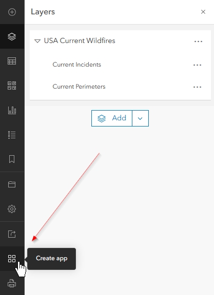
When I click the Create app button, the options menu for how to share the map appears. From here, I will click on Instant Apps. This will take me to the Instant Apps gallery.
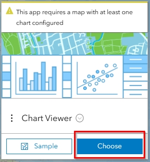
From the Instant Apps gallery, I will scroll down to find “Chart Viewer” and click on “Choose”.
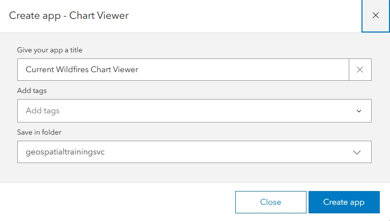
After giving my app a title, adding tags, and choosing the appropriate location, I will click on “Create App”.
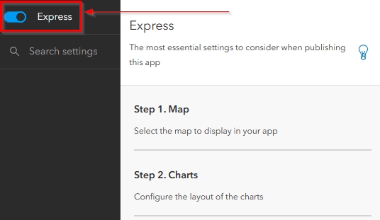
Instant Apps gives us the option to use Express setup or to disable Express setup. Express is the way you want to go if you are not particular in all of the small details and just want to get a nice-looking app up and running as quickly as possible. This mode will take you through only the most important settings. For this tutorial, I am going to turn off Express and go through each step manually. To do this, I will simply click the button to disable Express setup.
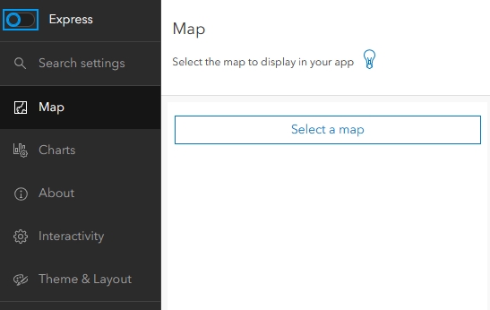
Map Tab
When I disable Express Mode, all the settings tabs will appear in the dark panel on the left. Each of these tabs contain settings that I will want to configure with the first being the map. If the map is not already selected, I will need to click on “Select a map” and choose my map.
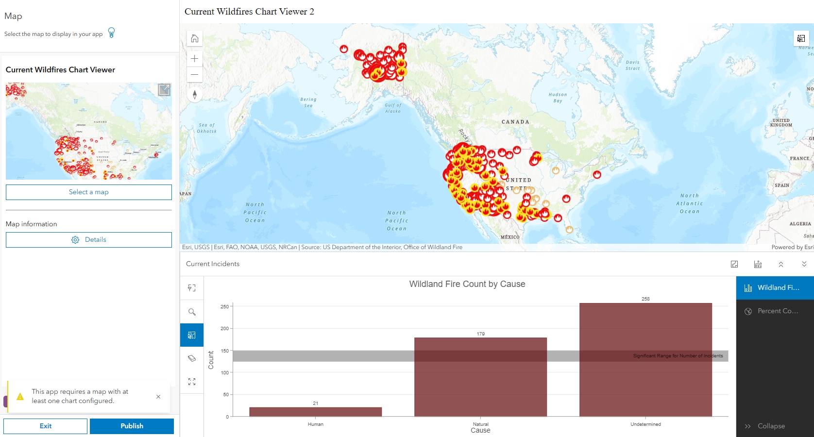
As soon as I choose my map, I will see the map and charts appear on the right preview panel.
Charts Tab
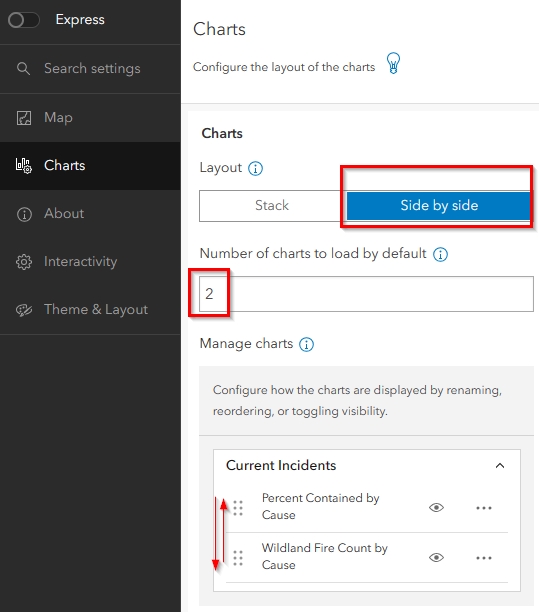
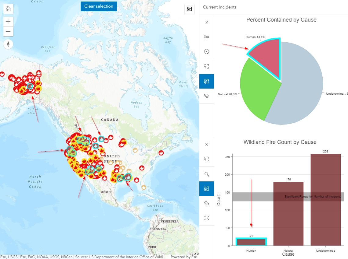
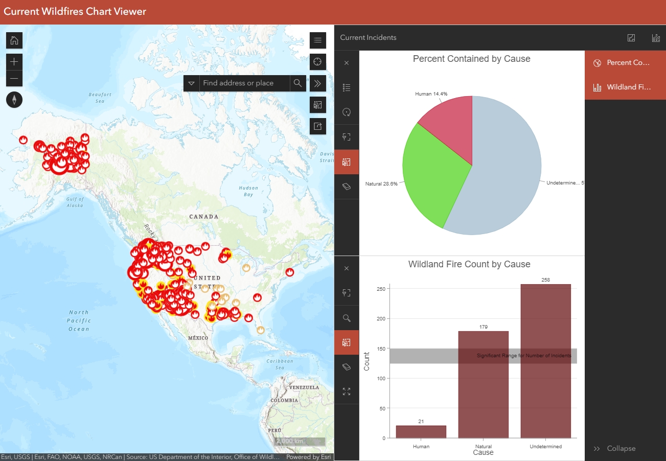
The next tab I will configure is the Charts tab. On this tab I am going to choose the Side-by-Side layout and have both of my charts load by default instead of just one. Lastly, I am going to pull my Pie Chart above my Bar Chart because I think it looks cleaner.
My preview now looks like the below image.
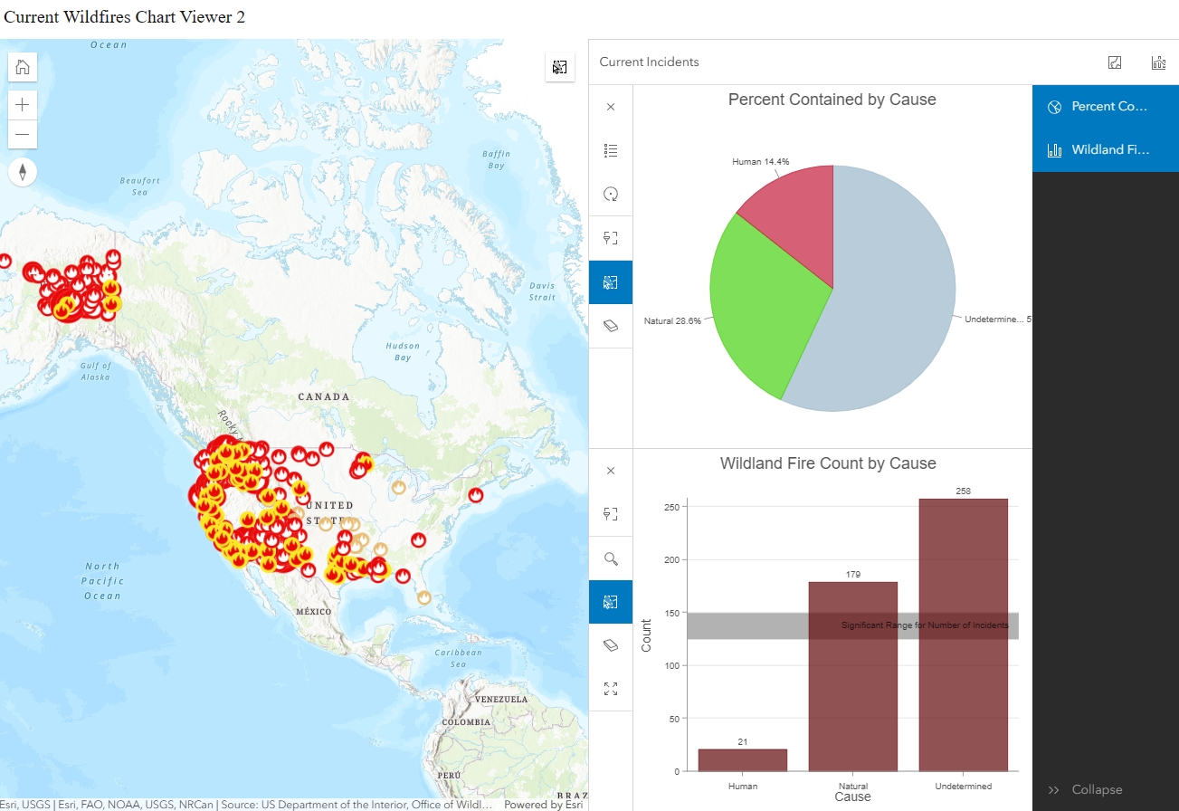
At this point, and if you are following along, you should click around in the preview and see how users will interact with the map and charts. For instance, if I click on the Human slice of pie in the Pie Chart, the same data will highlight in both the map and the Bar Chart.
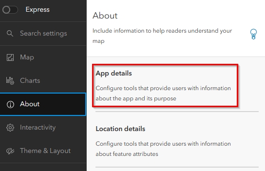
About Tab
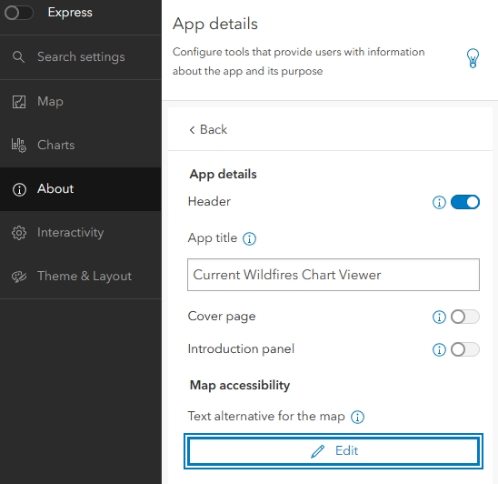
The first section in the About tab that I will configure is the App Details.
If I am going to embed this map into another page, I might want to disable the header. This section is also where I can modify the title, cover page, and introduction panel. If I need to add a text alternative for the map for accessibility purposes, then I can click on the Edit button at the bottom of the panel and fill in those details. For the purposes of this tutorial, I will leave the defaults. Once I have configured the App details, I will click on the Back button that appears in the upper left corner of the white App Details pane.
Next, I will click on Location details.
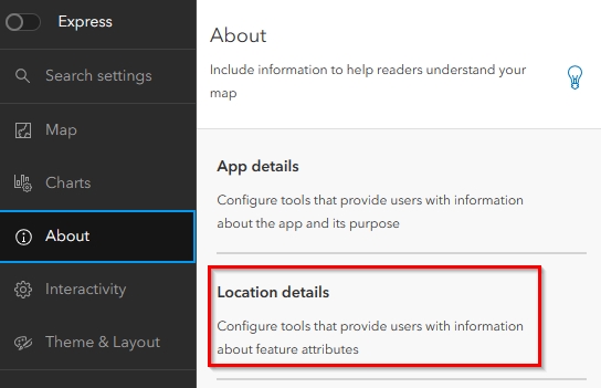
The first thing I will do on this tab is make sure the legend is enabled. Once that is done, I will leave the style as Classic and then enable the Fixed pop-up location. Once enabled, I can choose the position which will be “Bottom left”.
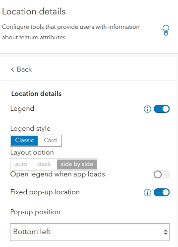
A fixed pop-up position is not always user-friendly, but in instances where there is not a lot of map navigation and interaction, it can provide a nice, clean look.
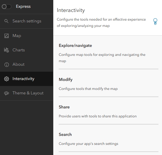
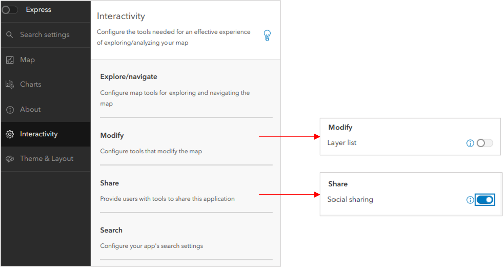
Interactivity Tab
The Interactivity tab is where I will find the Explore/navigate, Modify, Share, and Search settings.
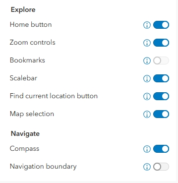
When I click on Explore/navigate, I will be taken to another pane that allows me to turn on and off the below settings. For this tutorial, I have made sure to enable the Home Button, Zoom controls, Scalebar, Current Location, Map selection, and Compass. Because I have not configured bookmarks in Map Viewer, the Bookmarks setting is disabled. I also do not want to configure a Navigation boundary, but this is where I have the option to configure the extent, zoom levels, and map rotation.
Once I click back to return to the main Interactivity panel, I will find minimal options under Modify and Share. Modify allows me to enable the layer list, which I will leave turned off because my map only has one layer. Share is where I will enable social sharing.
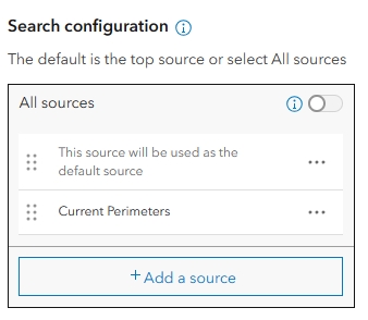
Under Search I have the option to enable search. Once enabled, I then have the option to “Open Search at Start” which means it will open when a user enters the map application. I am going to enable this. I can also add data sources for search. By default, ESRI’s world geocoder is automatically applied as a locator for search, but I would also like my users to be able to search by data in the map. To do this, I will first click on, “Add a source”.
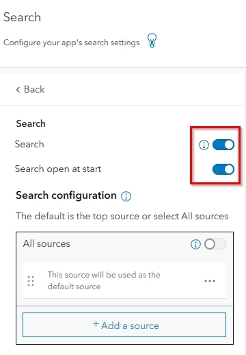
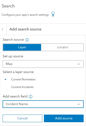
When the search source options appear, I am going to choose Layer as a search source, and Map as my Layer source. I am going to ensure that Current Perimeters is highlighted as my layer and then I am going to add Incident Name as the search field. Once these are configured I will click on “Add source” in the lower right.
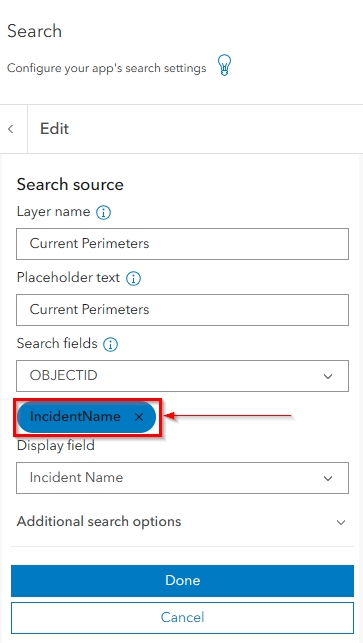
I will know the search source is added when I see it appear under the Search fields drop-down. At this point, I can either add more search fields or click Done. I will leave this as my only additional search source.
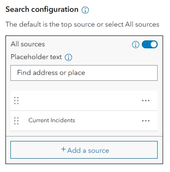
Once I click Done, I will be taken back to the main Search settings panel. Here, I can see the search source I added under the Search Configuration options. At this time, I can choose to allow my users to search all sources and then reorder the sources to control which results they will see first.
I am going to enable all sources but leave the default order of my search sources.
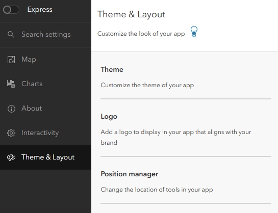
Theme & Layout Tab
The last tab to configure is Theme & Layout. This is where I can configure the look of my application, add my logo, and control the layout of the elements in my map, such as the location of the search bar and legend button.
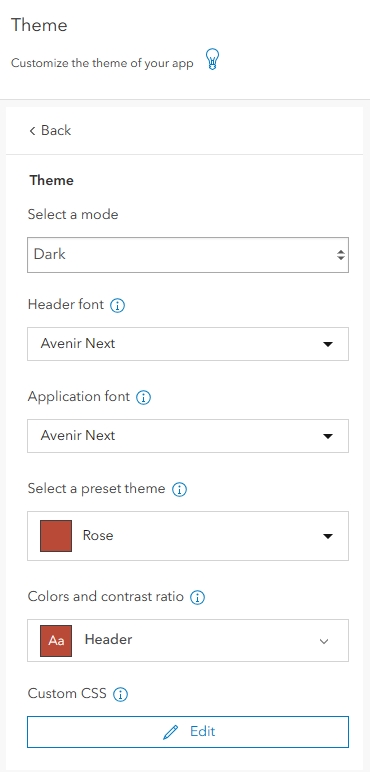
After I click into Theme, I will first select a mode. The default is light mode, but when there are separate sections I prefer to choose Dark to make it easier to distinguish between them. Because this map has to do with Wildland Fire, I am also going to choose a preset theme of Rose, however I could have just as easily customized a theme using the Colors and Contract Ratio drop-down or CSS at the bottom of the panel.
My preview now looks like the below image.
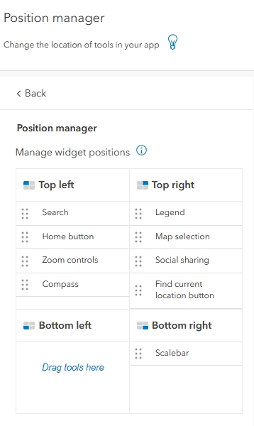
After I click the Back button, I am going to skip adding a logo and click into the Position Manager settings. This is where I can decide on the layout of the buttons and widgets in my map. I am going to leave the bottom left open because that is where I positioned my pop-up, and I am going to leave the scale bar in the bottom right. Next, I am going to click and drag my Search into the very Top Left and then drag my Find Current Location button down to the bottom of the Top Right.
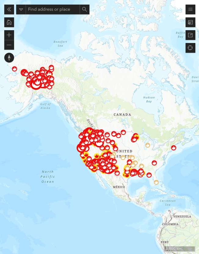
My map now looks like the below image.
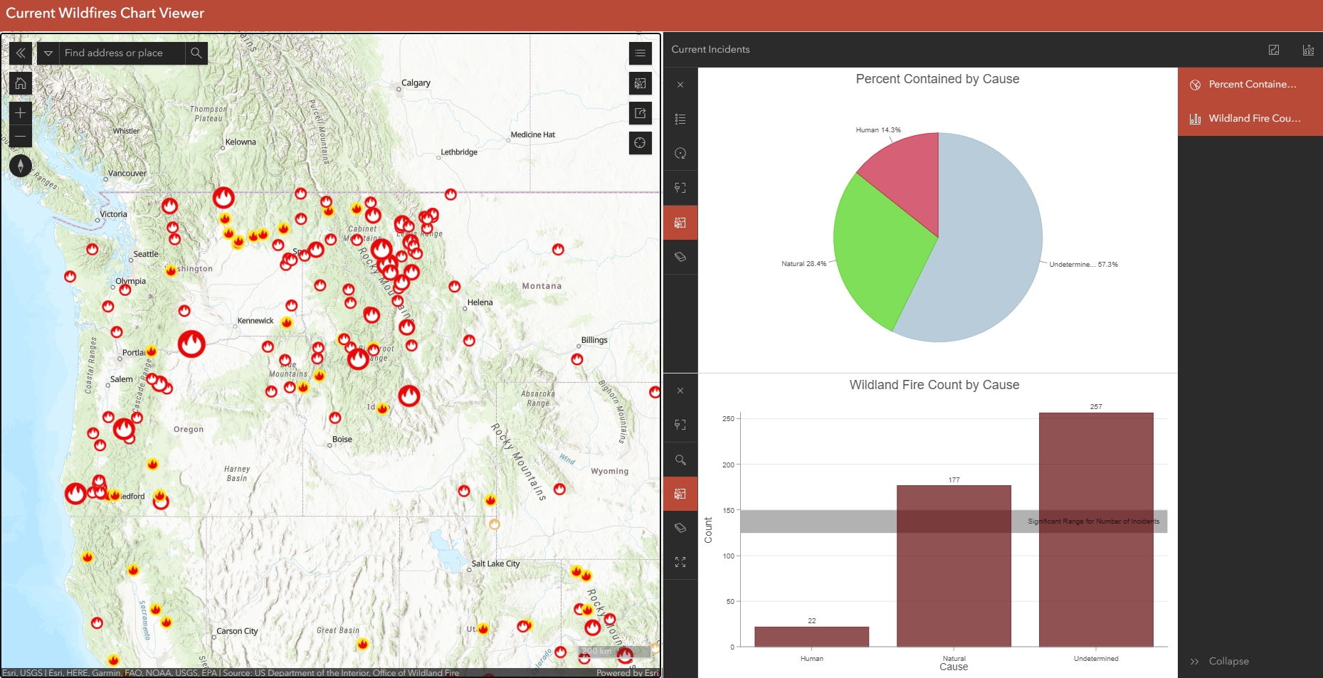
Once all of these settings are configured, the last step is to click on the blue Publish button which is always visible. I will confirm that I want to publish the app and then launch the preview. As you can see below, the web app is nicely curated, clean, and easy to understand.
I hope you’ve enjoyed this tutorial. Please subscribe to our newsletter to get free content and tutorials directly to your inbox.
