Many of our readers regularly work with U.S. Census data for mapping and analysis purposes. Whether you work with these datasets every day or just every now and then to create a simple map you’ve no doubt discovered how difficult it can be to decipher census table names, find the data you need, download the data, and then create maps or perform analysis. Today I’d like to illustrate how you can become much more efficient at automating your census map production using the R programming language along with the tidyverse and tidycensus packages.
Before we get started let’s get a few terms described for those of you who are unfamiliar with the R environment. R is a language and environment for statistical computing and graphics.
R provides a wide variety of statistical (linear and nonlinear modelling, classical statistical tests, time-series analysis, classification, clustering, …) and graphical techniques (including mapping), and is highly extensible. One of R’s strengths is the ease with which well-designed publication-quality plots (including maps) can be produced, including mathematical symbols and formulae where needed. You can read more about R here.
R includes thousands of open source packages that can be used by the R programming language to accomplish all sorts of tasks. The three primary packages used in this example are tidyverse, tidycensus, and leaflet.
The tidyverse is an opinionated collection of R packages designed for data science. All packages share an underlying design philosophy, grammar, and data structures. This collection of packages enables you to read data from external data sources, prepare and transform your data, perform data exploration and visualization, and more.
tidycensus is an R package that allows users to interface with the US Census Bureau’s decennial Census and five-year American Community Survey APIs and return tidyverse-ready data frames, optionally with simple feature geometry included. Because the data can be returned with simple feature geometry it can easily be mapped with a package like leaflet.
Leaflet is one of the most popular open-source JavaScript libraries for interactive maps. There is also a leaflet R package for integration and control of Leaflet maps in the R environment.
Geospatial Training Services has created an Exploring and Visualizing Census Data with R class offered online in self-paced and live formats as well as traditional classroom format. You can also download a free of my book by submitting your email at the link above. In the class and book we cover tidycensus, tidyverse, and leaflet in great detail.
For this simple example of map automation using R we also used the RStudio development environment. You can download and install a free version of RStudio at this link.
Let’s get to the example. For this map automation routine we are going to automate the creation of census tract level maps showing price-rent ratio for the largest 200 counties in the United States. Price-to-rent ratio is the ratio of home prices to annualized rent in a given location and is used as a benchmark for estimating whether it is cheaper to rent or own property, and can be an important indicator for residential real estate investors. Investopia provides a good overview of the specifics of print-rent ratio and how it is calculated.
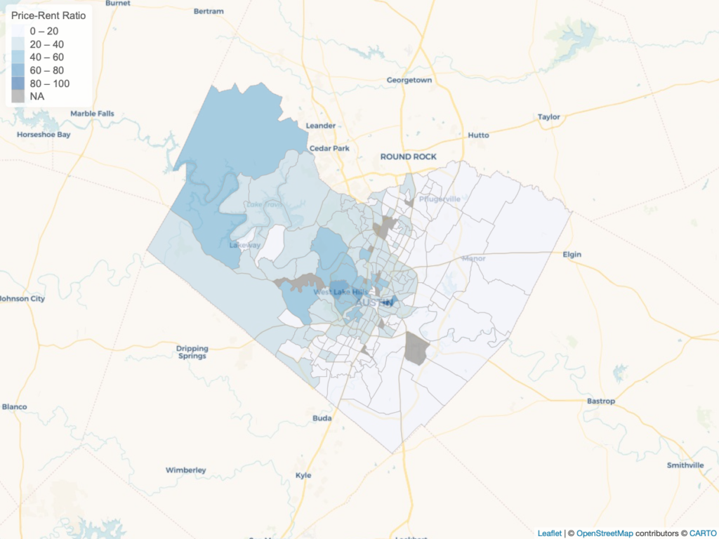
To achieve this end we will use data from the American Community Survey (ACS), produced the U.S. Census Bureau, for the most recent available year (2018) with the R programming language to produce the individual maps. Below is a map depicting price-rent ratio for Travis County, Texas, which includes the City of Austin. Price-rent ratio data for this map was mapped at a census tract level.
We will use the tidycensus package to download data for two ACS census tables: B25077 (Median Home Value in dollars) and B25058 (Median Contract Rent in dollars). We’ll join the two tables together, add and populate a new field to hold the price-rent ratio, and then map the data at a census tract level.
Below is a screenshot of the code used to automate the production of these maps. Take a look at the code and then we’ll discuss the specific sections of code.
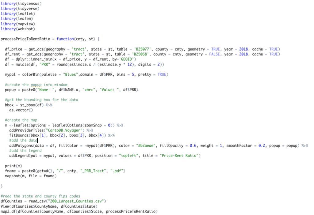
The first few lines of code simply import the packages that will be used in the script and these include tidycensus, tidyverse, leaflet, and a few other supporting packages.
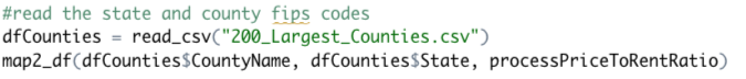
Now let’s skip down to the bottom of the script. This section of the script reads the county data from a 200_Largest_Counties.csv file (you can download the file here) into an R data frame object. More on data frame objects here. This is a large topic that we don’t have time to cover extensively in this article, but R data frames have a table like structure that includes columns and rows and can be easily manipulated with tidyverse. There are several columns of information in the 200_Largest_Counties.csv file by the two we are interested in are the CountyName and State columns which we pass into the map2_df() function along with a specific function called processPriceToRentRatio.
Essentially, what the map2_df() function does is iteratively pass each county and state combination from the csv file into the processPriceToRentRatio() function. The map2_df() function is found in the purrr package (part of tidyverse) and is the key to the automation in this case. It is going to loop through each county and state combination found in the 200_Largest_Counties.csv file and pass that combination tot he processPriceToRentRatio() function which will actually pull the data, join the tables, and produce the map.
The primary workhorse function of this script is processPriceToRentRatio() seen below.
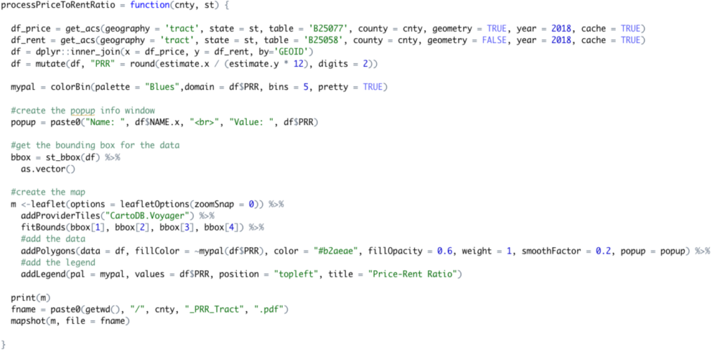
The first two lines of this function use the get_acs() function from the tidycensus package to import median home value and median contract rent into separate data frame variables. Notice that we’re importing tract level data (geography paramter) for the state and county that are passed into the function. We’ve also specified the year and a cache parameter that stores the data locally, and a geometry parameter that indicates if we want the simple feature geometry.

We then join the two tables together using the inner_join() function (part of tidyverse), add a new column to the joined table that will hold the price-rent ratio, and calculate the values for price-rent ratio for the county.

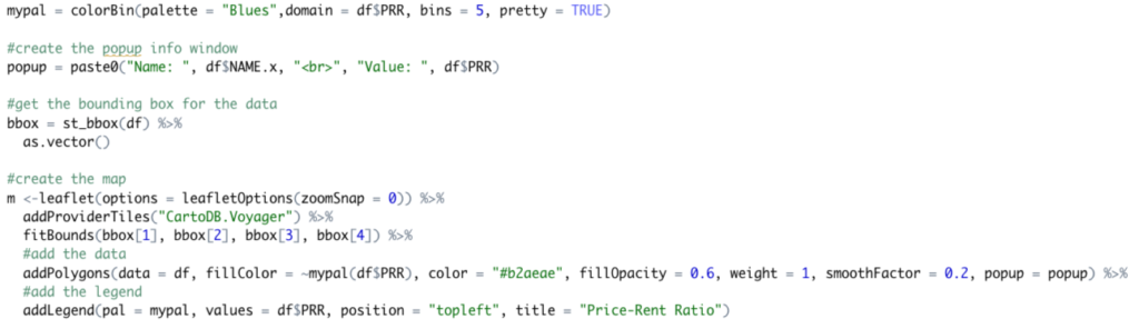
The next code block produces the map from the resulting data frame. Starting with the first line you see below, this code does the following:
- Creates the color ramp for the data (blue ramp with 5 bins using the PRR column)
- Creates the popup identify window (not actually needed since we’re producing PDF maps here).
- Retrieves the spatial extent of the data which is later used on the creation of the map
- Creates the Leaflet map that includes a basemap, the census tract level data for the county, and a legend
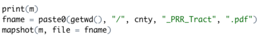
The final code block in the processPriceToRentRatio() function displays the map, creates a file name, and uses the mapshot() function to write the county map to a PDF file.
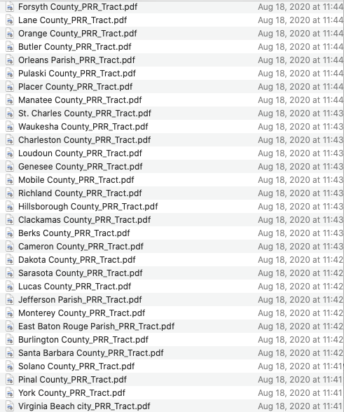
Now remember that the key to this is the automation piece which is facilitated by the map2_df() function from the purrr package. This function feeds each of the county/state combinations iteratively into the processPriceToRentRatio() function which creates the final map for each county. You can see the output below. There are also R packages that also allow you to interface with traditional GIS data formats includes shapefiles and geodatabase feature classes. For example, ArcGIS Pro and ArcGIS Desktop include an arcgisbinding package that can be used to interacting with GIS data in a R script. We’ll save that a future post though!