

Learn more about our Experience Builder courses and upcoming training schedule.
In a previous tutorial, we described the steps and options for configuring a modern pie chart in Experience Builder. In this tutorial, we will use Wildfire data from between 1984 and 2016 to customize a Stacked Bar Chart with a Split-By parameter, which provides more options for advanced data visualization. The Bar Chart will show us historical data on fires that occurred based on the agency responsible for managing the fire incident and how many total acres were burned, in addition to splitting the data by the wildfire cause (i.e. human or natural).
For those of you who have read the Pie Chart tutorial referred to above, the first two sections of this tutorial are identical, which are (1) Adding a Chart Frame and (2) Adding the Wildfire Data.
Adding a Chart Frame
First, we need to pull in a chart frame and then resize it to fill 100% of the height and width of our working canvas.
STEP 1: Find the Chart widget under the “Data Centric” gallery and pull it into the middle of your canvas.
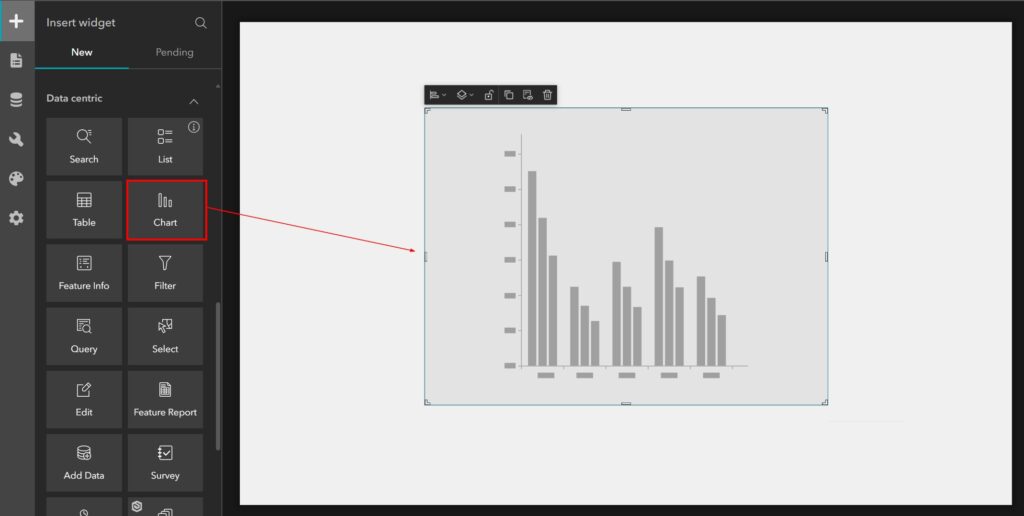
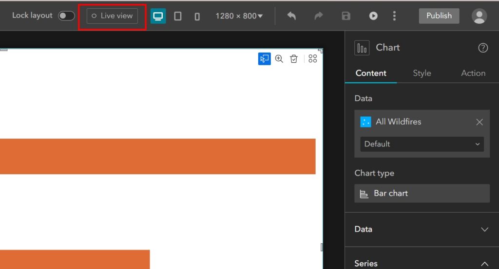
STEP 2: Next, click on the Styles tab in the settings panel on the right and then type 100 into the Width and Height size settings. Make sure the unit for these settings is set to percent. You may have to reposition your chart frame to fit your canvas if it does not automatically center itself. Or you can use the Size and Position graph to set 0 percent from the right and button edges, as shown in the image below. 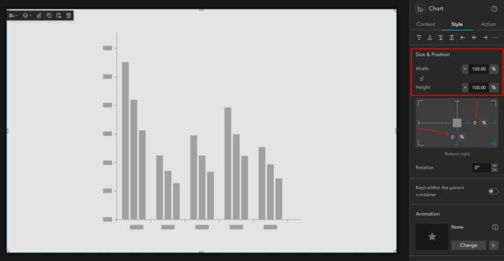
Adding the Wildfire Data
Now we need to add the Wildfire data to this project so that we can access it when it comes time to configure the chart.
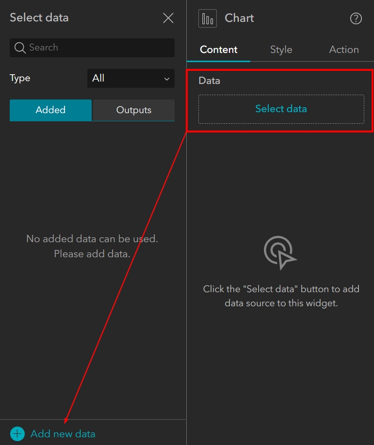
STEP 3: Click back to the Content tab in your chart settings on the right and then click on the “Select Data” button. When the Select data panel expands, click on “Add new data” at the bottom.
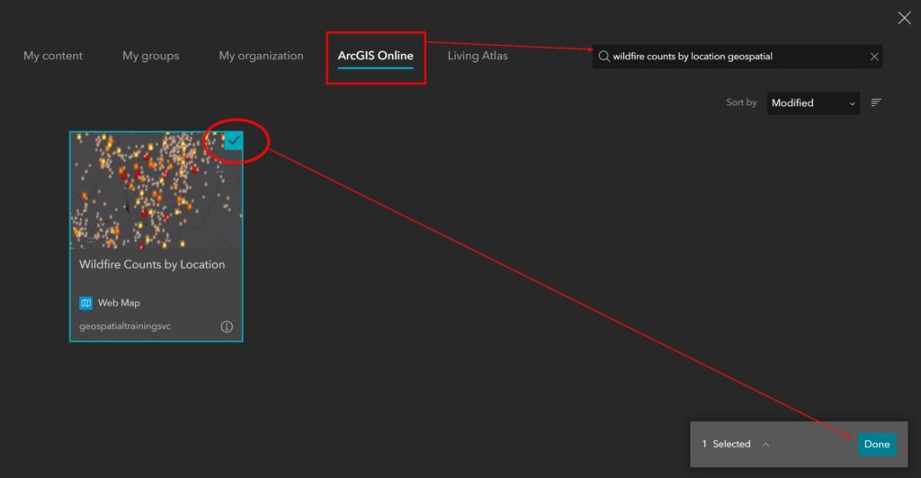
STEP 4, Option 1: You can add the Wildfire map data in one of two ways. The first approach is to click into the ArcGIS Online tab in the top menu and then search for “Wildfire counts by location geospatial”. When the dataset appears, click to select it and then click Done in the lower right to finish adding the data.
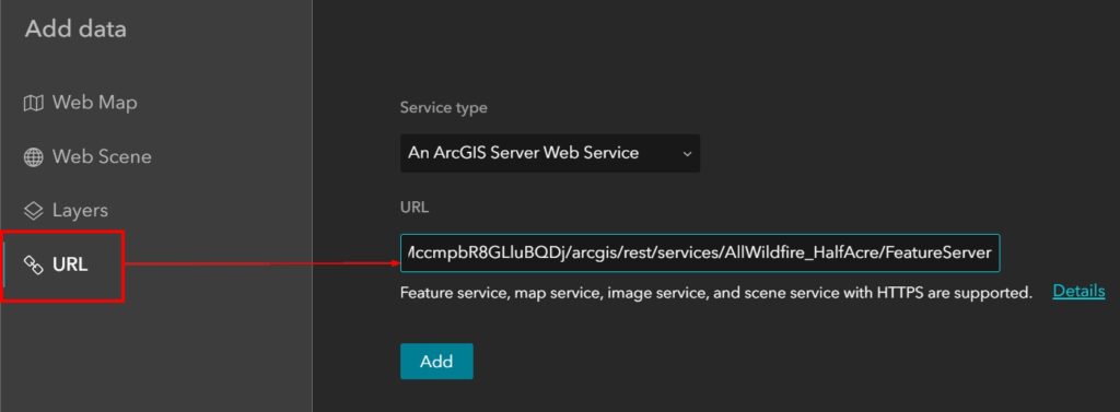
STEP 4, Option 2: The second approach is to click on the URL option in the menu on the left and then paste the below URL into the URL field. When you click on “Add”, the “Done” button will appear in the lower right. Click on Done to finish adding the data.
URL to copy and paste: https://services7.arcgis.com/MccmpbR8GLluBQDj/arcgis/rest/services/AllWildfire_HalfAcre/FeatureServer
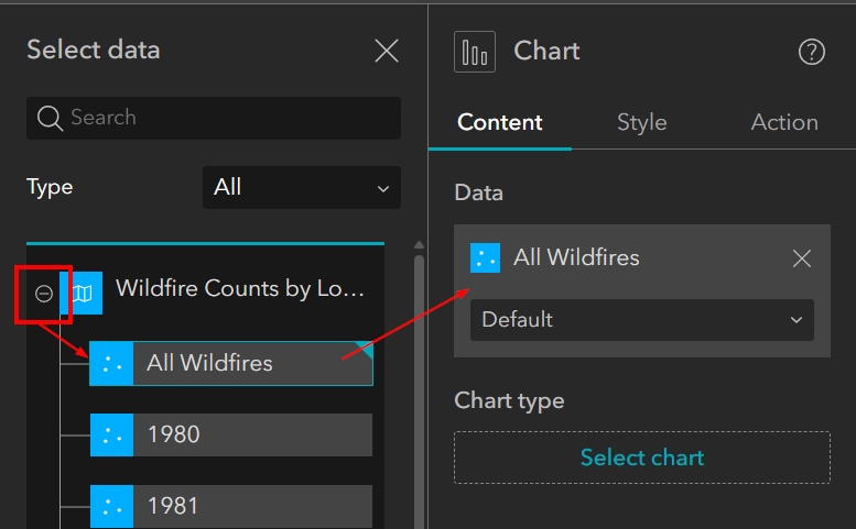
STEP 5: Now that the Wildfire Counts by Location map is added to the project, we can see it in the Select data panel. Click on the plus symbol to the left of the map title to expand the list of layers included in the map. Select the first layer in the map called “All Wildfires”. This will add the All Wildfires feature data to the Chart widget. Once it has been added you will see the Chart Type option appear below it.
Adding a Stacked Bar Chart
In the following steps, we are going to add and then begin customizing a Stacked Bar Chart. The difference between a Bar Chart and Column Chart is the direction of the bars. For a Bar Chart, the bars are horizontal, which means they extend from left to right instead of bottom to top.
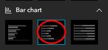
STEP 6: Click on the “Select chart” button under Chart type in the panel on the right (under the All Wildfires Data). When the gallery of options appears, find and select the Stacked Bar Chart, which is the middle option. You can hover over each Bar Chart thumbnail to see the names. Once the Stacked Bar Chart has been selected, you will see it appear as the Chart type.
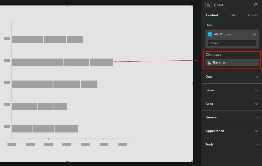
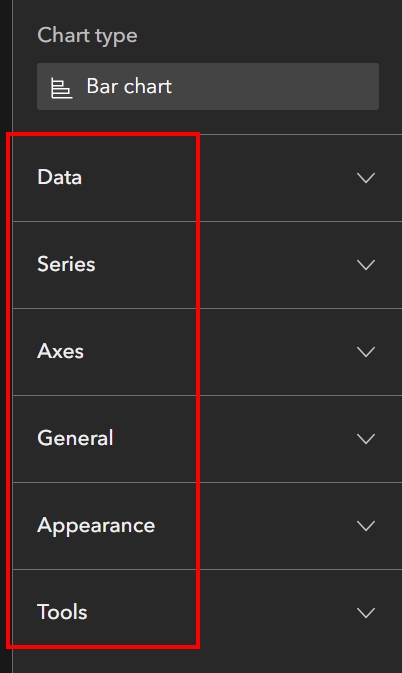
There are six sections of settings that we will go through to help us customize our Bar Chart. As shown in the image below, these are: Data, Series, Axes, General, Appearance, and Tools.
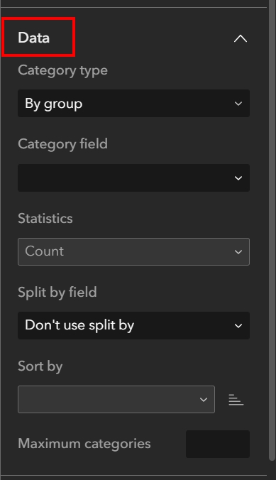
Configuring the Data Parameters
Typically, when you add your Chart type, the Data section will already be expanded.
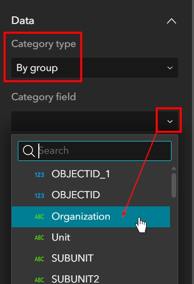
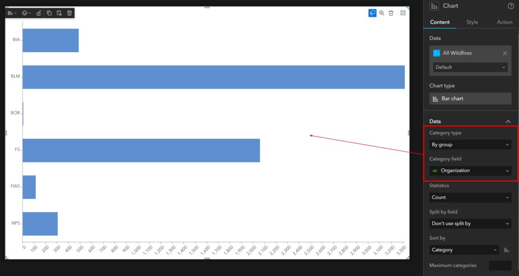
STEP 7: Leave the Category type as “By group”. Click on the drop-down arrow for Category field and choose “Organization” from the list of options that appears. This is the field that has the Agency identified.
You will see the Bar Chart begin to populate with information. After you choose your Category field, the chart will show the Organization (i.e. Agency) Category with the Count of total records found in the dataset, as seen below.
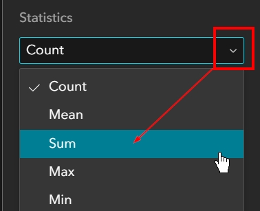
STEP 8: We want to visualize acreage burned in our chart. Change the Statistics type from “Count” to “Sum”.
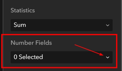
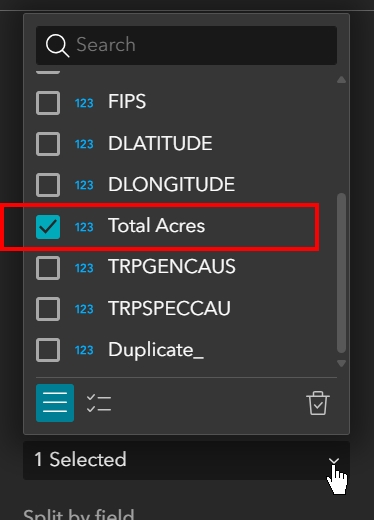
STEP 9: Once the Statistics type has been changed to Sum, a Number Fields option will appear below it. Click on the drop-down arrow to the right of the Number field and then check the box next to “Total Acres”. Because this is a stacked bar chart, we have the option of choosing more than one number field, but for the purposes of this tutorial we are going to stick with just one.
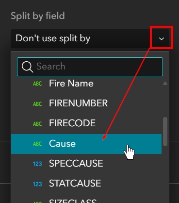
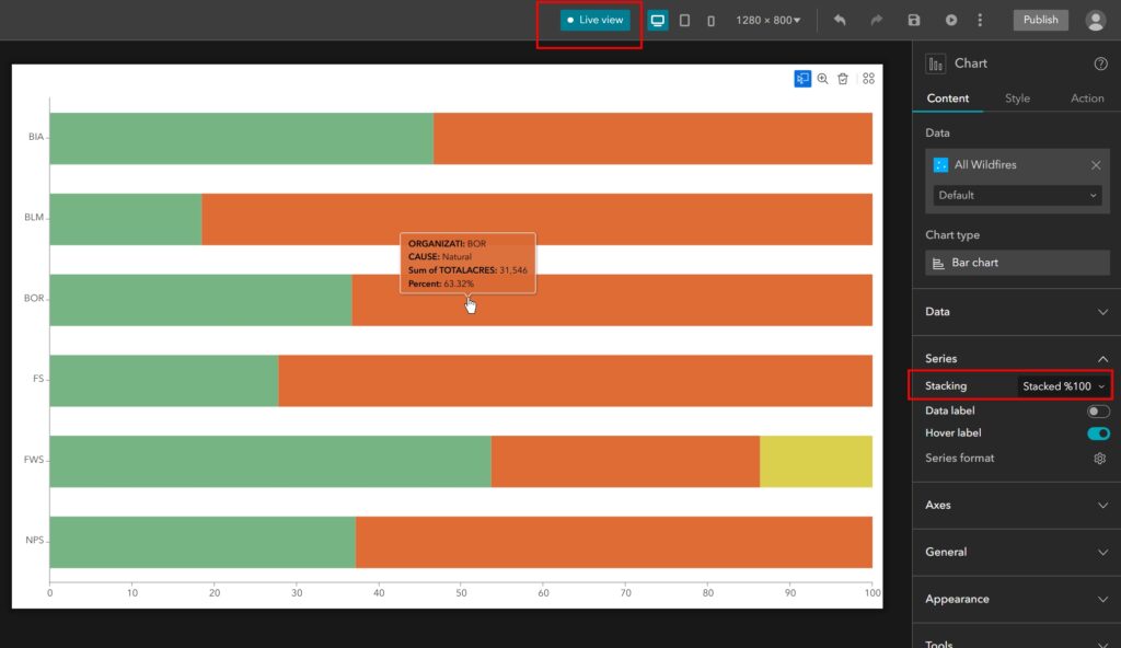
STEP 10: Click the drop-down arrow for the Split by field and choose “Cause” from the options that appear. When you do, the visual of your bar chart will change dramatically, showing you not only the number of acres each agency was responsible for managing, but also how many of those acres were caused by humans or natural events (see second screenshot below).
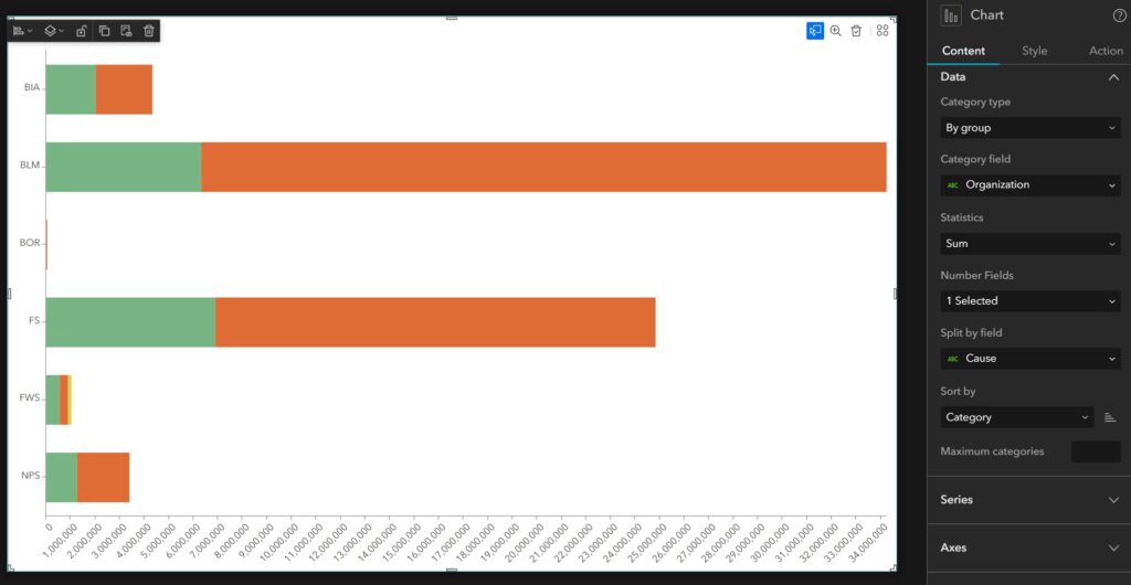
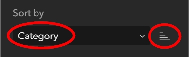
STEP 11: Leave the Sort by as ascending Category, which it is by default. This allows the chart to be alphabetized from top to bottom, as is seen in the above screenshot.
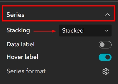
Configuring the Series Parameters
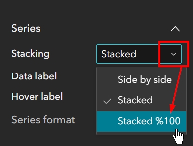
The Series section is where you will configure the labels and series formatting, such as color and border thickness. It is also where you could change the stack type of the Bar Chart if you wish. For example, we chose Stacked Bar Chart at the beginning, but you can see there aren’t many BOR acres burned, and the bar for BOR in the image above looks almost negligible at this point. If we were to look at this series of data as a percentage of a whole 100% instead, the bars would look very different.
STEP 12: Just to see what a Stacked 100% Bar Chart would look like, click on the drop-down arrow next to the Stacking options. Right now, it is set to Stacked, change this type to “Stacked 100%”. As you can see, the data in the bars now show up as a percentage of the entire 100%. The 100% would be the total acres burned for each agency.
STEP 13: Turn on Live View so you can see what happens when you hover your mouse over the bars in the chart. Live View is located on the very top Builder toolbar. When you click on this button, it will activate and turn blue. While in Live View, you can interact with your application in the builder just as an end-user would once the application goes live. Hover your mouse over the various bars in the chart to see the labels that appear.
STEP 14: When you are done testing out the Bar Chart in Live view, click on the blue Live View button to turn it back off. You should turn off Live View if you want to start configuring the application again.
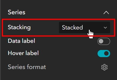
STEP 15: Change the Stacking type back to Stacked. We want our users to be able to see the large differences in acreage burned between all of the agencies when they look at the chart. If we were to leave this as Stacked 100%, then our users would have to hover over each portion of the bar to determine the actual number of acres burned and figure out the differences between the agencies.
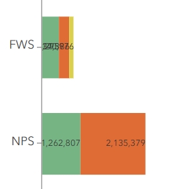
STEP 16: We are going to leave the Data labels turned off because some of the labels don’t quite fit with the size of the bars present in this chart (see below image). We will also leave the Hover label enabled to allow our end-users to interact with the chart and see more information about each section of bar.
STEP 17: Click on the gear next to Series format to expand the Series format panel. You will see that this dataset has some blank data that is not ‘null’ but is a blank field that is registering in the application as a value. That is shown in the below image just above the Human thumbnail. We are going to ignore this for the purposes of our tutorial, but this is something that you would want to reconcile in your own data if it is present.
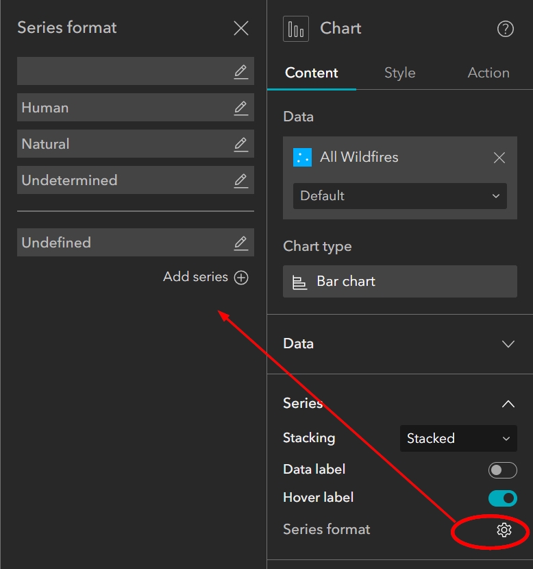
STEP 18: Click on the pencil symbol to the right of the Human series to expand the options. Leave the Label set to “Human” but change the color of the bar to a dark burgundy or red.
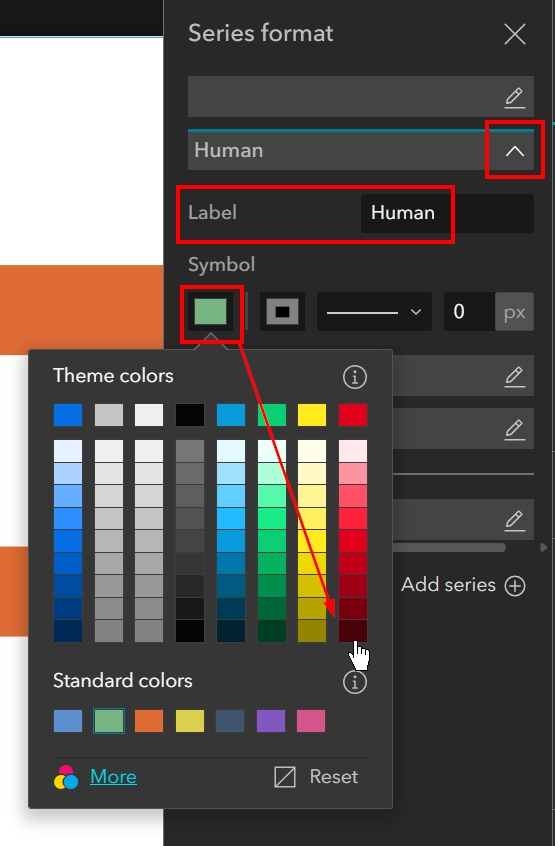
STEP 19: Change the border color to white and the thickness to two pixels.
![]()
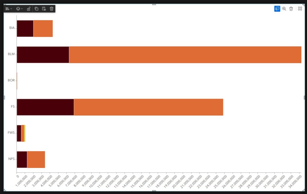
Your Bar Chart should now look like the below image.
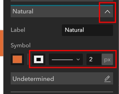
STEP 20: Expand the Natural series options by clicking on the pencil to the right. Leave the label set to “Natural” and the color set to the default orange but change the border to white and thickness to two pixels.
Your Bar Chart should now look like the below image.

Configuring Axes Parameters
The Axes parameters relate to the X- and Y- axis titles, labels, and grid.
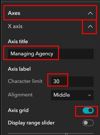
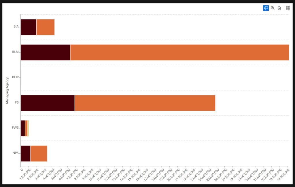
STEP 21: Expand the Axes section and then expand the X-Axis sub-section by clicking the pencil symbol to the right. Make the following changes:
- Change the Axis title to “Managing Agency”
- Change the Axis label character limit to 30
- Enable Axis Grid
- Leave all other settings as they are by default
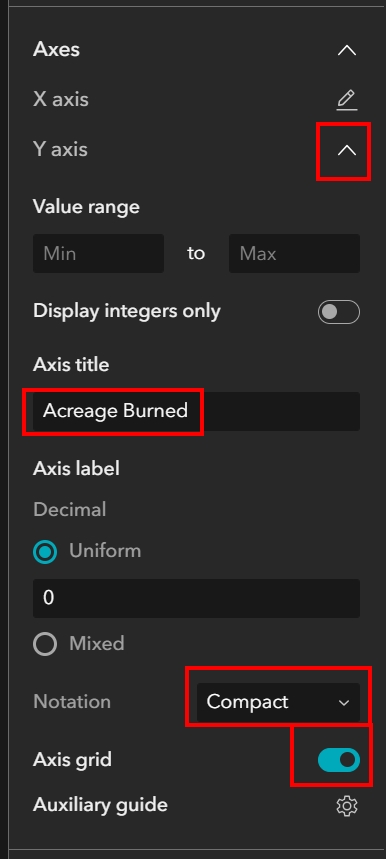
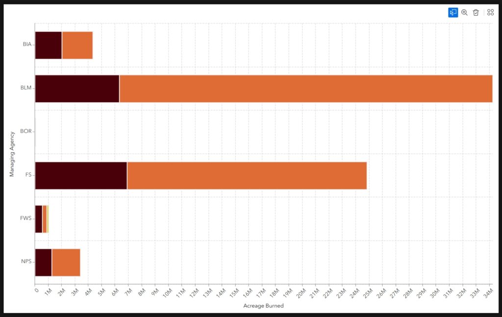
STEP 22: Expand the Y-Axis sub-section by clicking the pencil to the right. Make the following changes:
- Change the Axis title to “Acreage Burned”
- Change the Axis label Notation to “Compact”
- Enable Axis Grid
- Leave all other settings as they are by default
STEP 23: Click on the gear symbol to the right of Auxiliary guide and then in the panel that expands, click on the blue button to add a guide. Make the following changes to the settings:
- Name the guide “5 M”
- Set the Start at “5000000”. Type this in without any commas or separators.
- Make sure the color is a bright blue.
![]()
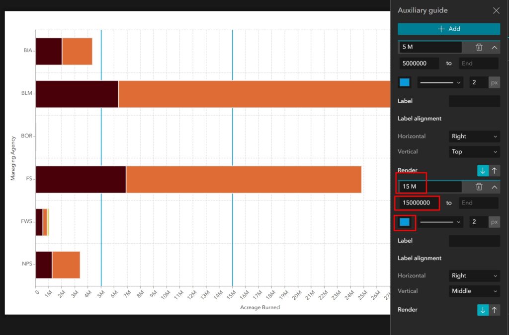
STEP 24: Click on the blue Add button to add another guide. Make the following changes to the guide settings:
- Name the guide “15 M”
- Set the Start at “15000000”. Type this in without any commas or separators.
- Make sure the color is a bright blue.
Ideally, we would have set a guide every 5 million acres burned in the chart, but for the purposes of this tutorial we will add two guides and move on. Your Bar Chart and guide settings should now look like the below image.
Configuring the General Parameters
The General section is pretty basic. It deals with the chart title, description, and legend.
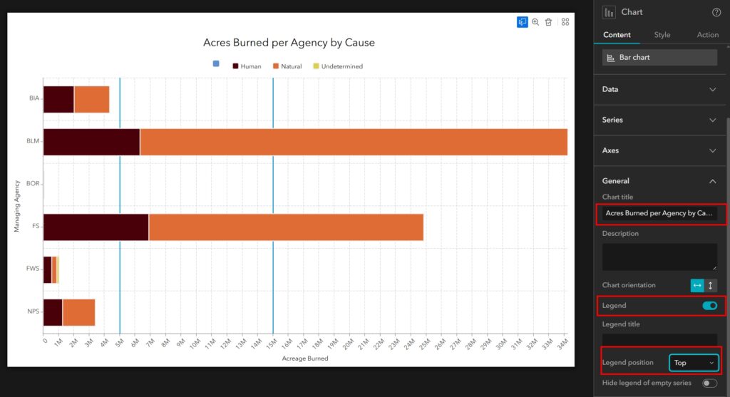
STEP 25: Expand the General section and make the following changes:
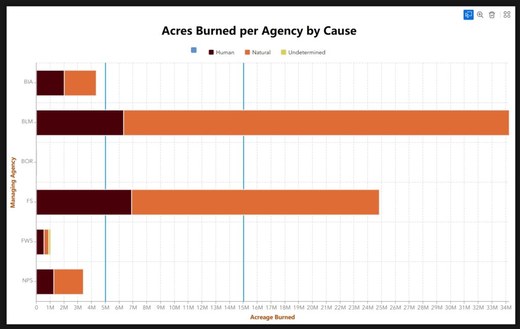
- Change the title to “Acres Burned per Agency by Cause”
- Enable the Legend
- Change the Legend Position to Top
As previously mentioned, we would ideally not have any blank data values in our Cause field. Because we do in this dataset, there is an out-of-place blue patch in the legend that does not have a label. For the purposes of this tutorial, we will ignore it. Your chart should now look like the below image.
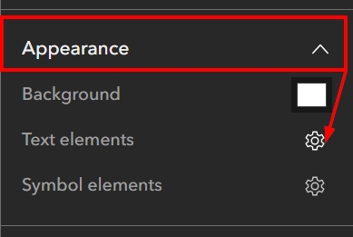
Configuring the Appearance Parameters
The Appearance section is where you can alter the background color of the chart and change the font style and color of the text elements. This is also where you can change the color and style of the symbols, or lines, found within your chart. These symbols consist of the axes and grid lines. For this tutorial, we will leave those as they are by default but make some changes to the text elements.
STEP 26: Expand the Appearance section and then click on the gear symbol next to Text elements.
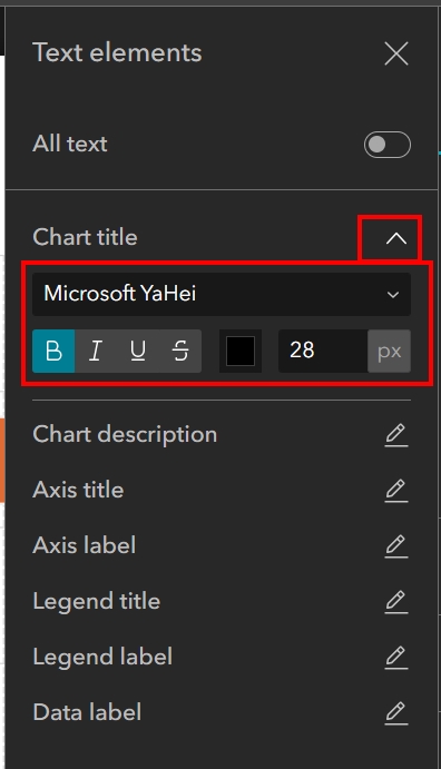
STEP 27: When the panel appears, click on the pencil to the right of Chart title to expand the title options. Make the following changes:
- Make the Chart title Microsoft Ya-Hei
- Bold the font
- Change the size to 28 pixels
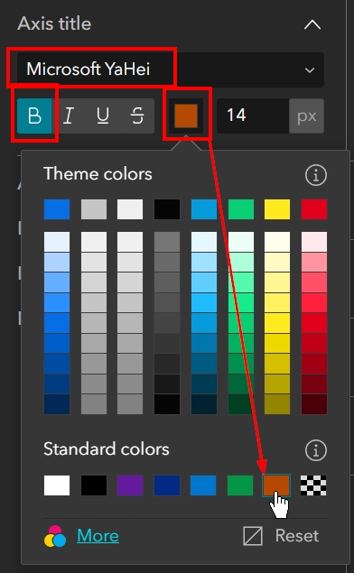
STEP 28: Click on the pencil to the right of Axis title to expand the options. Make the following changes:
- Make the Axis title Microsoft Ya-Hei
- Bold the font
- Change the color to a burnt orange
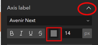
STEP 29: Click on the pencil to the right of Axis label to expand the options. Make the following changes:
- Make the Axis label color a lighter grey
Your chart should now look like the below image.
Configuring the Tools
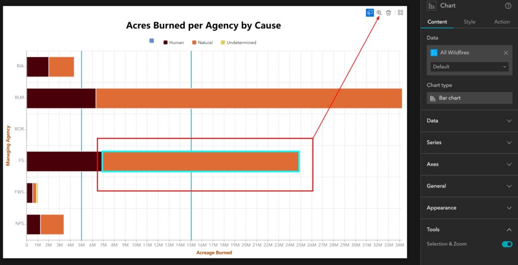
The Tools section is the last section to configure when customizing your Bar Chart. Here, we have one option: to enable the Tools or disable them. The Tools themselves allow your user to select a piece of the bar chart and have the items associated with that piece also select within a map. Once the items are selected, you could also zoom to the group you have selected in the chart.
We did not configure a map for this tutorial, but if you would like to take this the next step further you can do that on your own to see what that interaction looks like. For the purposes of this tutorial, we will leave the tools enabled which is the default. The settings look like the below image.
Summary
In summary, the Stacked Bar Chart is one of the best ways to show a lot of information in one graphic. We were able to show the managing agency, how many acres total they have managed, as well as how many acres were associated with Human or Natural causes.
Be sure to register for our newsletter to receive tutorials like this directly to your inbox. For more tutorials on Experience Builder, check out our YouTube channel.
