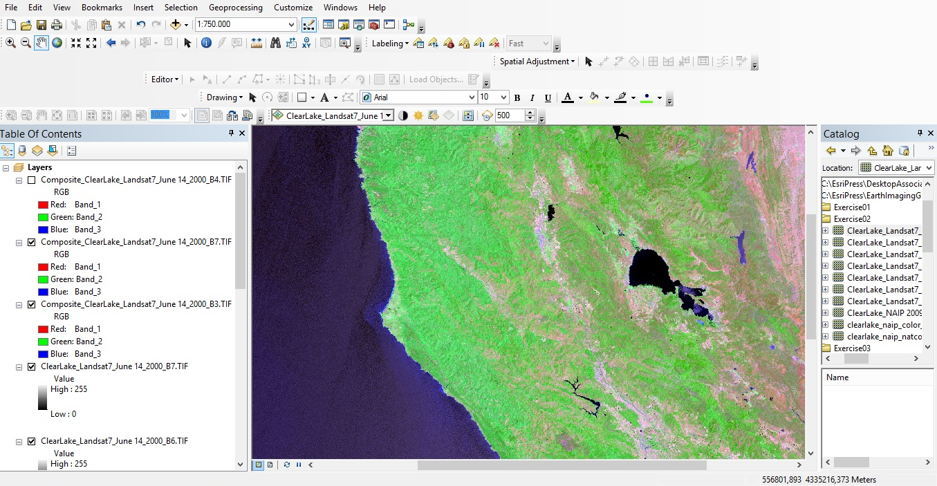
Airborne and satellite imagery these days is available in multiple bands, which gives the user the opportunity to enhance and use it for a wide range of applications. This blog describes some of the tools available in ArcMap to do this.
By Eric van Rees
Two-dimensional earth imagery, captured through different methods of remote sensing, is available on the market for GIS integration today. This means that GIS users now have access to imagery that comprises multiple bands common to the sensors that are used for generating the images. This allows them to do easy image visualization, inspection and analysis.
Display and assign colors in multiband images
ArcGIS Desktop allows for displaying and assigning colors in multiband images. Because image providers provide earth imagery in multiple bands (four spectral bands being quite common), it is possible to assign spectral bands to different colors. This process follows the logic of tristimulus theory of color vision, which means that combining red, blue and green colors yields all extra colors visible to the human eye. By doing the same thing with ArcMap, it can be enhanced yielding more information about what´s displayed.
How it works
Any color image that is displayed on a screen in fact consists of three different images, displayed on top of each other. To see which ones in ArcMap, you access the Image Window, which can be found at the Symbology tab in the Layer Properties after adding an image to the map window. Here, you see that ArcMap assigs three fixed channels (named 1 for red, 2 for green, 3 for blue) to different bands. These bands can be assigned by the user. The only limitation is that you can only display a maximum of three bands at a time. This also means that the more bands are captured by the sensor and made available to the user, the more combinations are possible in ArcMap.
Remote sensing image files are available in different types: three-band images, four-band images, more-than-four band images and separate image files for each band of a multispectral dataset. For an overview of available types of remote sensing imagery, refer to Lawrence Fox III’s book “Essential Earth Imagery for GIS”, p. 46. Depending on the intention of the user, different image composites can be created: natural-color composites for example are logically build by loading the red spectral band in the red channel on the color display, the green spectral band in the green channel, and the blue spectral band in the blue channel.
False-color composites, used for vegetation mapping, follow a more complex logic as a different set of spectral bands is assigned to the three color channels in ArcMap. Assigning the visible green band to the third blue channel means that blue is represented on the screen in green. This process can be rather confusing, but there are some simple checks available to make sure you assign the right colors.
Control contrast and brightness
After assigning the spectral bands to the color channels in ArcMap, the image is displayed in the map window. ArcMap automatically enhances the contrast and brightness of the results, but brightness levels can be modified in two ways. The first option is to use the Contrast and Brightness sliders in the Display section of the Image Analysis window. The second option is to modify the histogram of a single-band image or the histograms of various color images, tallying all brightness levels of all pixels in the image and is then stretched in order to increase contrast and brightness. This option is not always necessary, as the sliders do a fine job.
In conclusion
The imagery tools in ArcMap described above are easy to use, but in order to use them correctly, you should know what you´re doing: knowledge about functioning of sensors, different remote sensing methods, available image types, spatial statistics and displaying technology is indispensable in this case.

