

We’ve been asking for the Add Data widget since the debut of Experience Builder, and as of the Q1 2023 update our wishes have been granted. We at Geospatial Training Services are also counting down the days until the Q2 2023 update which will include a few more useful widgets, including Near Me, Swipe, Related Table Editing, and the Basemap Gallery. Stay tuned for more on those, but in the meantime let’s break down the Add Data widget.
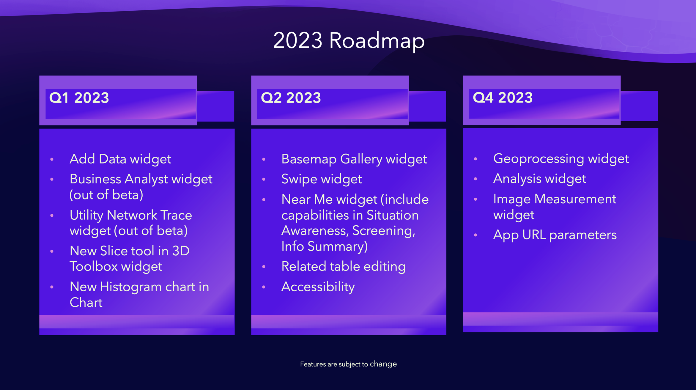
Why use the Add Data widget?
This widget will truly give your users the flexibility to view and print maps that are more meaningful to their own organizations or projects. For example, your users will be able to overlay their own data with your organization’s data in the map, quickly view any shapefile without having to have desktop software and their own licensing, or map CSV and GeoJSON files from an open data portal without having to upload them as items in their ArcGIS Online profile.
How do I configure the Add Data widget?
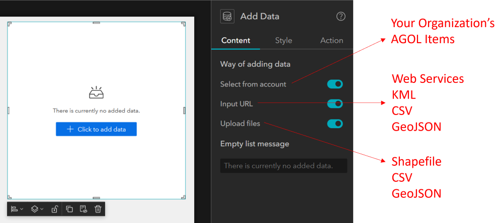
CONTENT SETTINGS
The first thing you will realize when using the Add Data widget is that there isn’t much to configure. When the widget is added to the canvas, the primary content options are to allow or not allow various ways of adding data, which include the following:
- Select from Account
- Imput URL
- Upload Files
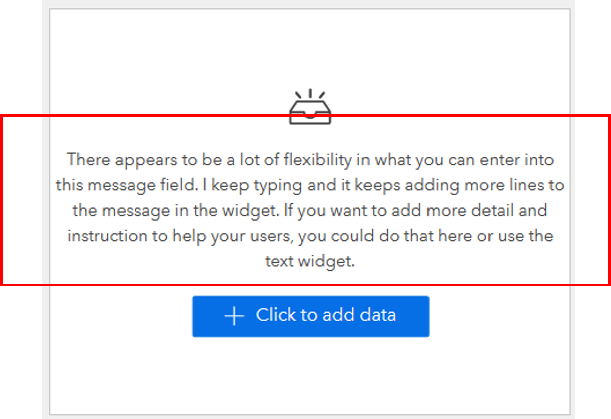
In addition, you can decide to leave the default ‘Empty list message’ shown in the above image, or modify it as illustrated below. In most cases, the default message seems to work well, but if you want to add more instruction you can add multiple lines of text into the widget.
ACTION SETTINGS
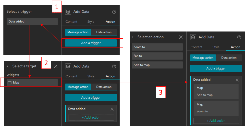
The action settings include one trigger, which is “Data added”, and one target, which is the “Map”. The actions you can choose from are “Zoom To”, “Pan To”, and “Add to Map”. What all this Experience-Builder jargon means is that when your user adds data (trigger) using the Add Data widget, it will be automatically added (action) to the Map (target) and then zoom (action) to the location of the features in the map (target). The image below illustrates the process of configuring these actions.
How will my users interact with the Add Data widget?
It’s important to understand how any widget you include in your application functions from the user’s perspective. This will help you differentiate between the intuitive and not-so-intuitive aspects of your application interface, which will help you determine where you may need to provide more detail or instruction.
SEARCH
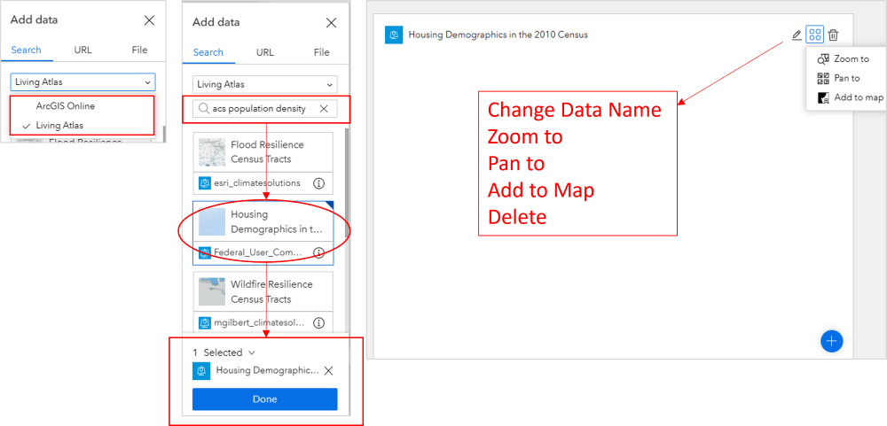
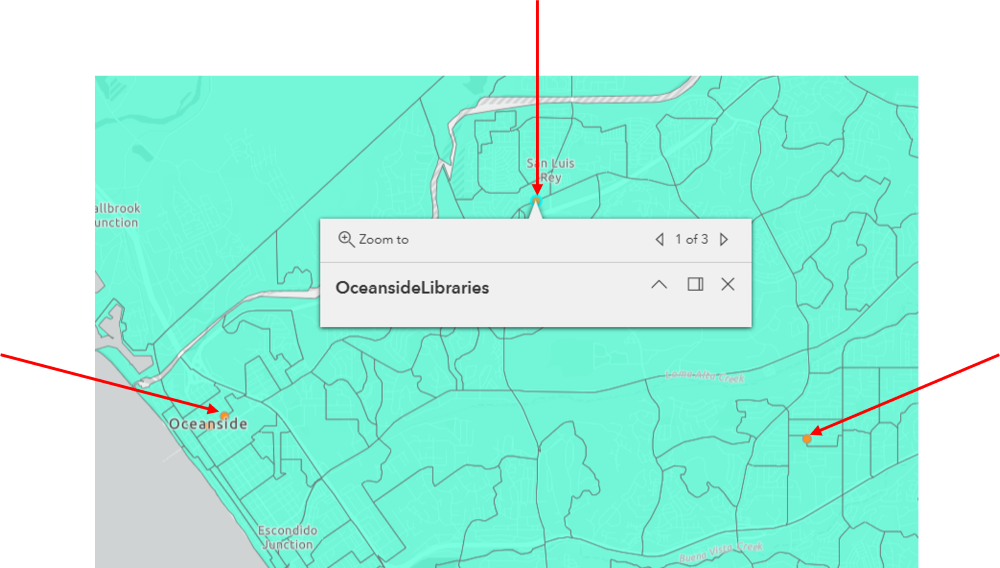
Users can search for and add ArcGIS Online content. Without logging in, the user can search for and data from ArcGIS Online public content and ESRI’s Living Atlas. For example, a public user can search ESRI’s Living Atlas for Amercian Community Survey (ACS) population density and demographics data and once they click on a dataset to select it, they will need to click on the “done” button at the bottom of the panel to complete the process. After adding a dataset, the user can change its name or delete it. If you haven’t preconfigured actions like we described in the previous section, the user will have the option to manually Zoom to, Pan to, or Add the data to the map.
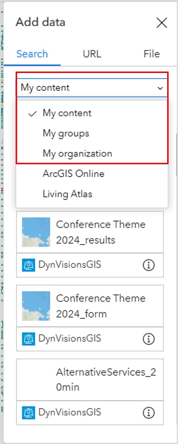
With an ArcGIS Online User profile, the user will be able to add their own content, and any content they have access to within their organization. One downside is that there is no easy way to log in from the application. So, if you are using an application and decide you want to add your own content, you will have to navigate to your account in another browser to log in and then come back and refresh the application browser to get it to recognize the connection to your profile.
URL
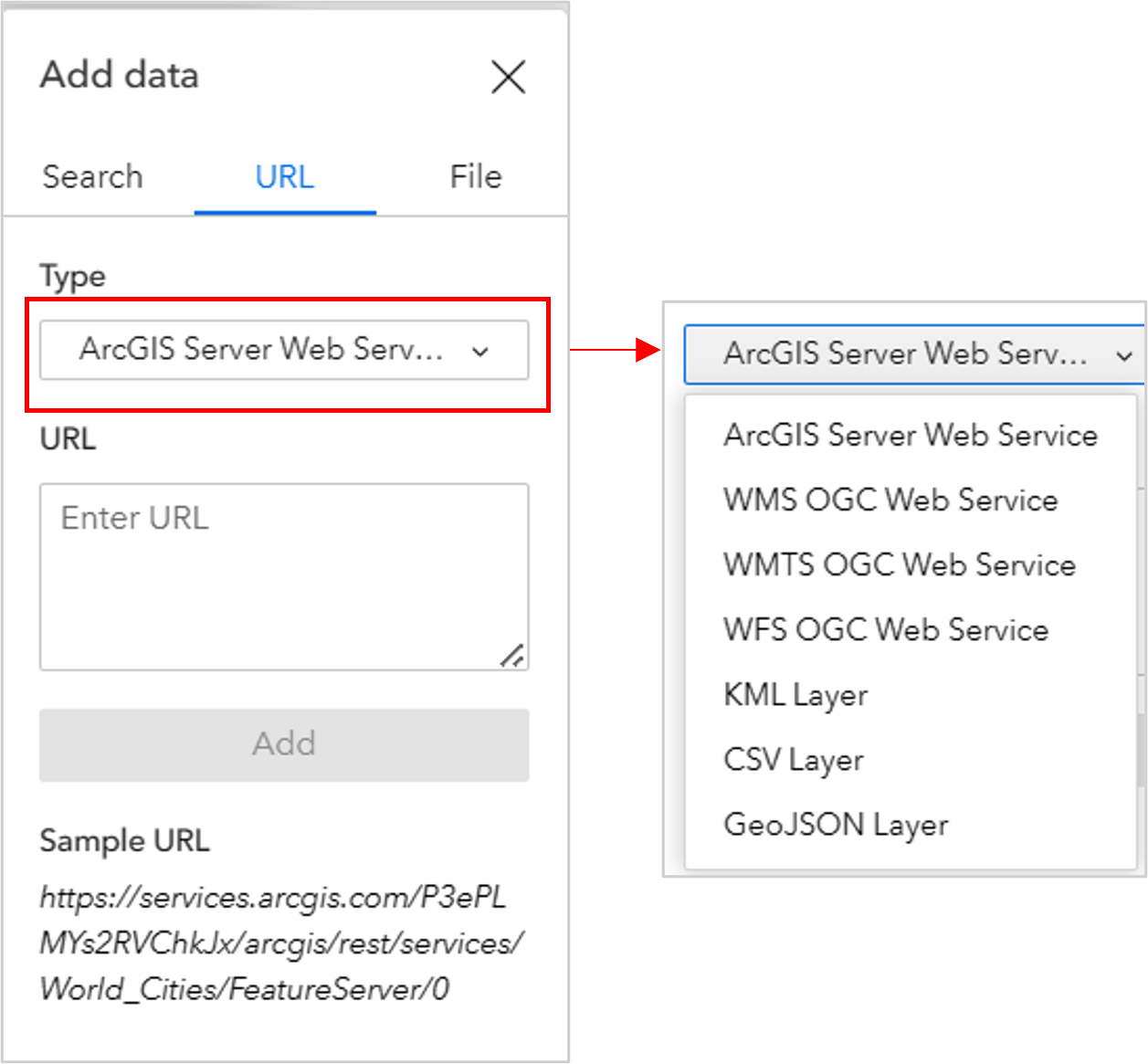
When adding data from a URL, the user has a lot of options. The following services can be added:
- feature
- map
- vector tile
- image
- scene
In addition, KML, WFS, WMS, WMTS, GeoJSON, and CSV can also be added via URL.
FILE
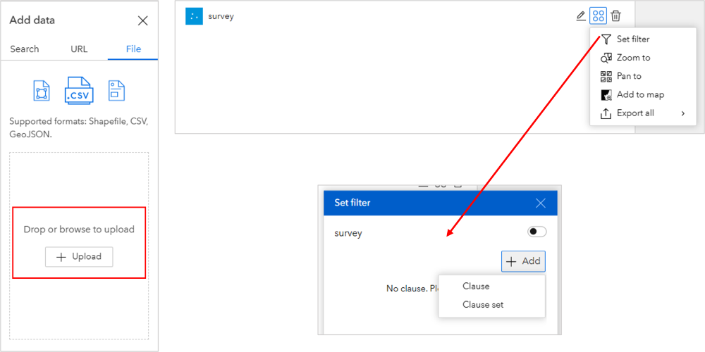
A user can also add data by clicking on the File tab and dragging files into the widget or clicking on “Upload” and navigating to the data location. File types can be shapefiles, CSV, or GeoJSON. Once a file is added, the user can set a filter on the data by adding a clause or clause set and can export the data back out to another file type, such as JSON, CSV, or GeoJSON.
What are some limitations when using the Add Data widget?
There are still some issues that may cause frustration in your users even though the basic capabilities of the Add Data widget are beneficial. These issues range from size limits and inflexible symbology to empty pop-ups and lack of interaction with other widgets.
DATA SIZE & RECORD COUNT
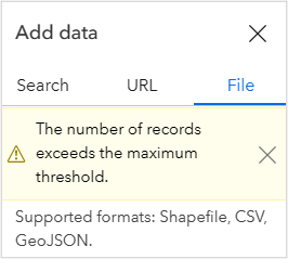
When adding files, shapefiles are limited to 4,000 records, 2 MB and must be zipped. CSV’s are limited to 1,000 records and 10 MB and must contain spatial information that the application can detect, such as location coordinates. GeoJSON is limited to 4,000 records and 1 MB. If you attempt to upload data that exceeds the maximum thresholds, you will receive the below error message.
POP-UPS
At this time, the Add Data widget will not read attributes from files that are added, such as CSV’s and shapefiles. The pop-ups will show the name of the file and nothing else. If data was added via a URL, then pop-ups will appear based on how they are configured on the original web service.
LAYER ORDER
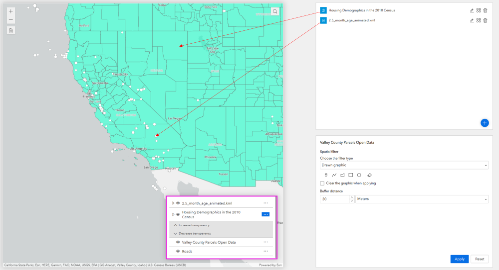
When initially adding data, your layers will appear in the map in the order you added them from bottom to top. For example, if you add Housing Demographic data by Census tract first and then add Earthquake points next, the points will appear on top of the census tract polygons. However, the way these are listed in your Add Widget data list will end up being the order in which they are layered in your map if you refresh your browser. This is a major pitfall in the way the widget functions. If you view the first image below, you can see on the right that I first added the Demographic data (polygons), and then I added earthquake points and, at first, the points are on top of the polygons in the map.
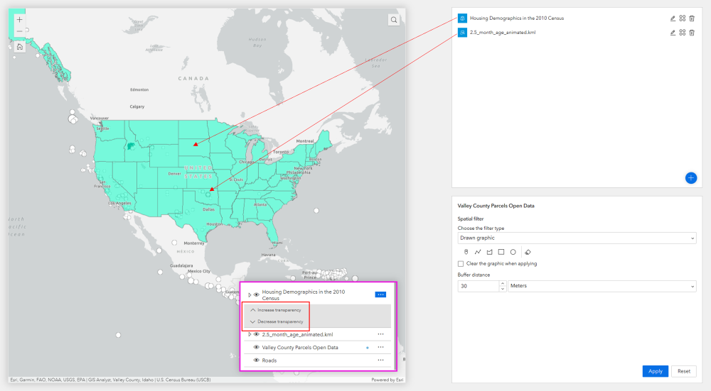
If you view the image below, you will see that I have refreshed the map and now the points are below the polygons because that is the way the drawing order is structured when you view the data in the Add Data widget on the right and the layer widget list outlined in pink.
SYMBOLOGY
Because we have no real control over the layer order of data that is added, it would be nice to have the ability to alter the symbology so we can more easily view relationships associated with the data we have added. However, the only thing we can alter about the symbology is the transparency level of the layer, and it is only if the creator has enabled this setting in the layer widget.
INTERACTION WITH OTHER WIDGETS
At this time, the data added will appear in the map and therefore also show up in the legend and layer widgets. But, as a user, you cannot add the data to the table widget or run a query on it, because those widgets are preconfigured to connect to data through the back-end builder.
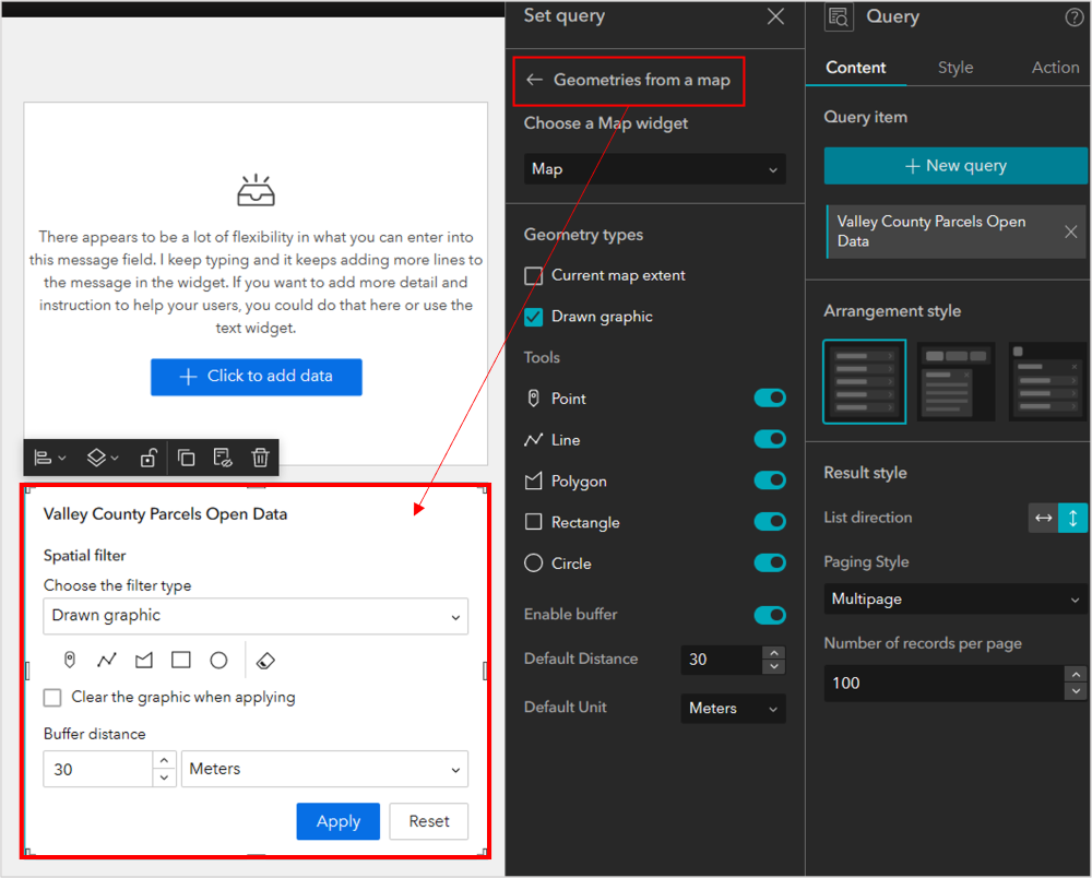
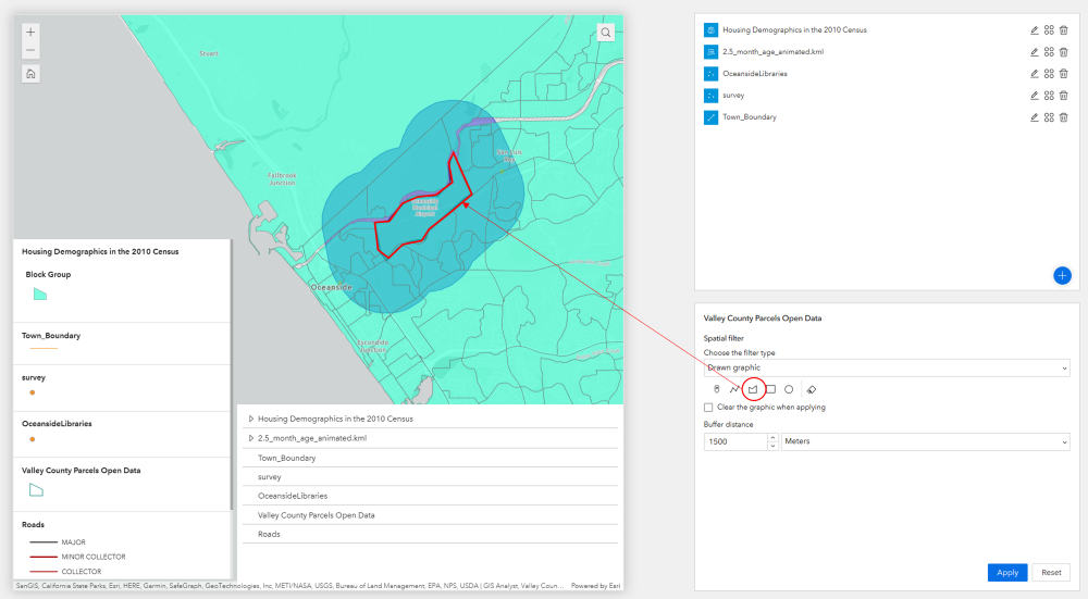
Even though you can’t preconfigure a query or buffer on the data that is added, there is still a way to use the buffer tool on data that is added. In the configuration example below, I have added the query widget, connected it to a random feature layer in my map, enabled the buffer tool in the query widget and have allowed for the buffer tool to function on geometries drawn in the map by the user. This means a user can click on top of a point or trace the polygon boundary from a dataset they have added and then run the buffer tool against what they have drawn, as shown in the second image below. It’s not as accurate as being able to select a feature that was added and then run the buffer on that feature, but it’s a decent work around until we have that ability.
To Summarize…
To summarize today’s review and tutorial on how to use the Add Data widget, we would like to say that we see some benefit in using the widget for simple data overlays, such as adding one or two layers. However, the issues in layer ordering and symbology may cause frustration and confusion, especially in novice users who don’t understand how layers interact and draw in a map. Adding point and line data is probably the best use-case at this time because polygons are added with a default or pre-configured fill symbology that makes is hard for users to actually see relationships between the polygons and other data already in the map.
