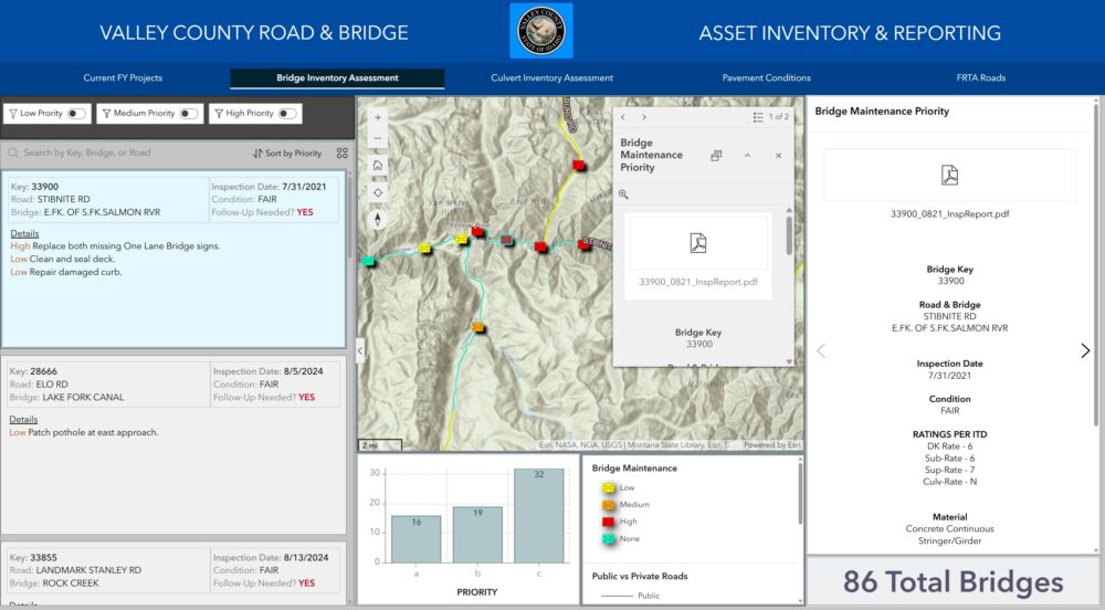
Data-driven dashboards are interactive interfaces that allow users to visualize and analyze data in real-time. By integrating widgets effectively in Experience Builder, you can enhance interactivity, improve usability, and create visually compelling dashboards that align with specific goals. It is widely supported that data-driven dashboards improve decision-making when designed with effective visualization and interactivity.
While maps are central to spatial storytelling and data visualization, this tutorial emphasizes widgets that work in coordination with maps to enhance interactivity and deliver meaningful insights.
Key Benefits of Widget Strategies
- Improved Data Exploration: Widgets enable users to interact with data dynamically, uncovering patterns and trends that static reports often miss.
- Enhanced Decision-Making: Real-time updates and visualizations support informed decisions, leading to faster and more accurate outcomes.
- Customization: Tailor dashboards to specific workflows and user needs, ensuring relevance and ease of use for diverse audiences.
In the following sections, you will find a detailed breakdown of essential widgets, their purpose, key functions, and how they integrate with other elements to enhance dashboard functionality.
Exploring Essential Widgets
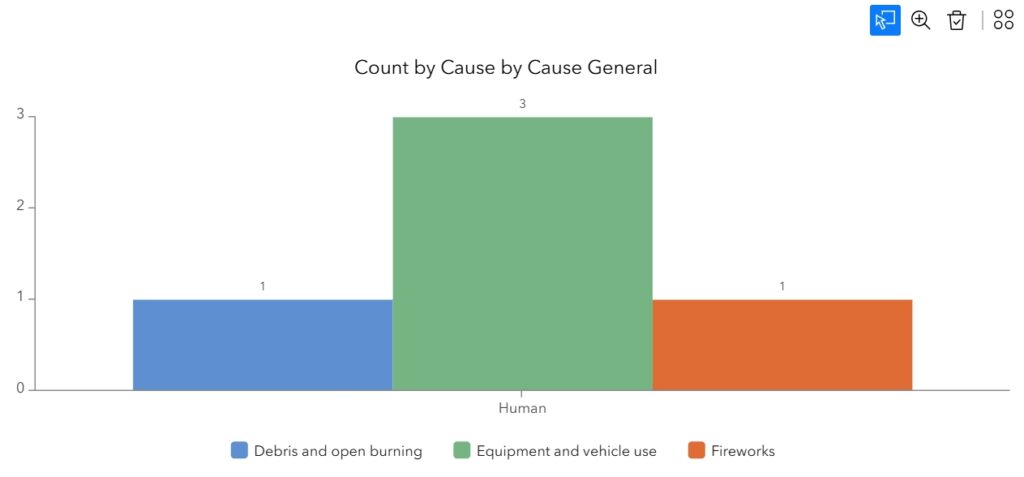
1. Chart Widget
Purpose: Visualize and analyze data patterns, distributions, and trends to support precise decision-making and data-driven insights.
Key Functions:
- Support for multiple chart types: bar, line, pie, scatter, area, stacked bar, and donut.
- Real-time updates based on data interactions.
- Configurable axes, legends, and tooltips for better usability.
- Real-time updates based on data interactions.
- Configurable axes, legends, and tooltips for better usability.
Integrations:
- Link with Query and Table Widgets to reflect filtered data dynamically.
- Sync with Map Widgets to visualize spatially relevant data summaries.
- Coordinate with List Widgets to provide detailed records corresponding to chart elements.
2. Table Widget
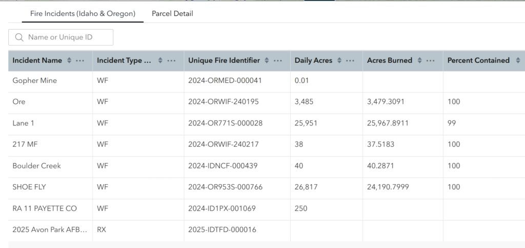
Purpose: Display structured attribute data that is easily searchable and filterable for efficient analysis and decision support.
Key Functions:
- Organize data into rows and columns.
- Allow editing capabilities for directly updating data records.
- Provide sorting, filtering, and pagination options for large datasets.
- Enable dynamic updates based on linked widgets.
Integrations:
- Link with Query Widgets to reflect selected data subsets.
- Sync with Map Widgets to show tabular details of spatial selections.
- Coordinate with List and Chart Widgets to align detailed and visual summaries.
3. Query Widget
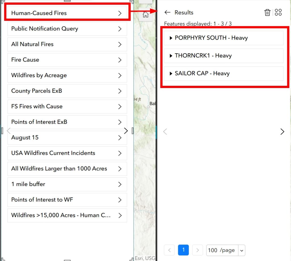
Purpose: Enable advanced data filtering and querying to support detailed exploration and customized dataset views. Unlike the Filter Widget, the Query Widget provides greater flexibility and complexity, allowing users to define advanced query logic and filter data dynamically in ways the Filter Widget cannot.
Key Functions:
- Support for complex query logic and parameters.
- Enable creation of attribute and spatial queries for tailored data exploration.
- Real-time filtering of linked widgets based on query results.
- Allow user-defined input criteria for flexible data views.
Integrations:
- Sync with Table, Chart, and List Widgets for dynamic updates.
- Link with Map Widgets to reflect query results spatially, such as highlighting regions or points.
- Configure triggers to automate widget interactions based on query outputs.
4. List Widget
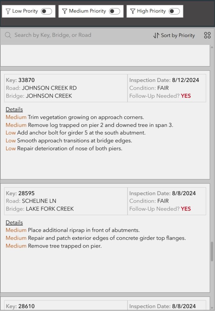
Purpose: Present key data points or summaries in a scrollable, customizable format for quick access and streamlined insights.
Key Functions:
- Display individual records or summarized data.
- Include buttons, images, and flexible layouts for enhanced interactivity and customization.
- Include links to additional details or actions.
- Customizable layout options for enhanced design.
Integrations:
- Link with Map Widgets to highlight features or regions based on list selections.
- Sync with Query Widgets to dynamically display filtered items.
- Coordinate with Chart and Table Widgets to provide additional detail or summaries.
5. Text and Card Widgets (as a KPI Display)
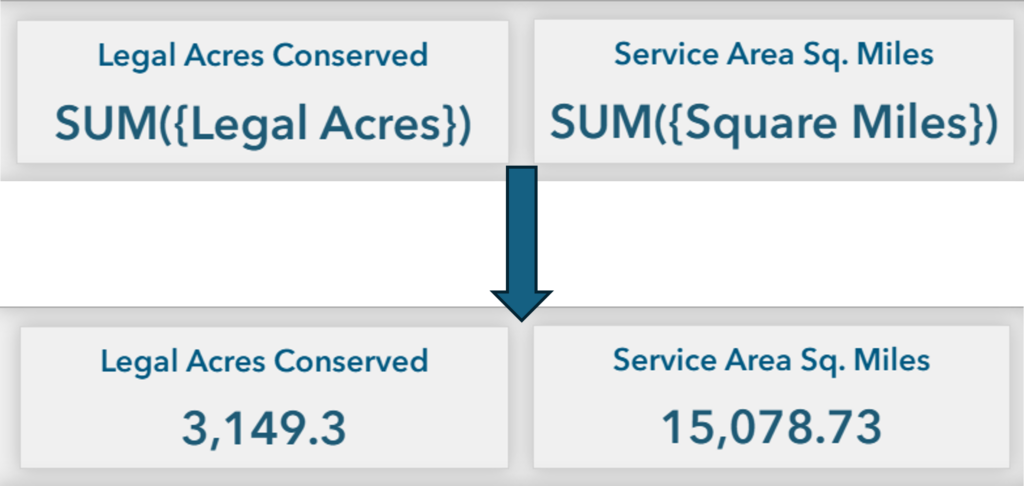
Purpose: Create the infographics necessary to highlight critical metrics, KPIs, or summaries in a visually prominent format for rapid interpretation.
Key Functions:
- Customizable fonts, colors, and layouts for effective presentation.
- Dynamically update based on filters or selections, ensuring real-time reflection of data changes.
- Dynamically update based on feature attributes or other linked data sources.
- Emphasize single metrics or values for quick interpretation.
Integrations:
- Link with Query and Chart Widgets to display calculated metrics.
- Coordinate with Map Widgets to display spatially contextual KPIs, such as totals within a region.
- Use with List Widgets to summarize the data displayed.
Additional Design Considerations
Designing an effective dashboard requires attention to user experience, clarity, and performance to ensure that data is accessible and actionable.
-
- Simplify the Interface: Highlight essential elements and remove unnecessary complexity. Keep the design clean and focused to enhance usability.
-
- Ensure Accessibility: Use legible fonts, provide alternative text for visuals, and test dashboards on various devices. Tools like WAVE or Lighthouse can help evaluate and improve accessibility compliance.
-
- Optimize Navigation: Guide users through the dashboard with intuitive navigation. Use logical widget placement, buttons, scrolling or tooltips, to create seamless interactions.
-
- Enhance Visual Consistency: Apply consistent colors, fonts, and layouts across all widgets. This improves the dashboard’s professional appearance and usability.
-
- Balance Performance and Interactivity: Optimize data sources and widget configurations to reduce load times. Use real-time interactivity only where necessary to maintain smooth performance.
Conclusion
By thoughtfully integrating widgets like charts, tables, queries, lists, and cards with maps, you can create dynamic and effective dashboards that provide actionable insights and enhance decision-making.
For additional learning, explore related articles and courses from Geospatial Training:
The next tutorial in this series will explore “Optimizing Asset Management with Widget-Based Tools in Experience Builder.”

