
From 2011 to 2020, there was an average of 62,805 wildfires annually and an average of 7.5 million acres impacted annually. In 2020, 58,950 wildfires burned 10.1 million acres, the second-most acreage impacted in a year since 1960; nearly 40% of these acres were in California.
There are many ways that this information can be visualized, but maps are a great way to spot patterns in the distribution of the data. In particular, it’s possible to distinguish patterns in the spatial distribution of wildfires through the use of a variety of cluster style maps. That will be the focus of this post.
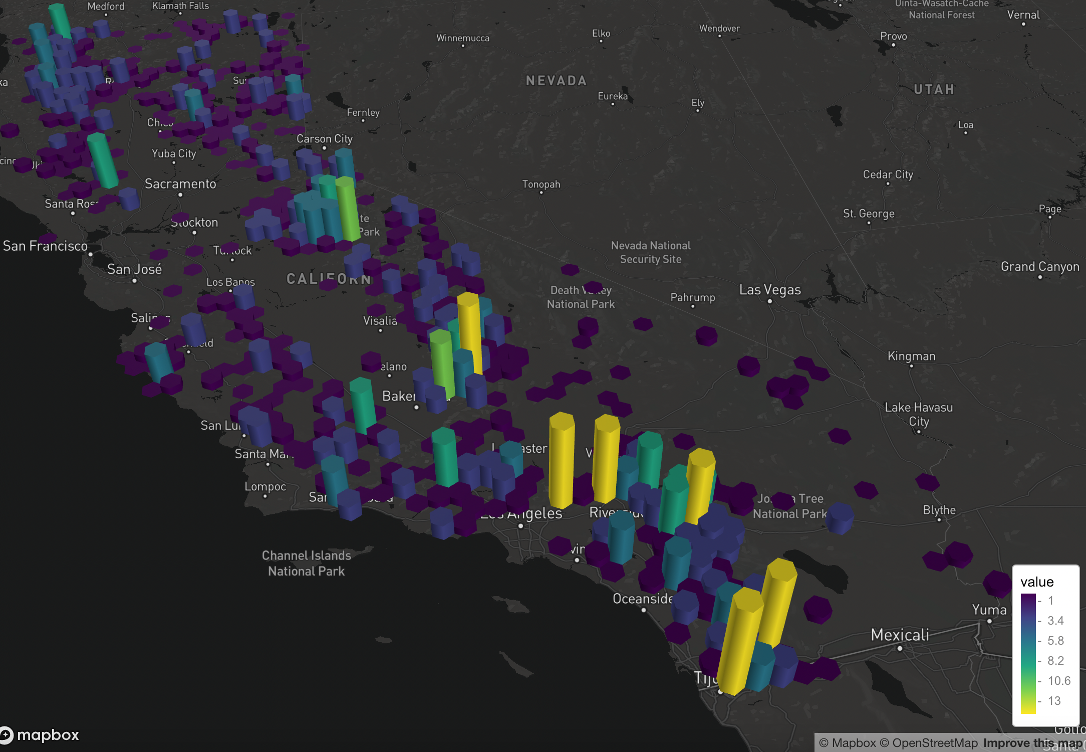
Using the Federal Wildland Fire Occurrence Database, which includes individual wildfire occurrences from 1980 – 2016 as point locations, the following maps were created using the R programming language and the mapdeck, dplyr, and readr packages. To simplify the dataset only wildfires that burned greater than 1,000 acres are included. The dplyr package was used to filter the data based on wildfire size.
The mapdeck package includes an add_hexagon() function that renders a hexagon heatmap based on an array of points. It takes the radius of the hexagon bin, and projects points into hexagon bins. In simpler terms, each wildfire that falls within the boundaries of the hexagon is counted to arrive at a sum per hexagon. The color and height of the hexagon is scaled by the number of points it contains. This gives a good visual sense of the clustering of wildfires.
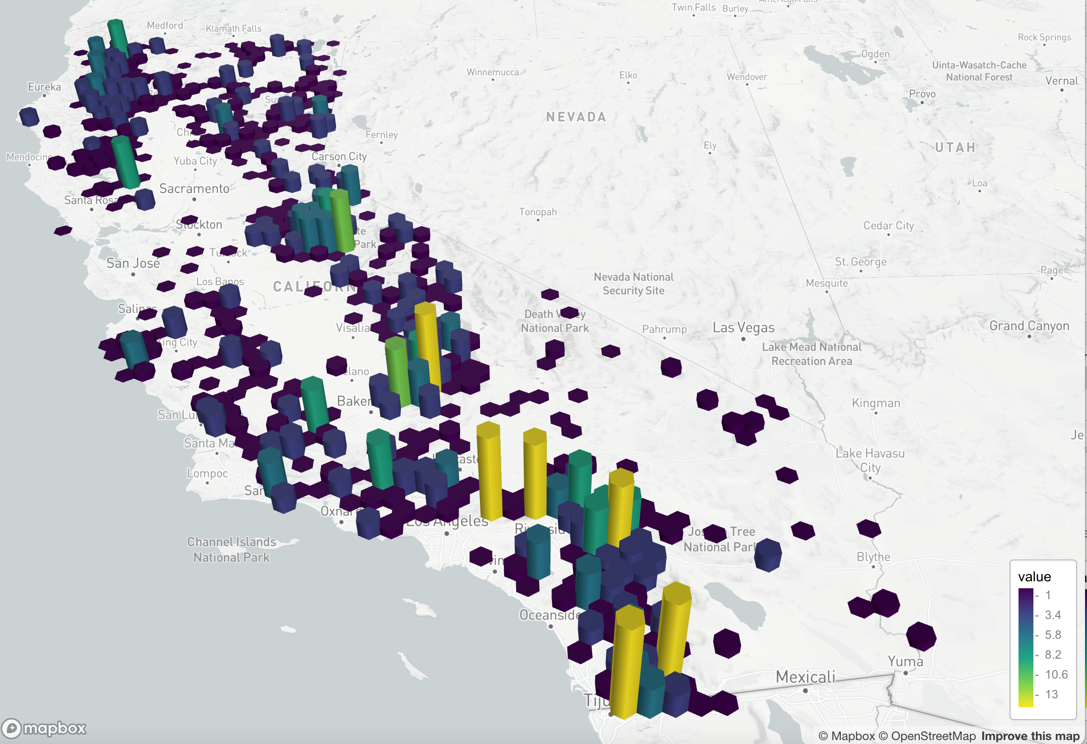
You can easily swap out the MapBox basemap as well.
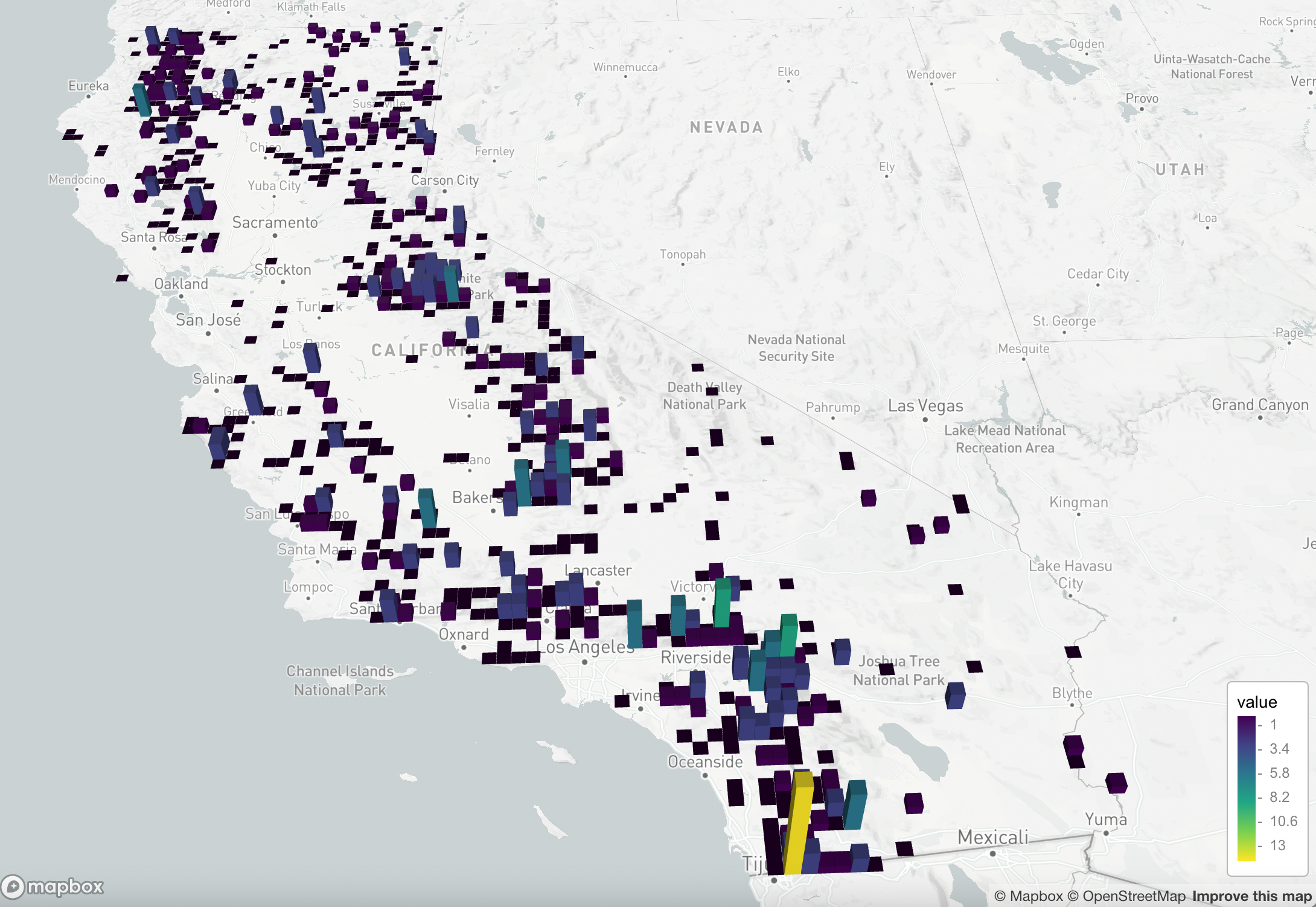
Similarly, a grid heatmap can be produced with the add_grid() function. Based on an array of points it takes the constant size of each cell, and sums the number of points in the cell. The color and height of the cell is scaled by the number of points it contains. The visual representation is not as aesthetically pleasing to me, but it still conveys the same patterns in the wildfire dataset.
The mapdeck packages also includes an add_heatmap() function for visualizing the spatial distribution of data. It implements a Gaussian Kernel Density Estimation to render the heatmaps. This provides yet another example of the spatial clustering of some phenomena, in this case wildfire distribution.
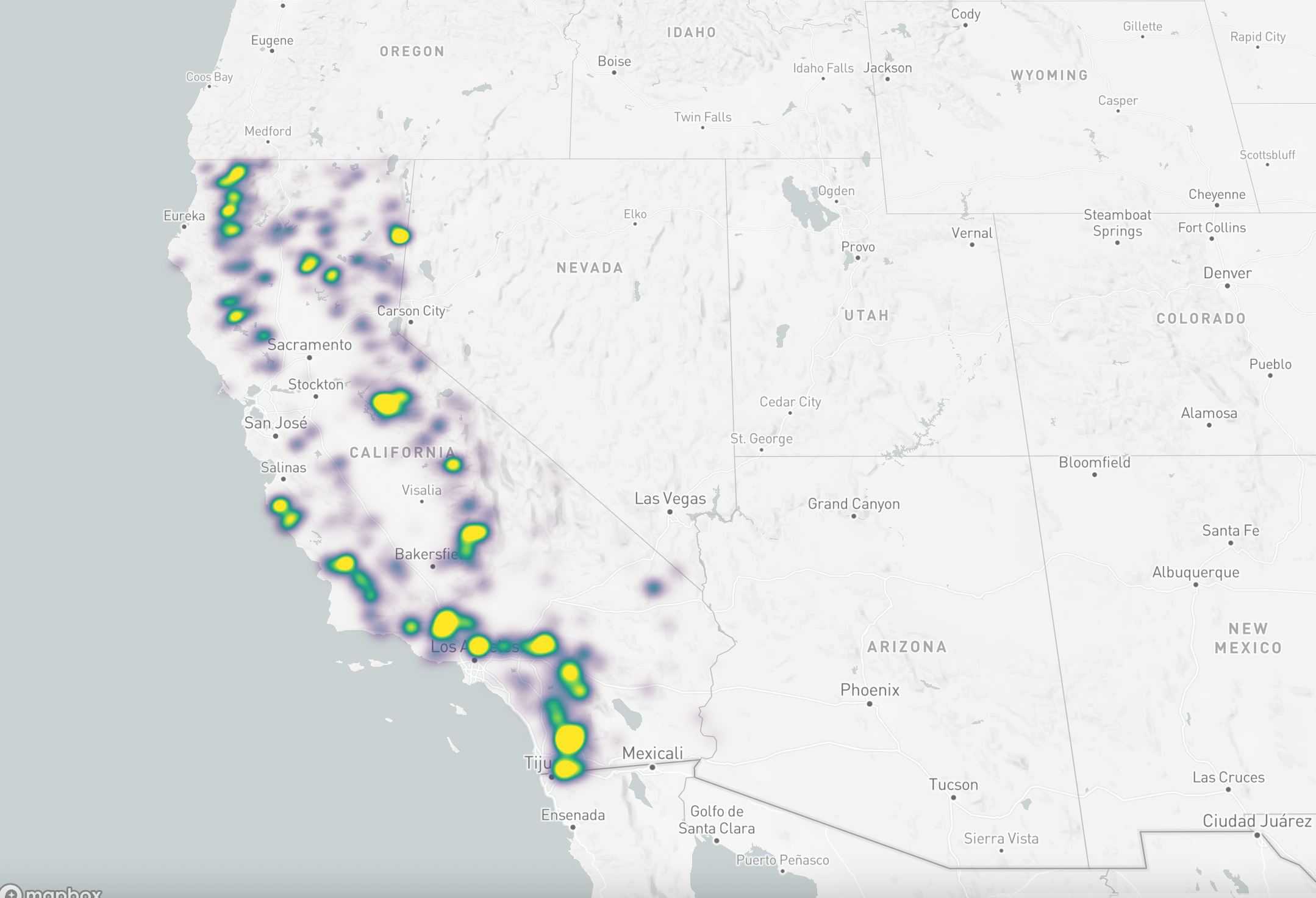
The heatmap is dynamically rendered each time you zoom in/out or pan the map. You can see how this works in the video below.
In future posts I’ll take a look a couple of alternative R packages you can use to produce similar types of cluster maps.
