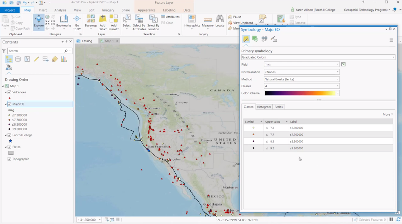
This article explains how to use the Histogram and Scales tabs when creating graduated color symbology in ArcGIS Pro.
In ArcGIS Pro, map symbology can be applied by selecting a layer in the Contents pane and clicking Symbology. Next, a Symbology dialog window opens up with multiple tabs. The default choice is the Primary symbology tab that lets you select how to symbolize a layer: either by a single symbol, category or quantity. For this blog post, we’ll discuss how to symbolize a layer by quantity using graduated colors.
Graduated color symbology is established using multiple colors to visualize a quantitative difference between features on a map based on multiple classes. Such maps, called choropleth maps, make it easy to easily and quickly compare different areas based on a single phenomenon, such as mean income or pollution levels at state or country level. When choosing the option “graduated colors” from the Primary symbology’s pull-down menu, you’ll see a dialog window with on the bottom three different tabs for creating graduated color symbology to the selected layer, Classes, Histogram and Scales. We’ll now focus on the Histogram and Scales tabs.
Histogram tab
The histogram tab shows the frequency distribution of data from the variable that is chosen for symbolization. This is done in the form a histogram, represented by a vertical bar showing both the maximum and minimum value of the symbolized field with different colors for the different classes that correspond with the class settings found in the Symbology pane. ArcGIS Pro uses default values for the different class breaks, so based on your conclusions about the data distribution histogram, these settings can be changed. For example, by choosing a graduated color scheme or use more or fewer classes, or introduce a critical value to mark differences between values even further.
In addition to marking the different classes and minimum/maximum data values, the histogram shows the mean average value of the data, which is marked by an “x”. Its value is shown when hovering over it with the mouse. The horizontal bars in the histogram represent a frequency count of the data in that percentile, which means that it shows how data is distributed over the multiple classes. Depending on this information, you can make changes to your map symbology to better communicate the spatial distribution of the data from the symbolized field.
Scales tab
In the Scales tab, you can specify the scale ranges for the symbol classes to be drawn. This lets you draw map symbology only at certain scales, to avoid overlapping symbols at smaller scales, showing maps that are zoomed out with large areas. When zooming in on a map, using scale ranges with map symbology will enable you to see more symbology, that is not visible at larger scales. As such, it only shows map symbology at the appropriate scale (such as bus stops on a city level instead of state level).
The Scales tab in the Primary symbology pane lets you define scale ranges for map symbols based on the selected field from a feature layer, as well as define alternate symbols at different scales for the same feature. This option makes it possible to use subtle changes to avoid the dominance of certain symbols when using a large scale, either by color or lining. To avoid typing scale values, scales can be set quickly and easily with a scale slider for each symbol class. Scale ranges of symbol classes can only be defined when feature layers are drawn with unique values or graduated colors.

