

Creating beautiful, informative maps in ArcGIS Pro requires more than just stacking layers and applying basic symbology. To truly elevate your cartography, you need to understand how features can interact visually within a single layer. Enter Feature Blending—a powerful technique that allows you to control how overlapping features blend together, unlocking new ways to highlight patterns and relationships in your data. Feature Blending in ArcGIS Pro is specifically designed to control how overlapping features within the same layer interact visually.
In this tutorial, we’ll explore what Feature Blending is, when to use it, how to apply it, and practical examples for incorporating it into your own mapping projects.
What Is Feature Blending?
While traditional symbology simply draws features on top of each other (usually with the most recent feature winning out), Feature Blending changes how overlapping features in the same layer appear by combining their color values in a visually meaningful way.
Instead of obscuring overlaps, feature blending uses mathematical blending modes—organized into categories like Darkening, Lightening, Divergent, Comparative, and Color—to highlight areas of intersection, density, or cumulative effect.
This is especially useful for:
- Overlapping features within a single layer where the default “last drawn wins” rendering doesn’t adequately show important patterns
- Dense point data where clustering or concentration patterns need to be highlighted – like customer locations, incident reports, or wildlife sightings
- Overlapping polygons such as:
- Historical fire perimeters across different years
- Service areas or coverage zones
- Administrative boundaries with shared jurisdiction
- Environmental zones with overlapping classifications
- Complex line networks where intersections and overlapping segments need emphasis – like transportation networks, utility systems, or hydrological features
While it can be applied to any geometry type (points, lines, or polygons), feature blending tends to be most effective with points and polygons because they typically have larger areas of overlap that benefit from the visual effect.
The key value of feature blending is that it allows you to see patterns of concentration, intersection, or repeated events without having to perform additional analysis or create new datasets. It’s a purely visual technique that can reveal relationships that might otherwise be hidden when features simply stack on top of each other.
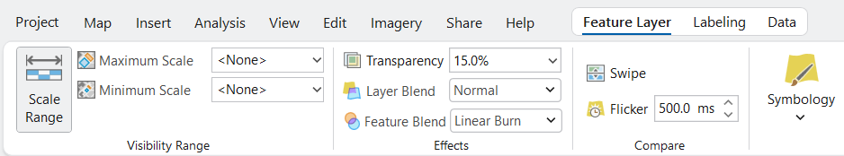
How to Apply Feature Blending in ArcGIS Pro
Applying feature blending is quick and easy:
- In the Contents pane, select the layer you want to apply feature blending to.
- On the ribbon, go to the Feature Layer context tab.
- In the Effects group, find the Feature Blend dropdown.
- Choose your desired blend mode from the categorized options.
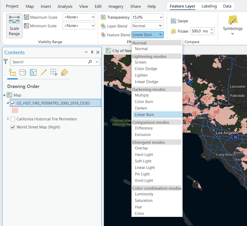
That’s it! Your features will now interact visually where they overlap.
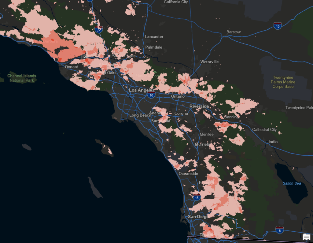
Real-World Application: Analyzing Historical Wildfire Patterns
Let’s walk through a practical example of using feature blending to enhance wildfire analysis:
Scenario: You need to analyze decades of historical wildfire perimeters to identify areas with repeated burns and understand fire recurrence patterns.
Without Feature Blending: Overlapping fire perimeters would simply stack, with more recent fires completely hiding older ones, making it impossible to identify areas that have burned multiple times.
With Feature Blending:
- Import historical wildfire perimeter data (2000-2018) as a single layer
- Symbolize all perimeters with a semi-transparent orange-red fill (15-40% opacity)
- Apply the Linear Burn method under the Darkening mode to create a darkening effect where fires overlap
- Areas that have burned multiple times will appear progressively darker, creating an intuitive visual hierarchy
- If necessary, add a legend explaining that darker areas indicate repeated burns
Additional Analysis:
- Use different color schemes based on fire severity, then apply blending to see how severity patterns overlap
- Combine with vegetation recovery data using contrast blend modes to highlight resilience patterns
- Add fire cause data with different blend modes to investigate spatial patterns of human-caused versus lightning-caused fires
The result is a powerful visualization showing not just where fires occurred, but revealing critical patterns of fire recurrence—helping land managers identify high-risk areas for mitigation efforts and ecological monitoring.
Feature Blend Mode Categories and Their Applications
ArcGIS Pro organizes feature blend modes into five main categories, each containing specific blend types that produce different effects. Let’s explore the most useful ones:
1. Darkening Blend Modes
These modes tend to produce darker results where features overlap.
Multiply
Darkens overlapping features by multiplying their color values. Ideal for:
- Creating visual density effects
- Emphasizing intersections in complex line networks
- Revealing overlapping boundaries in polygon datasets
Example: Display customer locations as semi-transparent points. Using Multiply will create a darker tone in high-density areas, simulating a heatmap effect—without needing spatial analysis tools.
Darken
Compares the colors of overlapping features and displays the darker one. Perfect for:
- Visualizing the darkest values across overlapping features
- Creating clean overlays without affecting darker underlying features
- Showing only the most intensive uses in land classification maps
Example: When mapping parcels with different zoning designations, Darken will show only the most restrictive zoning category where multiple designations overlap.
Linear Burn
Linear Burn works by adding the values of the overlapping features and then subtracting the maximum value (usually 255 in RGB color space). This creates a darkening effect that is often more intense than Multiply but with different characteristics.
When applied to feature blending, Linear Burn:
- Creates darker results than the Multiply blend mode, especially in mid-tones
- Produces strong contrast in areas of overlap
- Can sometimes create nearly black results where multiple features intersect
- Tends to preserve more of the underlying color characteristics than Color Burn
2. Lightening Blend Modes
These modes produce lighter results where features overlap.
Screen
Lightens overlapping features by blending their inverted colors. Great for:
- Highlighting clusters or intersections
- Creating glowing effects with bright colors
- Making symbols “pop” on dark basemaps
Example: Use bright yellow symbols for streetlight outages on a dark basemap. Applying Screen blending will create a luminous effect in areas where multiple outages cluster.
Lighten
Compares the colors of overlapping features and displays the lighter one. Useful for:
- Visualizing maximum values across overlapping features
- Creating maps that emphasize higher values or intensities
- Showing the “best case” scenario where features overlap
Example: When mapping soil quality with polygons of different values, Lighten will show only the highest quality classification where areas overlap.
Color Dodge
Creates a brightening effect where features overlap. Excellent for:
- Creating dramatic highlighting effects
- Emphasizing intersections of important features
- Making overlapping areas stand out visually
Example: Apply Color Dodge to emergency response time polygons to create bright “hot spots” where multiple response zones overlap, highlighting areas with the best coverage.
3. Divergent Blend Modes
These modes affect the contrast between overlapping features.
Overlay
Combines Multiply and Screen—preserving highlights and shadows. Use it when:
- You want to boost contrast and visibility
- You’re layering semi-transparent categories that need differentiation
- You want a subtle but dynamic visual effect
Example: Display zoning areas with partially transparent colors. Overlay blending will enhance color richness in overlapping zones, making policy complexity easier to see at a glance.
Hard Light
Similar to Overlay but with more intensity, creating dramatic contrast where features overlap. Use it for:
- Creating very high-contrast visualizations
- Emphasizing significant overlaps or intersections
- Adding dramatic emphasis to important areas
Example: Map transportation corridors with Hard Light to create dramatic visual emphasis at major intersections, helping viewers immediately identify key network nodes.
Soft Light
A subtler version of Hard Light, creating gentle contrast without overwhelming detail. Perfect for:
- Adding subtle emphasis to overlaps
- Creating nuanced visualizations with minimal distortion
- Maintaining readability while adding visual interest
Example: Apply Soft Light to watershed boundaries to subtly highlight areas where multiple catchments overlap while maintaining the overall visual hierarchy of your map.
4. Comparison Blend Modes
These modes compare the values between overlapping features and show differences.
Difference
Shows the visual difference between overlapping features. Useful for:
- Highlighting boundaries between adjacent features
- Creating edge-detection effects
- Showing contrast between overlapping polygons
Example: Apply Difference to adjacent administrative boundaries to emphasize the border areas and create a visual separation effect.
Exclusion
Similar to Difference but with lower contrast, creating more subtle effects. Ideal for:
- Creating subtle boundary effects
- Showing differences between similar datasets
- Adding visual interest without dramatic contrast
Example: Use Exclusion when mapping overlapping ecological zones to create subtle distinction while maintaining an overall cohesive look.
5. Color Combination Modes
These modes focus on adjusting hue, saturation, and luminosity of features.
Hue
The Hue mode blends overlapping features by using the hue (color tone) of the top feature while maintaining the saturation and luminosity (brightness) of the underlying feature.
Effect: This mode changes the color tone of overlapping features without altering their intensity or brightness.
Use Case: Useful for recoloring features while preserving their overall appearance and contrast.
Saturation
The Saturation mode blends features by applying the saturation (color intensity) of the top feature while retaining the hue and luminosity of the underlying feature.
Effect: Overlapping areas become more or less vivid depending on the saturation of the top feature.
Use case: Ideal for emphasizing areas with high or low color intensity without changing their tone or brightness.
Color
The Color mode combines the hue and saturation of the top feature with the luminosity (brightness) of the underlying feature.
Effect: This mode recolors overlapping features while preserving their brightness, creating visually distinct overlaps.
Use case: Useful for thematic maps where you want to apply specific colors to overlapping features while maintaining their lightness.
Luminosity
The Luminosity mode blends features by applying the brightness (luminosity) of the top feature while keeping the hue and saturation of the underlying feature.
Effect: Overlapping areas are adjusted in brightness without altering their color tone or intensity.
Use case: Ideal for maps where you want to highlight or dim certain areas without changing their color.
Tips for Successful Feature Blending
- Use Transparency Wisely: Blending works best when your symbols are semi-transparent (30-70%).
- Experiment with Modes: Each blend mode reacts differently to colors and symbol types.
- Zoom In and Out: The visual impact can vary based on map scale.
- Be Purposeful: Choose blend modes that support your map’s communication goal—not just aesthetics.
- Combine with Effects: Try glow, drop shadow, or symbol layering for added impact.
- Consider Color Interactions: Test how your color scheme works with different blend modes.
- Complement with Layer Blending: For multi-layer visualizations, consider how feature blending and layer blending work together.
Common Pitfalls to Avoid
- Too Many Effects: Overusing blending + transparency + glow = visual chaos.
- Inconsistent Styles: Keep your approach uniform across a map series.
- Poor Color Choices: Some color combinations blend poorly or become muddy.
- Unclear Legends: Always clarify the meaning of blended effects in your legend or notes.
- Overcomplicating Simple Data: Sometimes standard symbology is more appropriate for straightforward data.
- Cognitive Overload: Consider your audience’s familiarity with complex visualizations.
Final Thoughts
Feature Blending in ArcGIS Pro is one of the most versatile and underutilized techniques for making your maps not only look better—but communicate more effectively. Whether you’re working with points, lines, or polygons, this tool helps you draw attention to the patterns and intersections that matter.
By understanding the different categories of blend modes (Darkening, Lightening, Contrast, Comparative, and Color) and their specific effects, you can choose the perfect visualization technique for your particular data and story.
Take time to experiment with different blend modes, symbol transparency, and color schemes. The result? Cleaner, more insightful maps that go beyond surface-level symbology and tell a deeper spatial story.
