Note: This is a guest post by Joe Ramsey and Jared Garza, two members of my Spring 2010 “GIS Applications” class at San Antonio College.
One of the courses required for an Associate of Applied Science Degree in GIS at San Antonio College is titled “GIS Applications”. In this class, students typically pair up in teams at the start of the semester and submit a proposal for a GIS project to the instructor for approval. Once approved, the student teams begin work on what is usually a semester-long project.
My team member, Jared Garza, and I decided to study community crime within public school districts and its influence, if any, on student test performance. Following are the steps we took and the issues that arose while completing our project.
Acquiring the Crime Data
We were fortunate to have a contact within the City of San Antonio Police Department who supplied us with the necessary crime data. The crime statistics (Year 2009) were already assembled into tabular format with geographic coordinates for the location of each crime, so geocoding the data was not required. We simply imported the table into ArcMap, converting it to shapefile for further analysis.
After briefly analyzing the crime data, we discussed whether certain categories of crime (major offenses, minor offenses, etc.) should be or should not be used in the study. We wondered if “major” crime would perhaps have more of an impact than “minor” crime. This uncertainty led us to include all categories of crime in the study because we reasoned that the “presence” of crime was as equally relevant as the “seriousness” of the crime
Acquiring School District Boundary Data
Obtaining the school district boundary information was quite simple. The boundaries were downloaded, in shapefile format, from the Texas Education Agency website (TEA.org). We knew there were approximately twenty independent public school districts in the San Antonio area, so we directed our attention to these particular school districts.
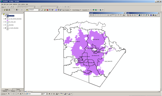
A quick display of the crime data on top of the school district boundaries began to reveal a problem. The geographic extent of the City of San Antonio (and its related crime data) varied greatly when compared to the school district boundaries (See Figure 1).
While nearly all of the school district boundaries “touched” the City of San Antonio, not all school districts were located entirely within the city limits. Many school districts shared their boundaries with rural Bexar County for which crime data was not available at the time of our study.
As a result, we had to eliminate several school districts from our study. We felt that because all crime data were obtained from the City of San Antonio, only school districts whose geographic boundaries are located predominantly within the city limits would be included in our study.
What About Small Towns?
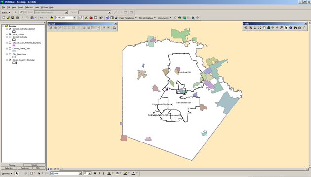
As we dug deeper into the data, another issue arose. A few of the school districts have boundaries that encompass very small incorporated towns for which crime data was not available at the time of our study (See Figure 2).
We discussed whether trying to track down crime data for approximately a dozen small communities was a viable option, considering the time constraints of a college semester and our lack of a “contact on the inside” of their law enforcement departments. Also entering the discussion was the speculation that some of these small towns may not even maintain electronic databases of their crime data. (That was speculation and was not verified).
So, on a different tack, we carefully compared (using ArcMap) the school districts’ larger geographical size against the much smaller towns. In the end, we decided that because of the towns’ miniscule geographic extent, the unavailability of crime data from the small towns should have no significant impact on the study.
Which School Test Data to Use?
Once we knew specifically which school districts we were going to study, we began to focus on what test performance data to use. Ultimately we used school test data taken from published results of the 2009 Texas Assessment of Knowledge and Skills (TAKS) test. Again, this data was readily available on the TEA website.
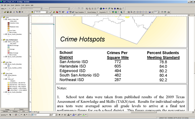
The TAKS consists of six different subject-area tests, administered at different times throughout a student’s academic career (3rd grade through 11th grade). In order to accurately compare each school districts’ test performance, results for individual subject-area tests were averaged across all grade levels to arrive at a final test performance value for each school district (See Figure 3 below). This value represents the percentage of students within each school district that met the test standard.
Analyzing the Data
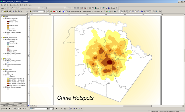
With most of the data issues ironed out and our focus narrowed on the relevant school districts, we began to analyze the data. Initially, we created a crime density surface and displayed the raster on top of the school district boundaries (See Figure 4).
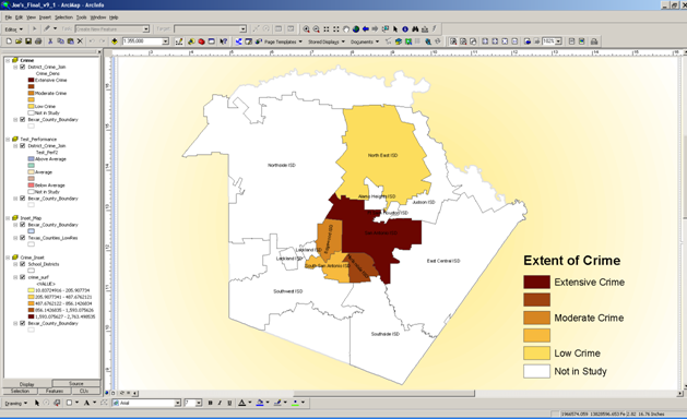
This revealed the districts with crime “hotspots”, however, it was difficult to visually determine how the districts “ranked” against each other in terms of the extent of crime. As a solution, we decided to normalize the crime data into number of crimes per square mile within each school district boundary. Then we were able to categorize and symbolize the districts thematically, allowing us to visually rank the extent of crime among the districts (See Figure 5).
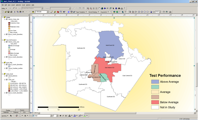
In order to similarly rank student test performance, we computed an average test performance value for the school districts as a whole. This permitted us to compare and rank the individual districts against their average. We also discussed comparing the individual districts against the region average and against the state average, but ultimately decided that the “area” average was perhaps a more accurate figure to use. At any rate, we symbolized the districts using their relationship to the average, thereby ranking the districts on their student test performance (See Figure 6).
Pulling it All Together
With the two main data frames created, we began to assemble all the map elements into a coherent map document (See Figure 7). The usual cartographic elements were included: title, scale, legends, data sources, etc.
We placed the crime map and the test performance map adjacent to each other so the users could visually compare the two maps and determine for themselves if there is a relationship between localized crime and its impact, if any, on student test performance.
Additional maps included on the map document are an inset map showing the Bexar County/ San Antonio region highlighted on a state map of Texas. This was done simply for viewers of the map who may not be familiar with where the area of study is located. We also inserted a small map of the crime density surface to help reinforce where the most extensive crime is observed. Other map elements include the crime data and test performance data in tabular format and a general notes section.
Any Surprises?
As we surmised before the project began, the data, in general, seems to show that the more extensive the crime is within a school district, the further below average that student test performance becomes.
However, we can only state “in general” because of the apparent anomaly concerning the Harlandale ISD. Of the five school districts studied, Harlandale had the 2nd highest crime rate but had the 2nd best test performance. A more involved study would perhaps determine the reasons for this apparent inconsistency.
Final Thoughts
Although the data seems to show a relationship between the presence of crime and school test performance, we fully recognize that crime is only one of many factors that impact school test performance. Future studies could include possible additional factors: demographics, family make-up, unemployment rates, etc.
Special thanks to our instructor for the GIS class, Eric Pimpler GISP, for his guidance during the completion of the project.
— Joe Ramsey and Jared Garza

