
In this article you’re going to learn how to create graduated color maps in ArcGIS Pro. ArcGIS Pro includes a lot of new functionality for creating choropleth maps and we’ll explore not only the basic options that have been used to create graduated color maps in Esri’s desktop software for years, but also some new functions that you may not be aware of or don’t understand how to use.
The Basics of Graduated Color Symbology in ArcGIS Pro
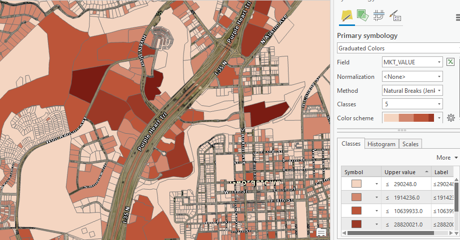
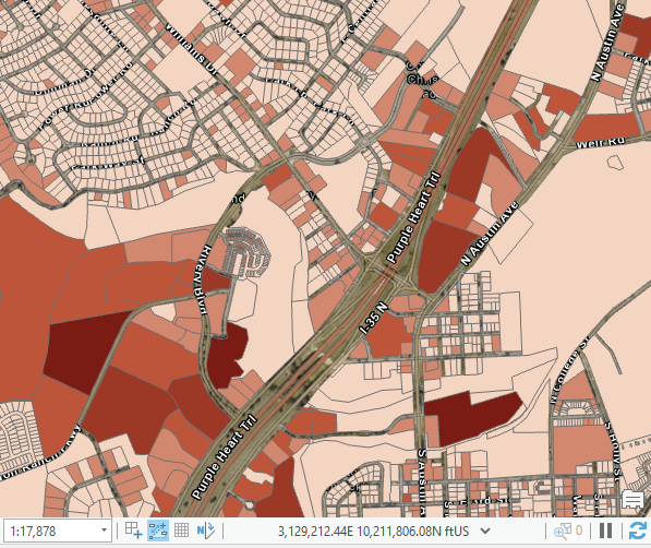
Let’s start with with some basic terminology for those of you who are new to the topic. Graduated color symbology is used to show a quantitative difference between mapped features by varying the color of symbols. Data is classified into ranges that are each assigned a different color from a color scheme to represent the range. For instance, if you’re symbolizing parcel polygons based on the assessed market value you might break your data into five classes which represent the full range of values. Each class would be assigned a different color, and then each parcel would be assigned to a class based on the market value of the parcel. You can see an example of this in the screenshot below. In this example, the MKT_VALUE field has been selected as the field to use in the generation of the graduated color map. For each parcel, the value found in the MKT_VALUE will be mapped to a color scheme
To access the Symbology pane in ArcGIS Pro, click the layer you want to symbolize in the table of contents to display the Feature Layer context menu. Then, from the Appearance tab, click the Symbology dropdown button and select Graduated Colors. The Primary symbology tab will be selected by default. We’ll discuss some of the other tabs in future articles.
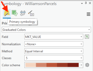
ArcGIS Pro will automatically select a numeric field from the layer and symbolize it using the Natural Breaks method along with a color scheme.
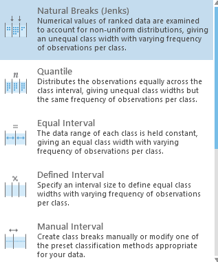
Graduated color maps are defined using numeric fields so only those data type fields will be displayed in the Field dropdown box. Natural Breaks (as seen in the screenshot above) is the default method used to create the classes, but other options are available including Quantile, Equal Interval, Defined Interval, Manual Interval, Geometric Interval, and Standard Deviation. It’s beyond the scope of this article to go into the specific details of all the available methods, but each method is briefly explained in the dropdown list, and here is a link to a help page that further describes each of the options in greater detail.
The default number of classes will be 5 and ArcGIS Pro will automatically assign a color scheme as well. However, you can easily change both. For most situations it is recommended that you not go above six or seven classes because it becomes difficult for the human eye to distinguish the difference between a lot of slightly different colors.
Now let’s discuss the sometimes difficult to understand concept of Normalization. By default, the Normalization parameter is set to <None> in ArcGIS Pro. Normalizing data factors out the size of areas by transforming counts (measures of magnitude) into ratios (measures of intensity). Normalization is typically used in situations where counts of some variable are involved. For example, if you had a census tracts polygon feature class that included a field for the number of crimes in each tract it would be appropriate to normalize the data by area since geographically larger tracts would be more likely to have a higher count simply based on size. You might also normalize by some other variable like population in this type of scenario.
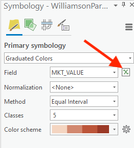
It’s easy to overlook the small button just to the right of dropdown box where the field is defined. However, this “set expression” button is an important new addition to ArcGIS Pro that allows you to create Arcade expressions for custom symbology definition. Arcade is a new expression based programming language developed by Esri for the ArcGIS platform. This is a big topic and is beyond the scope of this article, but I’ve written previously about Arcade and why you should learn to use this simple language. We’ve also developed a one day course called Getting Started with ArcGIS Arcade. It really is worth your time to learn this simple language and you can become reasonably proficient in a day or two.
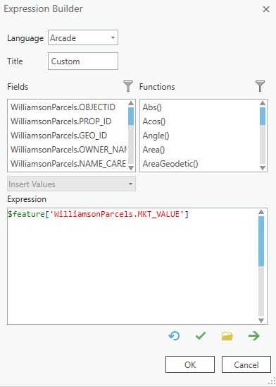
Arcade can be used to dynamically create custom symbols from data that is already present in your attribute table. For example, you might create an Arcade expression that creates a graduated color map that ranks parcels into “Low”, “Medium”, and “High” categories based on the current market value. Prior to Arcade you would have to create a new field in the attribute table to contain this information, and then you’d have to assign the values for each feature using the Field Calculator. If the data changed you’d then have to update all the values. This approach is error prone and requires periodic updates. Arcade can dynamically create those categories and symbolize the data appropriately through the use of an expression.
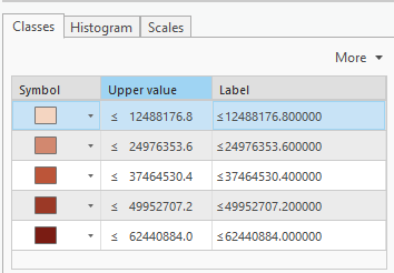
The Classes tab contains the symbol for each class along with the upper values and labels. All of these values can be changed individually. You can change symbol colors and shapes, values, and labels.
The Histogram Tab
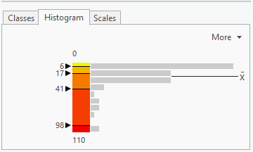
The Histogram tab is where you can view the distribution of values by class and edit the data ranges of the classes. Histograms display the frequency distribution of data for a single variable. In ArcGIS Pro, the symbology histogram visualizes the distribution of data across the chosen symbolized field. You can use this histogram to view whether the data follows a symmetric, skewed, or modal pattern, and how the data can be symbolized to show outlying or prominent features on your map. In the screenshot below you can see an example. The gray bars to the right of each class are an indicator of how many features are within a class. For this dataset a far higher number of features fell within the lower class values. By default, the minimum and maximum values of the symbolized field are displayed at the top and bottom of the histogram. Here the minimum is 0 and the maximum is 110.
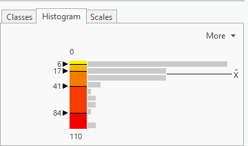
The mean of the dataset is also displayed and if you hover your mouse over the mean symbol it will display the mean value for the dataset.
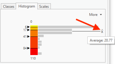
You can also change the ranges by dragging the arrows up and down for each range or by double clicking any of the range numbers and entering a new value. Notice how I’ve changed the upper range from 84 (screenshot above) to 98 (screenshot below).
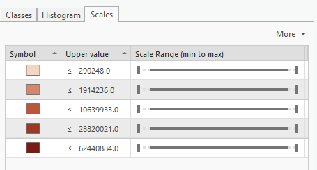
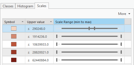
Scale Based Symbol Classes
When a layer is symbolized with either unique value or graduated colors symbology, you can specify the visible scale range for each symbol class. This is an effective strategy to limit the amount of detailed data at smaller scales without having to make multiple versions of the layer, each with a unique definition query.
Scale based symbol classes can be defined by clicking the Scales tab found on the Symbology pane. Each class has two thumbs, one on either enter of the slider, that you can drag to set the scale or scale range at which the symbol will be drawn.
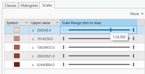
In the example below I have set a scale range of 1:24,000 as the maximum scale at which the first class of symbols will be defined. This will ensure that the symbols from this class will only draw when the scale is below 1:24,000. Above that and the scale will be hidden, much like setting a definition query.
You can also set a range of scale values by using both thumbs. In the screenshot below I have set a scale range of 1:100,000 to 1:50,000 meaning that this particular symbol class will only draw when the map scale is between those two values.
In the next article in this series we’ll examine some of the other tabs on the ArcGIS Pro Symbology pane including Vary symbology by attribute, Symbol layer drawing, and Advanced symbol options.
Want to learn more about ArcGIS Pro? Take a look at our Online Training Bundles and Live Online Training events.
