Google Fusion Tables is an excellent way to create and share visualizations of data in map, chart, and tabular formats. Today we’re starting a new series of blog posts designed to get you up to speed with using this fantastic platform. We’ll also be releasing a free e-learning course called Bringing Data to Life with Google Fusion Tables to all our newsletter subscribers.
The Fusion Tables platform provides a way of uploading up to 100 MB of spreadsheet or comma delimited data and manipulating the data by merging it with other data sources, or creating maps and charts.
In this new series of blog posts we’re going to cover how you can use Fusion Tables to turn spreadsheet data into maps and charts.
There are many potential applications for Fusion Tables including:
- A city planner wants to publish building permit data (see figure below)
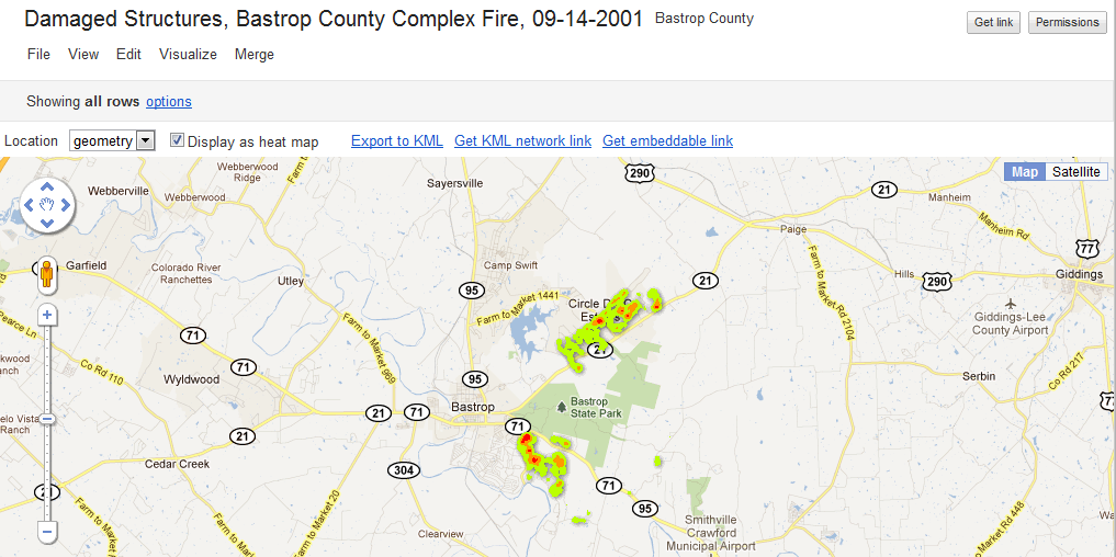
- Emergency management professionals want to illustrate the density of structures destroyed in a recent wildfire (see figure below)
- Ecologists who want to maintain records of specimens and include genetic information produced by a lab in Canada
- Non-profit that wants to publish data about water resources
- An epidemiologist who wants to illustrate disease trends
- See other uses of Fusion Tables at the example gallery
Figure 2:
Key components of Fusion Tables
- Uses spreadsheets, comma separated values, or KML files
- Data can be made available online
- Share data internally or externally
- Collaborate on the production of visualizations including tables, maps, and charts
- Export data to KML format
- Combine your data with other tables
- Geocode records
- Filter data for more selective visualizations
- Has an API that can be used to create custom applications
Mapping with Fusion Tables
Many different types of location information can be used in Fusion Tables including points, lines, polygons, customer addresses, placenames, and countries. Columns containing location data are automatically interpreted.
Several types of maps can be created including basic points, line, and polygon feature visualization, intensity maps, and density maps. Intensity maps are thematic maps that can be created for countries, states, or provinces. Custom intensity maps can be created through the use of KML polygons. Heat maps, my favorite, show point locations similar to what you might find with the output from ESRI’s Spatial Analyst product.
After creation you can embed the maps in a blog, send a link to the map, save it to KML format for display in Google Earth, or even use Google Earth dynamic linking technology to provide an update to date display of the latest map data.
In the next post in this series you’ll learn how to upload an Excel spreadsheet, geocode the data, and display in Fusion Tables.


