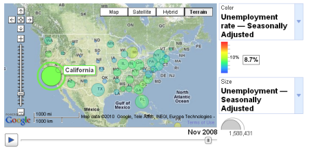
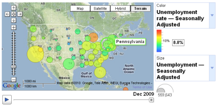
Another fantastic data visualization tool has been released by Google. The Google Public Data Explorer (currently in labs) makes large publicly available datasets available for exploration, visualization, and communication.
Visualizations of public data can be explored, linked to, or embedded on a web page.
Note the ability to animate data over time as seen in the figures below.
In addition to visualizing data in a map format you can also mash up data using line graphs, bar graphs, and bubble charts. As I mentioned visualizations can display data over time, but you can also change topics, highlight different entries and change the scale. Once you have created the chart you can share the results by embedding on your website or blog.
Data source include the World Bank, U.S. Bureau of Labor Statistics, U.S. Census Bureau, Organization of Economic Co-Operation and Development, California Dept. of Education, Eurostat, U.S. Center for Disease Control, and the U.S. bureau of Economic Analysis.


