

The new Map Viewer in ArcGIS Online has cranked up the power of visualization with a Smart Mapping turbocharge. Smart Mapping techniques were integrated into the ArcGIS Online (AGOL) platform in 2015, which means some techniques were available for use with Map Viewer classic. Whether you used Smart Mapping back then or not, you will certainly want to use it moving forward.
Since I’m smart and I map things, am I Smart Mapping?
You could say that. But technically speaking, the answer is no. You should think of Smart Mapping as another tool in your mapping toolbox. Software enhancements for symbolizing data in Map Viewer provide you with the tools to help symbolize and interpret your data quickly, discover relationships, and find meaningful patterns you might not have been aware of.
In the words of Mark Harrower, Product Engineer at ESRI, “By using data-driven defaults, cartographic best practices, along with innovative ways of depicting your data, Smart Mapping helps uncover the stories inside your data.”
How does Smart Mapping help to examine my data?
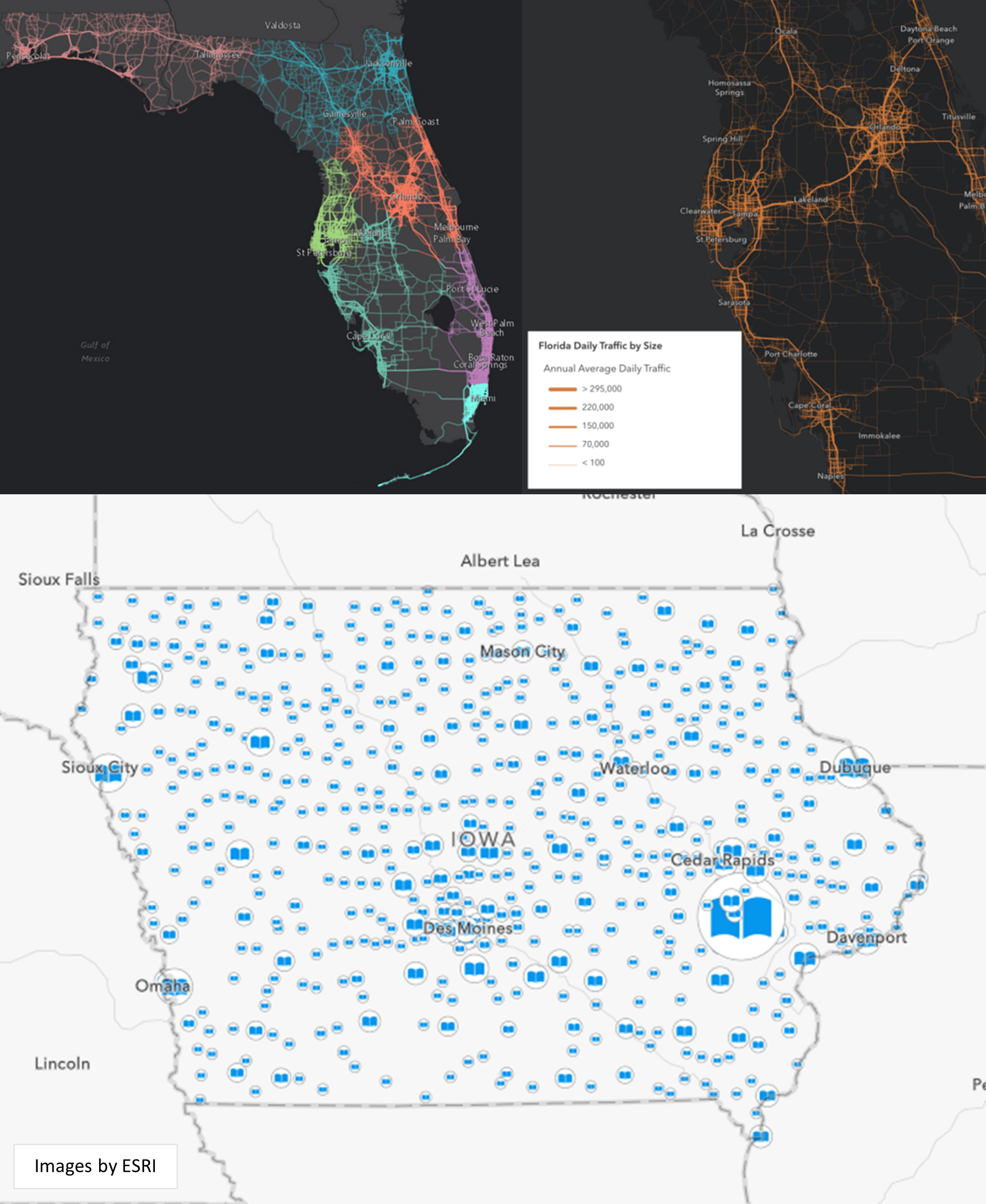
There are built-in tools in Map Viewer that allow you to examine your data visually in ways that weren’t possible before. Map Viewer helps you explore univariate or multivariate data and will provide suggestions on how to visualize your data by quickly reading through the attribute values to determine patterns that might exist. For example, Map Viewer may see your data and suggest a Counts and Amounts approach where your symbols will adjust by color and size based on numerical values in your data. These visual suggestions show you instant spatial relationships in your data that could have taken you many hours to interpret on your own.
Other examples are when Map Viewer will quickly adjust the line thickness of your road network segments to show which roads are more heavily trafficked or adjust the size of your points based on population surrounding certain ammenities.
How does Smart Mapping help to symbolize my data?
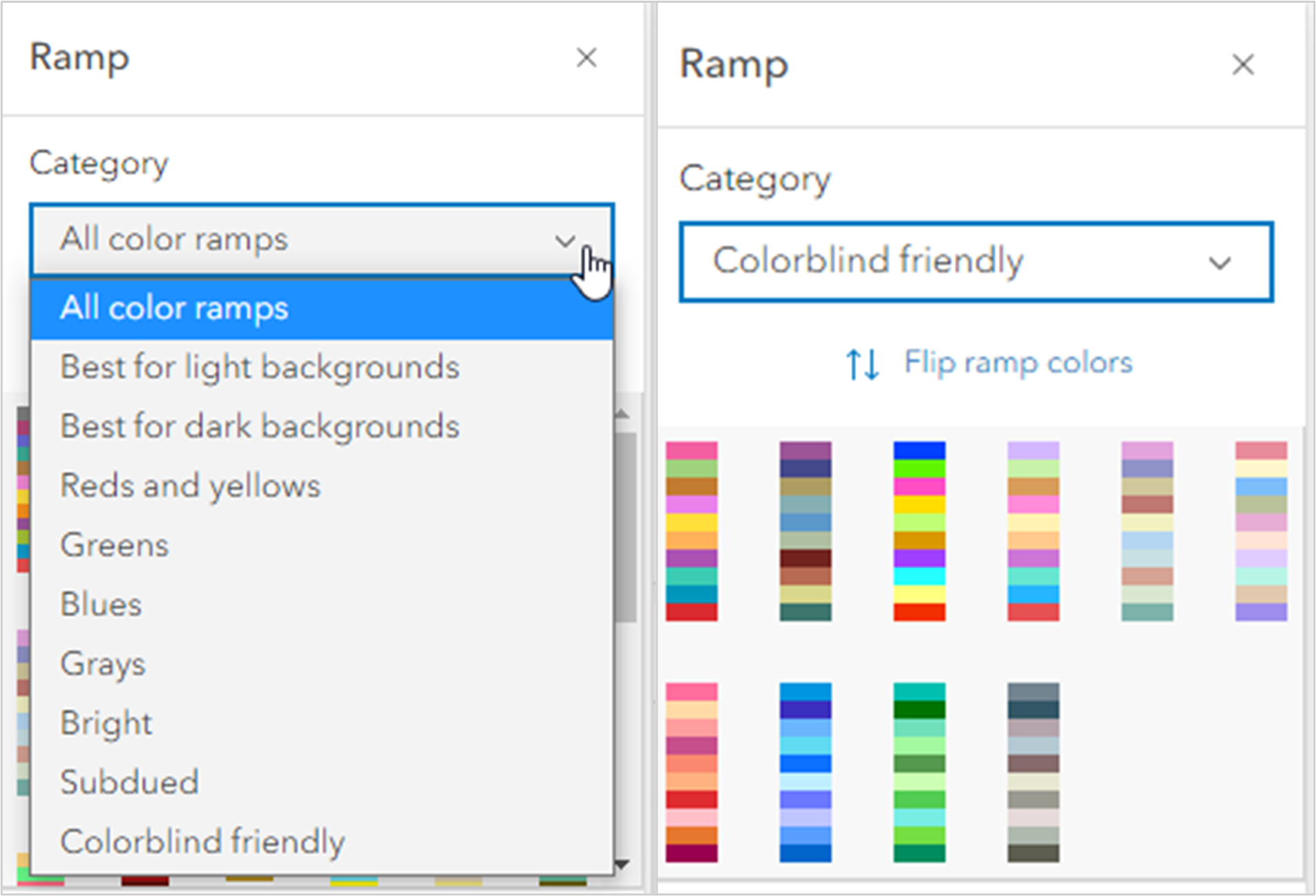
Aside from the visualization techniques briefly described above, Smart Mapping provides you with color ramps that were designed by experts in color theory. This is important in cartography because humans will perceive the meaning of colors based on common knowledge and experience, such as red being used in the United States to identify something that is bad, dangerous, or emergency-related. This is one example of how colors communicate messages. Color experts will also consider color blindness and how colors mix, match, or contrast with each other, saving you a lot of time in symbolizing your maps.
Smart Mapping sounds great, so how do I start using it?
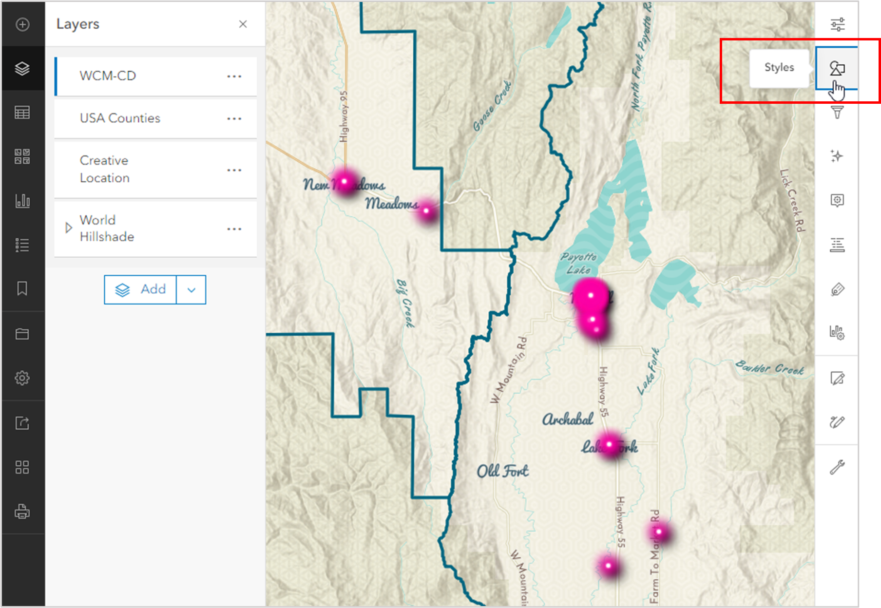
Step 1: Open Map Viewer and add your layer.Step 2: With your layer selected, click to open the Style settings toolbar on the right side of the view.
Step 3: Choose the field you want to represent in your data and let Map Viewer show you options for symbolizing. If you choose a date field, you will be given many options for color and size, timeline, age, time-period, etc. If you choose a number field, you will be given options for color and size, counts and amounts, density, etc.
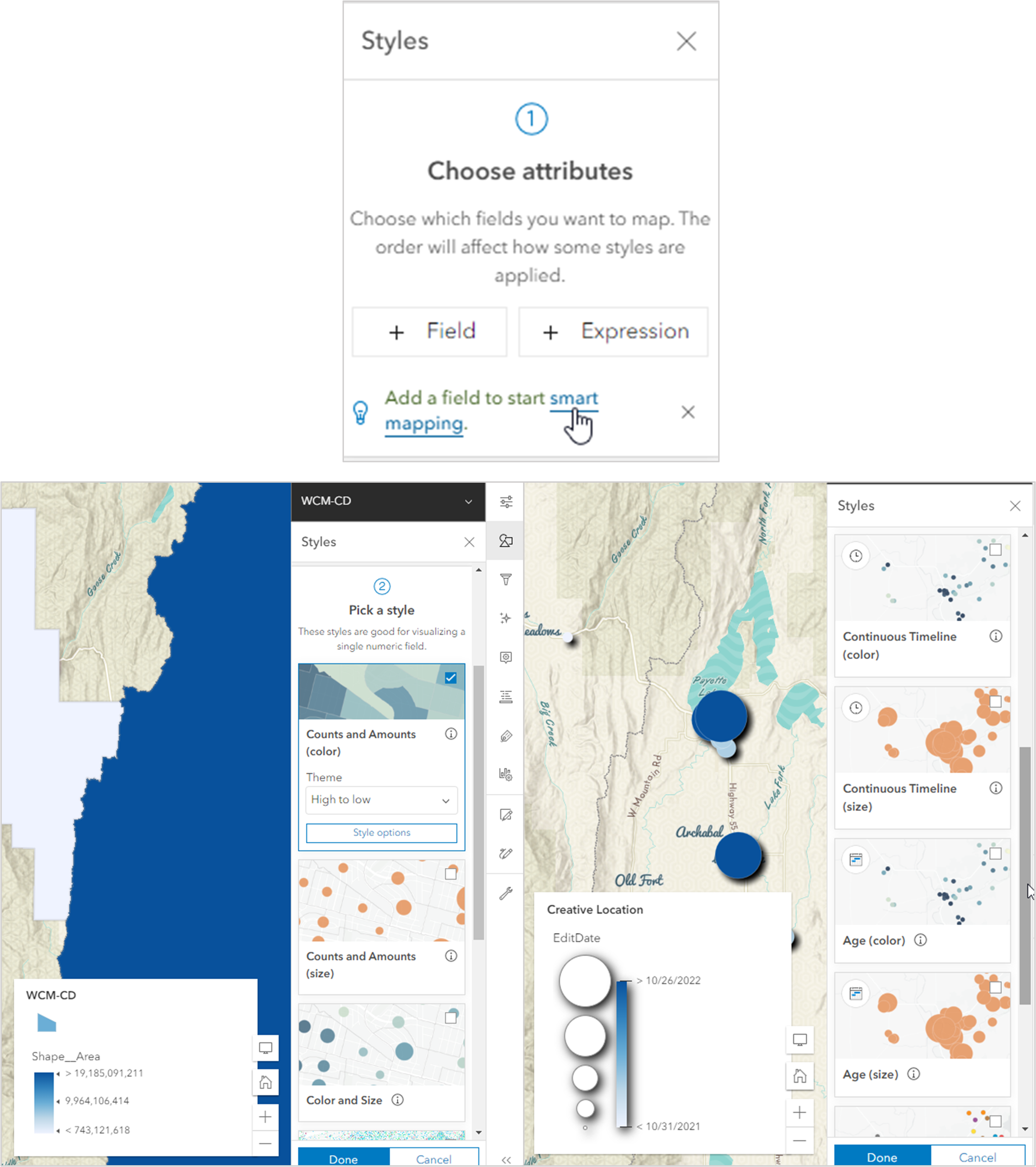
Step 4: Explore your data in various styles to see if you can find the significance you want represented in the story you are telling your audience.
