

The American Community Survey Migration Flows dataset estimates the number of people that have moved between pairs of places. The estimates are calculated based on where a person lived when surveyed and where they lived one year prior to being surveyed. The data is available at three geographic levels: county, county subdivision (minor civil division), and metropolitan statistical area (MSA). Because the number of movers may be small for some pairs of counties, the data is aggregated over a five-year period. The estimates for each five-year period represent the number of people that moved between places each year during that period.The tidycensus R package includes a get_flows() function that provides access to these estimates. Because the get_flows() function includes the ability to return the associated spatial data it is possible to use a complementary R mapping package like mapdeck (MapBox) to map the migration flows between places. In this tutorial you’ll learn how to map migration flows using these packages.
What You Need to Complete this Tutorial
To complete this tutorial you’ll need to have installed R along with an integrated development environment like RStudio (free desktop version is fine). In RStudio you’ll also want to install the tidyverse, tidycensus, sf, and mapdeck packages. The mapdeck package requires a MapBox account and access token.
Mapping Migration Flows
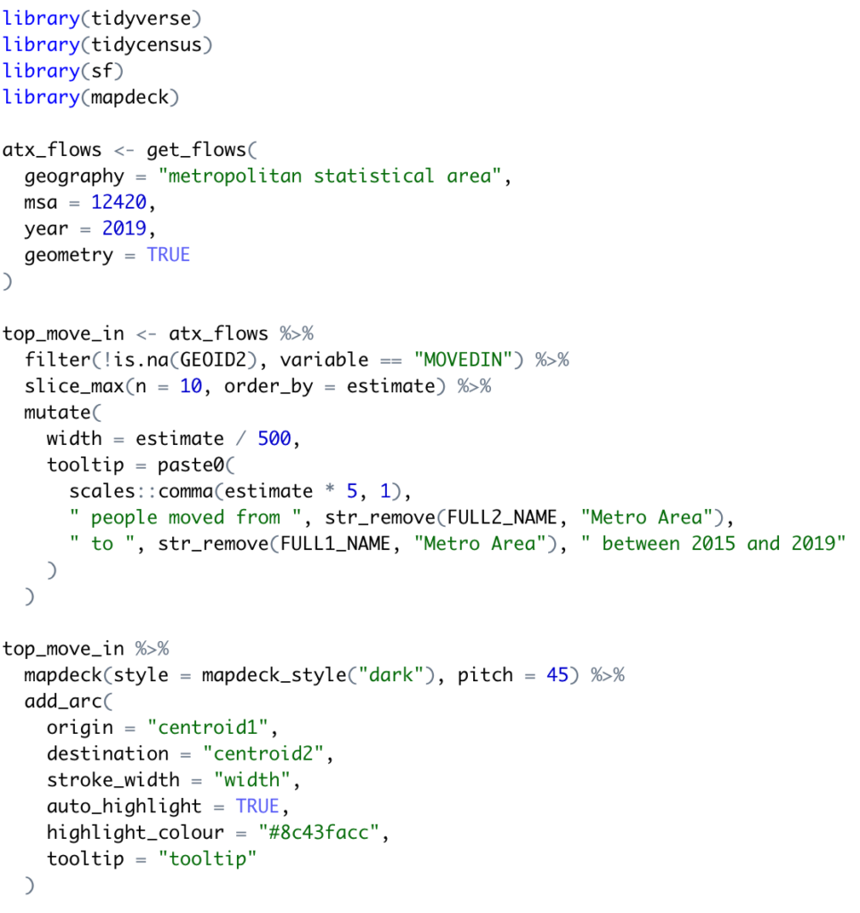
For this tutorial we’re going to map the migration flows info the Austin Metropolitan Statistical Area. The FIPS code for the Austin MSA is 12420. You can get a list of MSA FIPS codes if you’d like to try a different MSA.You can either create a new R script file in RStudio or simply use the Console to write your code.First, load the R packages that will be used in this script.
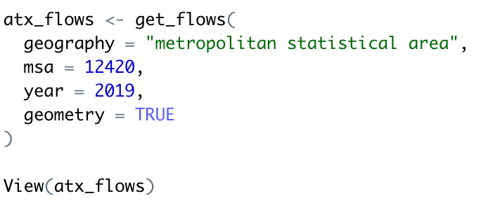
Next, use the get_flows() tidycensus function to return the migration flow information for the Austin MSA. The parameters for this function include the geography, msa, year, and geometry among others. 2019 is the most recent data as of this writing. Setting the geometry parameter to TRUE ensures that the geometry of the features will be returned. In this case the geometry will be points that represent the location of each MSA. We’ll also view the returned data frame using the View() function.
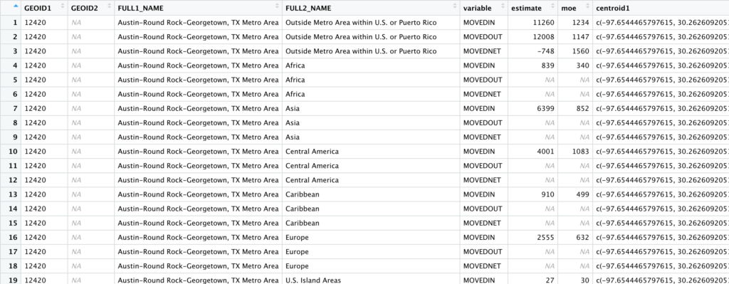
The returned data frame (atx_flows) should be displayed similar to what you see below.
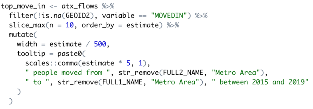
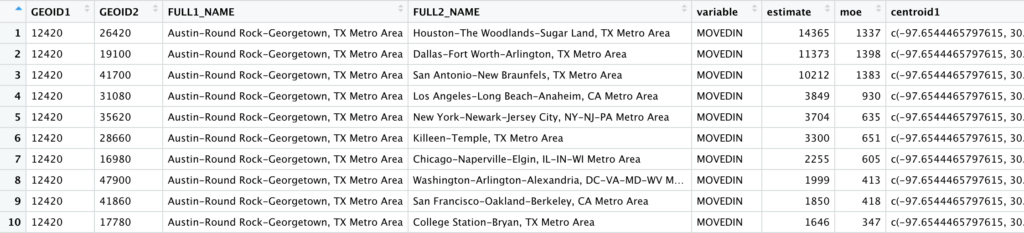
With the centroids attached to each pair of places, it is straightforward to map the migration flows. Here, we look at the most common origin MSAs for people moving to the Austin-Round Rock-Georgetown MSA. Add the following code block. This will filter the returned atx_flows data frame to include only people who have moved into the MSA (MOVEDIN variable), limit the returned records to only the top 10 locations, and add width and tooltip columns to the data frame. This information is placed into the top_move_in data frame.
Now if you run the entire script and view the top_move_in data frame it should appear as seen below. This represents the top 10 MSA’s from which people moved in during the period 2015-2019 along with an estimate of the number of moves and a margin of error (moe).
Finally, we’ll use the mapdeck package to map the migration flow. Add the code block you see below.
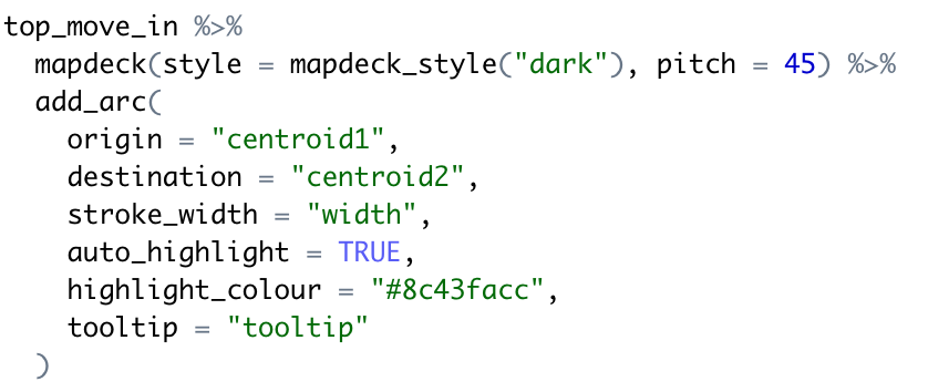
This code block pipes the top_move_in data frame into the construction of a map that contains weighted arcs that represent the flow of migration from each MSA into the Austin MSA. Note the origin and destination column along with the stroke_width parameter. The stroke_width parameter defines a thickness for each migration line. A thicker line represents more people migrating into the area. The entire script should appear as seen below.
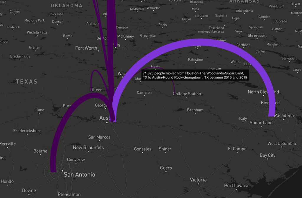
When you run the script it should generate the map you see below.
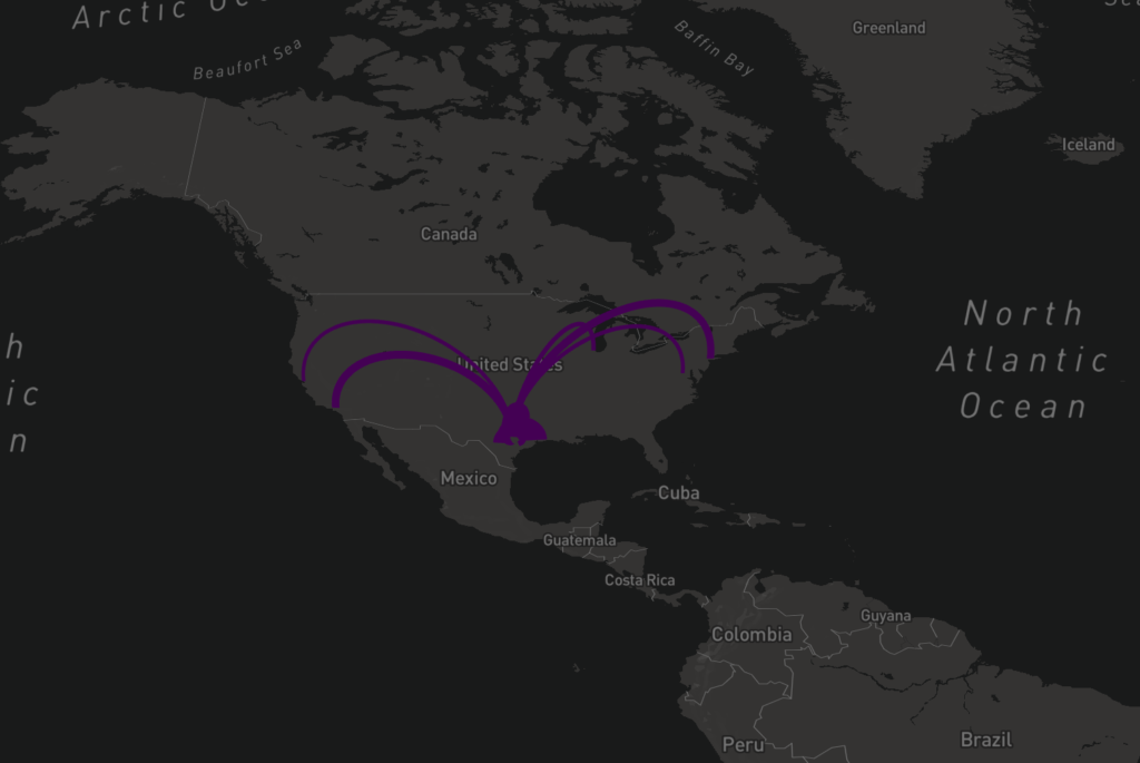
This is a dynamic map so you can zoom, pan and tilt the display. As you mouse over the individual migration flows it will also display information about the migration. The information displayed about the migration was defined in the code.
Learn more about data visualization and exploration with R in our Introduction to R for Data Visualization and Exploration class.
