Flow maps, like the one you see below, provide a great way of visualizing the movement of variables between an origin and a destination. 2021 saw a 20% rise in movers for the year compared to 2020, with an estimated 56% of Americans moving in 2021 while just 35% moved in 2020.
The pandemic has accelerated moving plans for many Americans; the rapid shift to remote work for many professionals opened up a window of opportunity to move long distances to a more desirable location.
The Los Angeles metro area saw over 200,000 residents move out of the region during the first year of the pandemic, according to new numbers released recently by the U.S. Census Bureau.
Naturally, you might want to know where people are migrating when they leave an area. A flow map provides an excellent method for visualizing this information. To create a map like this you need a dataset and software tools.
For a flow map you need not only the origin, but also the destination. For this, the American Community Survey (ACS) Migration Flows dataset from the U.S. Census Bureau provides the appropriate origin and destination information for states, counties, and MSAs. The migration flows dataset is a period estimate that measures where people lived when surveyed (current residence) and where they lived 1 year prior (residence 1 year ago). The data are collected continuously over a 5-year period in order to provide a large enough sample for estimates in smaller geographies. The estimates for each five-year period represent the number of people that moved between places each year during that period.
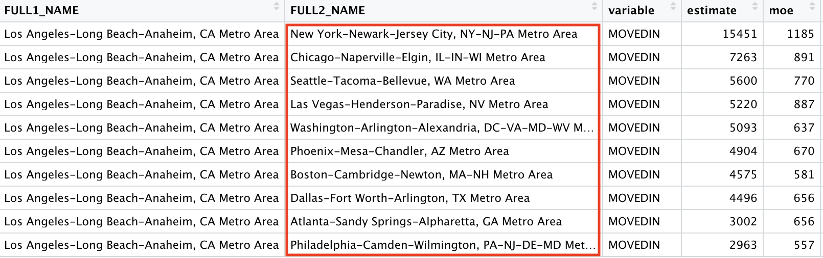
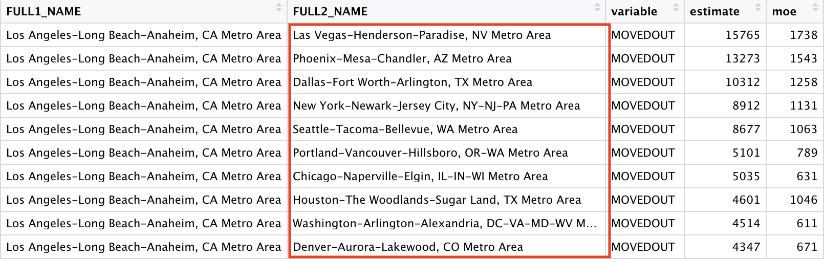
Kyle Walker’s excellent tidycensus R package includes functionality for pulling this data from the U.S. Census Bureau API. The get_flows() function in the tidycensus package provides access to the flows dataset. You can see an example of the data returned by a call to this function below. Information includes the names of the metro areas, variable (MOVEDIN, MOVEDOUT), an estimate of the number of people who have moved, a measure of error (moe), and latitude, longitude coordinates of both geographies. As of the time this article was written, ACS has released migration flow data through 2019 with 2020 soon to be released. Obviously there is a lag between the current date and what has been released, but it’s still far better than the ten year interval between the full census release. Also, keep in mind that ACS datasets are statistical estimates not a physical count.

Now that you have the data a software tool must be used to create the flow visualization. Recently, R developers have created an infrastructure to bridge R with JavaScript using the htmlwidgets package, allowing for the generation of interactive web visualizations from R. This has resulted in the availability of several packages that can be used to explore flow patterns. The networkD3 package uses the JavaScript D3 framework to create a variety of network diagrams including Sankey networks, which are appropriate for visualizing the flow of variables. The parsetR package provides a similar set of functionality. Kyle Walker provides a good overview of these packages. However, neither of these packages include functionality for mapping the flows.
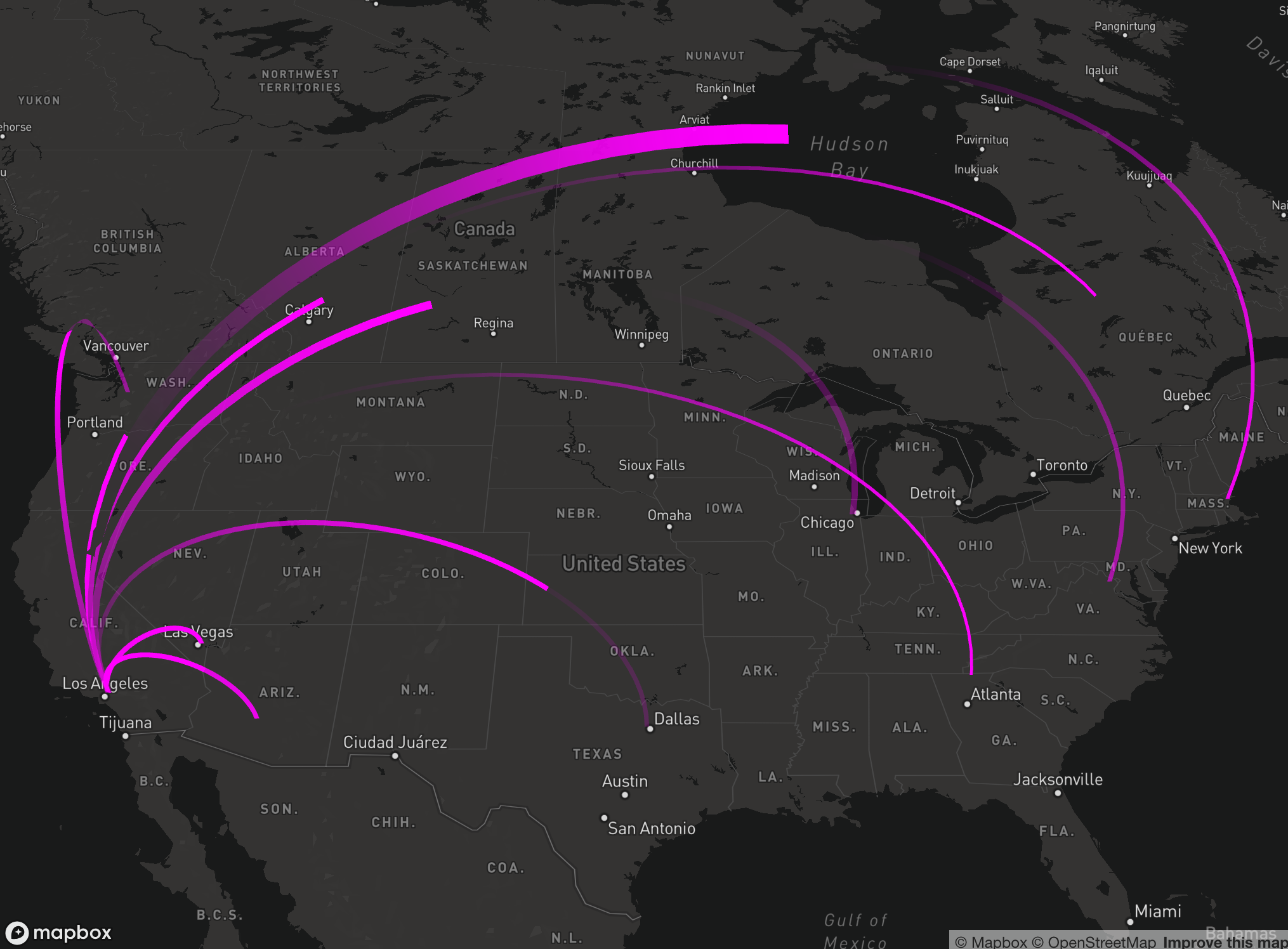
The recently released mapdeck package, from MapBox, is an excellent tool for creating flow maps. After pulling the migration flow data for the Los Angeles MSA using the tidycensus package, and manipulating the data using tidyverse the mapdeck package was used to create the animated flow map you see in the video below.
The add_animated_arc() function was used to produce the arcs between the LA metro area and the ten most popular destinations in the U.S. for people moving out of the area. The thickness of the arcs varies with thicker arcs indicating a higher flow of traffic from LA to a specific metro area. You can also mouse over each of the individual arcs to see a tooltip that contains the estimated number of people moving to the metro area.
The top 10 destinations for people migrating out of Los Angeles in 2019 were, in order, Las Vegas, Phoenix, Dallas-Fort Worth, New York City, Seattle, Portland, Chicago, Houston, Washington DC, and Denver. The estimated outflow to these MSAs was 80,537.
Conversely, top MSA’s for in-migration to the Los Angeles MSA included New York, Chicago, Seattle, Las Vegas, Washington DC, Phoenix, Boston, Dallas, Atlanta, and Philadelphia. The estimated inflow to Los Angeles from these MSAs was 58,567.
Keep in mind that this data is pre-Covid so it will be interesting to see the difference when 2020 data becomes available.