

Part 1 – Analyzing Wildfire Activity with Spatial Analytics
In this post we’ll continue our analysis of wildfire activity using spatial analytics techniques. In part 1, we downloaded historical wildfire information for the years 2002-2016 from a USGS ArcGIS Server map service for the United States. Each year was exported to an individual feature class containing wildfires for that particular year only. After downloading the data we appended the annual wildfire information into a single feature class containing all wildfire information for the 2002-2016 time period.
Today’s post will continue to massage the dataset and we’ll also define our study parameters, and perform some basic analysis. Future articles will focus on using various spatial analytics tools and the R programming language to analyze the data in support of our study parameters.
Data Manipulation
Part of the analysis phase of this project will be to create various hot spot maps. Hot spot maps can be created from point or polygon feature classes. We’ll create hot spot maps from both at various points of the analysis, but before doing so we’ll need to aggregate the points to a polygon layer. In this section of the article we’ll download a US Counties polygon feature class that will be used in the aggregation. We’ll also project the datasets to a projected coordinate system instead of a geographic coordinate system which is necessary for the spatial statistics tools. We’ll also do a little data cleanup.
- When distance is a component of your GIS analysis, which is most often the case when dealing with spatial statistics tools, you need to project your data using a projected coordinate system rather than a geographic coordinate system. Right now the HistoricalWildfires feature class is stored in a geographic coordinate system. Use the Project tool to project the data to a USA_Contiguous_Alberts_Equal_Area_Conic projection with an output feature class name of HistoricalWildfiresPrj and store it in the USGS Wildfire Data geodatabase. In this coordinate system, all areas are proportional to the same areas on earth, and distance is most accurate in the middle latitudes where many of the states in the lower 48 are located.
- During the analysis phase of this project we’re going to use a U.S. Counties feature class for part of our analysis. We’ll spatially join the HistoricalWildfiresPrj feature class to the county feature class. Esri provides a layer containing these counties. Download this layer from Esri, select the lower 48 states, and export them to a new layer called USCounties_Lower48. Project the USCounties_Lower48 feature class to the USA_Contiguous_Alberts_Equal_Area_Conic projection as a layer called USCounties_Lower48Prj and save it in the USGS Wildfire Data geodatabase.
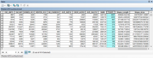
- Right click the USCounties_Lower48Prj layer in the ArcMap table of contents and select Joins and Relates | Join. Spatially join the layer to the HistoricalWildfiresPrj layer to create a new feature class called USCountiesJoined in the USGS Wildfire Data geodatabase. This will create a new field called Count_ in the USCountiesJoined feature class. The Count_ field contains a count of the number of wildfires that occurred in each county. You can see this is the screenshot below.
- Some counties haven’t had any wildfires during the study period. The Count_ field will contain <Null> values for these records. Use the Field Calculator to set the <Null> values to 0.
Defining the Parameters of the Study
For this study we’re going to focus on the analysis of wildfires from the years 2002-2016 in the United States. We’ll examine the data from a national perspective as well as by individual state. In particular, here are some of the questions that we are going to attempt to answer (we made add more in the future):
- Where do wildfires cluster?
- Are human induced wildfires concentrated in particular areas (what about naturally occurring wildfires)?
- What are the temporal variations in wildfires?
- In what areas are the largest wildfires concentrated?
- What areas of the country are similar to others with respect to the occurrence of wildfires?
We’ll examine some of these questions in this article, and others in future articles.
Some Basic Analysis
We’ll start by doing some basic analysis on the dataset. The HistoricalWildfiresPrj feature class is a point feature class containing the location of each wildfire from our study period. The attribute table for this feature class contains a firecause field, which is a one character code indicating the cause of the fire. For now we’re going to create some basic maps and analysis without looking at the underlying cause of the fire. Later we’ll break the fires out into categories based on whether the fire was started by natural or human events.
Color Coded Map of Wildfire by US County
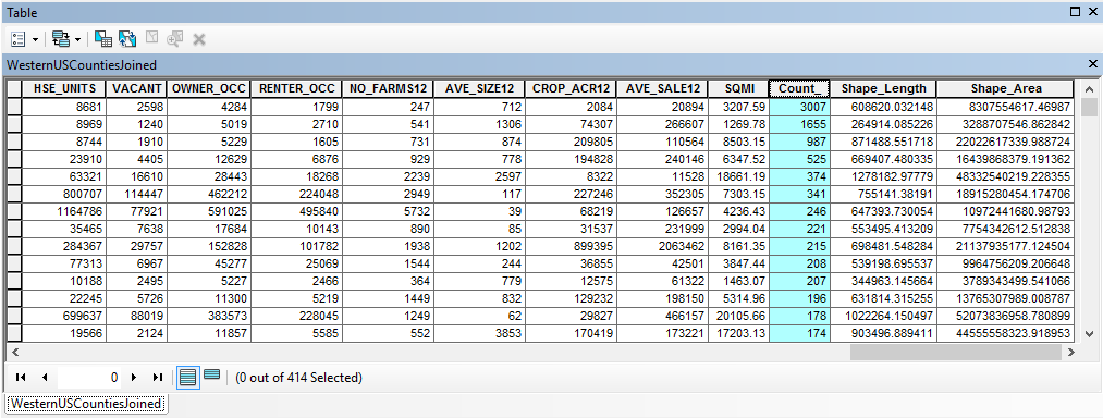
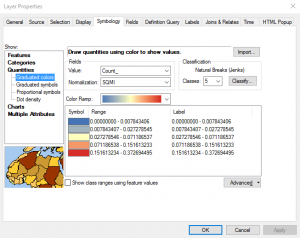
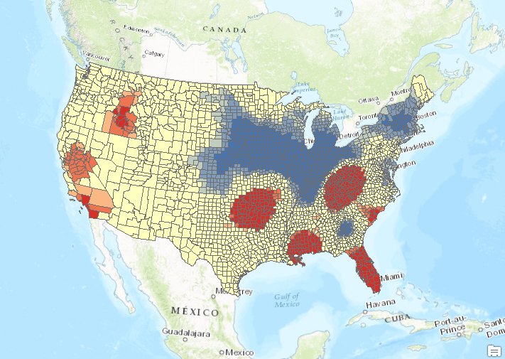
- Using the Count_ field in the USCountiesJoined layer, create a color coded map that is normalized by the SQMI field. Normalization takes the size of the county out of the equation. Otherwise, counties with a larger area will naturally have more fires, all other variables being equal. I’ve provided a couple screenshots below to show you how this is done as well as the result. This reveals some fairly obvious patterns of high wildfire activity in the western United States including California, Oregon, and Idaho along with Oklahoma, the Appalachian region, and Florida. However, these patterns are subjective. If you changed some of the properties of the graduated color map (different number of classes or classification scheme) you might get a very different result. Fortunately ArcGIS includes a number of spatial statistics tools that we can use to get a more accurate picture of wildfire activity.


Preparation for Hot Spot Analysis
In this step we’ll prepare the counties feature class for hot spot mapping and also run the Spatial Autocorrelation tool to make sure the data exhibits a clustered pattern, which is a requirement for hot spot analysis.
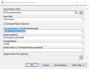
- One of the fields the Hot Spot Analysis tool needs is an input field. Create a new field called NormCount (Double data type) in the USCountiesJoined feature class. This will hold the results of the normalization we used in the creation of the color coded map in the last step.
- Use the Field Calculator to calculate the values of this field to be the Count_ field divided by the SQMI field.
- Find the Spatial Autocorrelation (Moran’s I) tool in the Spatial Statistics toolbox and open it. This tool measures spatial autocorrelation based on both feature locations and feature values simultaneously. Given a set of features and an associated attribute, it evaluates whether the pattern expressed is clustered, dispersed, or random. A dataset should exhibit a clustered data pattern to be used in the hot spot analysis. Define the parameters seen in the screenshot below and click OK to execute the tool.
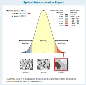
- This will create an output HTML report that you can open. The location of the file will be displayed in the progress dialog. Take a look at the screenshot below to see the output. The output graph, along with the high z-score and low p-value, indicates that the data exhibits a clustered pattern, which is needed for hot spot analysis.
- A full explanation of the Spatial Autocorrelation tool, along with other tools in the Analyzing Patterns toolset, is beyond the scope of this article. Our Introduction to Spatial Statistics using ArcGIS and R class includes detailed lectures and exercises on this topic.

Hot Spot Map of Wildfires by US County
Now that we’re confident our data exhibits a clustered pattern we can proceed with the hot spot analysis.
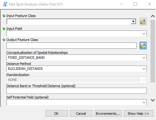
- Find the Hot Spot Analysis tool in the Spatial Statistics toolbox and open it. As you’ll see in the screenshot below there are a number of parameters, some of which are required and others are optional. In particular, I want to discuss the Conceptualization of Spatial Relationships and Distance Band parameters as these can have a significant impact on the results. For the Conceptualization of Spatial Relationships parameter there are a number of options including Fixed Distance Band, Zone of Indifference, Inverse Distance, Contiguity, and Spatial Weights from File. It’s beyond the scope of this article to discuss these in detail so I’ll refer you to a previous webinar that I recorded, which discusses these in more detail, along with an excellent overview by Esri.However, I’ll provide a brief overview of the options here. Selecting the right parameter for Conceptualization of Spatial Relationships requires that you have a good understanding of the questions you’re asking along with having familiarity with your dataset. In this exercise we’re wanting to get an understanding of where wildfires cluster within county boundaries across the United States. Counties across the United States are not uniform in size–they exhibit quite a lot of size variability. Hot spot analysis examines each feature in relation to it’s neighbors.What does it mean to be neighbors? The value we select for Conceptualization of Spatial Relationships will determine how the neighborhood is defined. Let’s examine some of the possible values that you can select for Conceptualization of Spatial Relationships.
Fixed Distance Band is the default value. It defines a distance (or buffer) that will be created for each feature in the dataset. All features that fall within this distance will be included as neighbors, and any features that fall outside the distance will be excluded.
You can also use Inverse Distance or Inverse Distance Squared, but neither is recommended for hot spot analysis as they tend to create small, isolated “salt and pepper” hot spots. The neighbors defined using these parameters tends to be too small.
Other possible parameter values include Contiguity Edges Only and Contiguity Edges and Corners. These parameters define the neighborhood as being limited to other features that touch the boundary of the feature being examined. Both work well when the dataset contains relatively equal sized polygons. In our case though because counties vary significantly in size it doesn’t work so well.
Zone of Indifference is similar to Fixed Distance Band in that it defines a specific distance (buffer) that defines the neighborhood. However, unlike Fixed Distance Band, Zone of Indifference is sort of like a fuzzy boundary in that features outside the boundary are still used as part of the neighborhood, but the further beyond the distance band, the less influence each feature imparts. For our analysis, Zone of Indifference and Fixed Distance Band would seem to be the best choices.
The Distance Band or Threshold Distance parameter also deserves some discussion as well. This optional parameter is only used when Fixed Distance Band, Zone of Indifference, or Inverse Distance has been selected for the spatial relationships parameter. It defines the distance at which features are included in the neighborhood analysis for the tool. Refer back to the videos I linked to for more detailed information.
Initially we’re going to select Fixed Distance Band for the spatial relationship and we’ll leave the Distance Band parameter empty. Leaving this parameter empty will allow the Hot Spot Analysis tool to automatically calculate the distance. The automatically calculated distance will be large enough to ensure that every feature in the input feature class has at least one feature that will be included in the analysis. In a later step I’ll show you a tool that can be used to calculate this distance for specific numbers of neighbors that you want to include.
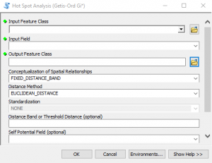
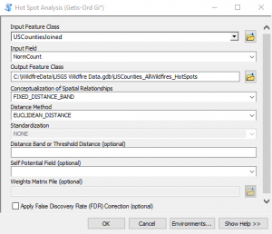
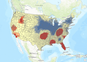
- Input the parameters shown in the screenshot below and click OK to execute the tool. The progress dialog will indicate the automatically calculated value used for the distance band. It should be 146885.8371 Meters.
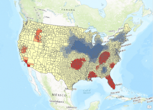
- The output will be a new feature class that displays each feature as a hot spot, cold spot, or statistically not significant. This statistical analysis really highlights the patterns that were hinted at when we created our initial map. There are some obvious hot and cold spots, although some of these hot spots may not have been what you expected. The wildfires in the western United States get more publicity due to the size and intensity of the fires, but in terms of sheer numbers of wildfires the southern United States including Florida, the Gulf Coast and Appalachian Region along with Oklahoma appear to be “hotter”.
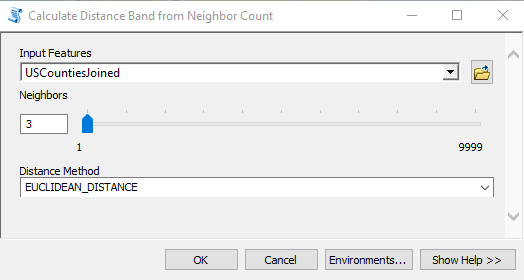
- Now let’s run the tool again, but this time with a larger value for the Distance Band parameter to see if it has an effect. This time, instead of guaranteeing that every feature has at least 1 neighbor that will be used in the analysis we’ll up that to 3 neighbors. There is a tool called Calculate Distance Band from Neighbor Count in the Utilities toolset in the Spatial Statistics toolbox that can be used to assist with determining the distance. Find the tool and open it.
- Select USCountiesJoined as the input features and 3 as the number of neighbors. You can see this in the screenshot below. Click OK to execute the tool.
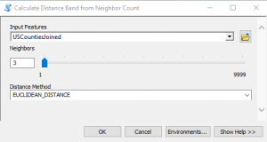
- The output will include a minimum, maximum and average distance value. The maximum is the value you’re looking for in this case as it indicates the maximum value that will insure that all features have at least 3 neighbors that will be used in the analysis. The value should be 192816.933508. We’ll just round that up to 192817.
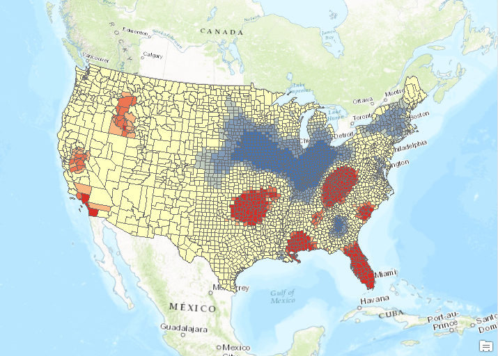
- Run the Hot Spot Analysis tool again with the same parameters, but use 192817 as the Distance Band value. You’ll also need to create a unique name for the output feature class. The output should appear as seen in the screenshot below. The results are similar, but more areas in the western United States are now defined as hot spots. The areas defined as cold spots have also expanded.
- Run the Hot Spot Analysis tool one final time, but set a Distance Band equal to the value you find for a minimum of 8 neighbors. Use the Calculate Distance Band from Neighbor Count to find this value. It should be 299358.285146. The output should appear as seen below.

- Run the Hot Spot Analysis tool one last time, but this time select Zone of Indifference for the Conceptualization of Spatial Relationships parameter and a value of 192817 for the Distance Band. Zone of Indifference is a good parameter value for this type of dataset as is Fixed Distance Band.

- So what is the correct answer? There really isn’t one. Obviously you want to use a parameter that bests fits your data for the Conceptualization of Spatial Relationships parameter. The Fixed Distance Band and Zone of Indifference parameters work well for our analysis. The distance band is important as well.


Cluster and Outlier Analysis of Wildfires
In this section we’ll use the Cluster and Outlier Analysis tool to identify counties that have a high incidence of wildfires even though the surrounding counties have a low incidence of wildfires, and vice versa. The Cluster and Outlier Analysis tool should be run anytime you run Hot Spot Analysis. Outliers can be extremely important when examining many types of problems. When examining wildfire activity this tool would enable us to find areas with high wildfire activity that are surrounded by areas of low wildfire activity and vice versa. It attempts to find values that are different from their neighbors and is an underutilized tool.
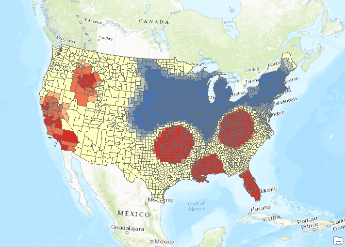
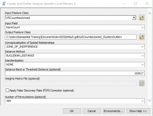
- Find the Cluster and Outlier Analysis tool in the Spatial Statistics toolbox and open it. Input the parameters shown in the screenshot below. The Zone of Indifference with a distance value of 192817 seemed to work well so we’ll stick with that for now.
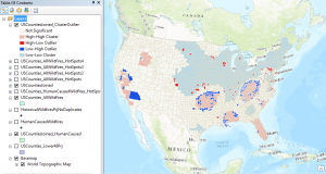
- Click OK to execute the tool. The results of the analysis should appear as seen in the screenshot below. The counties in dark red and blue are the outliers. The dark blue counties indicate areas of low wildfire activity in close proximity to areas of high wildfire activity. The dark red county indicates an area of high wildfire activity in close proximity to counties of low wildfire activity.

Conclusion
In the next article we’ll dive deeper into our dataset and investigate human induced wildfire activity.
More information on Spatial Analytics:
- Need help with a spatial analytics, data science, or data visualization project? Get more information on our consulting services.
- Class – Introduction to Spatial Statistics using ArcGIS and R
- Class – Python for Data Science I: Python programming and efficient data management (Pandas)
- Class – R for Data Science I: R Programming and Efficient Data Management
- Book – Spatial Analytics in ArcGIS
- Services – Spatial Statistics and Data Science
