
In this tutorial, you’ll learn how to create a simple bar chart in an ArcGIS Pro python notebook.
Pro includes a series of pre-installed Python packages. One of these packages is matplotlib, a plotting library which enables you to create bar charts, scatterplots and more. Here, we’ll show you how to create some very basic bar charts, as an example of how you can combine the functionality of different Python packages to plot column data and get quick insights from them.
STEP 1: Download the data
Again, we’ll be using the Natural Earth quick start kit. Download the data, unzip the file on your hard drive, open up Pro and create a new, empty project. Create a folder connection to the unzipped Natural Earth dataset and add the ne_110m_lakes.shp file to the map window so that it is listed in the maps contents pane on the right of the screen.
STEP 2: Create a new python notebook and import the required libraries
On the ribbon interface, click “Insert” and then “New Notebook”. A new python notebook opens up automatically. Here, we’ll be using a new field with area calculations in the attribute table. To add this field, refer to this tutorial. First, we’ll need to list the libraries we want to use. Also, to be able to display the bar charts we’ll be creating, we need to add a command to display matplotlib inline. Without this command, we can create the bar charts but not visualize them. Also, we’ll be using the following libraries: matplotlib, pandas and arcgis:
- Pandas is a fast, powerful, flexible and easy to use open source data analysis and manipulation tool, built on top of the Python programming language.
- Matplotlib is a comprehensive library for creating static, animated, and interactive visualizations in Python.
- Arcgis is a powerful Python library for mapping, spatial analysis, data science, geospatial AI and automation.
As we’ll see below, all three libraries work together: the arcgis library uses the pandas library to create a spatially-enabled dataframe, which is a table that manages spatial data types, while pandas uses matplotlib for plotting columns from pandas data frames. Use the following code for importing the libraries:
STEP 3: Create a spatially enabled dataframe and a bar chart
As stated before, a spatially enabled data frame creates an attribute table with spatial reference information that is usable in a Python environment. This means we can create it as a pandas dataframe, which is also handy when plotting row and column data with matplotlib. Because we’ve added the lakes shapefile to the map, we can directly reference it by name in the following code snippet instead of using a file path. The second code cell contains the code to create a simple bar chart, showing the lake names and the area in square kilometers:
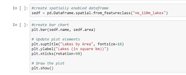
Creating the bar chart is done with a simple command that uses two column names (name and area) as methods added to the sedf object. The lake names are rotated 90 degrees so you can read them better.
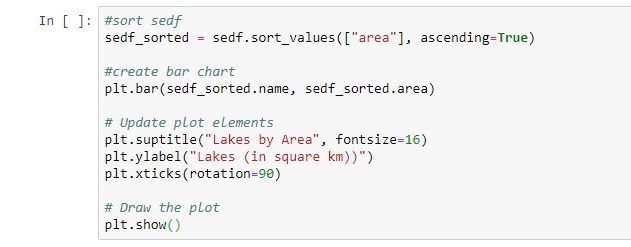
STEP 4: Sorting the data
Running the code will show you the bar chart, but it is not very informative, as the data is not sorted. Adding a single line to the last code snippet, we can sort the area column of the table, as show in the first line of the following code cell:
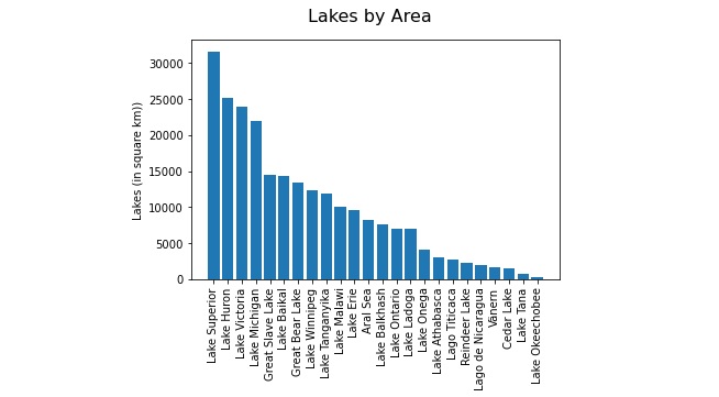
Running this code will show you something strange, as there is a double entry in the data which causes an outlier. If you change the first line of the code cell to “ascending=False” and run the cell again, the problem is solved:
During our Spring Sale, you can save 20% on any of our GIS training opportunities.
